01. Overview
One idea, three design disciplines, built by two people
SportyFor started as a personal observation. As active people who regularly searched for sports and outdoor products across a dozen different online stores, my wife and I noticed a gap: there was no single, well-designed destination for the Polish market that brought together products, specialist knowledge, and a community around sport, fitness, and outdoor activity. The market was fragmented, and the few aggregators that existed were either dated, generic, or focused purely on price comparison without any editorial layer.
We decided to build it ourselves. That meant designing everything from the ground up: the brand name, the visual identity, the print materials for business development, and the entire web platform - a marketplace that combined a product catalogue from partner stores with an editorial section, a specialist directory, and a business acquisition funnel for new retailer partners.
What makes this project different from anything else in my portfolio is that I wasn't executing a brief - I was writing it. Every design decision was also a business and product decision. The design had to be attractive enough to win over both users and B2B partners, while the platform had to function as a three-sided marketplace: users browsing products, retailers wanting exposure, and specialists offering their services.
01 · Branding
Brand Identity
Name, logo, colour palette, typography, brand language. A visual identity that had to work for both sport and business contexts - dynamic, trustworthy, and distinctly Polish-market ready.
02 · Print
Sales Collateral
Business card and a folded brochure for direct sales to retailers - the primary tool used to pitch new store partners on joining the platform.
03 · Digital
Web Platform
Full UX/UI design for the SportyFor.pl platform: homepage, article section, product catalogue, login & registration, user profiles, specialist directory, and B2B landing page.
02. Brand identity
Sporty, trustworthy, and built to scale across touchpoints
The brand needed to work in two completely different contexts simultaneously. For users - the sports and outdoor community - it had to feel energetic, motivating, and credible. For B2B partners - retailers, distributors, sports specialists - it had to feel professional and trustworthy enough to hand over their product catalogue and pay for exposure.
The logomark is a stylised "S" built from speed-lines and a directional arrow form - visually communicating motion, forward momentum, and sport without leaning on any single discipline. The navy and gold colour palette was deliberately chosen to feel premium and trustworthy rather than the typical neon-sport aesthetic; it aged better, worked in print, and differentiated SportyFor from the crowded sports apparel visual space.
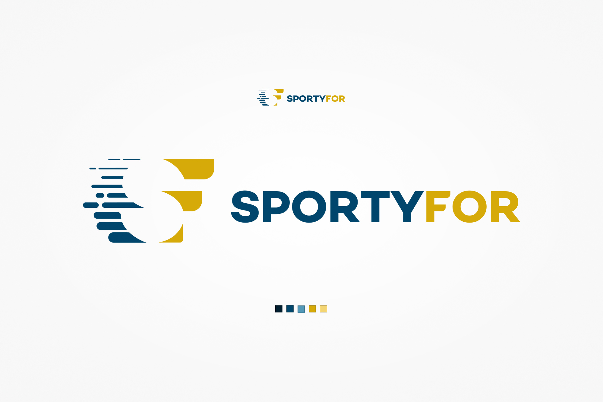
Logo & colour palette. The logomark pairs a stylised "S" (speed-lines suggesting motion) with bold wordmark typography - "SPORTY" in navy, "FOR" in gold - reinforcing the dual identity of the brand: serious sport meets accessible discovery. The palette spans dark navy, steel blue, warm gold, and light gold - usable from digital screens to premium print.
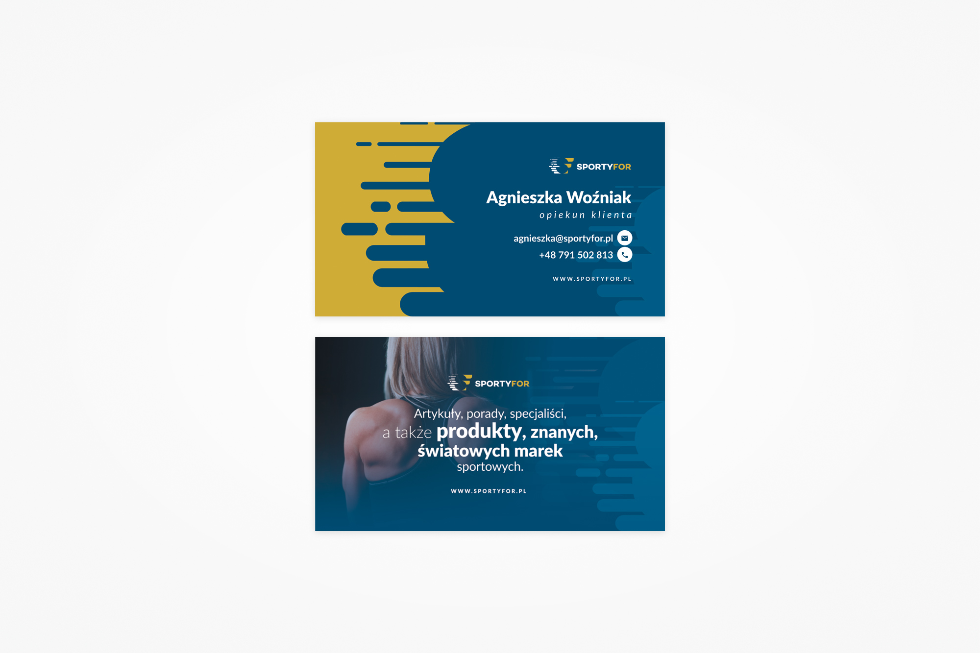
Business card. A two-sided card using the full brand language. The front applies the logo pattern as a bold graphic element on gold, with contact details on the dark navy half. The back uses a full-bleed lifestyle photo with a brand tagline - designed to be kept, not thrown away.
03. Print
The pitch document - designed to close B2B deals
One of the core challenges in building SportyFor was the B2B acquisition problem: the platform's value to users depended on having a wide and diverse product catalogue, which meant we needed retailers to join. Getting a store owner to trust a new, unproven platform with their product inventory required a proper sales conversation - and a proper leave-behind.
The sales brochure was our primary tool for that conversation. It introduced the platform concept, explained the three audience groups (users browsing for products, retailers wanting reach, specialists offering services), made the business case for joining, and ended with a direct CTA. The design had to look credible and professional while still feeling like a brand with personality - bland corporate print was the wrong call for a sports lifestyle platform.
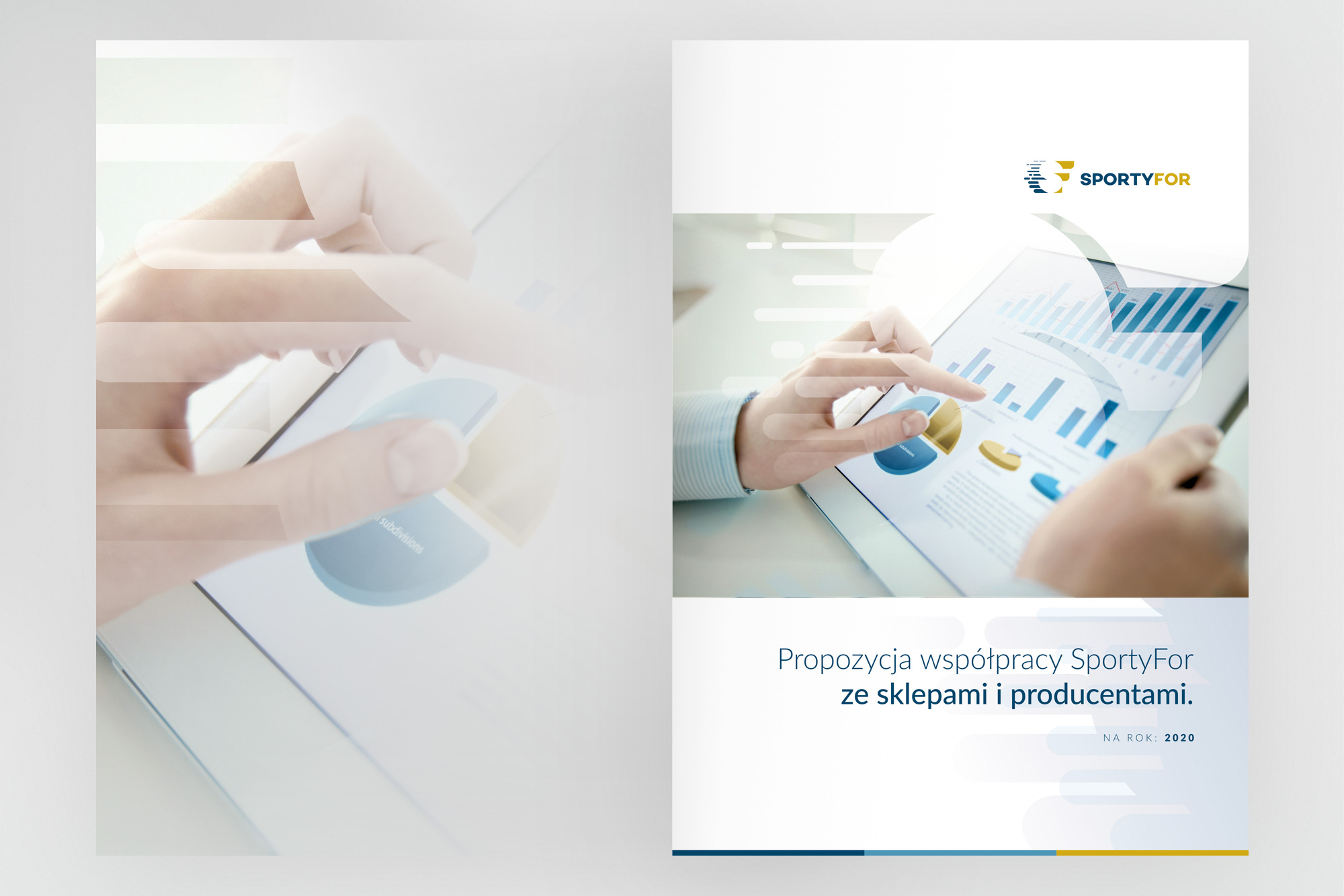
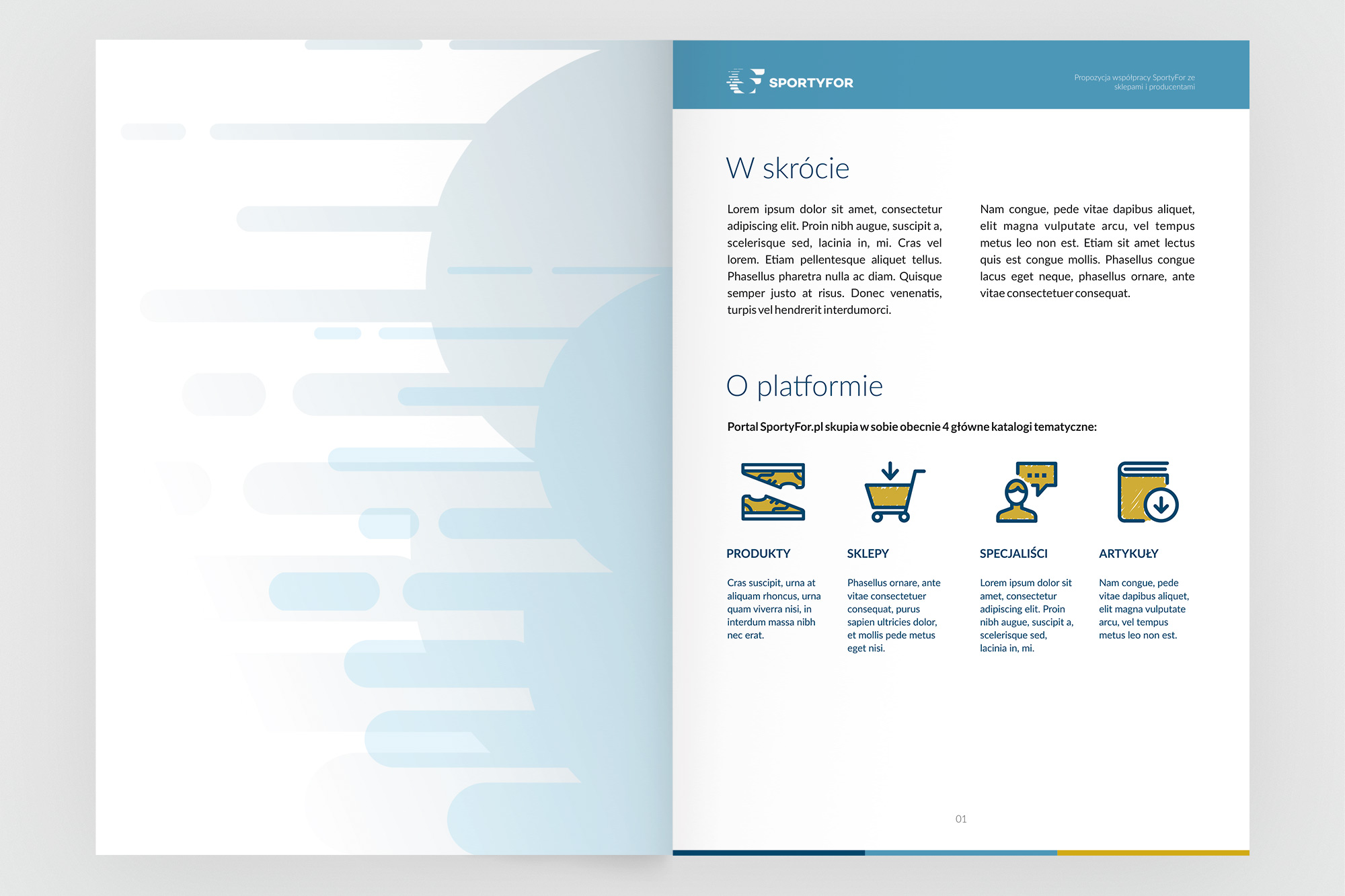
Cover and interior of the partner acquisition brochure. The cover uses a clean editorial style with a data/analytics photo - immediately speaking to the business mind of a store owner. Inside, the platform is introduced through four product categories (Produkty, Sklepy, Specjaliści, Artykuły) with icon-led descriptions.
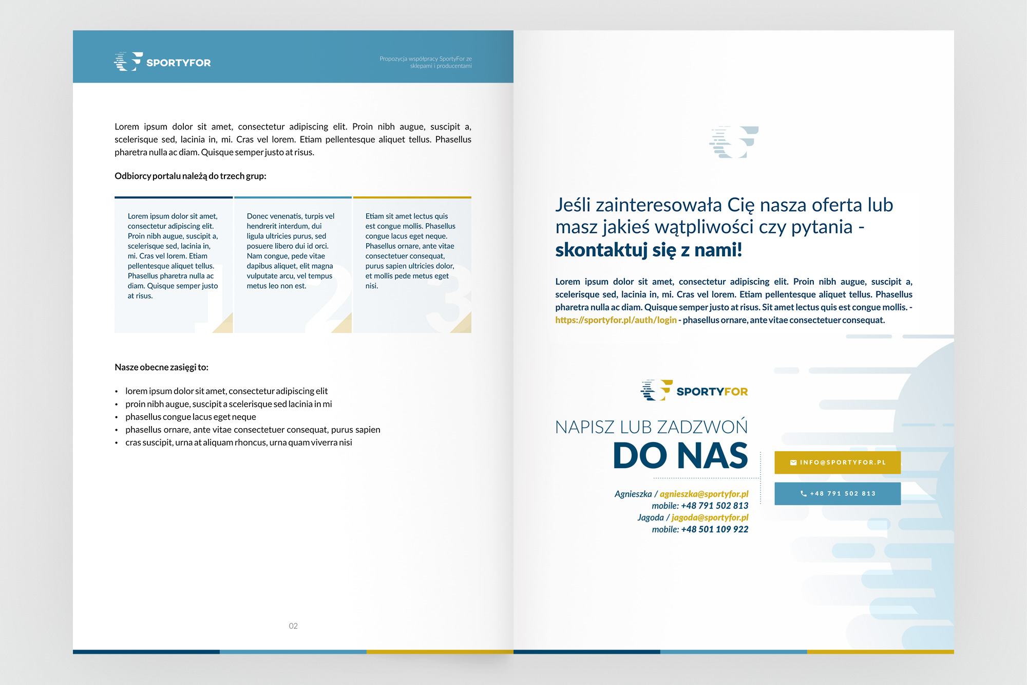
The audience page shows the three recipient groups in a structured three-column layout. The final page is a dedicated CTA - direct contact details, a prominent "DO NAS" (contact us) call to action, and a tone of voice shift from informational to conversational. This was the page left on a retailer's desk.
04. Web platform
Three audiences, one platform, designed to convert
SportyFor.pl was built around three distinct user groups, each with different goals and different entry points. Regular users came for content (articles, inspiration, specialist advice) and products. Retailers came to list their inventory and reach a targeted, sport-interested audience. Specialists - personal trainers, fitness coaches, sports professionals - came to build visibility and connect with potential clients.
The information architecture had to serve all three without the platform feeling fragmented. The navigation reflected the editorial hierarchy: Inspiracje (articles and lifestyle content) led with discovery; Produkty directed toward commercial intent; Specjaliści gave the community directory its own section. The visual language was intentionally lighter and more editorial than a typical e-commerce site - content-forward, with strong photography and generous whitespace.
Design principle
"SportyFor wasn't just a shop - it was a destination. The design had to give equal weight to inspiration, community, and commerce, without any of the three feeling secondary."
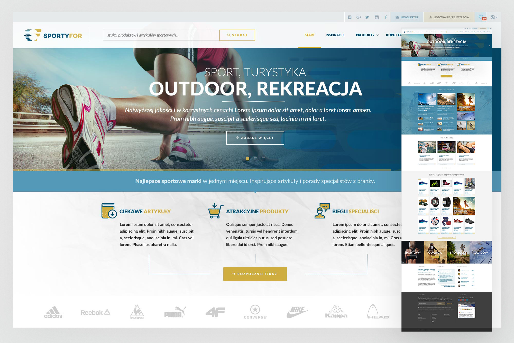
Homepage. A full-bleed hero with a sport lifestyle image and the platform's value proposition - "Sport, Turystyka, Outdoor, Rekreacja". Below: a three-column value section (Artykuły / Produkty / Specjaliści) with icon-led descriptions and a single CTA. The brand partner strip (Adidas, Reebok, Nike, Puma…) establishes credibility above the fold.
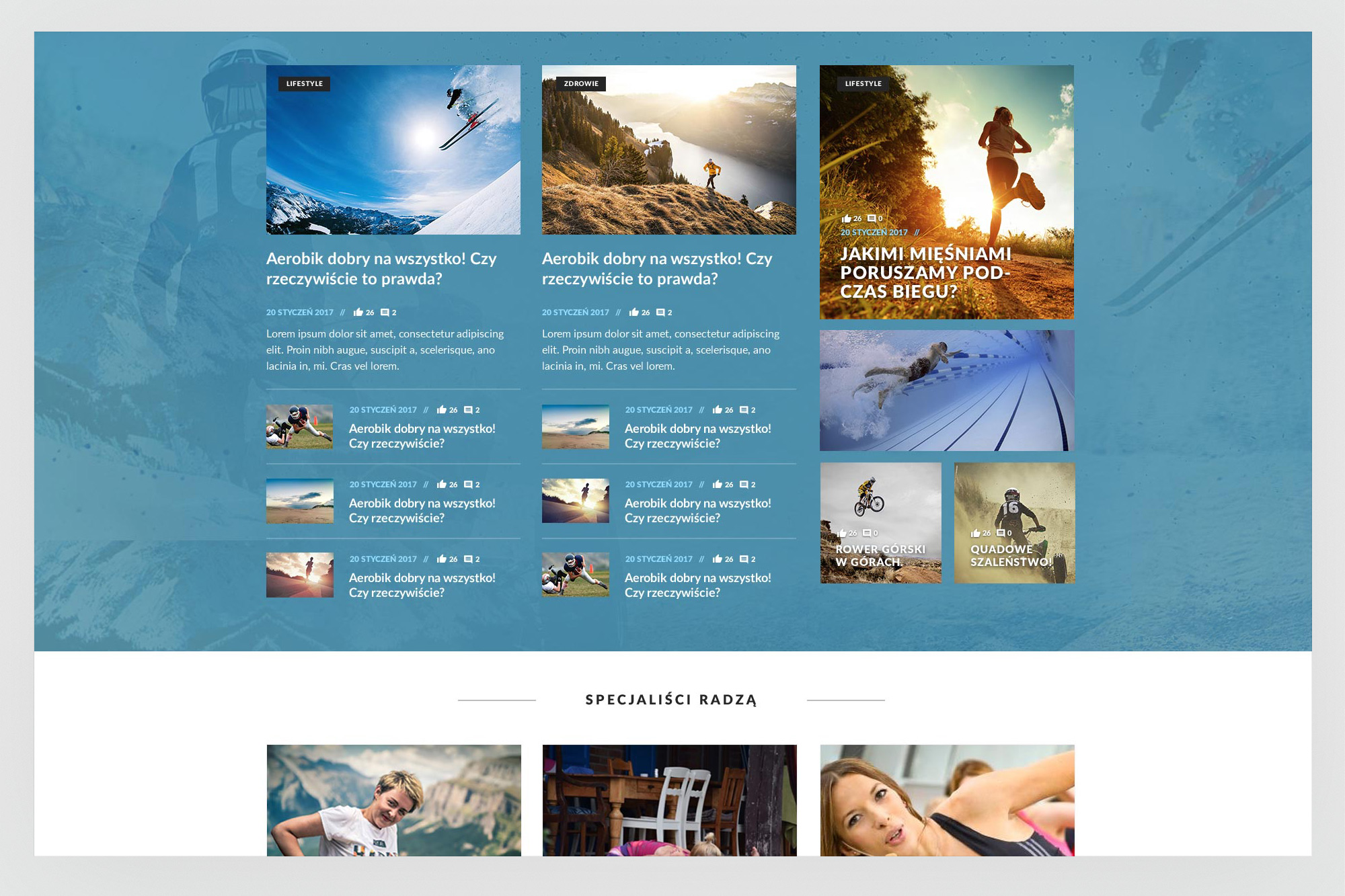
Inspiracje - editorial section. A magazine-style article grid with category badges, author attribution, and social signals (likes, comments). The visual rhythm alternates between large featured cards and smaller article rows, keeping the browse experience dynamic. A category navigation strip (Lifestyle, Zdrowie) allows quick filtering.
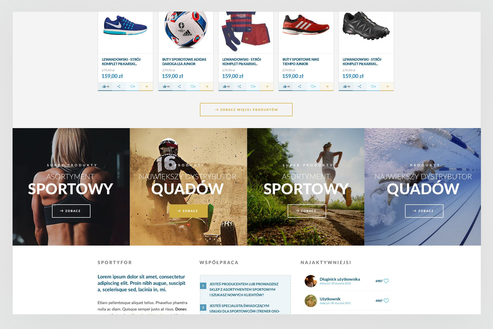
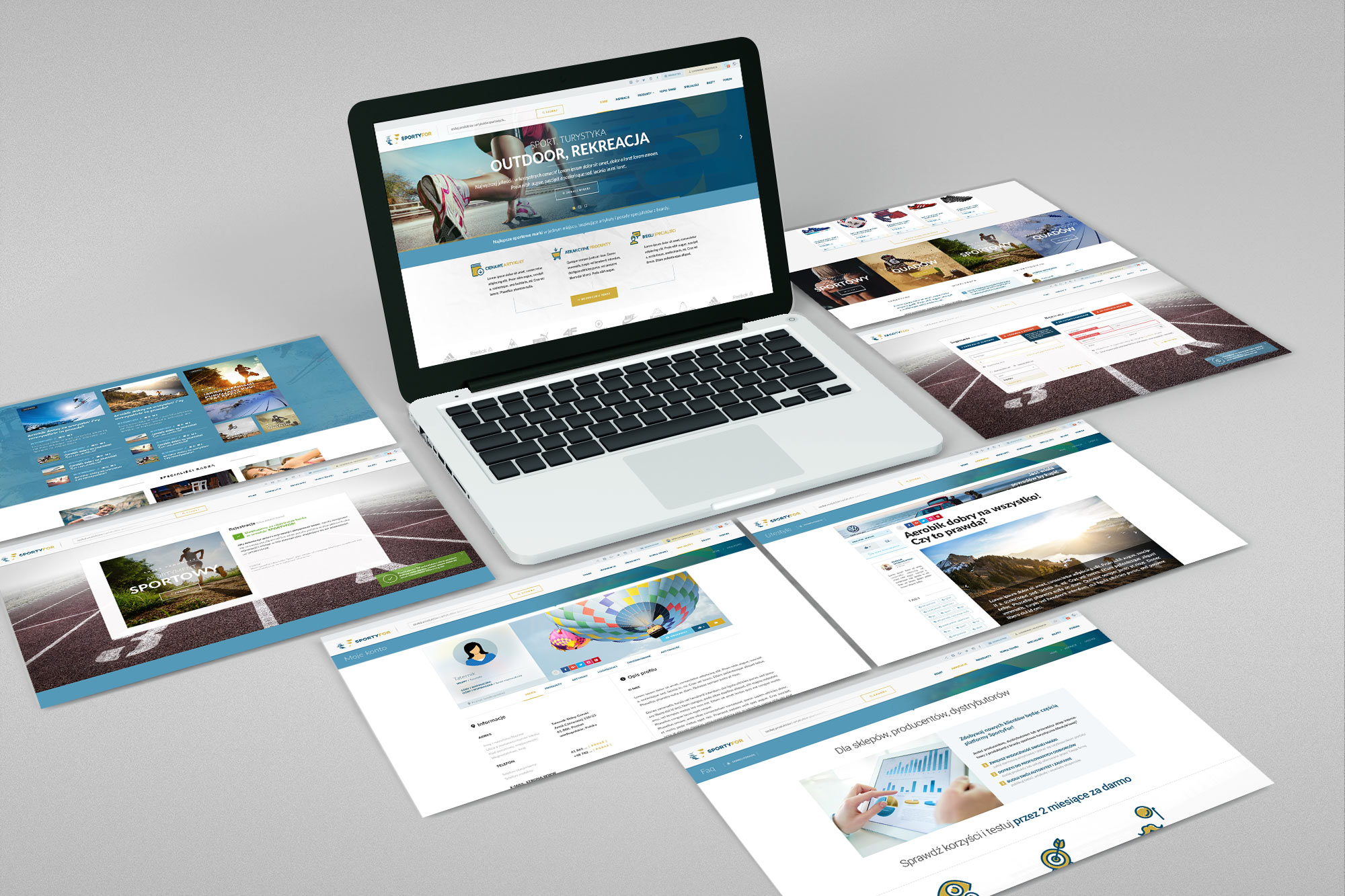
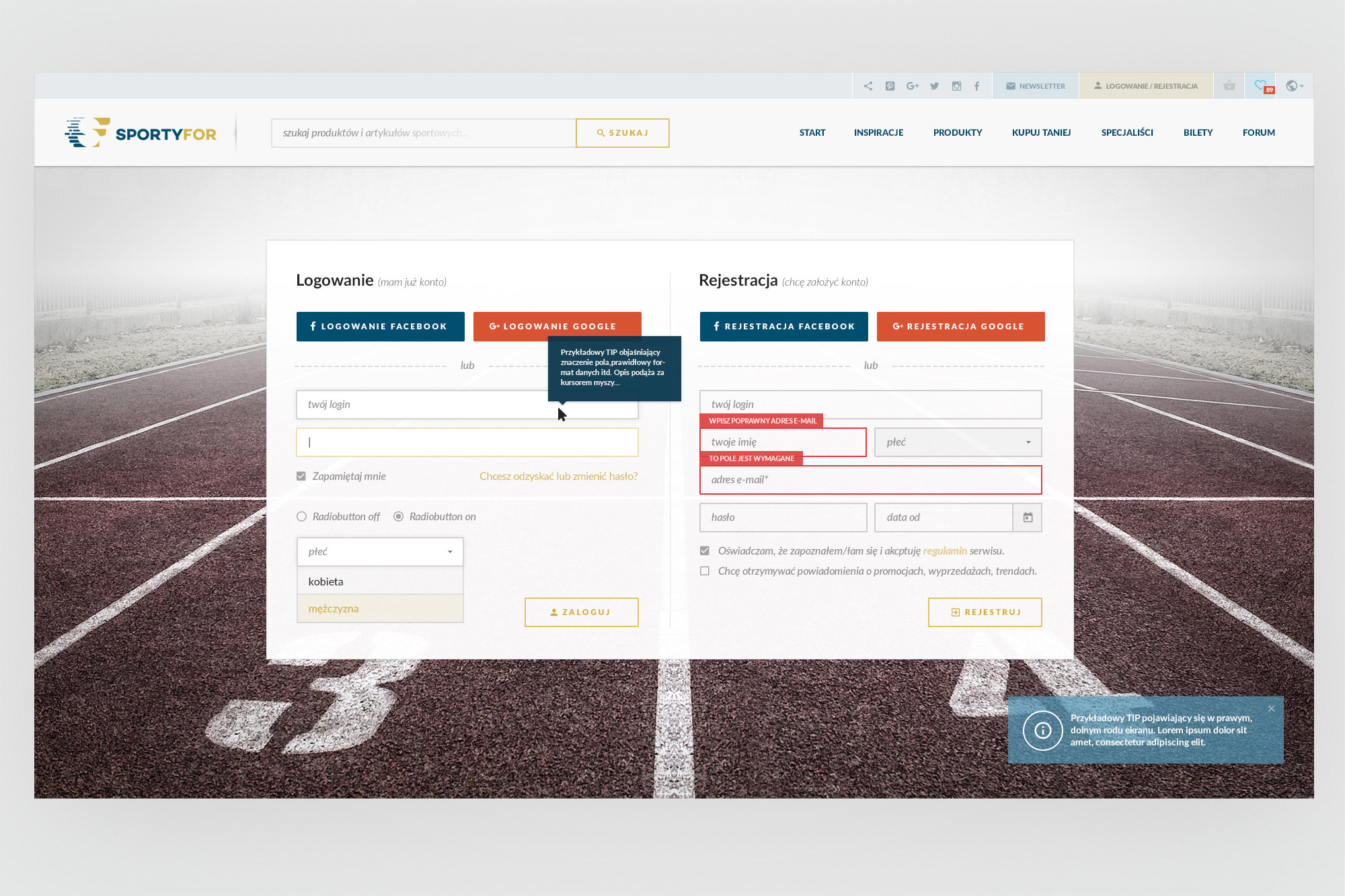
Left: product listing - clean product cards with pricing, brand, and engagement actions (like, share, wishlist), followed by full-bleed category banners driving to sport verticals (Asortyment Sportowy, Quady). Right: the login and registration screen with full form validation states - inline error messages, tooltip contextual help, and a success toast notification system. Both flows on a single screen on a track background.
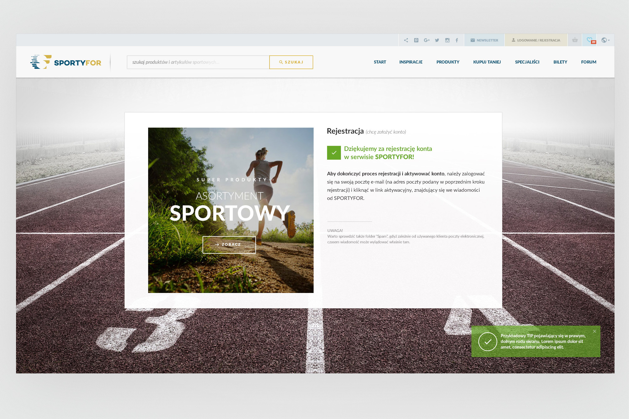
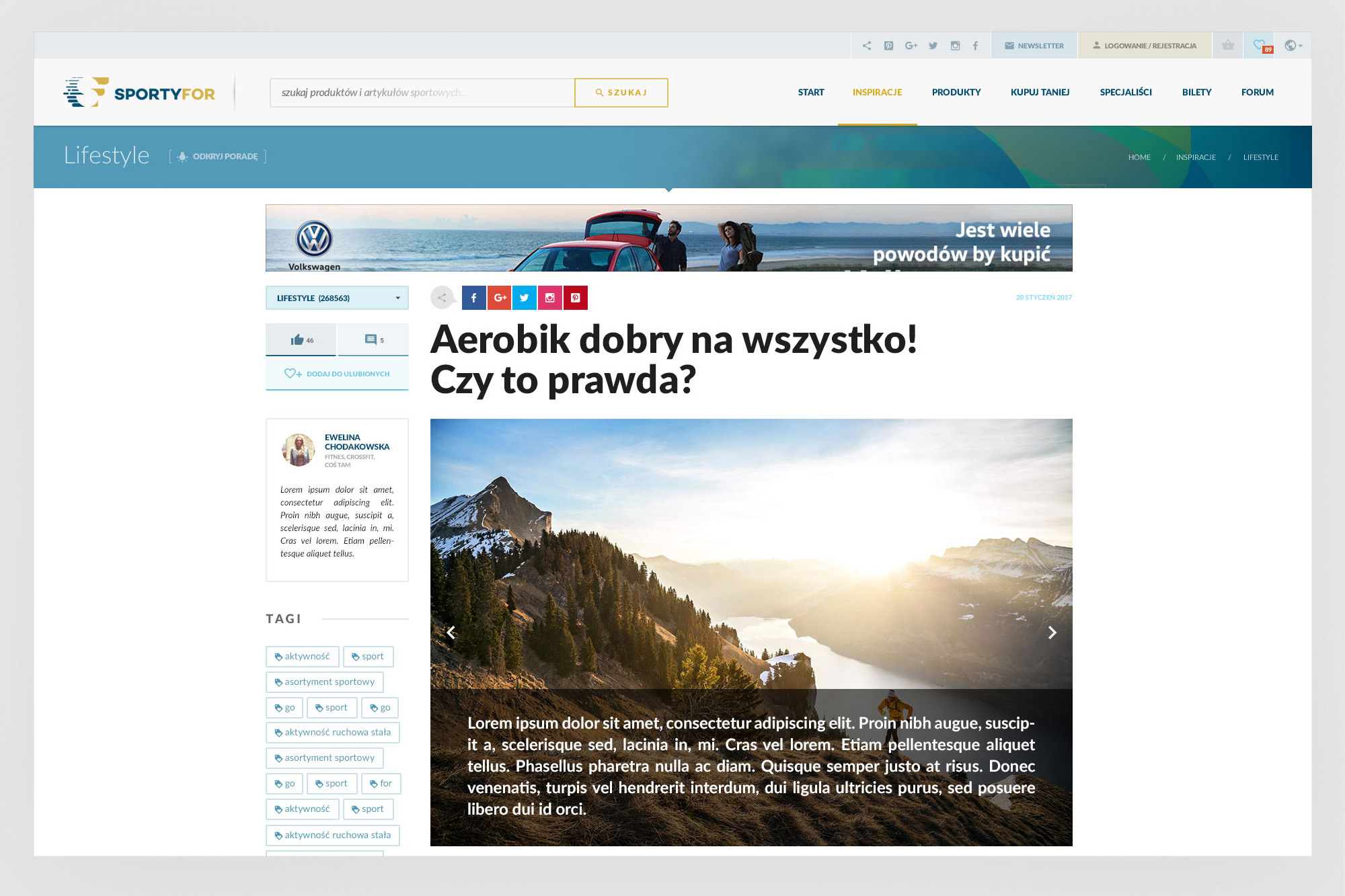
Left: registration success - a confirmation screen that uses the opportunity to drive the user back into the product catalogue immediately. Right: article detail page with a sidebar-mounted specialist author card (with credentials and bio), tag cloud, and a full-bleed article hero image. The left side panel pattern was used consistently across article and specialist pages.
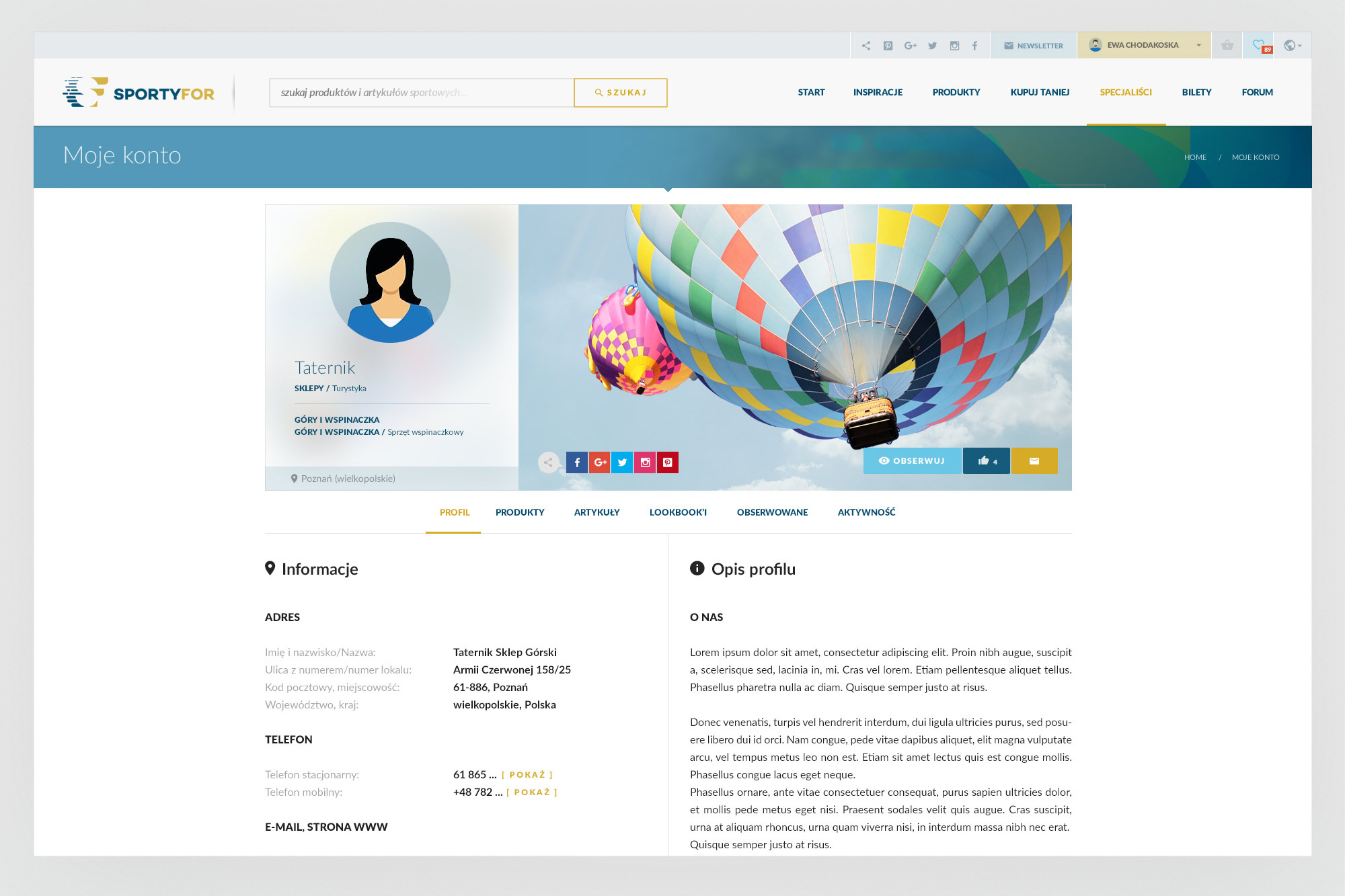
Profile page. A unified profile template serving both individual users and shop/specialist accounts. A cover image strip with avatar and account type labels; tab navigation (Profil, Produkty, Artykuły, Lookbook, Obserwowane, Aktywność). For retailer accounts, the Produkty tab becomes the primary view - their catalogue within the SportyFor context.
B2B landing - for retailers and producers. A dedicated acquisition page for store owners and specialists, separate from the consumer experience. Clear value propositions (visibility, targeted reach, authority building) with numbered steps and a direct trial CTA - "Sprawdź korzyści i testuj przez 2 miesiące za darmo" (Try free for 2 months). This page was the digital counterpart to the print brochure, serving the same audience through a different channel.
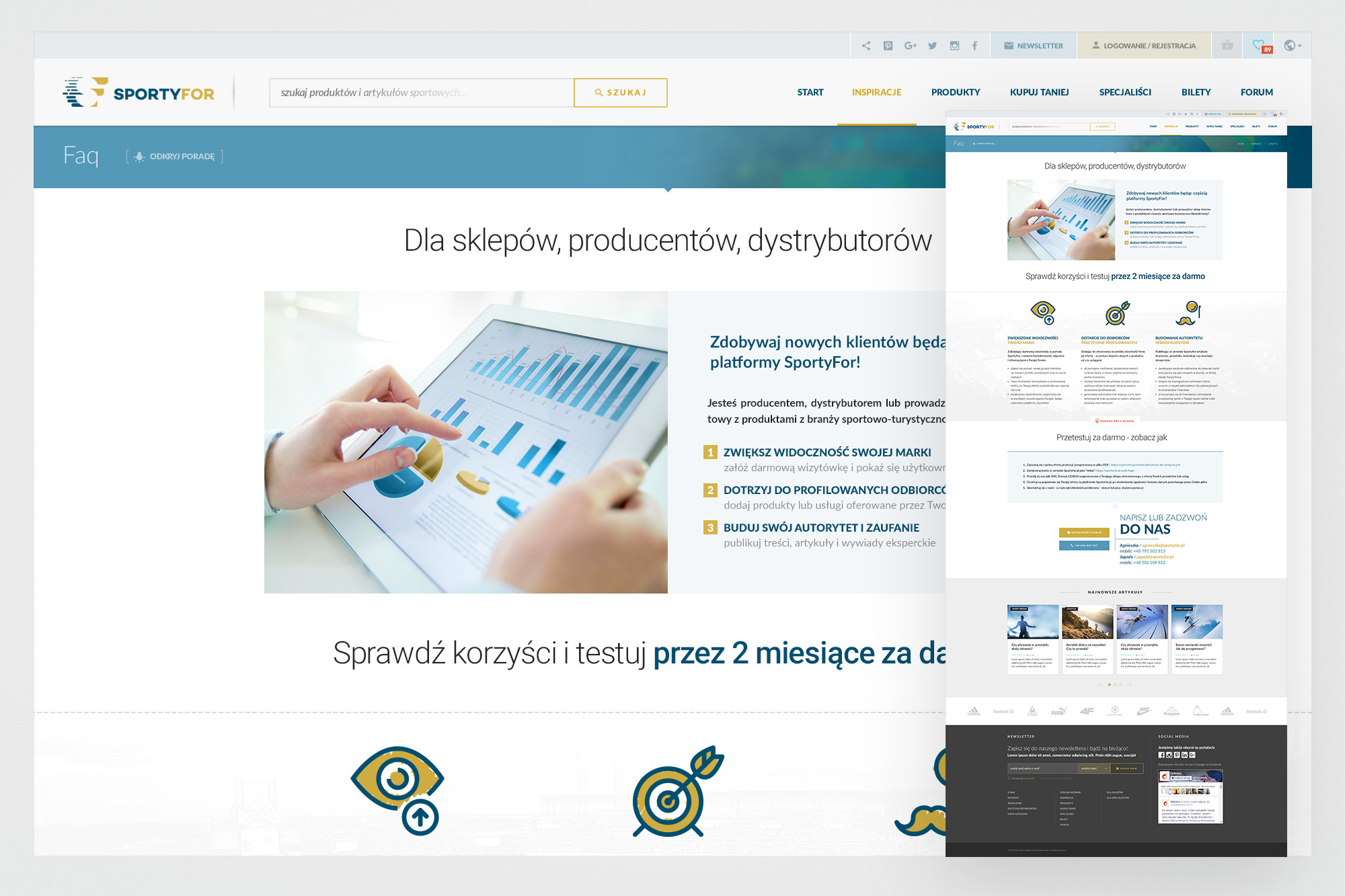
A landing page for suppliers, explaining how it works, presenting the benefits and encouraging them to join.
05. Outcomes
A working platform, measurable results - and an honest postmortem.
SportyFor ran as a live business for a meaningful period. The platform attracted users, published original editorial content, onboarded several retail partners (including two larger ones), and generated measurable click-through improvements for those partners. Monthly reports showed that being listed on SportyFor meaningfully increased conversion for the stores that integrated their catalogues.
Ultimately, the business didn't reach sustainability. Two people covering product, content, sales, platform development and customer success across a three-sided marketplace was the core constraint - there was simply too much ground to cover for a two-person team without external investment. The infrastructure costs (the platform required a server with significant capacity for the product catalogue sync) added further pressure before the affiliate revenue had time to compound.
The experience was one of the most complete design educations I've had - not just in terms of craft, but in understanding how design decisions connect to business outcomes, and what "user acquisition" and "B2B conversion" actually mean when it's your own money on the line.