01. Overview
From grey utility tool to something people actually want to open
BeeOffice is a commercial workforce management platform. All For One - the company formed when the Polish division of SNP was acquired - had been running it internally for years, customising it extensively to fit the organisation's needs. By 2022, the application had accumulated a significant amount of technical adaptation, but its visual design and some of its interaction patterns had not kept pace. It looked like what it was: enterprise software from an earlier era.
When AFO's UX researchers completed a study on the pain points of the existing system, it created the opportunity for something more than a visual facelift. The decision was made to redesign the application from the ground up in terms of layout, visual identity, and interaction patterns - and to build something that employees would find pleasant and motivating to use, not just functional. The project was also AFO's first step toward a new design system, with the visual patterns I developed serving as its seed.
I was the sole designer on this project, working alongside a product owner, project manager, UX researcher, and a front-end and back-end development team in two-week Scrum sprints.
02. The challenge
More rows, better feel, and a mobile app that didn't exist
The research pointed clearly at the Schedule tab as the most critical area - the view where HR managers and team leads spent the majority of their time. The core problem was simple but structurally significant: the top navigation bar was eating vertical space that was needed for the employee list. In an organisation with dozens of employees per unit, every row that could be added to the visible schedule without scrolling had direct operational value.
Alongside the space problem, two other issues needed addressing. The application's visual design was grey, dated, and generated no enthusiasm among users - a conscious decision was made to make the new version visually positive and emotionally pleasant, in line with AFO's new CI. And the old BeeOffice had no mobile capability for making or editing schedule entries - users could view their schedules on mobile, but not interact with them. That gap needed to be filled.
The primary design problem
"Move the main navigation from the top to the left sidebar. Reclaim the vertical space for the schedule grid. Do it in a way that works for the whole application - not just the one screen."
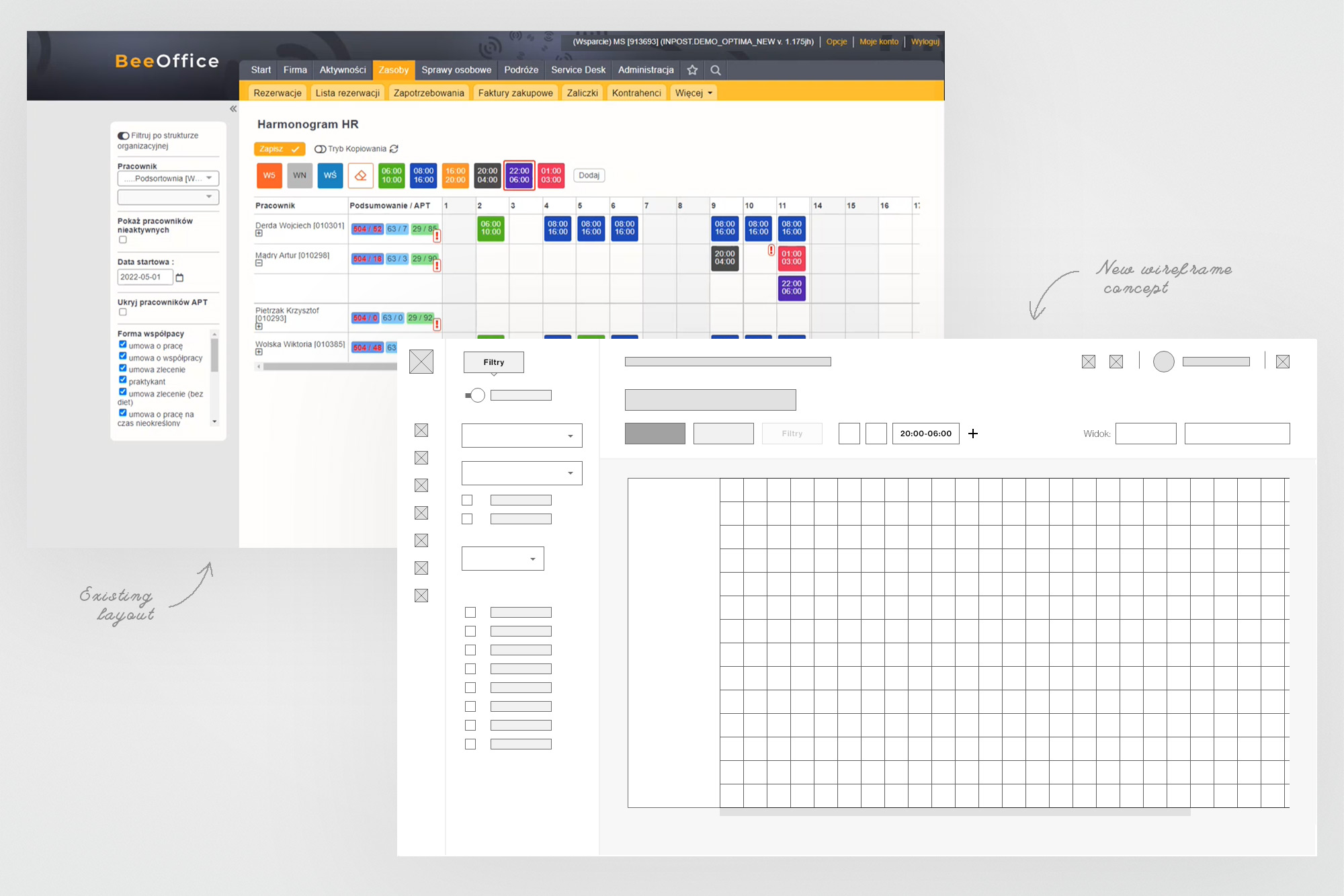
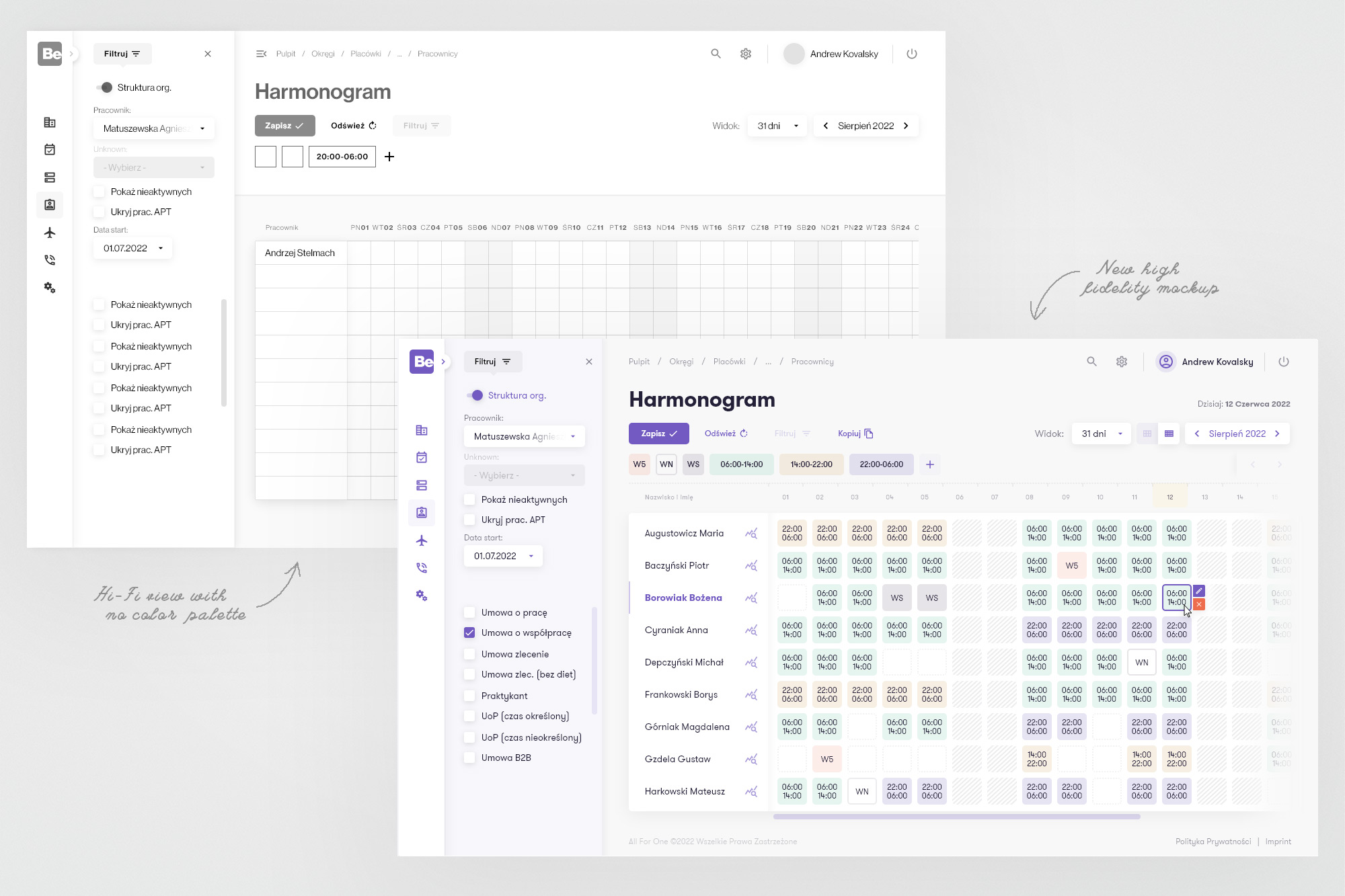
Left: the old BeeOffice with its horizontal top navigation (Zasoby, Sprawy osobowe, Podróże…) consuming the full width of the screen, and the first lo-fi wireframe concept. Right: hi-fi wireframe (no colour) and the finished hi-fi mockup - left sidebar, collapsed by default, with the full screen given to the schedule grid.
03. Design process
Research-grounded, iteratively tested
The process followed the same Scrum rhythm I'd used on CrystalBridge - two-week sprints, tasks in JIRA, pre-work refinement sessions. The difference here was that I started with a pre-existing body of UX research: detailed findings from the researcher on the team, documenting exactly which parts of the application were causing friction and which were working well. That research eliminated a lot of early ambiguity and let me focus design energy on the areas that actually needed it.
From wireframes, I moved to iterative remote usability testing with AFO employees. The sessions were focused primarily on the schedule grid - testing the proposed layout, the filter panel behaviour, and the inline editing interactions. Each round of testing produced a tighter, more confident design.
04. Desktop
The schedule grid - finally in charge of its own screen
The centrepiece of the redesign is the Harmonogram (Schedule) view. The structural change is fundamental: the navigation moves from a full-width horizontal top bar to a collapsible left sidebar. By default the sidebar shows only icons - giving the schedule grid the maximum possible horizontal and vertical space. Expanding the sidebar reveals the full menu hierarchy; collapsing it disappears entirely, leaving only the icon rail.
The schedule grid itself is cleaner: lighter cells, colour-coded shift types with readable time labels, weekend hatching to visually separate non-working days. The top action area (Zapisz, Odśwież, Filtruj) is compact and placed flush with the grid. The filter panel - accessible on demand - slides in from the left without navigating away from the schedule view.
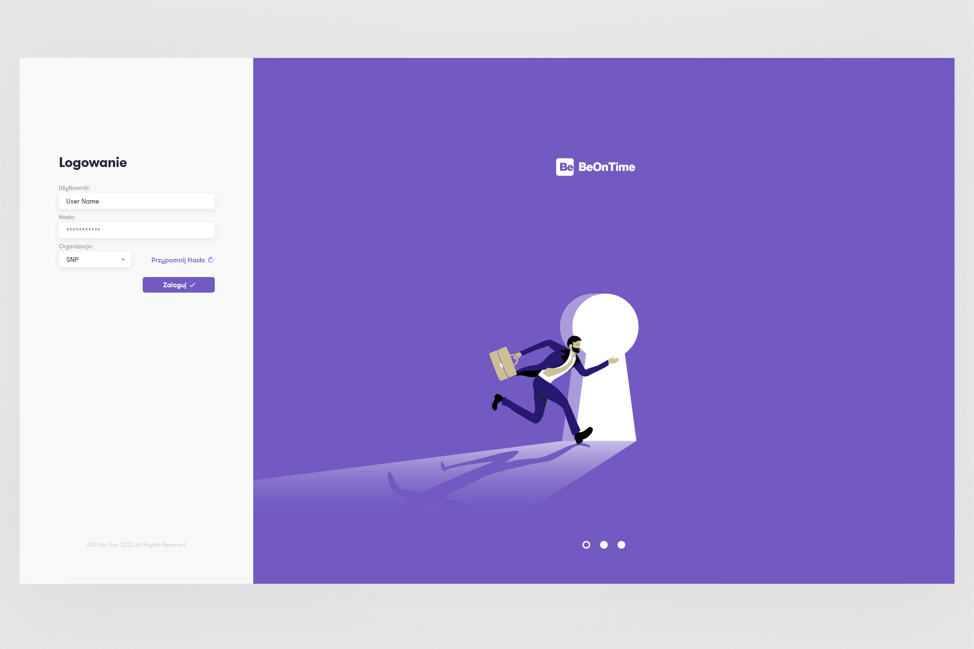
The login screen - a clear departure from the old BeeOffice aesthetic. Split layout with a clean form on the left and a full-bleed illustrated panel on the right, using the new BeOnTime brand purple and a custom illustration. Sets the emotional tone for the whole application.
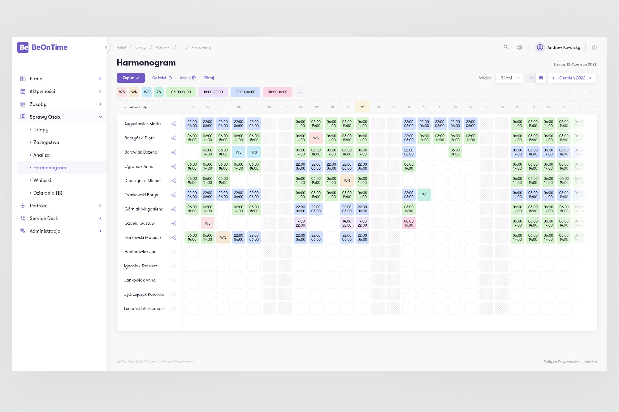
Expanded navigation. When the sidebar is opened, the full menu hierarchy appears - Firma, Aktywności, Zasoby, Sprawy Osob. (with sub-items), Podróże, Service Desk, Administracja. Active item is highlighted in purple. The schedule grid remains visible and usable behind it.
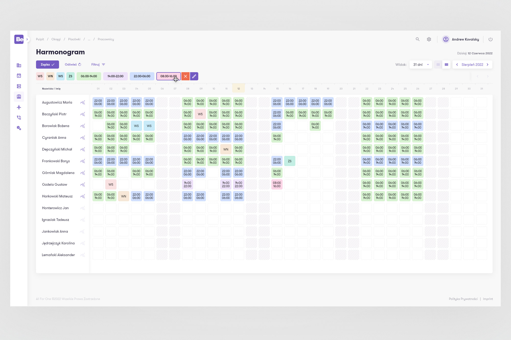
Collapsed sidebar - maximum grid space. The default state: only icon navigation on the left, the full width given to the schedule. 14 employees visible without scrolling in this view - significantly more than the old layout allowed. Colour-coded shift chips show start and end times; hatched cells indicate weekends and non-working days.
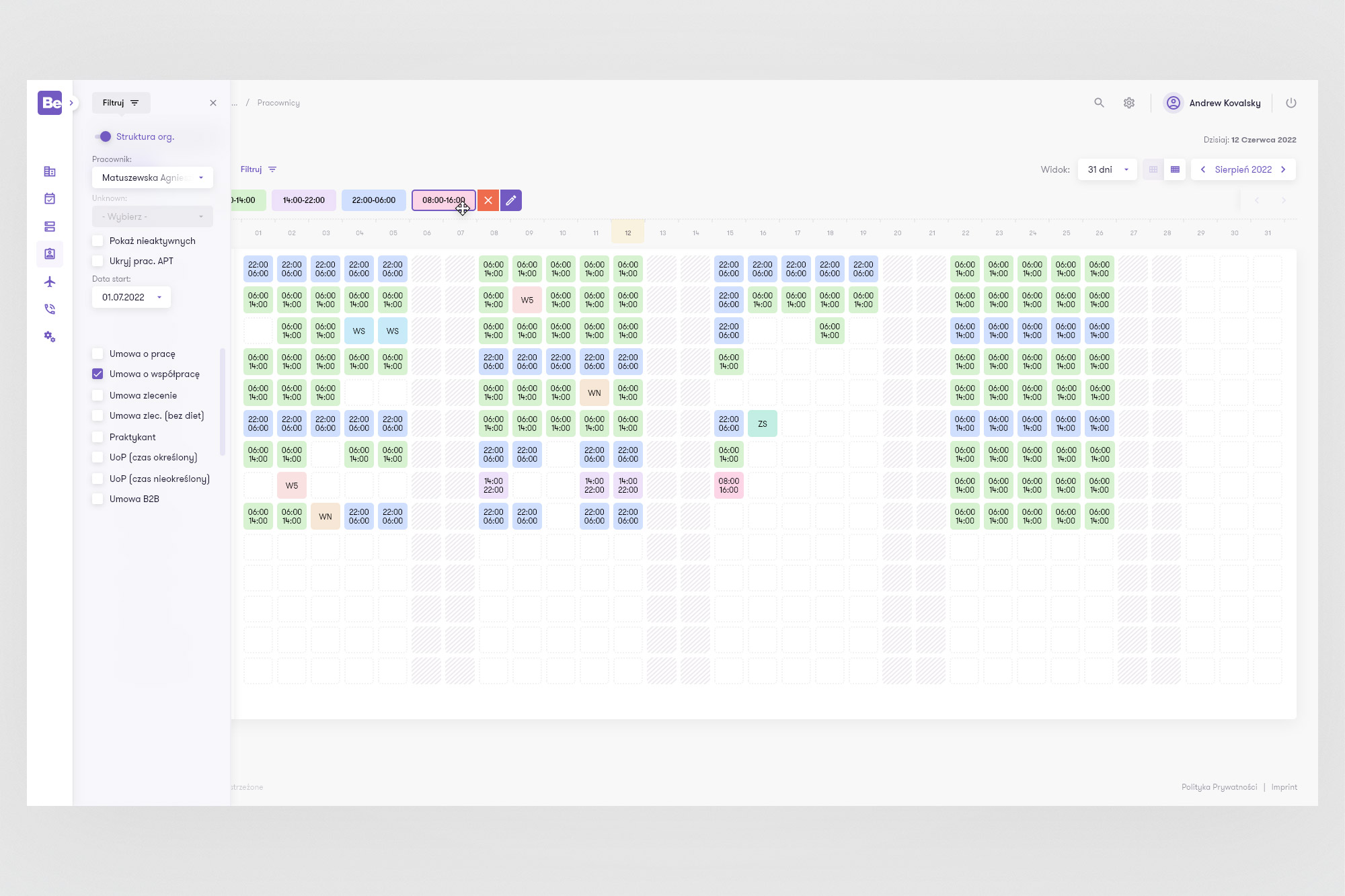
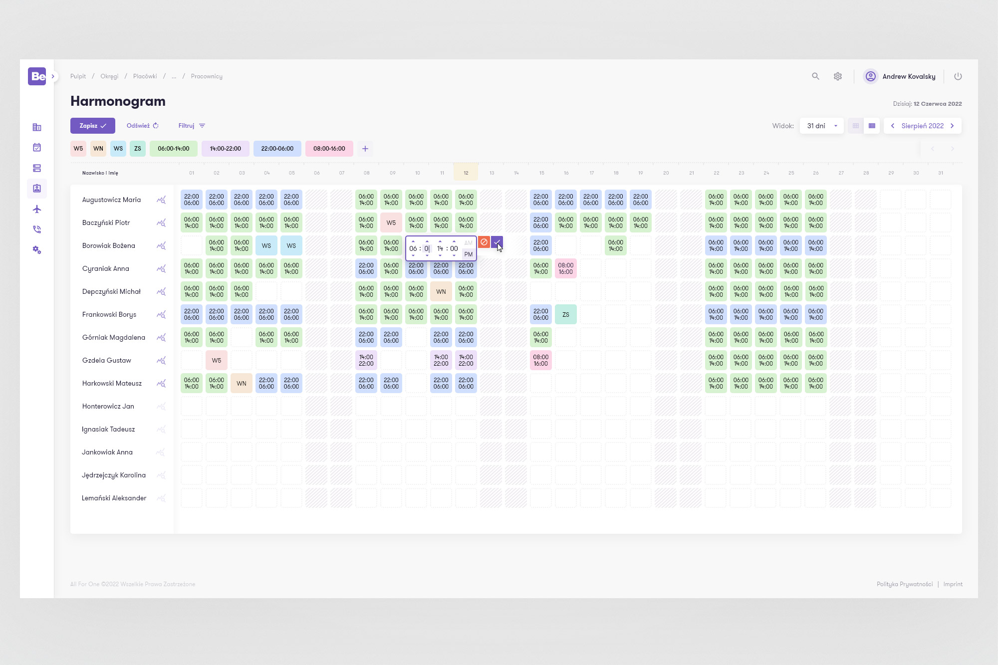
Left: the filter panel open alongside the schedule - structure org toggle, employee search, employment type checkboxes. All filters are applied without leaving the schedule view. Right: inline editing directly in the cell - clicking a schedule entry reveals a compact time picker without opening a separate modal, keeping the user in context.
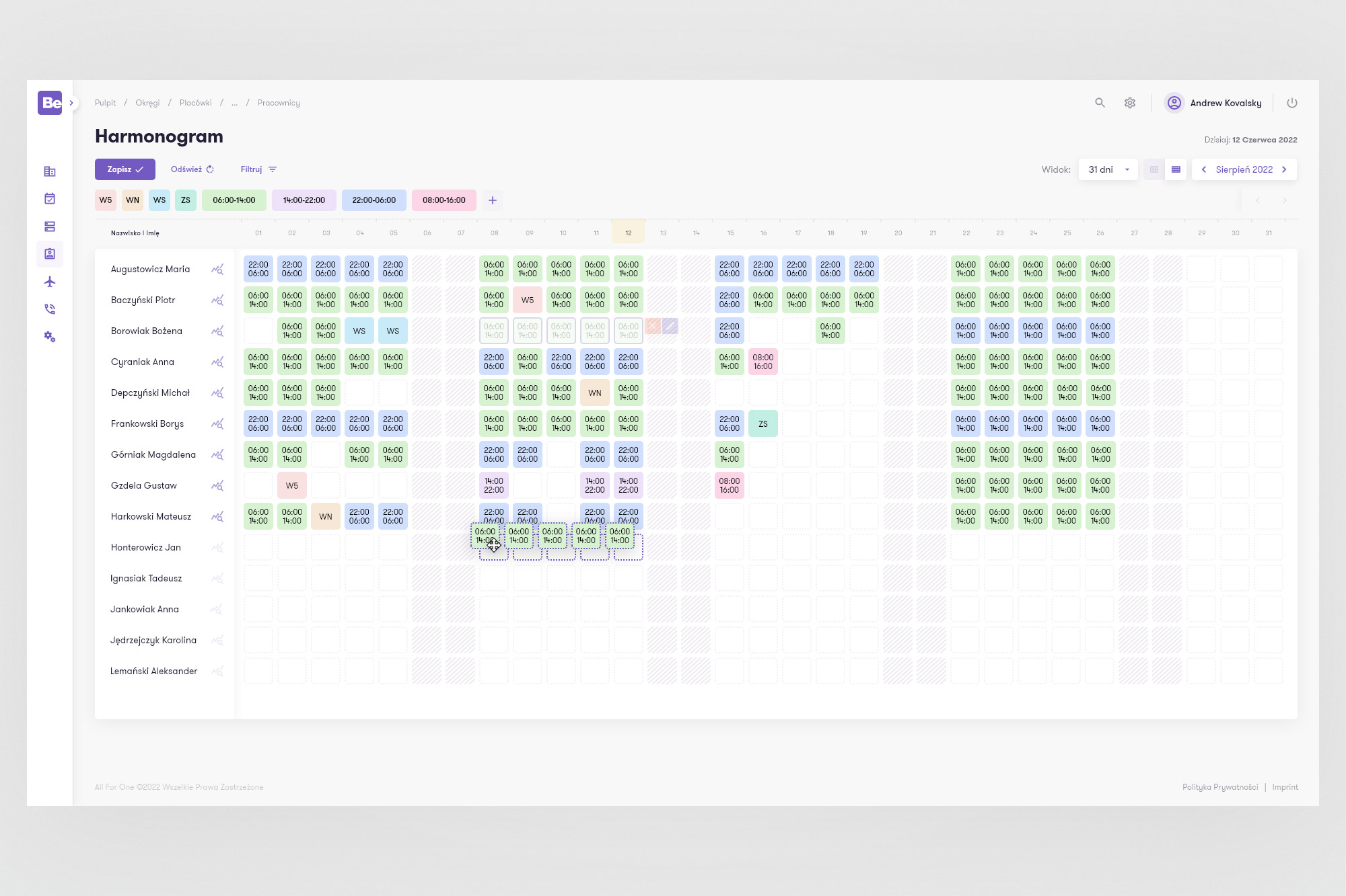
Drag-copy. Selecting a shift entry and dragging across adjacent cells populates them with the same shift - shown here with a dashed selection rectangle. One of the optimised entry patterns designed to speed up bulk schedule editing.
05. Mobile
A first: editing the schedule on the go
The old BeeOffice had no mobile schedule editing. Users could view their personal schedule on a phone, but making or changing entries required a desktop. For a workforce application used by employees who aren't always at a desk - particularly in shift-based work - this was a significant gap.
The mobile BeOnTime concept provides a visual parallel to the desktop: the same schedule grid, the same colour-coded shift chips, the same entry and editing interactions - adapted for touch. The navigation becomes a full-screen drawer rather than a sidebar. Editing an entry brings up a large-format time picker designed for thumb interaction rather than mouse precision.
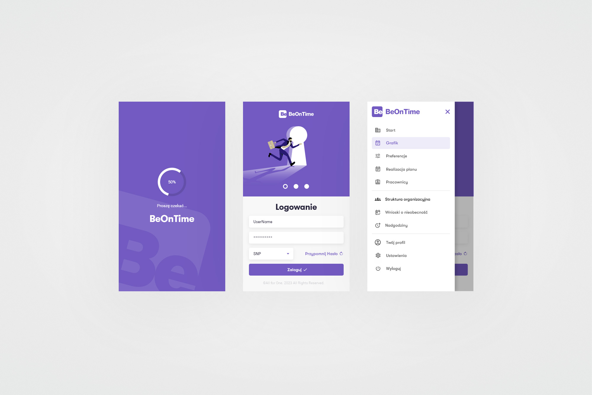
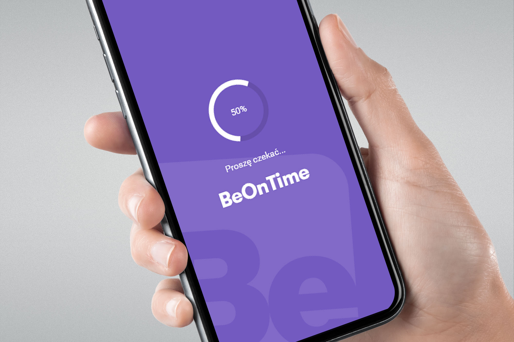
Onboarding flow. Splash screen with the BeOnTime purple identity and loading spinner. Login screen with the same keyhole illustration as the desktop, adapted for mobile proportions. Navigation drawer - a full-screen slide-over with all menu items and clear active state highlighting.
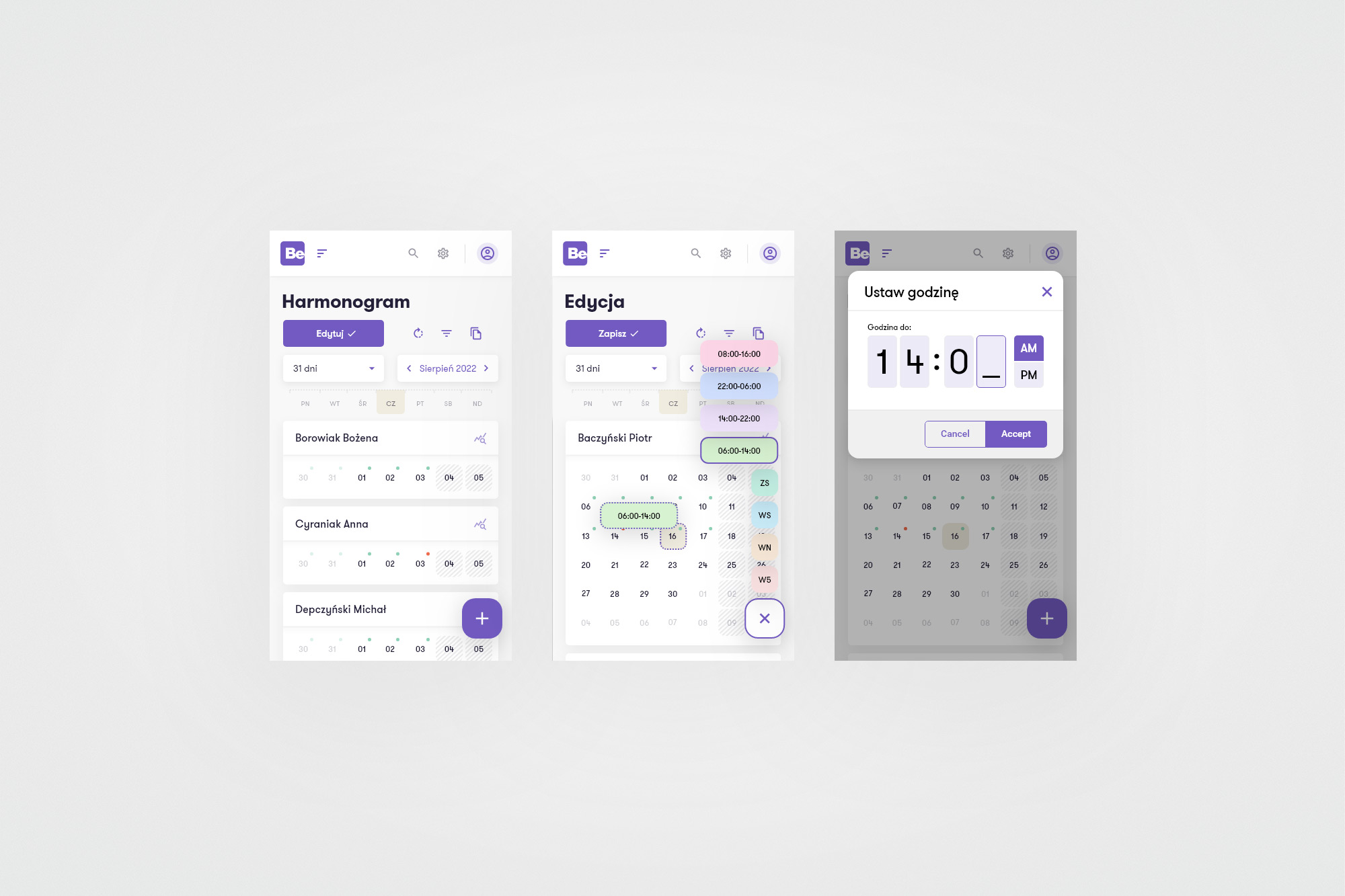
Schedule and editing. Mobile schedule view - compact weekly grid per employee, scrollable horizontally. Edit mode activates with the purple Edytuj button, revealing shift type chips from the top. Tapping a cell opens the entry picker, and confirming a shift time brings up the large-format time picker modal - drum-scroll hour/minute inputs with AM/PM toggle and clear Accept/Cancel actions.
06. Outcomes
Positive response. And a design system foundation.
The project didn't reach production delivery - All For One restructured its UX function, moving the team to Germany before the development phase was complete. But the work that was done was validated and had a lasting impact beyond the project itself.