01. Overview
SAP transformations require clarity at enterprise scale
SNP SE is a global leader in SAP data transformation - the company helps large enterprises migrate, carve out, and restructure their SAP landscapes, often affecting hundreds of subsidiaries and thousands of business objects simultaneously.
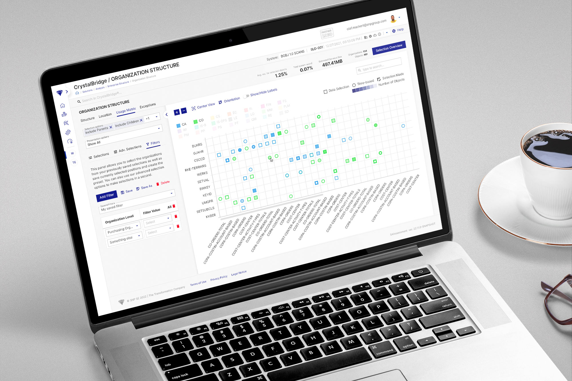
CrystalBridge is SNP's core analysis and planning platform. It gives transformation consultants the ability to understand, select, and carve out organisational structures before any migration begins. For a global manufacturer or a multinational holding, this means working with hundreds of company codes, plants, controlling areas, and sales organisations - distributed across dozens of countries.
The Organization Structure module sits at the heart of this process. It is the primary tool used to define which parts of an organisation will be migrated, and how.
02. The challenge
Three scattered tools. No shared context.
In CrystalBridge 1.0, the functionality that consultants needed was split across three separate, independent subpages. Each page offered a different visualisation of the same underlying data - a circle chart, a matrix view, and a heat map - but they shared nothing: no common selection state, no unified filter, no persistent context.
Core problem
"A consultant working with a client's SAP landscape had to repeatedly switch between three subpages to get a complete picture - rebuilding their filters from scratch every time. For datasets with hundreds of org units across 40+ countries, this friction compounded quickly."
Three specific problems compounded each other. First, context loss on every switch - navigating between subpages wiped all selections and filter configurations, forcing the user to recreate their working state from zero. This was not just slow - it was cognitively exhausting in complex, multi-parameter analyses.
Second, chart readability at scale - the circle charts and matrices were designed for modest datasets. When an enterprise system contained 400+ org units across 15 modules, the visualisations became illegible without constant zoom manipulation. There was no way to reduce what was displayed without switching pages.
Third, wasted viewport space - each subpage included a fixed, always-visible controls sidebar, permanently consuming roughly 30% of the screen even when the user was focused entirely on reading the visualisation.
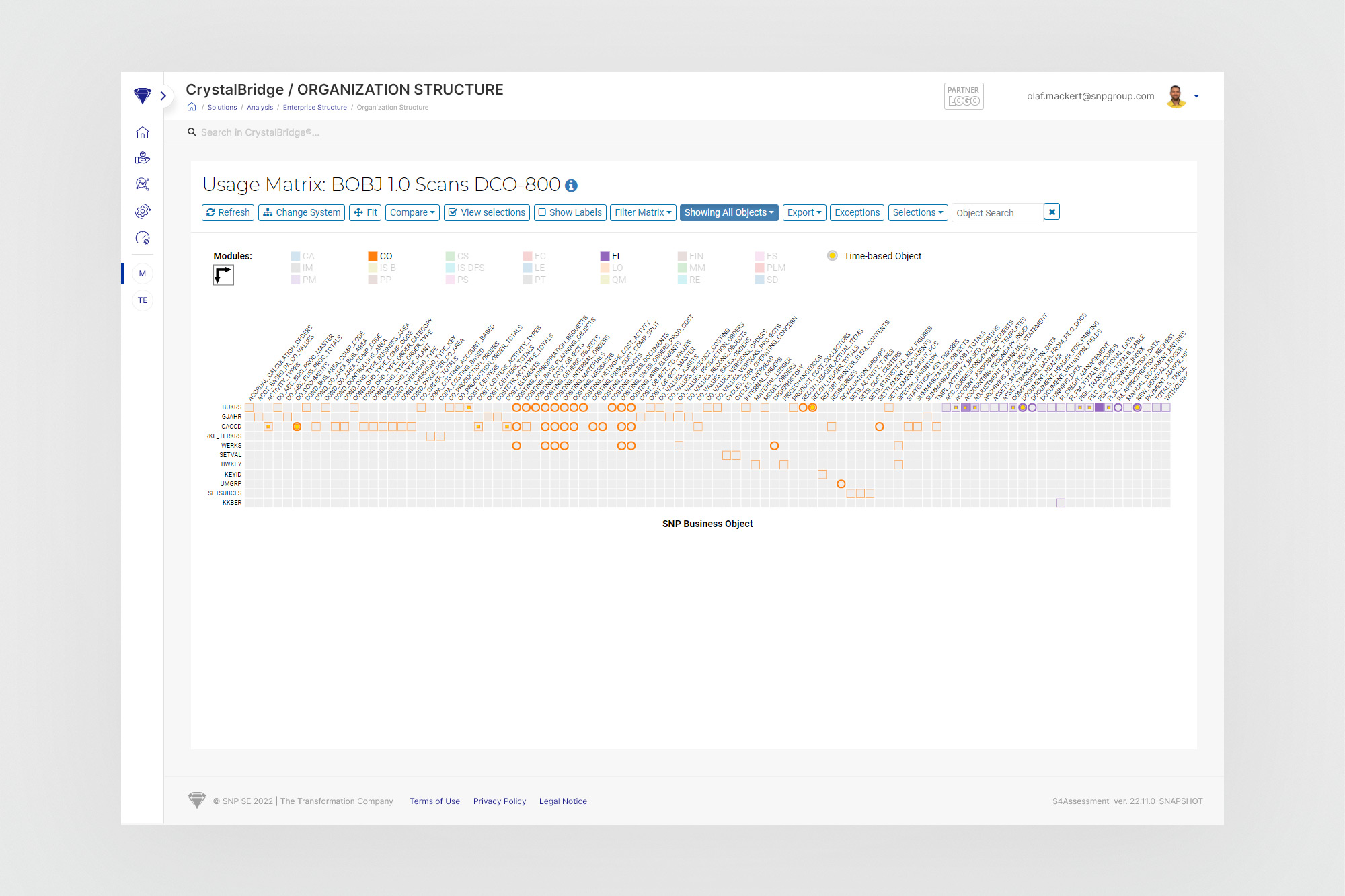
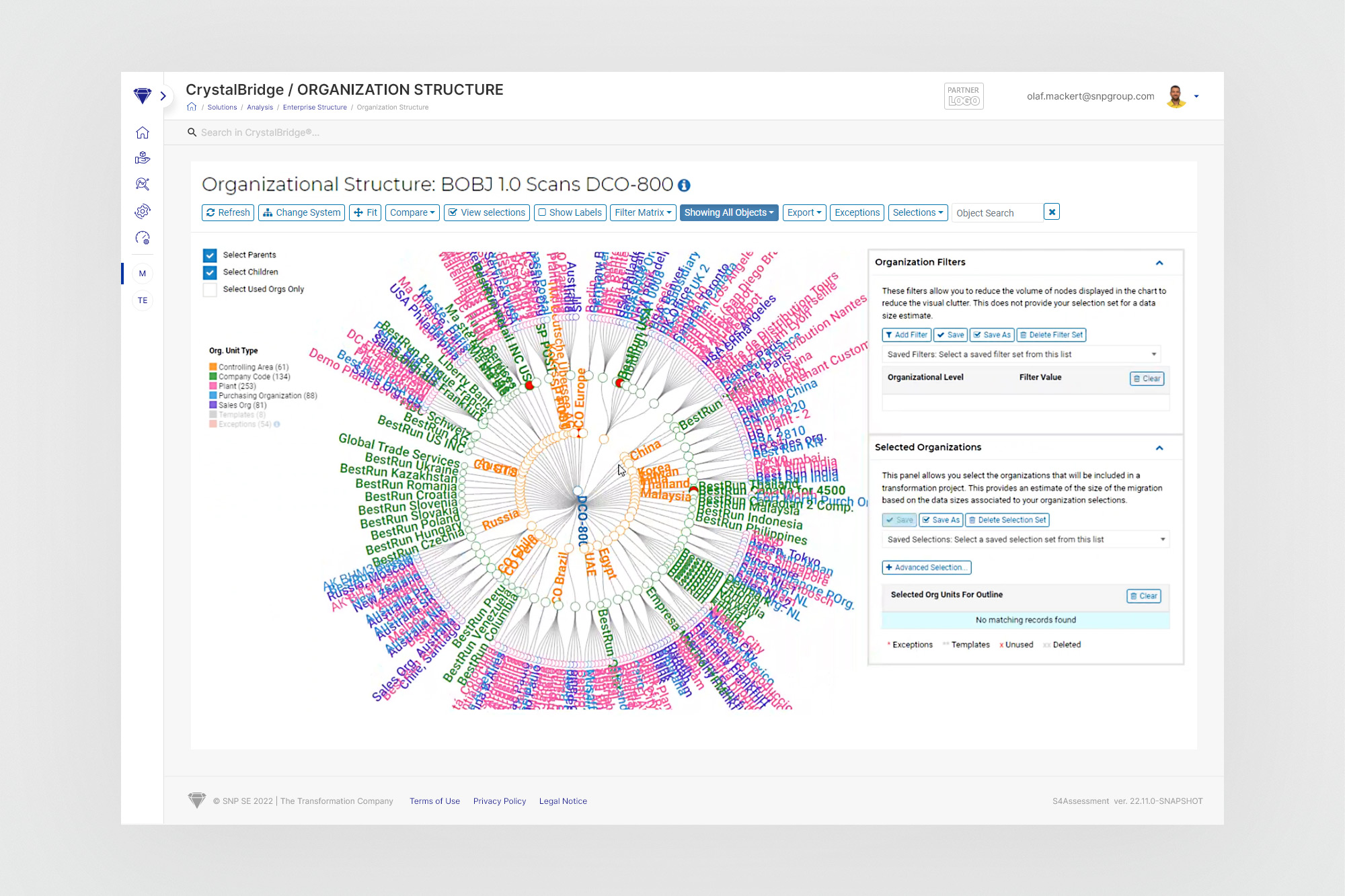
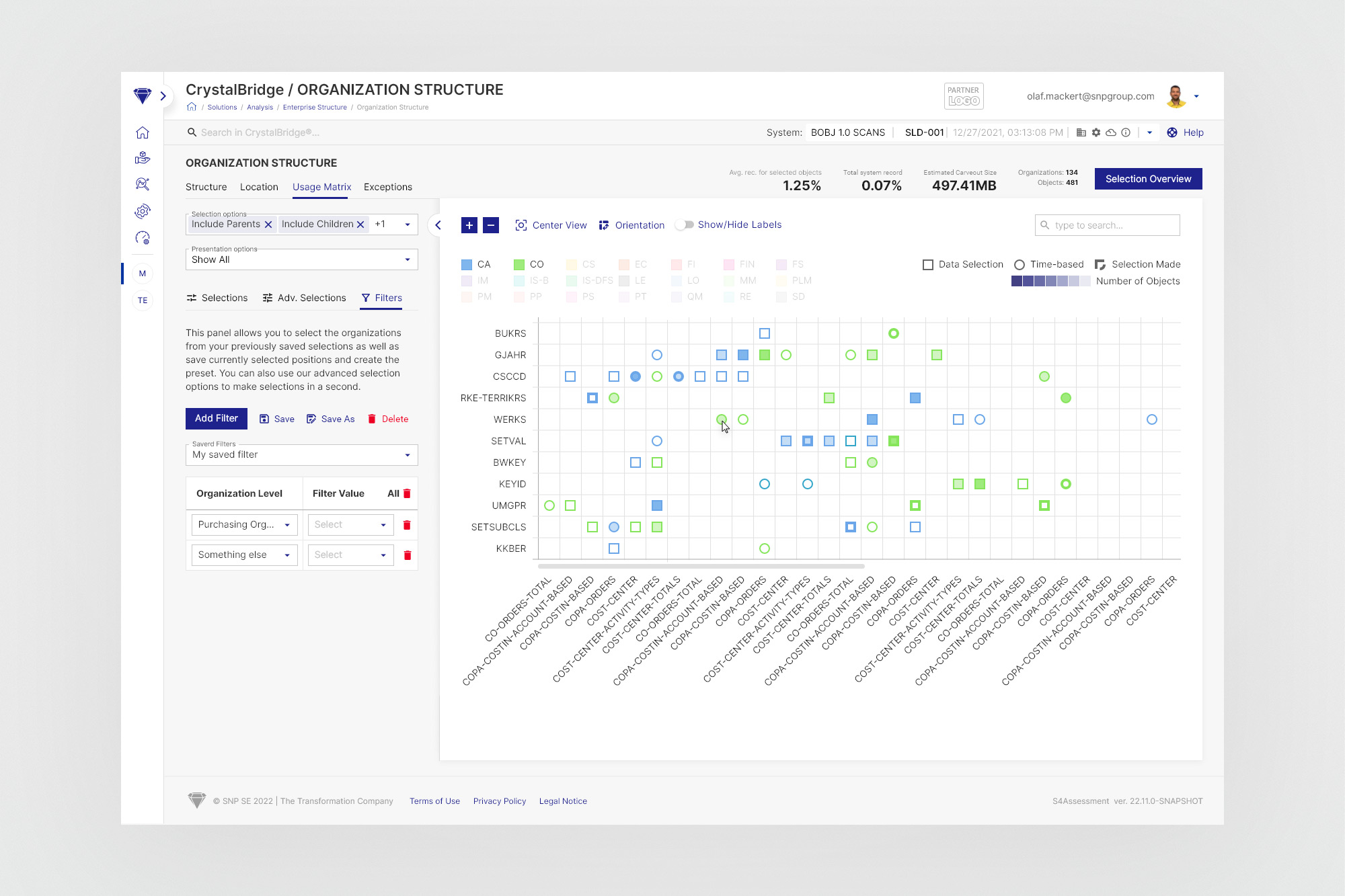
Left: the original 1.0 views - matrix and circle chart as separate pages with fixed toolbars and no shared context. Right: the redesigned 2.0 module with a unified, collapsible left panel.
03. My role
Sole designer for the Organization Structure module
I was part of a UX/UI team working on CrystalBridge 2.0 - a full redesign and rebranding of the platform, including a new design system built collaboratively with another designer. Within the team's division of work, the Organization Structure module was assigned entirely to me.
I was responsible for the full design lifecycle: from initial stakeholder interviews and PRD refinement, through wireframes and prototype validation, to the final hi-fi designs handed off to a dedicated group of 2–3 developers. The module was complex enough in scope that it required close collaboration with both SNP's product stakeholders and the engineering team throughout its development.
04. Design process
From JIRA task to shipped feature - a structured loop
The team worked in Scrum, in two-week sprints. Tasks were added to the backlog by stakeholders via JIRA; during sprint planning we distributed and estimated them. Before any design work began, I ran a short refinement session with the relevant stakeholders - a working interview to align on scope, validate assumptions, and produce a precise PRD.
The CrystalBridge 2.0 design system - built collaboratively in Figma - gave me a significant advantage. With foundational components already in place, moving from wireframe to hi-fi was fast and consistent. On the developer side, the team had translated our design system into a Storybook component library, which enabled rapid, high-fidelity implementation.
05. The solution
One workspace. Shared context. Collapsible controls.
The core proposal was structural: consolidate all three subpages into a single, unified module with persistent state across views. Instead of navigating between separate pages - each with its own isolated controls - the user stays in one place and switches between visualisations via a tab bar. All filters, selections, and presentation options are maintained as the user moves between views.
The second key decision was the collapsible left panel. All the controls needed for adjusting presentation parameters, managing selections, and configuring filters are aggregated in a single sidebar. Crucially, this panel can be hidden entirely - giving the visualisation the full screen width when the user needs it most. For a detailed circle chart with 400+ nodes, or a world map showing geographic distribution, this extra space is not cosmetic: it directly affects readability.
The panel also introduced an important coupling: the filter tree and the chart are in sync. Anything visible in the left panel's tree component reflects exactly what appears in the visualisation on the right. Filtering the chart also filters the tree, and vice versa. This bidirectional binding was a significant usability improvement over the fragmented 1.0 approach, where chart and controls could fall out of sync between page switches.
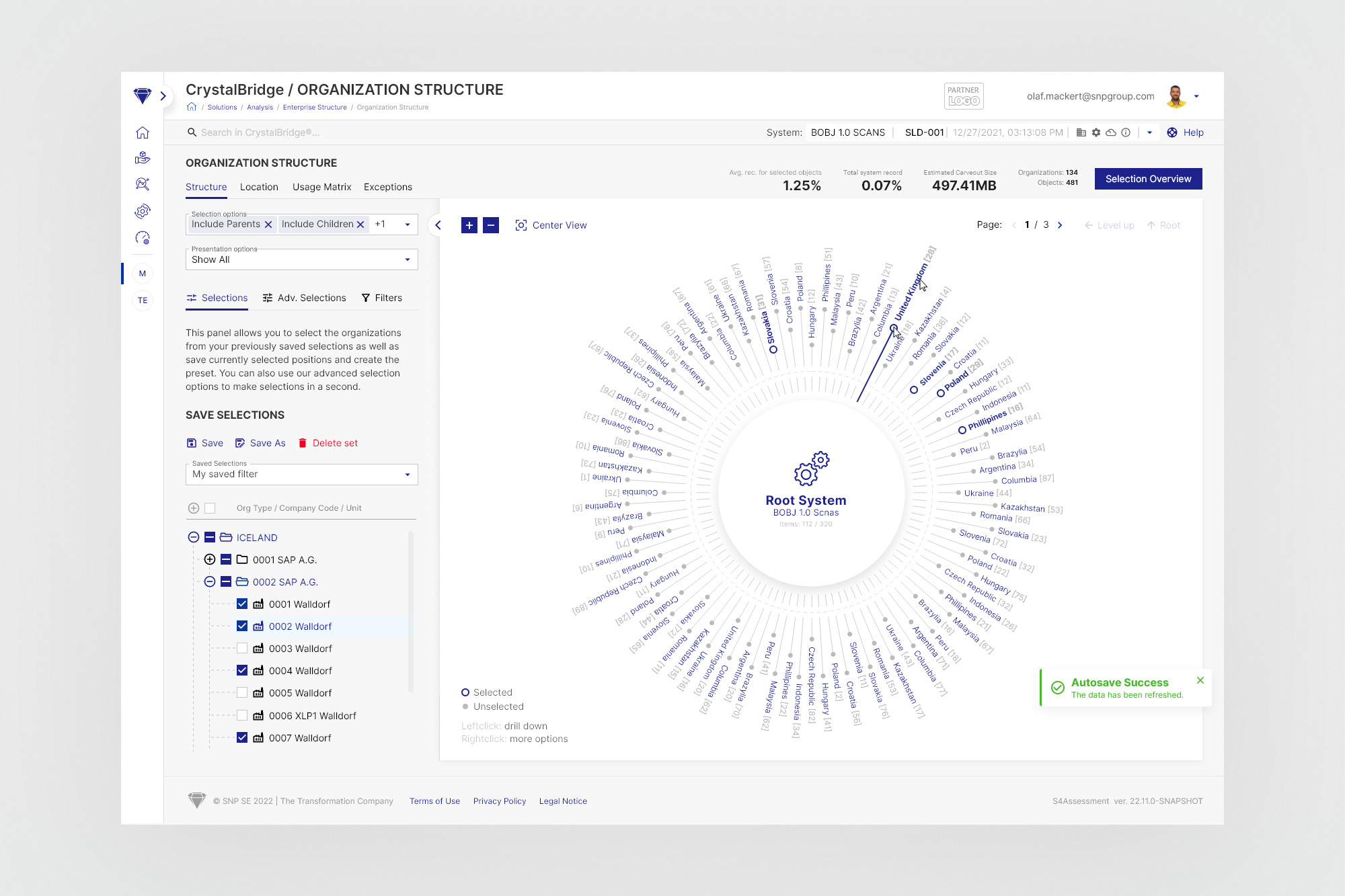
Structure view with the selection panel open - tree component on the left, circle chart on the right. Both reflect the same selection state.
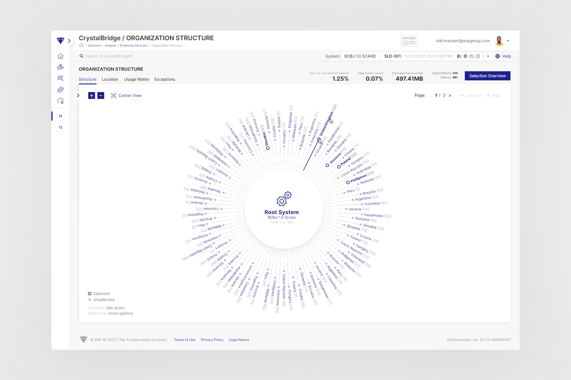
Panel collapsed - the visualisation expands to full width. The collapse/expand toggle is accessible at the panel edge.
Key design decisions
Persistent selection state
All filters, selections, and presentation parameters are retained when switching between views - no reconstruction needed when moving from Structure to Location to Matrix.
Collapsible left panel
Controls are available when needed, hidden when not. The panel reduces to an icon strip, reclaiming the full viewport for the visualisation.
Bidirectional filter sync
The tree component and the chart are always in sync. Filtering by org type in the panel immediately reflects in both the tree hierarchy and the visual chart.
Scalable to large datasets
Pagination on circle charts, drill-down navigation, and module-level colour coding - all designed to remain usable when displaying hundreds of nodes.
Reusable, full-screen layout
The entire module uses no page scroll - everything fits within the viewport. The layout is designed to be reusable across other CrystalBridge analytical tools.
Saveable filter presets
Consultants working repeatedly with the same client environment can save and recall filter configurations - reducing setup time on repeat sessions.
06. Four views, one key
Each visualisation tells a different part of the same story
The module is organised around four tab-based views, each offering a distinct perspective on the organisation's structure. The left panel's content adapts to the active view - showing relevant selection and filter options - while all state is shared across tabs.
Structure - a hierarchical circle chart representing the full org tree. Nodes are colour-coded by module type. Drill-down navigation and pagination allow working with large datasets across multiple pages.
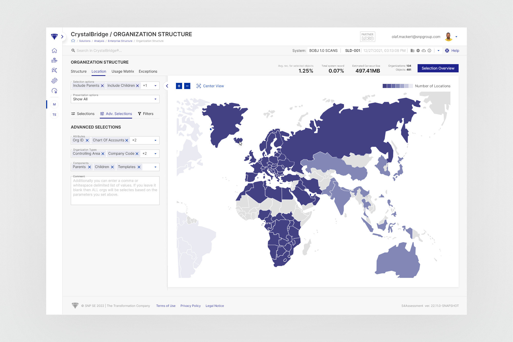
Location - a geographic map view showing where selected org units are distributed globally. Colour intensity indicates the number of locations per country. The panel collapse is especially useful here - a full-width map is far more readable for country-level analysis.
Usage Matrix - a matrix view showing dependencies between org units (rows) and business objects/domains (columns). Cells are coded by type: filled squares for data selection, circles for time-based objects, with colour intensity showing volume. This view was the most cluttered in the 1.0 design; the persistent filter panel now allows meaningful reduction of the dataset before the matrix is read.
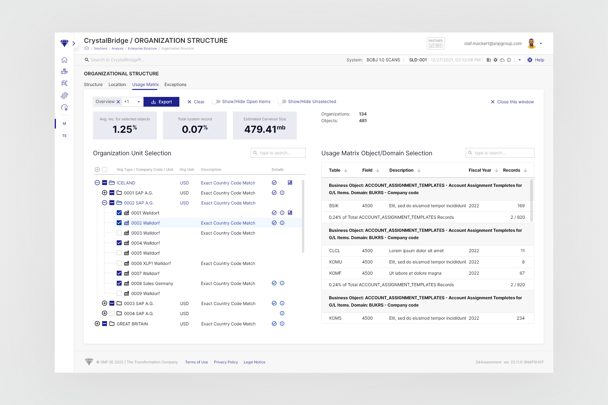
Selection Overview - a detailed dual-pane table view for reviewing the full set of selected org units alongside their associated business objects and record counts. Designed for the final review and export stage of the analysis workflow.
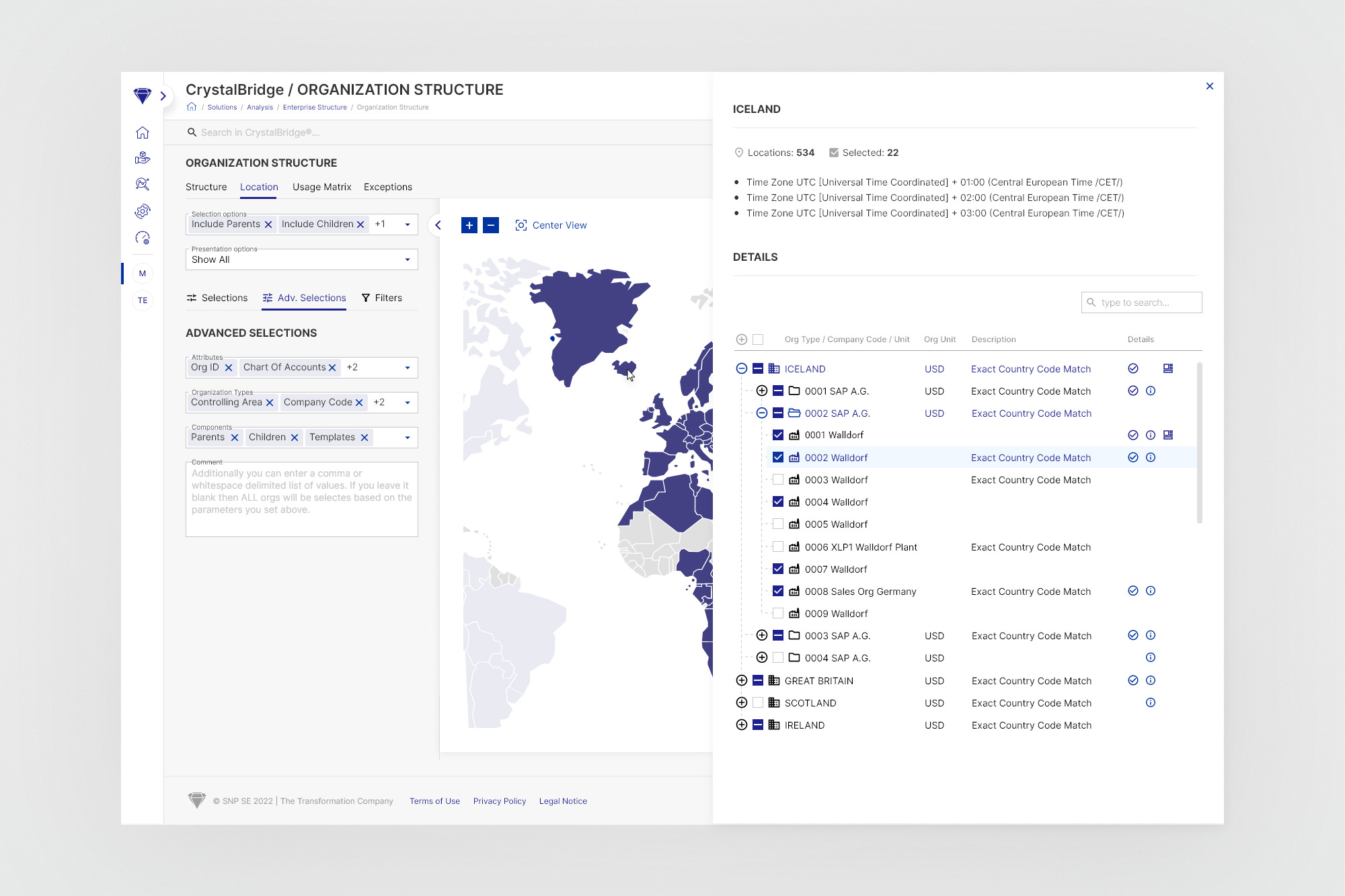
Clicking a country on the map opens a contextual detail panel showing all org units and their SAP data for that region - without navigating away from the current view.
07. Outcomes
A single, coherent tool for complex enterprise analysis.
The redesigned Organization Structure module shipped as part of CrystalBridge 2.0 and became the standard working environment for SNP transformation consultants. The structural changes addressed all three of the original pain points: scattered navigation, lost context, and constrained viewport.
08. Learnings
What designing for enterprise complexity teaches you
Fragmentation is expensive at scale. When tools that belong together are split apart, every context switch carries a cost - in time, in mental load, and in the quality of decisions made from incomplete data. The single most impactful design decision here was not a visual one: it was the structural choice to unify, and to share state across the unified views.
Viewport is a resource. In data-dense enterprise interfaces, screen space is not a design preference - it is a functional requirement. A map that fits 60% of the screen cannot show the same information as one that fits 100%. The collapsible panel was a direct response to this, and the value was immediately obvious to anyone who had used the 1.0 version with a large client dataset.
Stakeholders who are the users are invaluable. SNP's product stakeholders were themselves transformation consultants - people who used CrystalBridge in client engagements. This meant feedback on wireframes was grounded in real workflows, not abstract preference. Problems surfaced in refinement that would have only appeared in post-launch user testing otherwise.
A design system accelerates complex work. Working within the CrystalBridge 2.0 design system - which I helped build alongside the wider team - meant that even a module as complex as Organization Structure could be designed and handed off efficiently. Components, tokens, and patterns already existed; the work was composition and logic, not construction from scratch.