01. Overview
One system to replace many, scattered tools
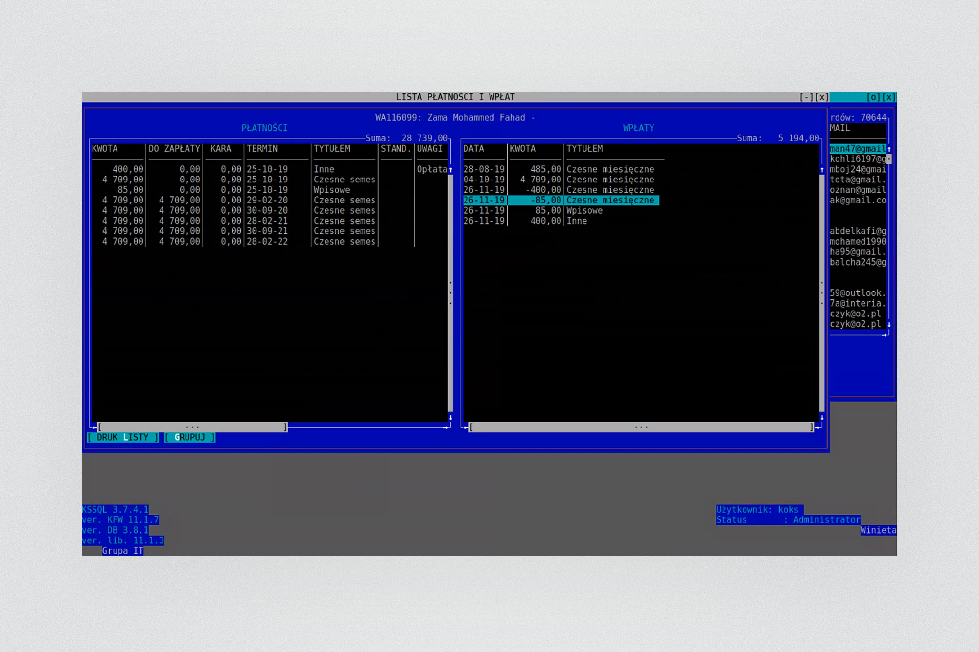
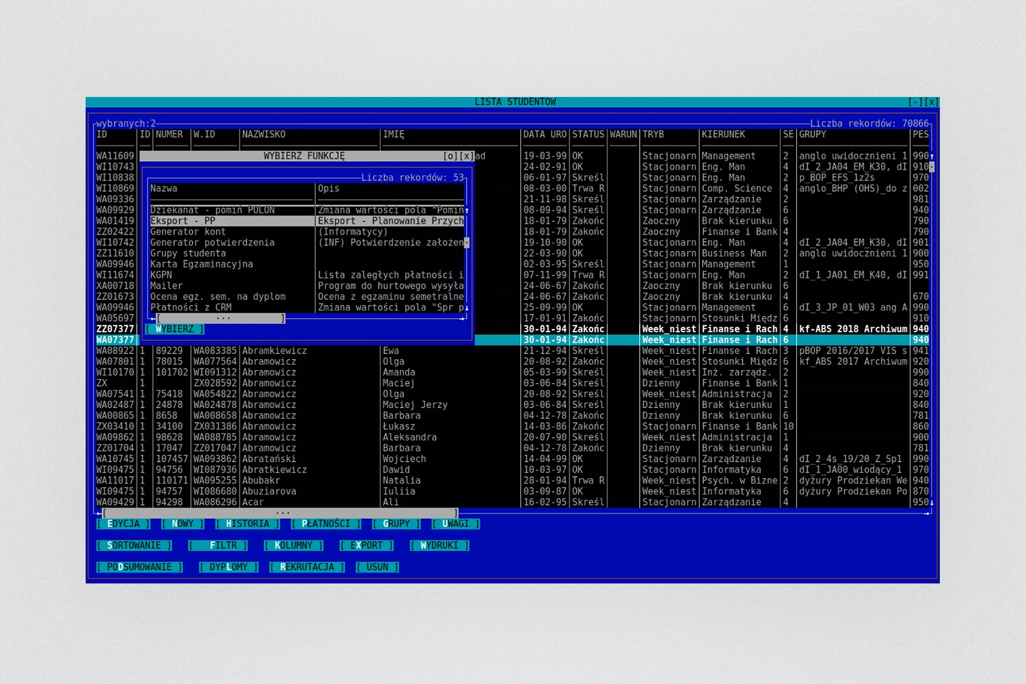
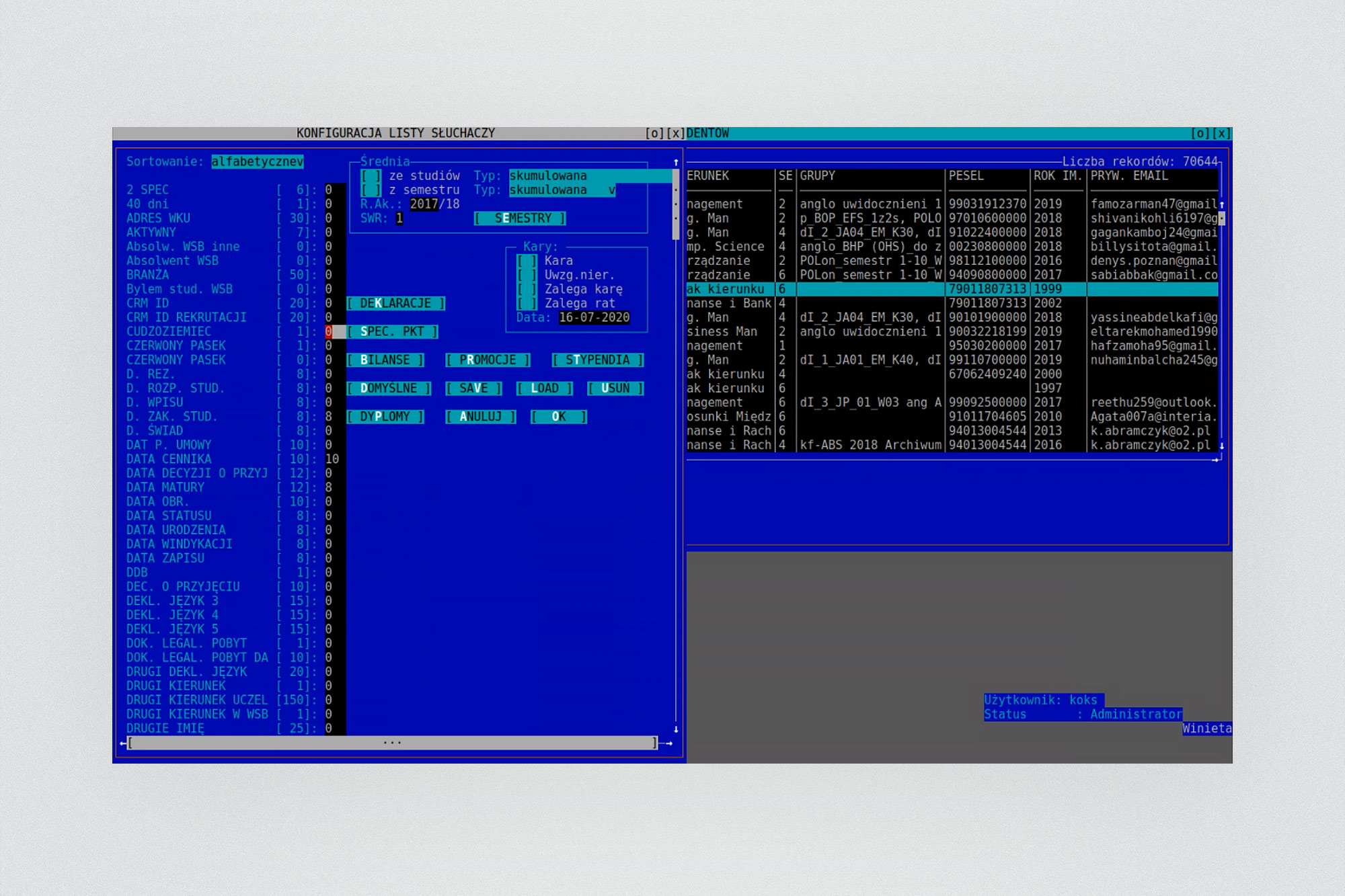
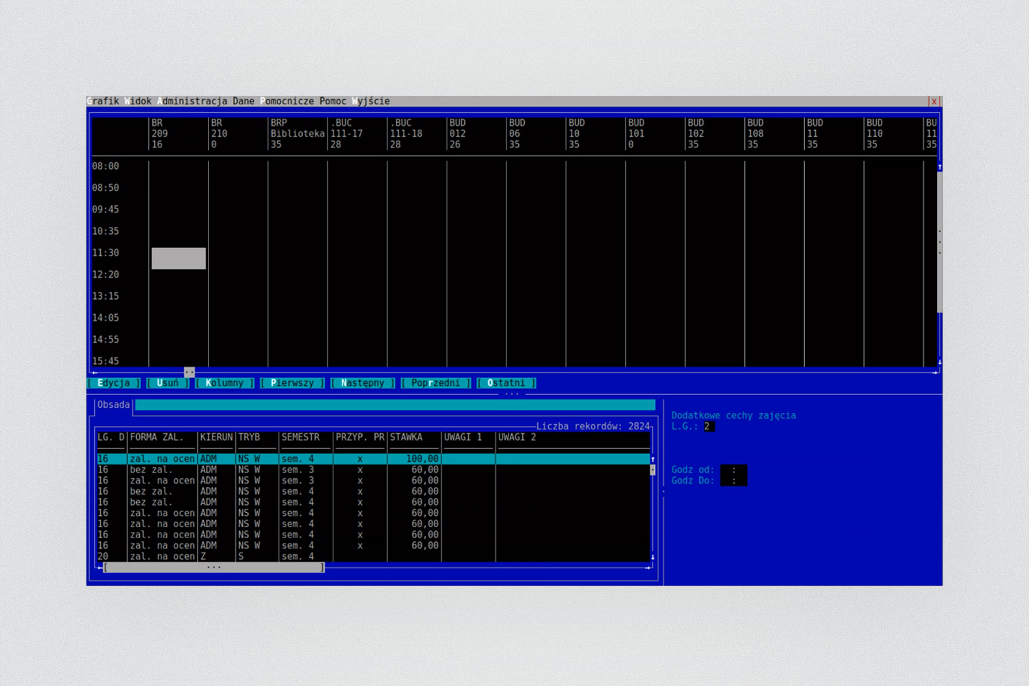
Merito Group operates a network of private universities across seven Polish cities. Every campus ran its own legacy system - some using DOS-era Experia desktop software, others relying on Word documents and spreadsheets. A single administrative task could require switching between four separate applications.
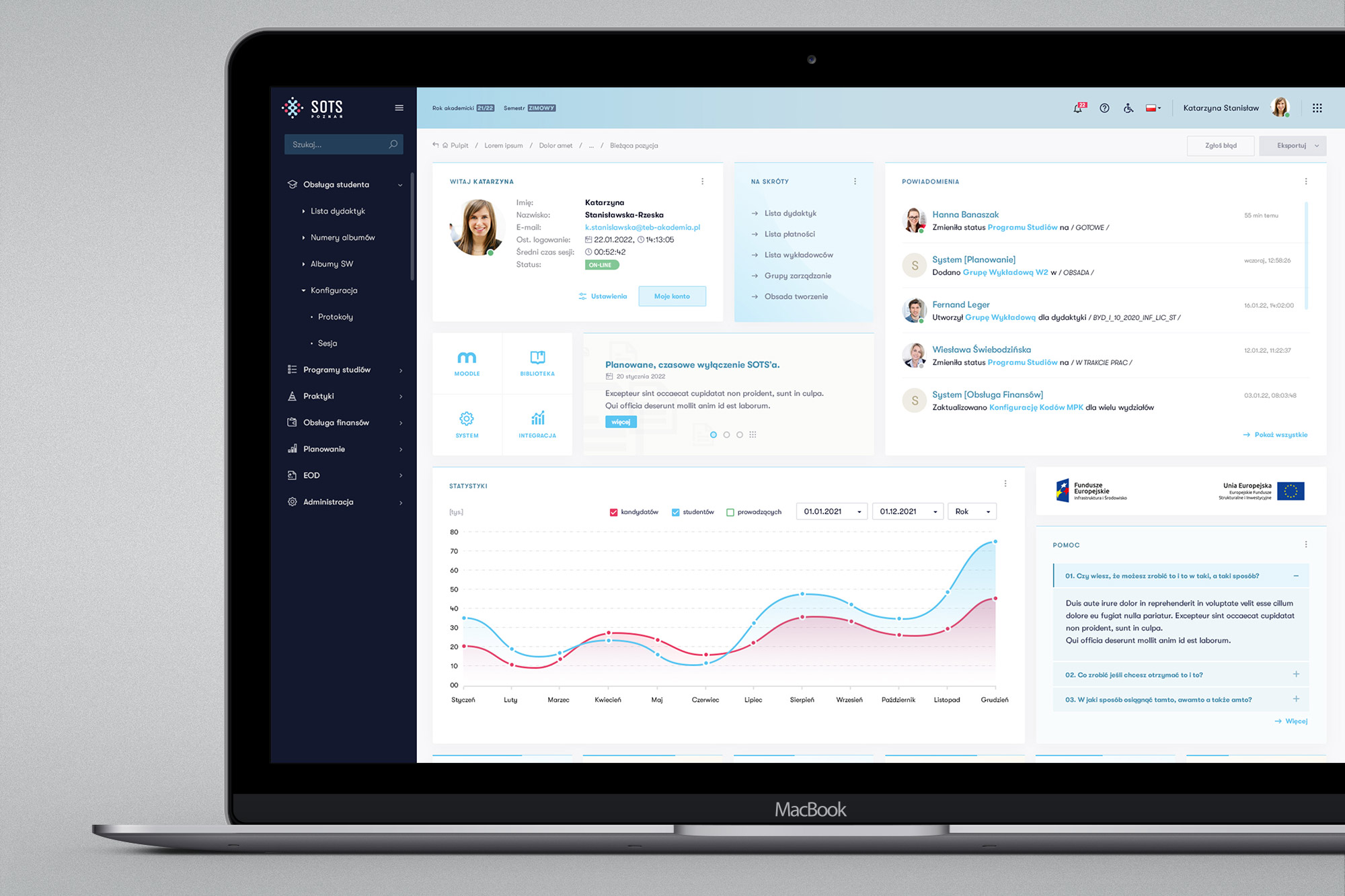
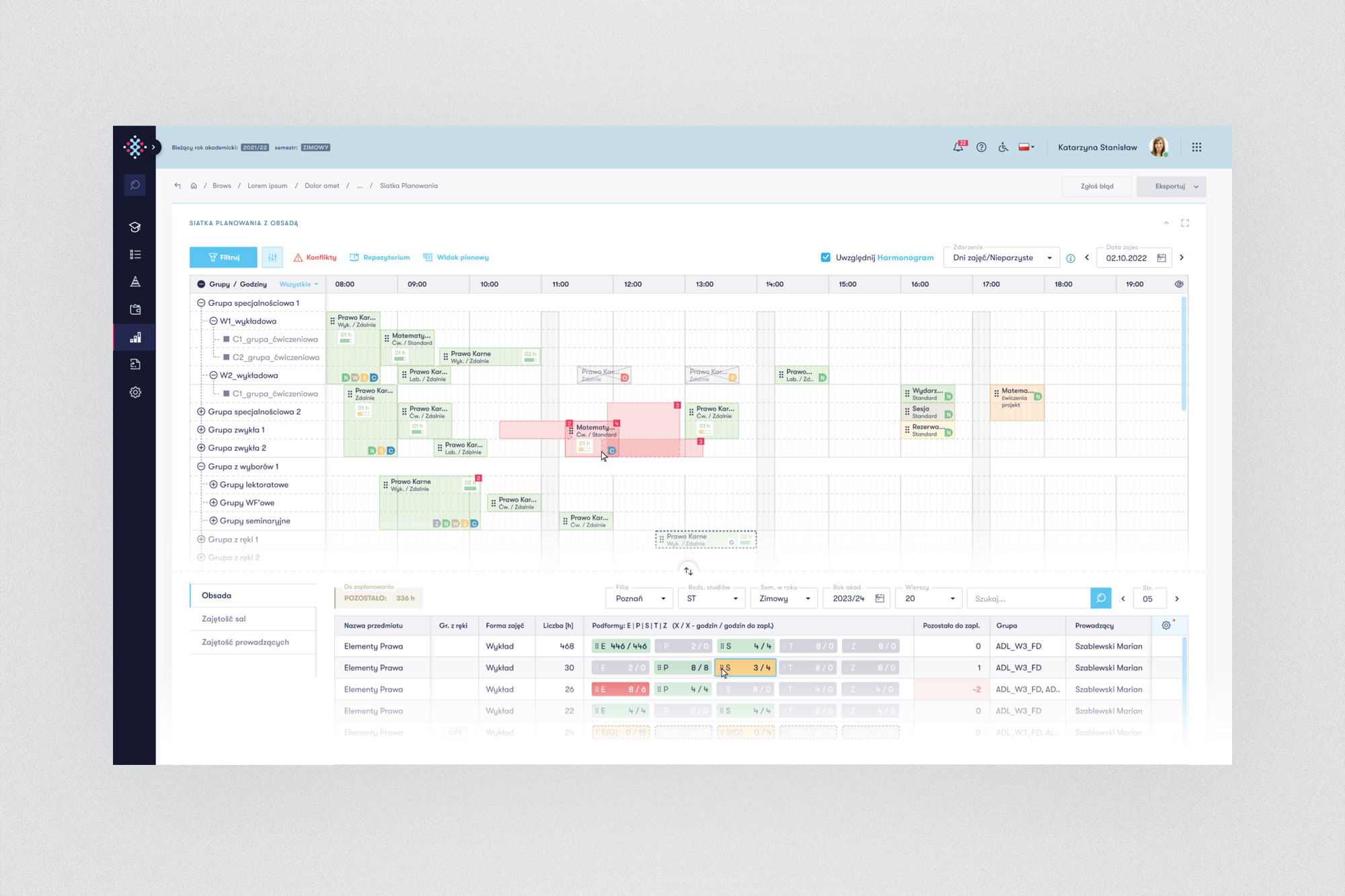
In 2020, Merito launched SOTS (System Obsługi Toku Studiów - Study Process Management System) - a unified web platform to replace all of it, connecting every campus under one consistent interface for the first time.
02. The challenge
Integrate everything into one
The core challenge was not purely technical - it was organisational and human. University staff had spent years developing workarounds, informal processes, and habits around broken tools. Any new system that didn't map precisely onto how people actually worked would be rejected.
Core problem
"Seven campuses, seven different systems, no shared data, no common interface, no way to perform routine tasks without switching between four applications. Administrative staff were spending more time fighting the tools than serving students."
The scope was enormous: six distinct functional areas, each with its own stakeholders, its own set of edge cases, and its own deeply embedded workflows. Curriculum management, student administration, internships, finance, scheduling, and lecturer settlement — all had to be redesigned from scratch, unified under a single design language, and shipped to few 10-person teams working in parallel.
As the only designer on a project of this scale, the challenge was also logistical: how do you maintain design consistency across six teams working simultaneously on six independent modules?
03. My role
Cross-team UX/UI designer and researcher
I was the sole UX/UI designer on the project, working across all six product teams simultaneously. Unlike typical single-squad embedded designers, my position required constant context-switching - participating in multiple refinement cycles per week, each covering a different domain of the application.
Being cross-team meant I had to develop strong facilitation skills - running brainstorming sessions, mediating between business expectations and technical constraints, and translating abstract process descriptions into concrete interface decisions. I also became an informal bridge between teams, ensuring design patterns remained consistent even as different squads worked independently.
04. Design process
A repeatable loop across six areas
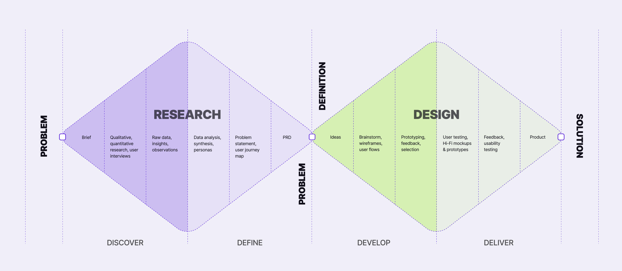
Working across six parallel workstreams required a structured, repeatable process that could scale. We settled on an Agile/Scrum methodology with 2-week sprints, and I developed a design loop that consistently moved from business need to shipped feature.
05. Research & discovery
The business was the user
One of the most valuable aspects of this project was direct access to end users. The business stakeholders - the APOs and their teams - were themselves the primary users of the system being built. This created an unusually rich feedback loop: every design decision could be validated against someone who would literally use the feature themselves.
Research was conducted continuously throughout the project, not as a front-loaded phase. Each domain area required learning an entirely new process vocabulary - from curriculum credit structures and ECTS point allocation, to lecturer contract settlement and room booking conflict resolution.
Key insight
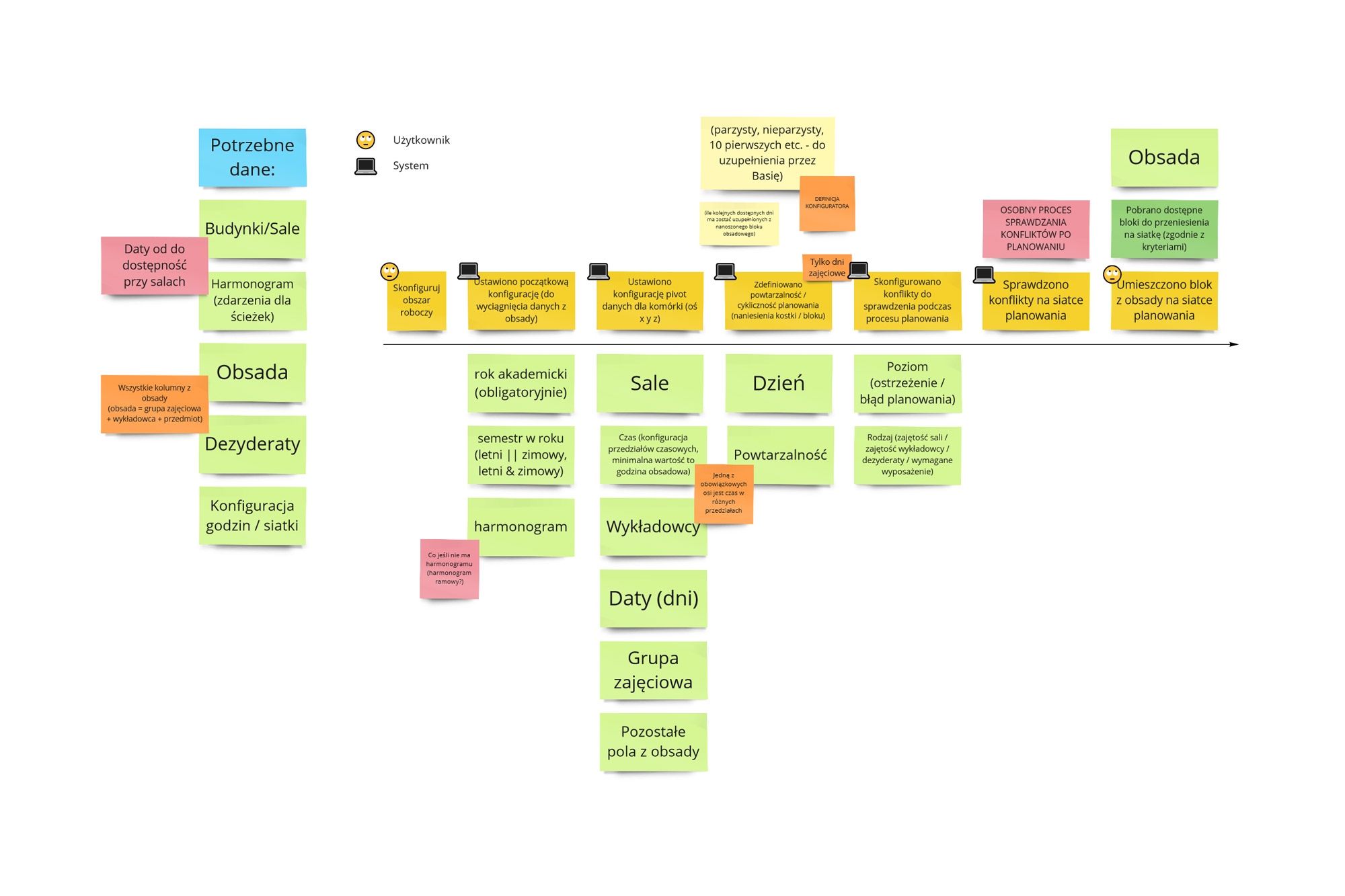
University staff had developed dozens of invisible workarounds - things they "just knew" weren't captured anywhere. Surfacing and documenting these informal processes was as important as designing the formal ones.
06. Wireframes & flows
From diagram to interaction
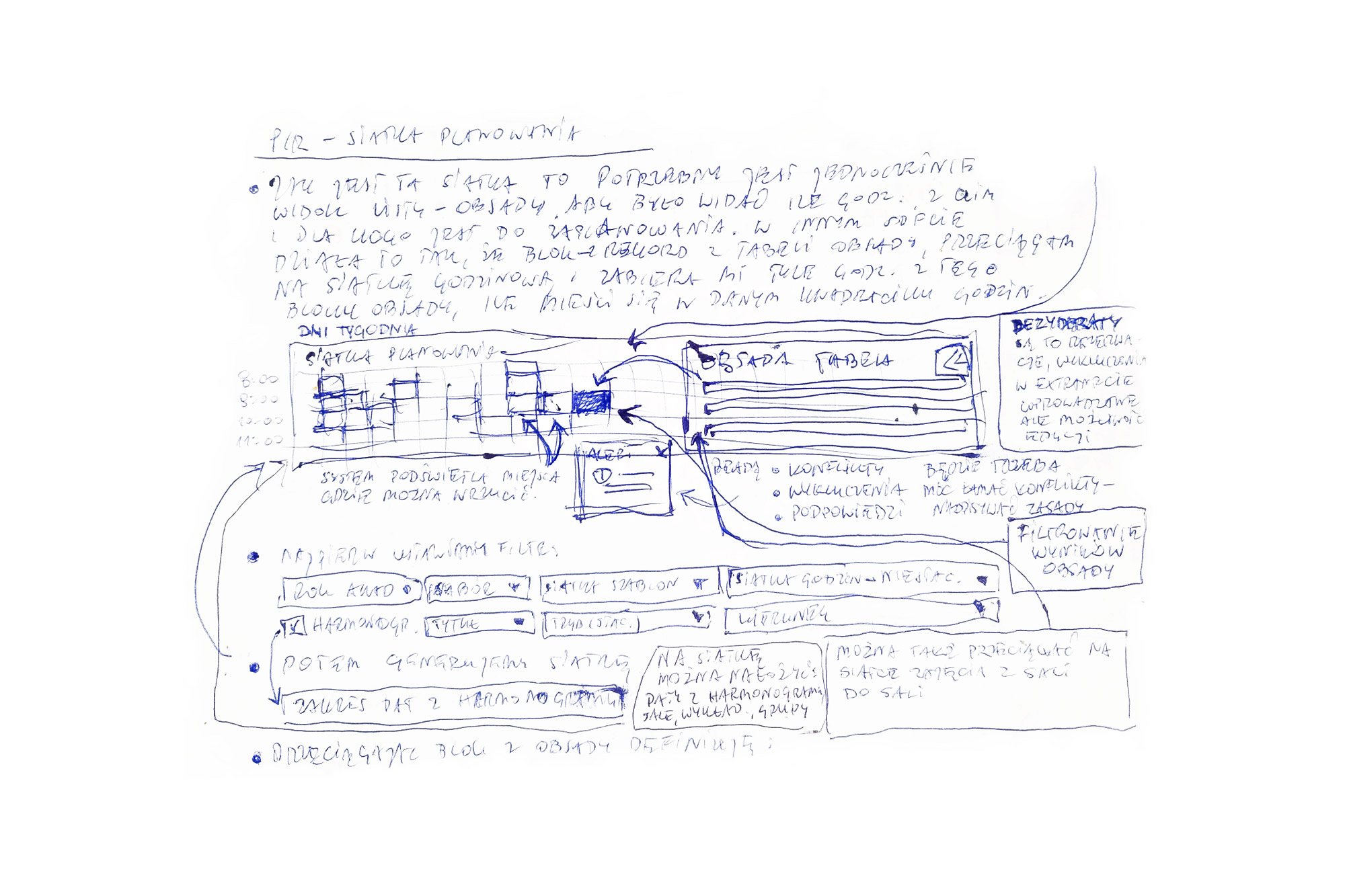
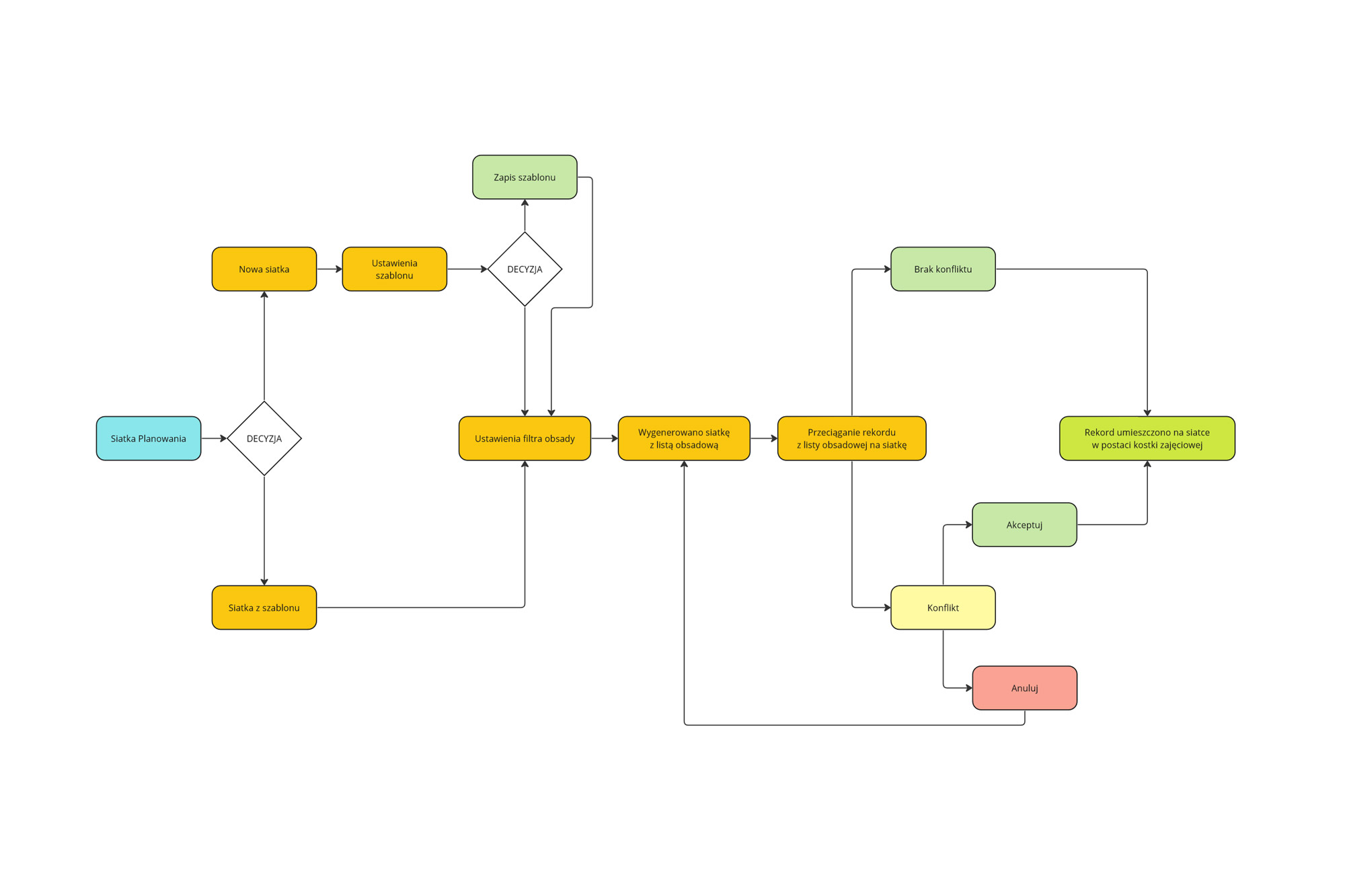
After each discovery cycle, I translated the user flow diagrams into low-fidelity wireframe prototypes. The goal at this stage was not visual refinement - it was logic validation: does the proposed interface support every step of the process, including the edge cases surfaced in research?
Wireframes were intentionally minimal - monochrome, using generic component shapes - to keep feedback focused on flows and logic rather than visual details. Testing with business users at this stage caught structural issues early, before any high-fidelity work began.
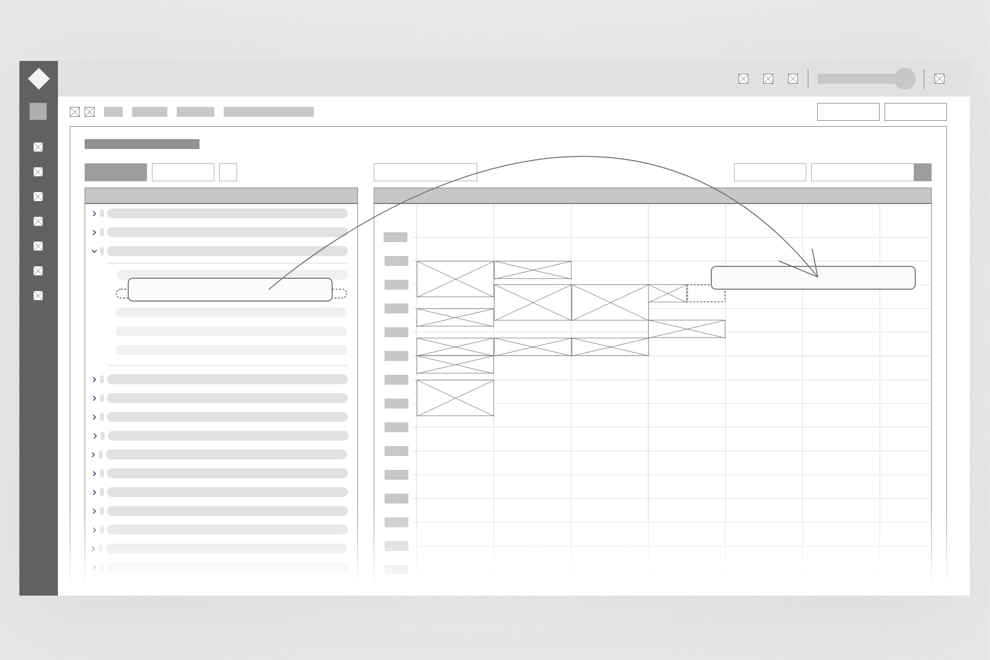
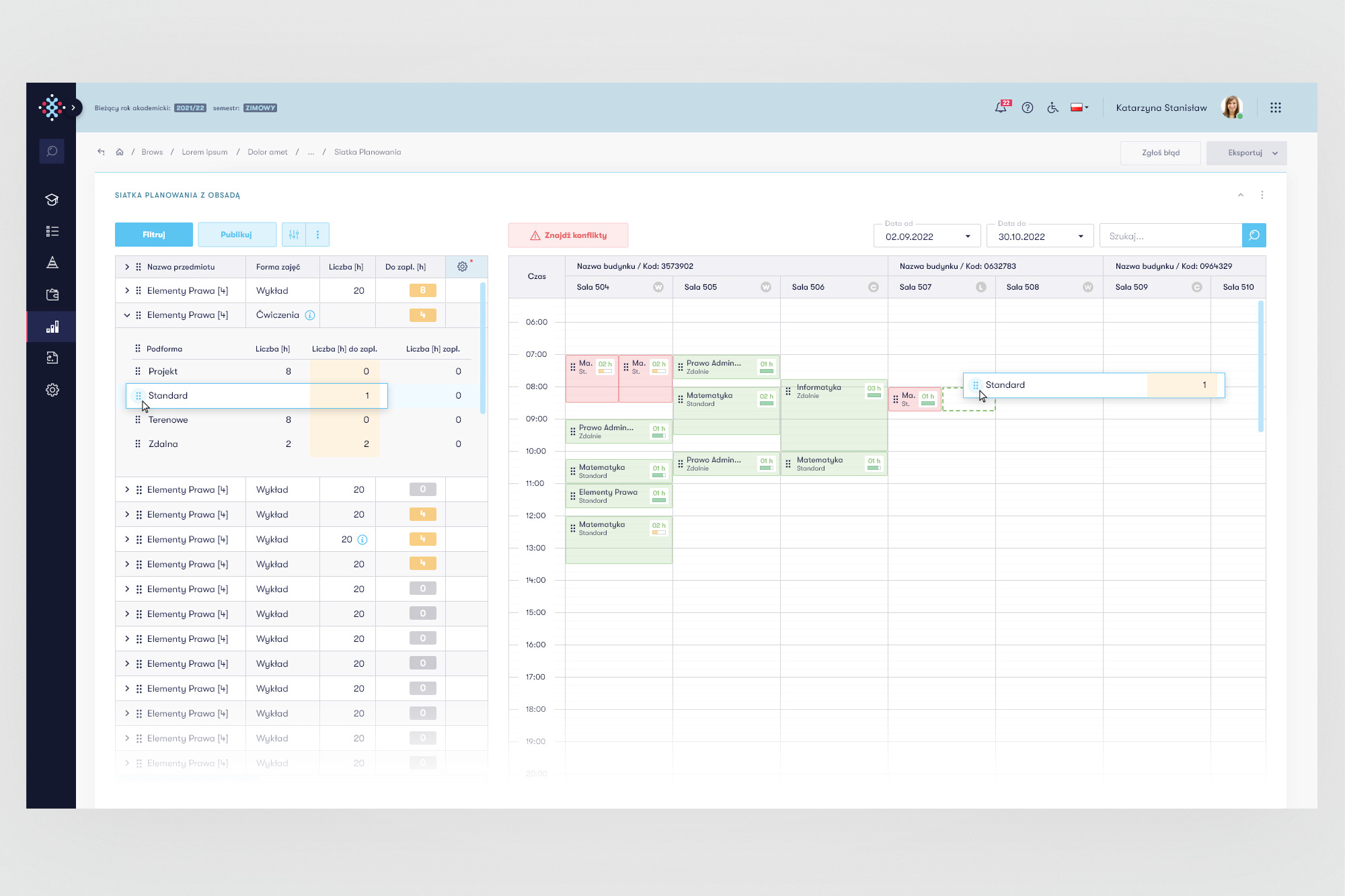
Same module - lo-fi vs hi-fi. Wireframes kept monochrome to focus feedback on flows, not visuals.
07. Design system
Built to scale across six teams in parallel
The most technically complex part of my work was building and maintaining a comprehensive design system in Figma - not as a side project, but in parallel with shipping features every two weeks. The need became clear early: without a shared component library, each team would gradually diverge, and the product would become visually incoherent.
I started in Adobe XD, but the limitations of static styles quickly became apparent. I migrated to Figma and rebuilt the system using auto-layout components, design tokens, variables, and thorough documentation. The frontend team translated the system into a Tailwind-based component library, meaning the design system had a direct 1:1 relationship with production code.
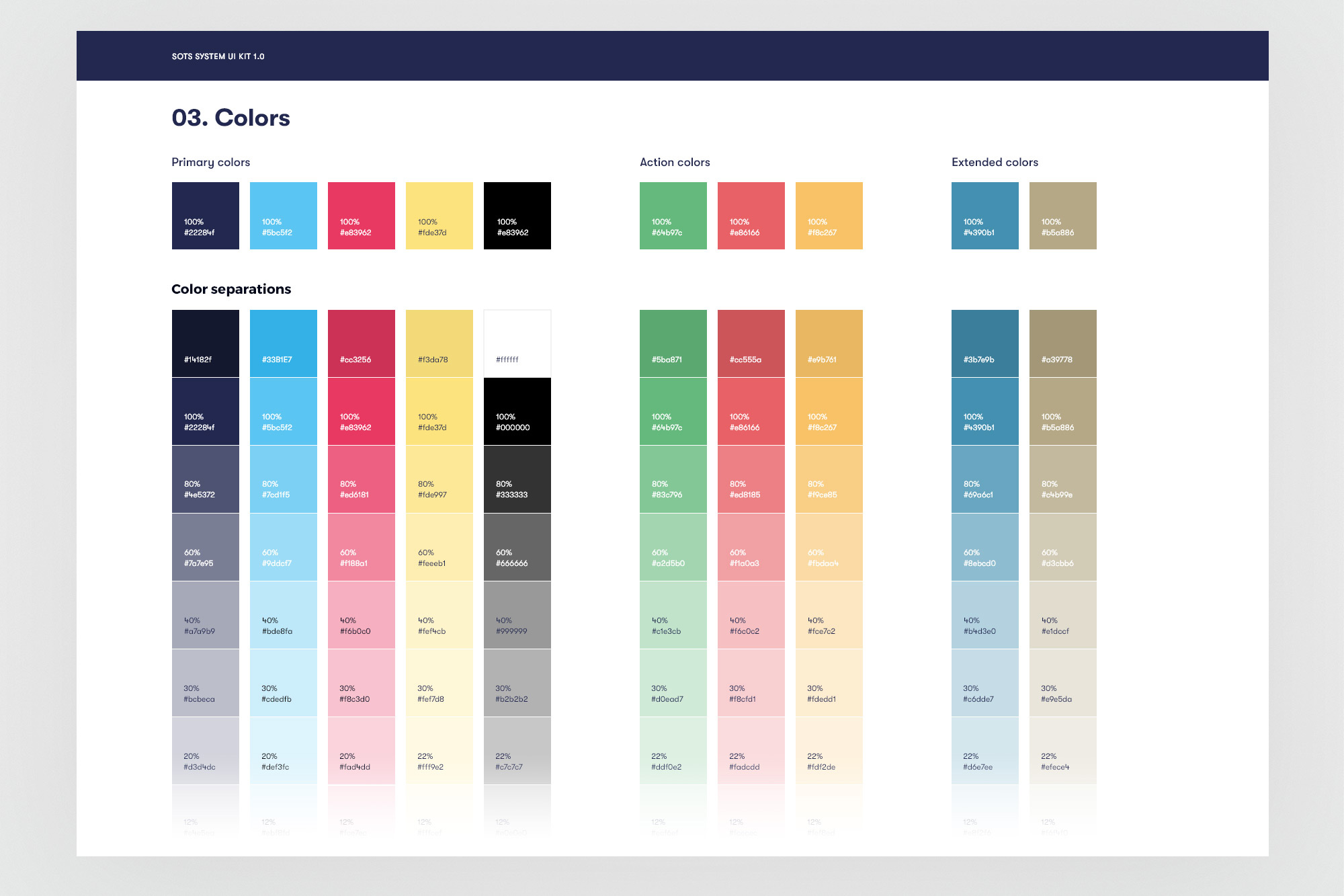
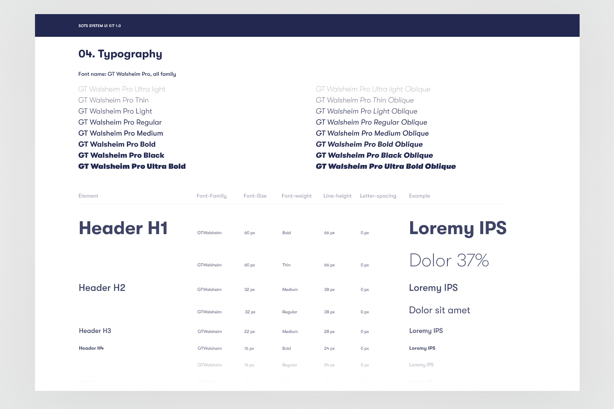
Foundations - colour tokens and typography scale defined as Figma variables, synced with the frontend Tailwind config.
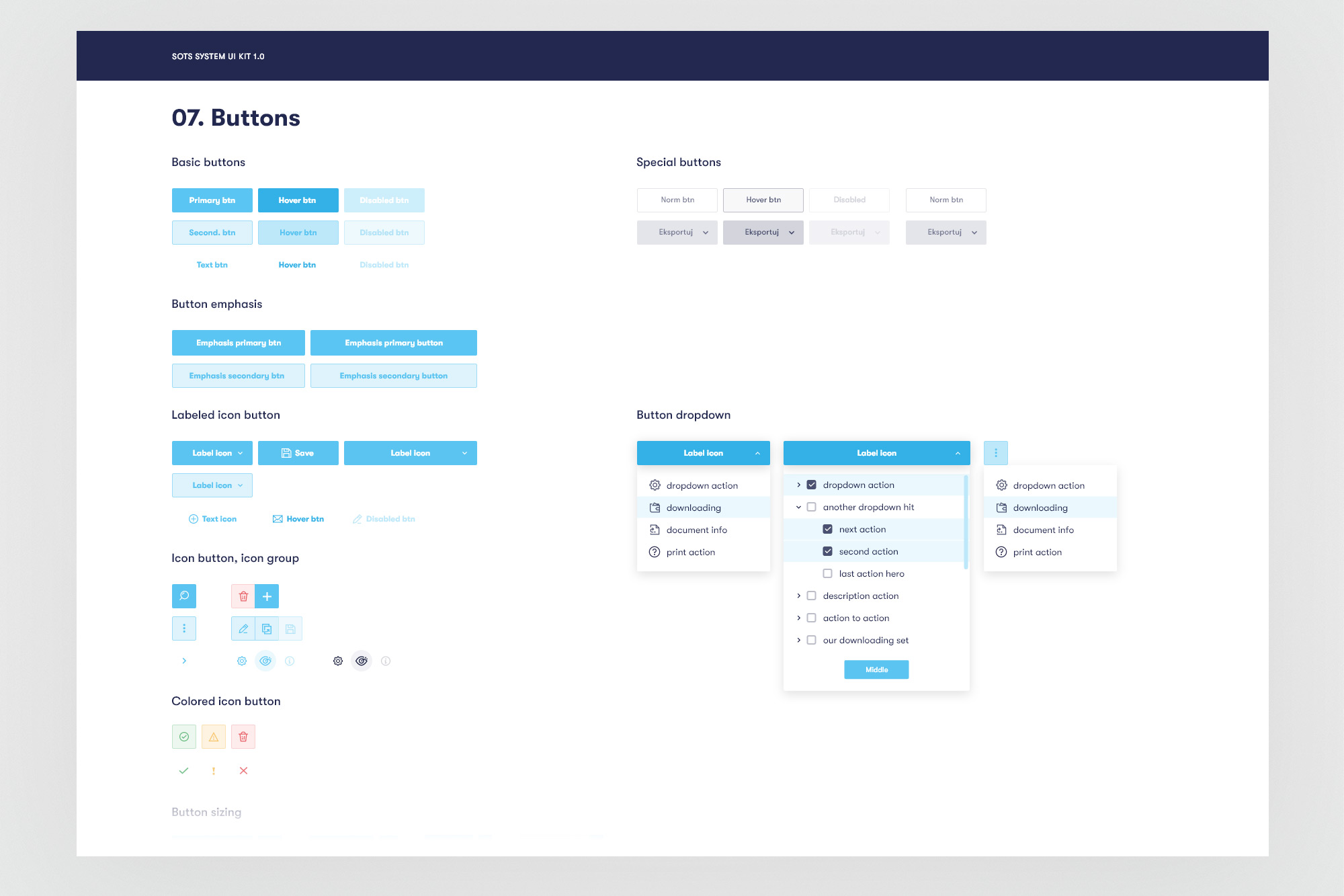
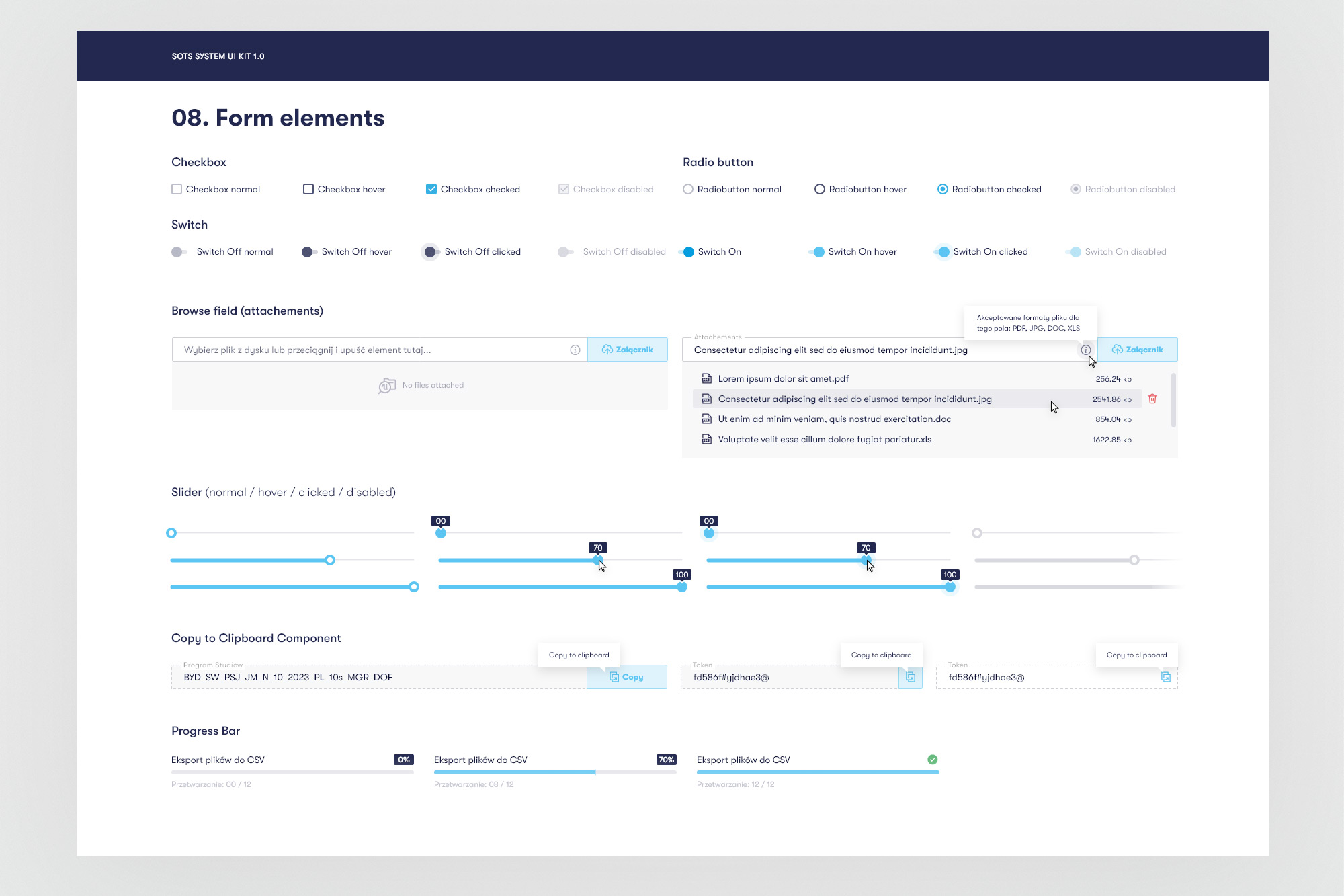
Interactive components - buttons with all states and form elements built with auto-layout and Figma variants.
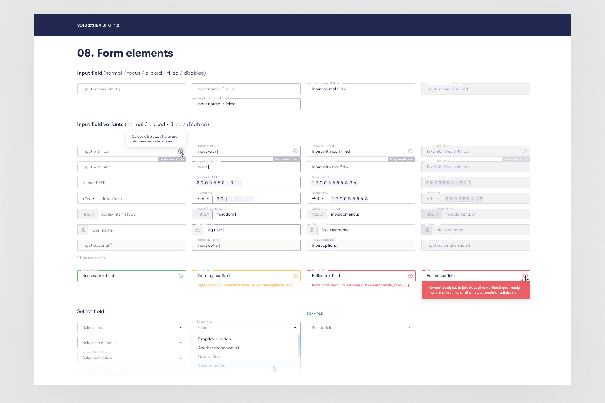
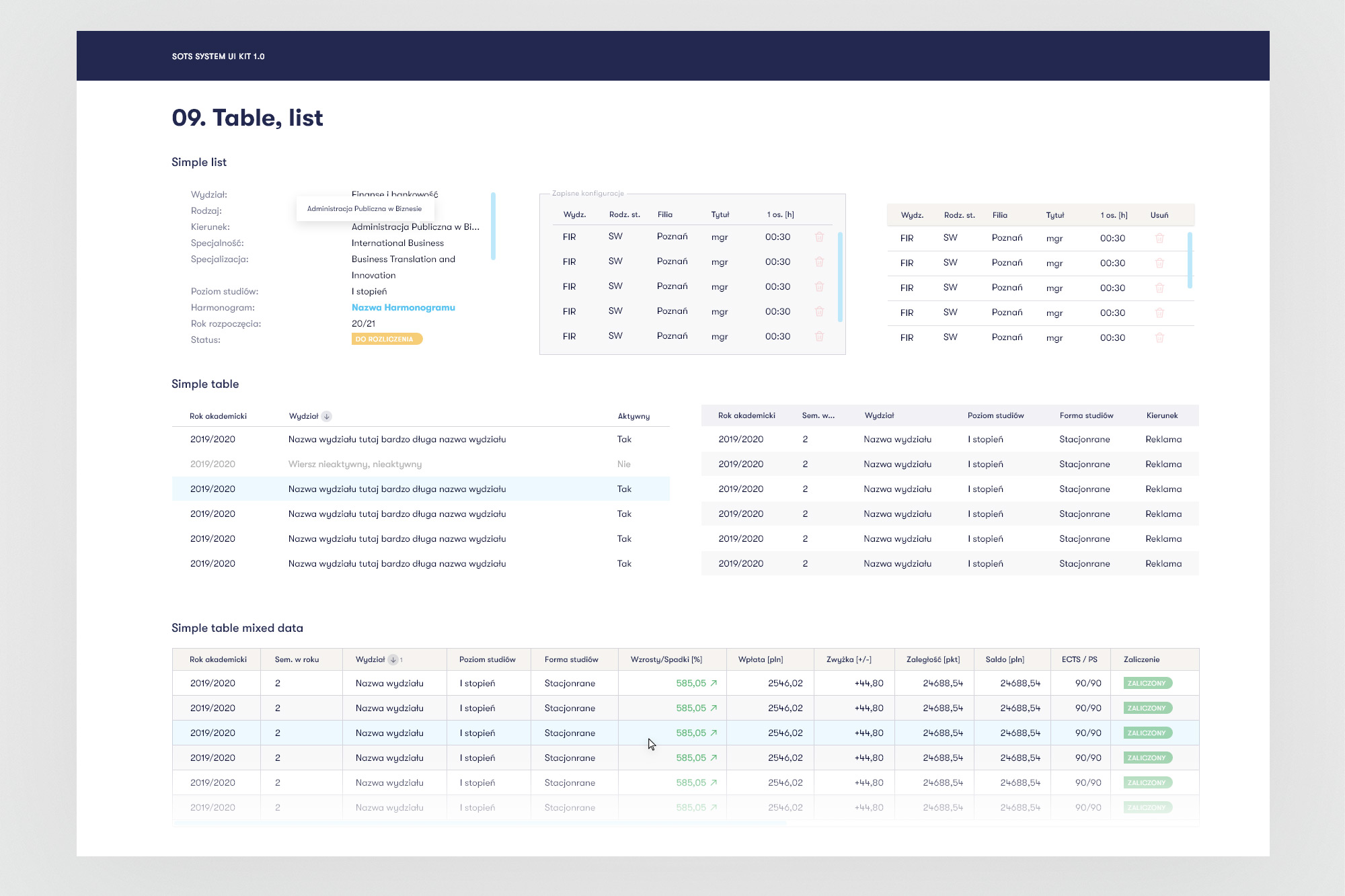
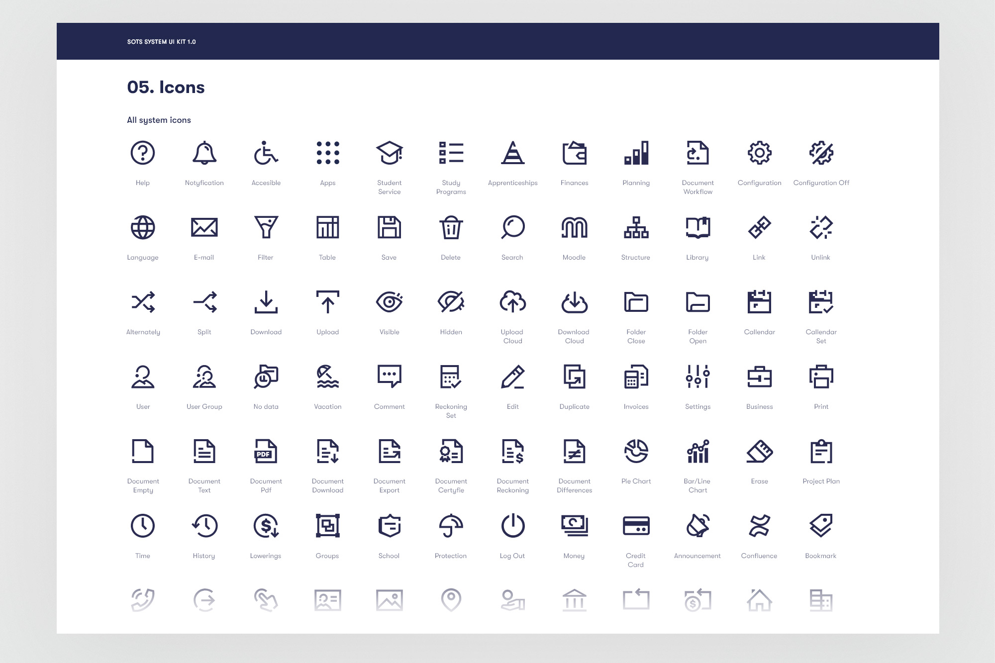
Data tables, extended forms, and the icon system - the most frequently reused components across all six modules.
08. Hi-Fi & testing
Tested at every stage, iterated until consensus
High-fidelity prototypes were built in Figma using design system components - which meant updates to a component automatically propagated across all screens using it. This was essential for maintaining consistency while working at the pace of 2-week sprints.
Testing was multi-modal. Remote unmoderated tests via Maze ran on every major prototype, gathering quantitative data on task completion, error rates, and time-on-task. Quarterly on-site moderated sessions at different campuses allowed us to observe actual university staff working through tasks in their real environment - catching context-specific usability issues that remote testing missed.
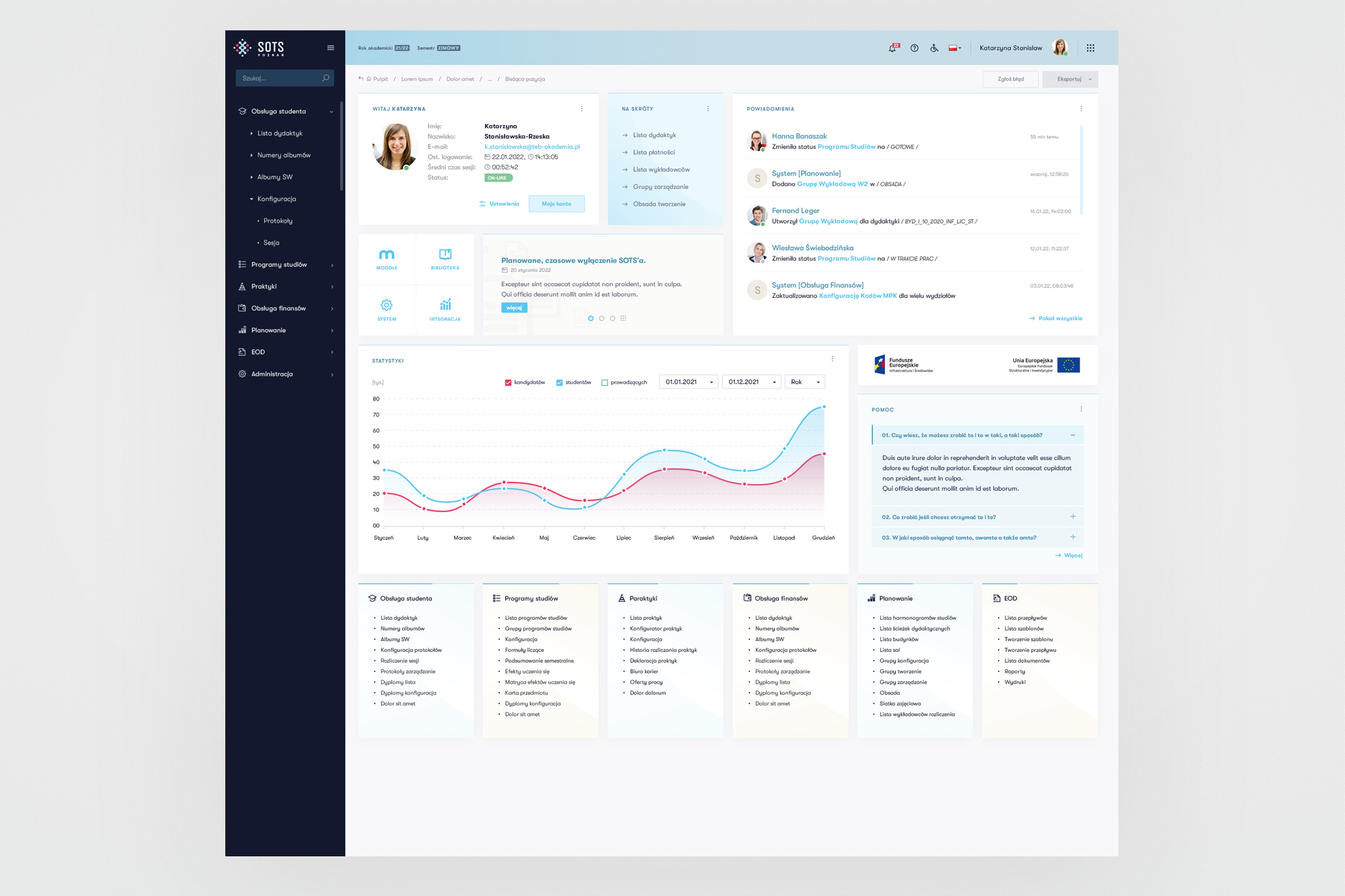
Main dashboard - entry point for all six modules. Designed to surface the most frequent tasks without deep navigation.
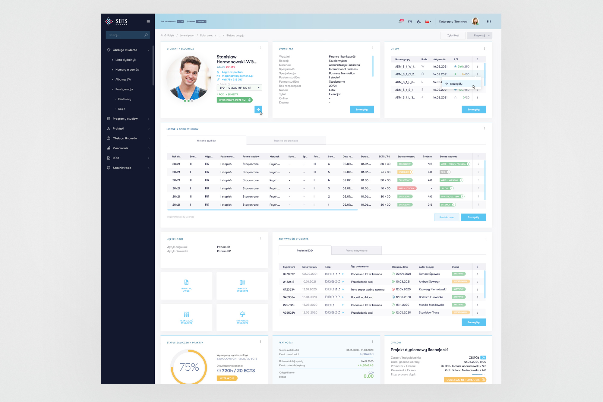
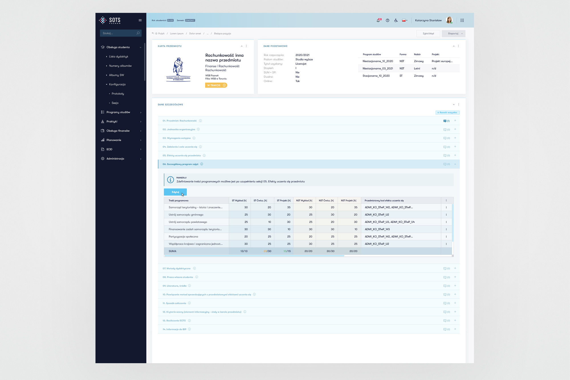
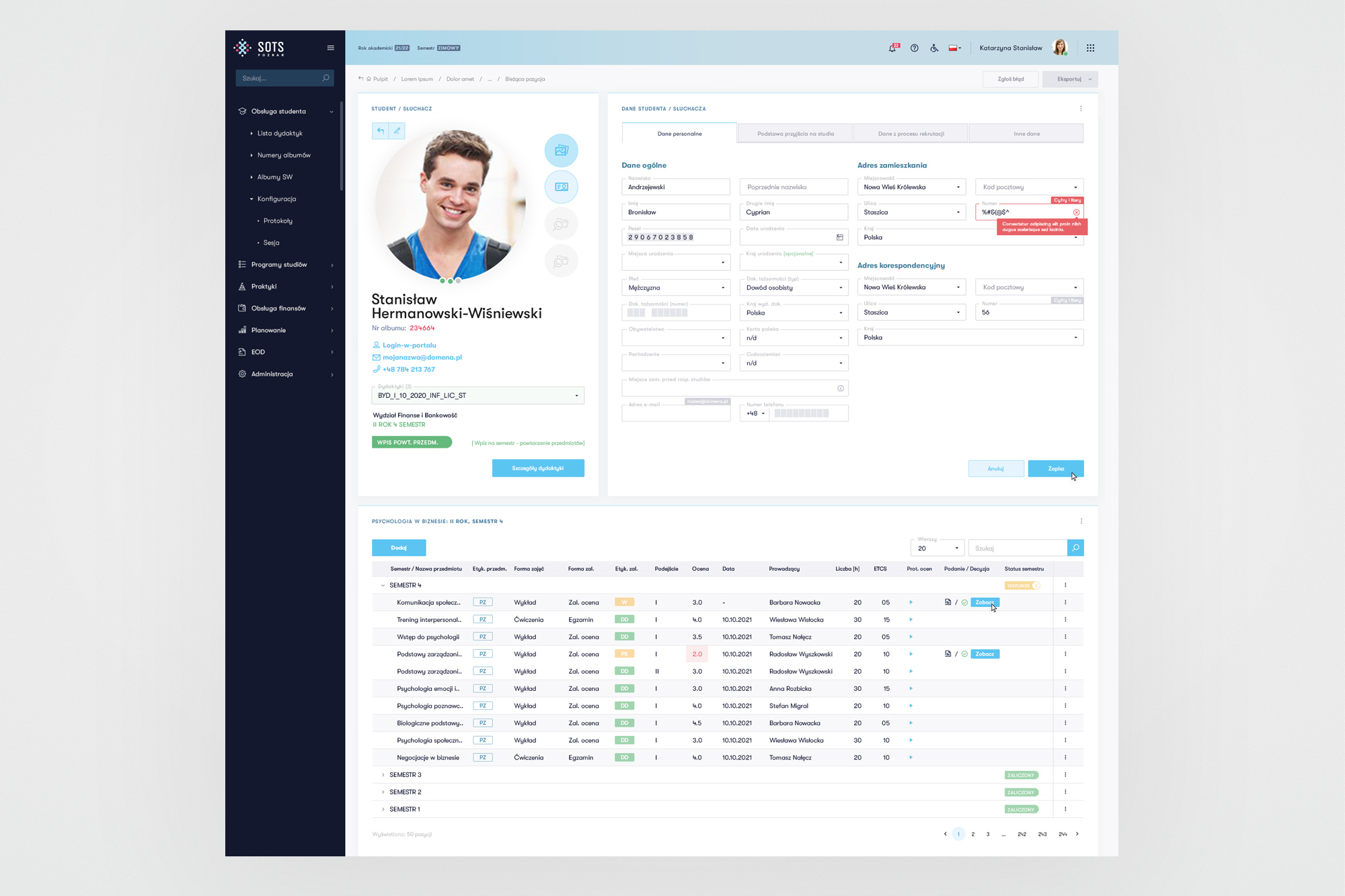
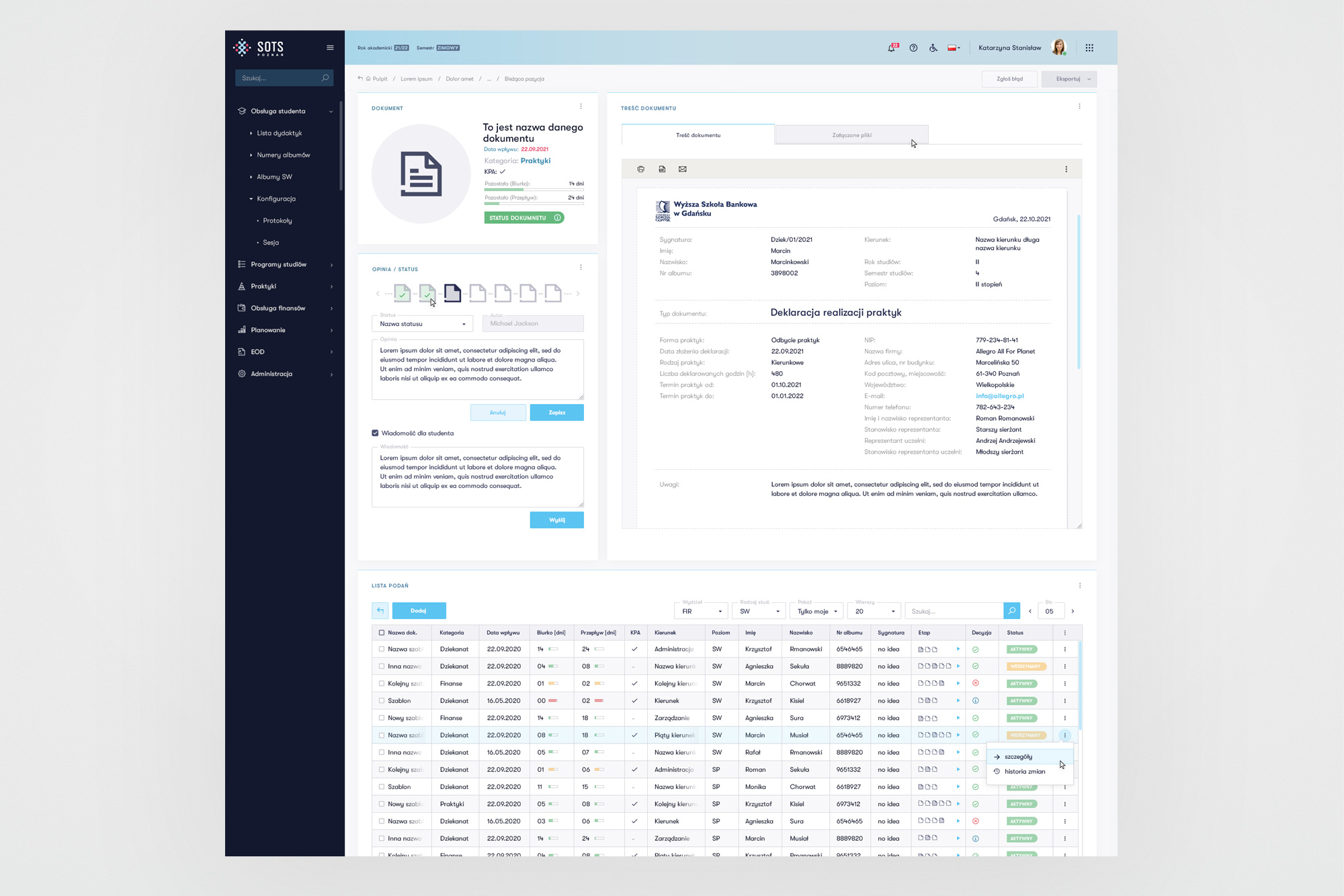
Student record (kartoteka) and the student administration module - the most complex view in the system, aggregating data from five sub-domains.
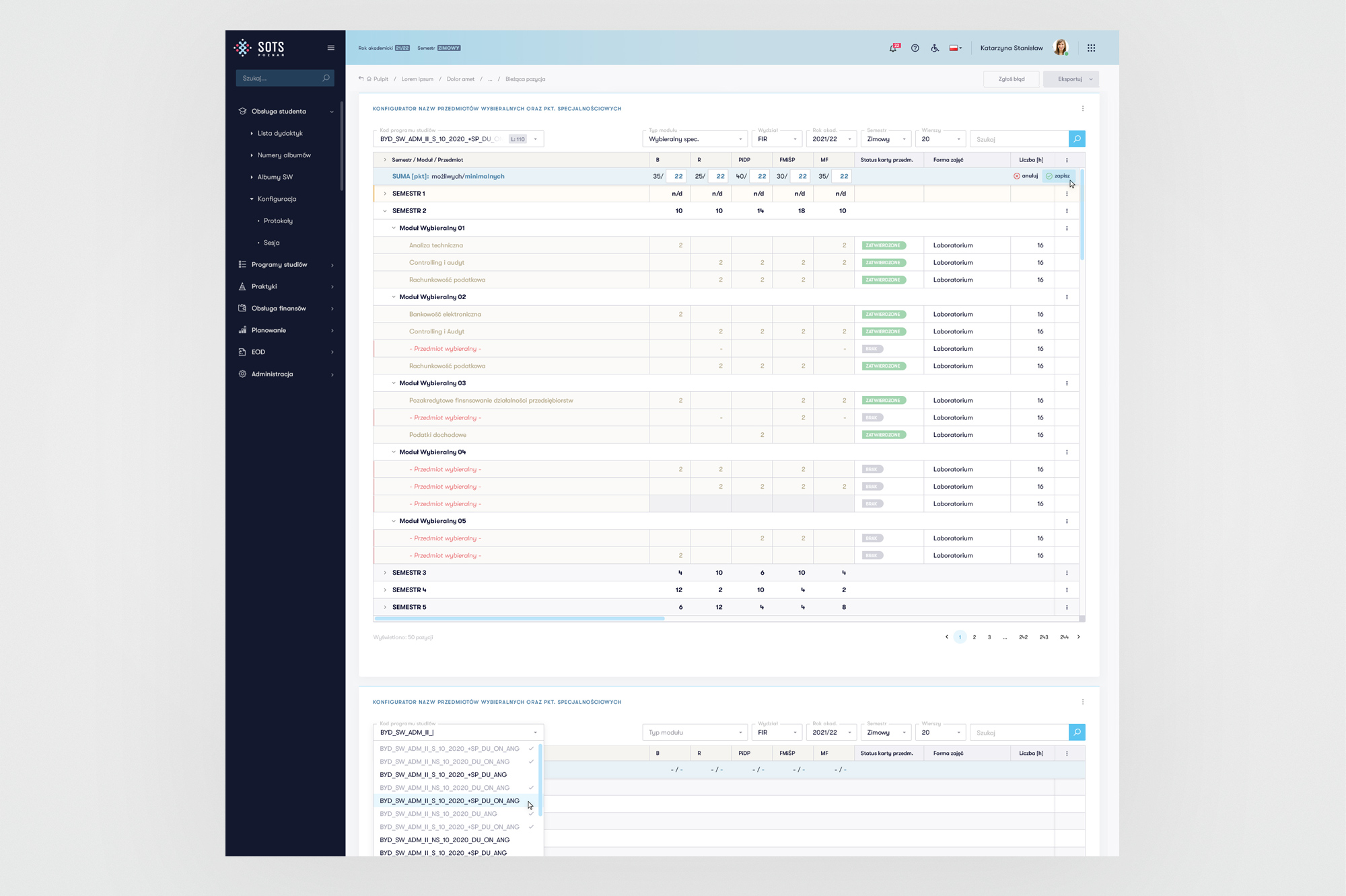
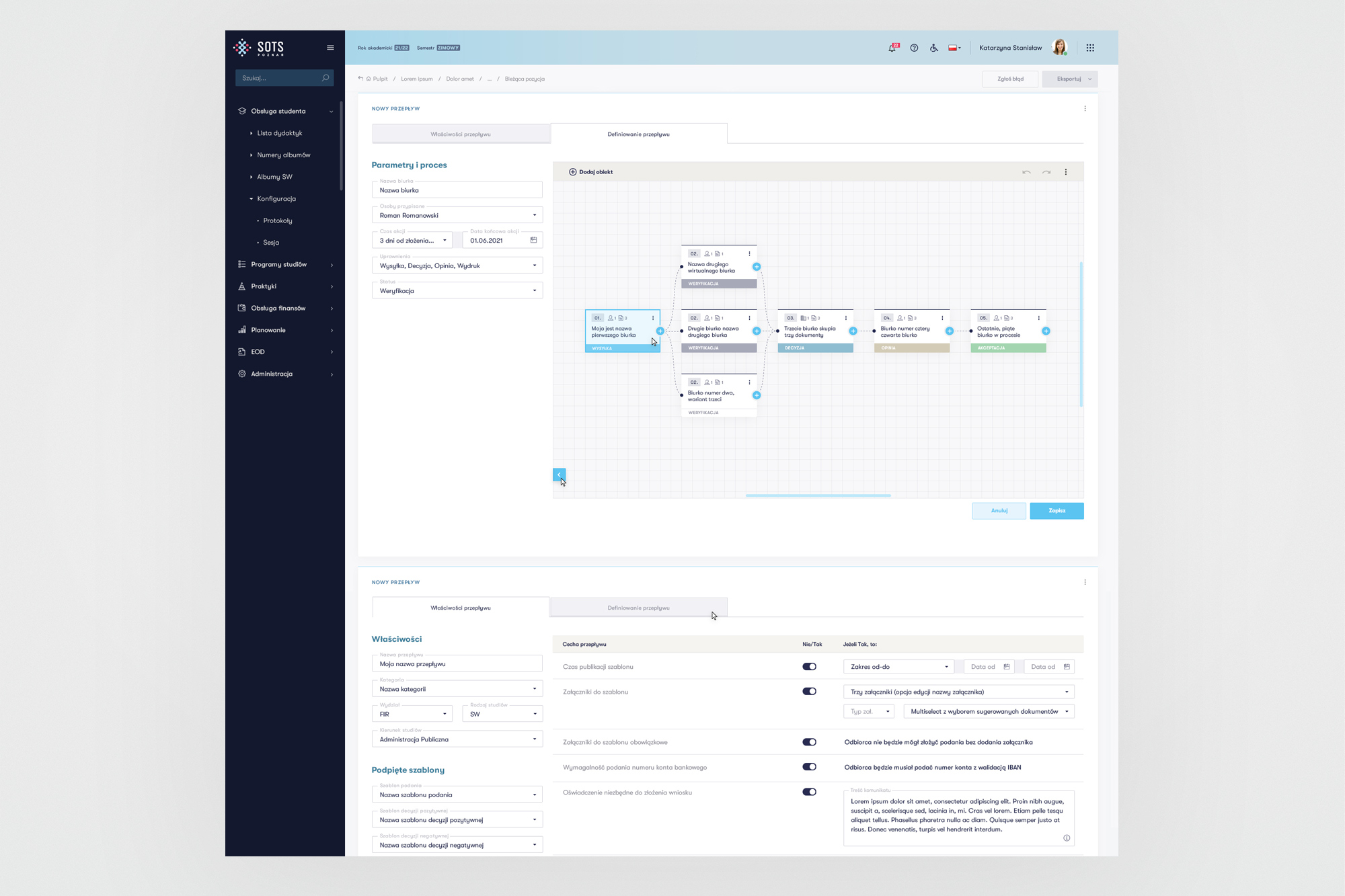
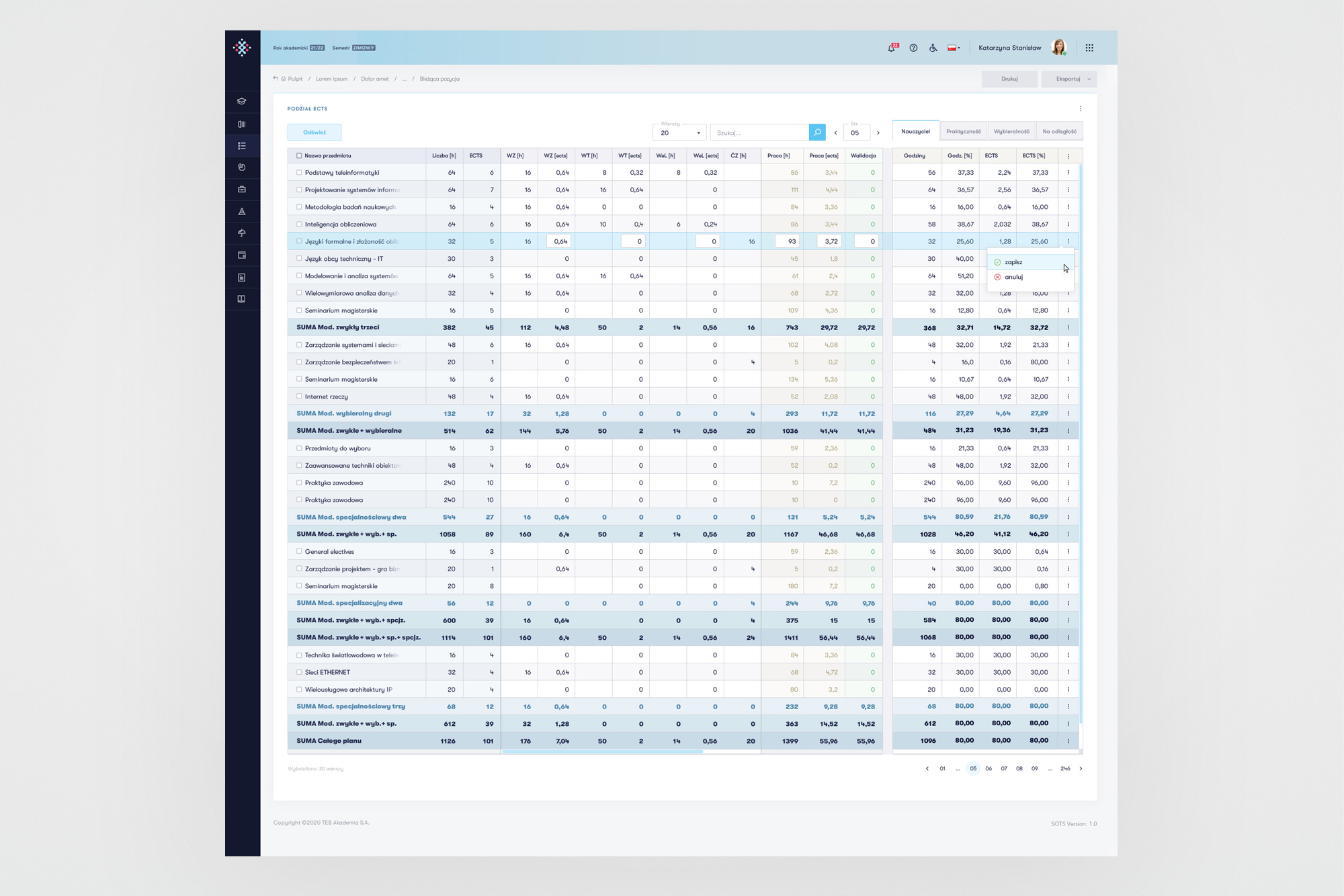
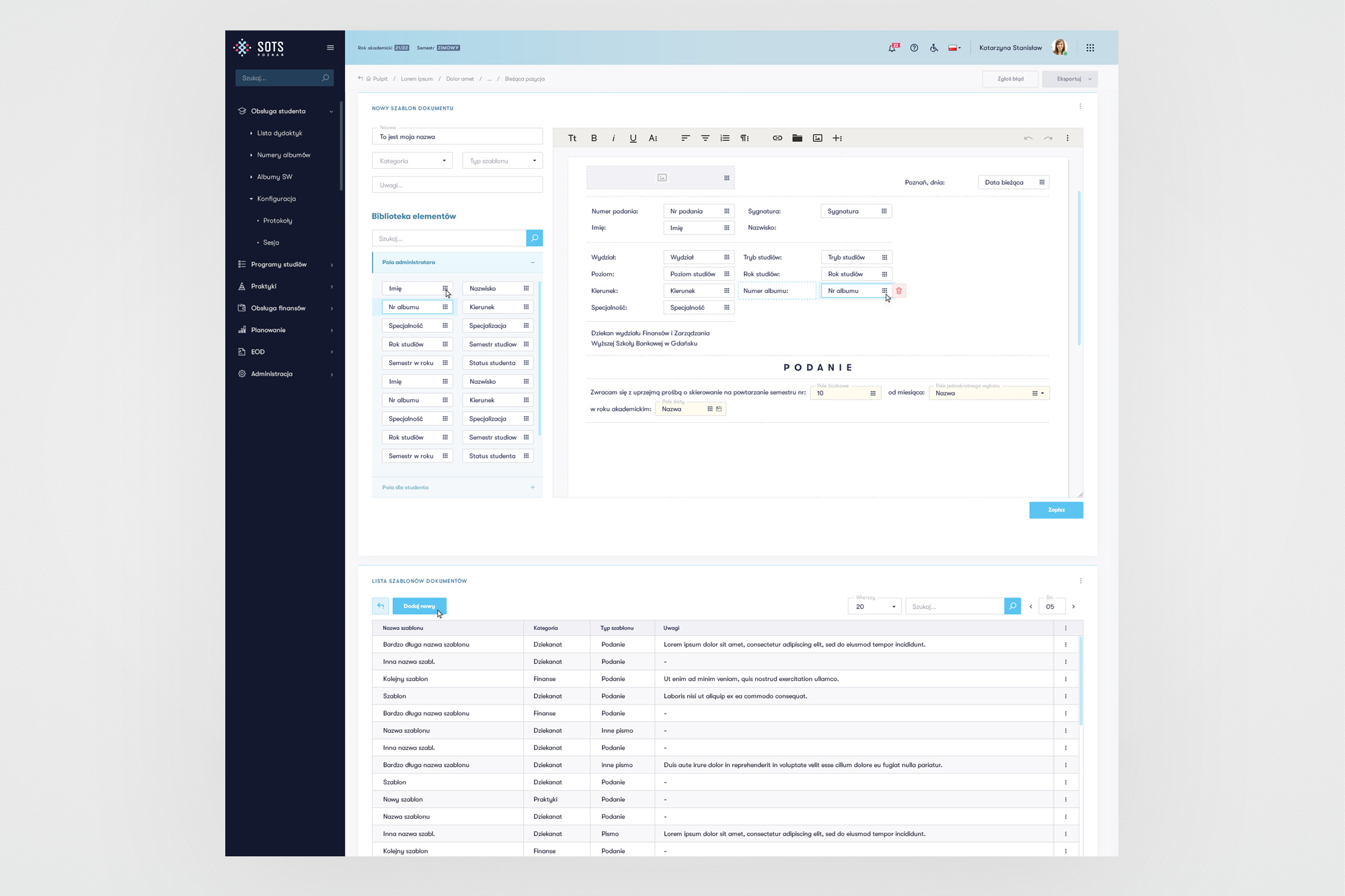
Finance, curriculum builder, and internship tracking modules - each domain required its own information architecture while sharing the same component language.
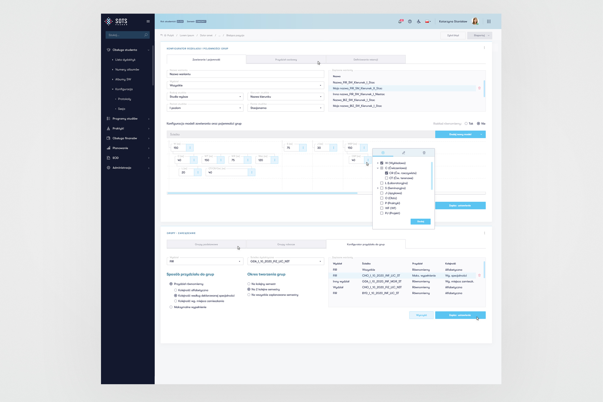
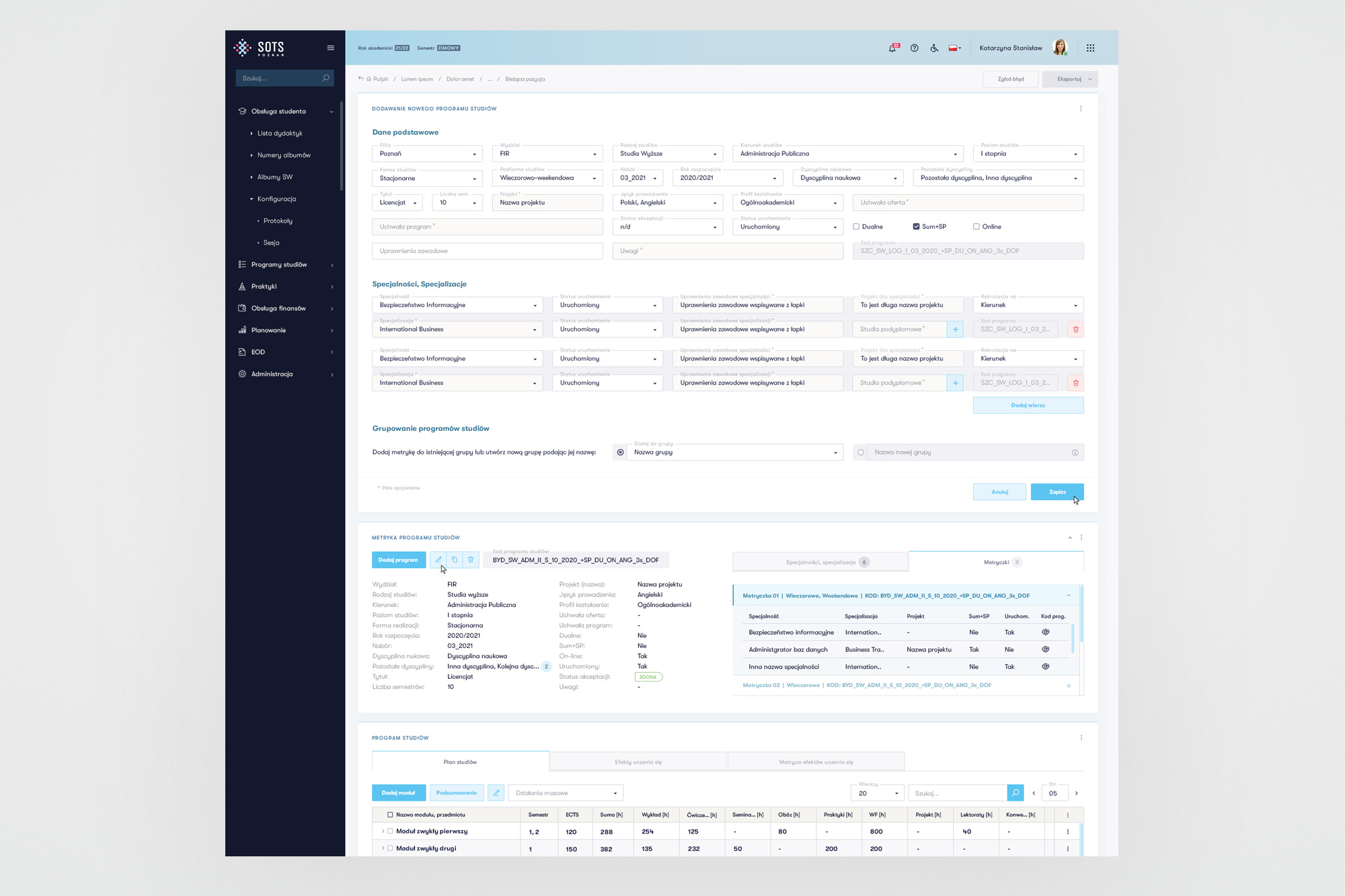
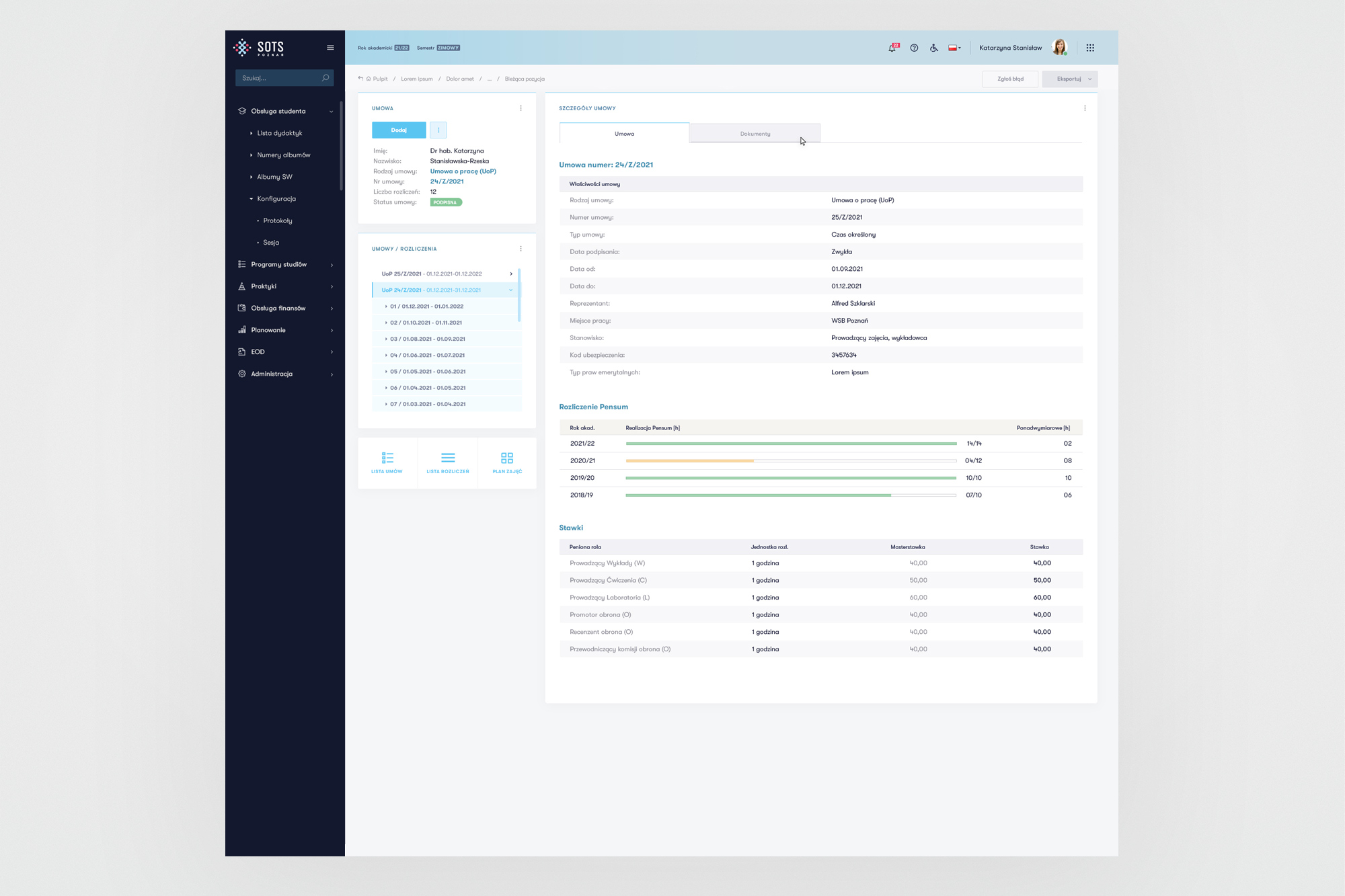
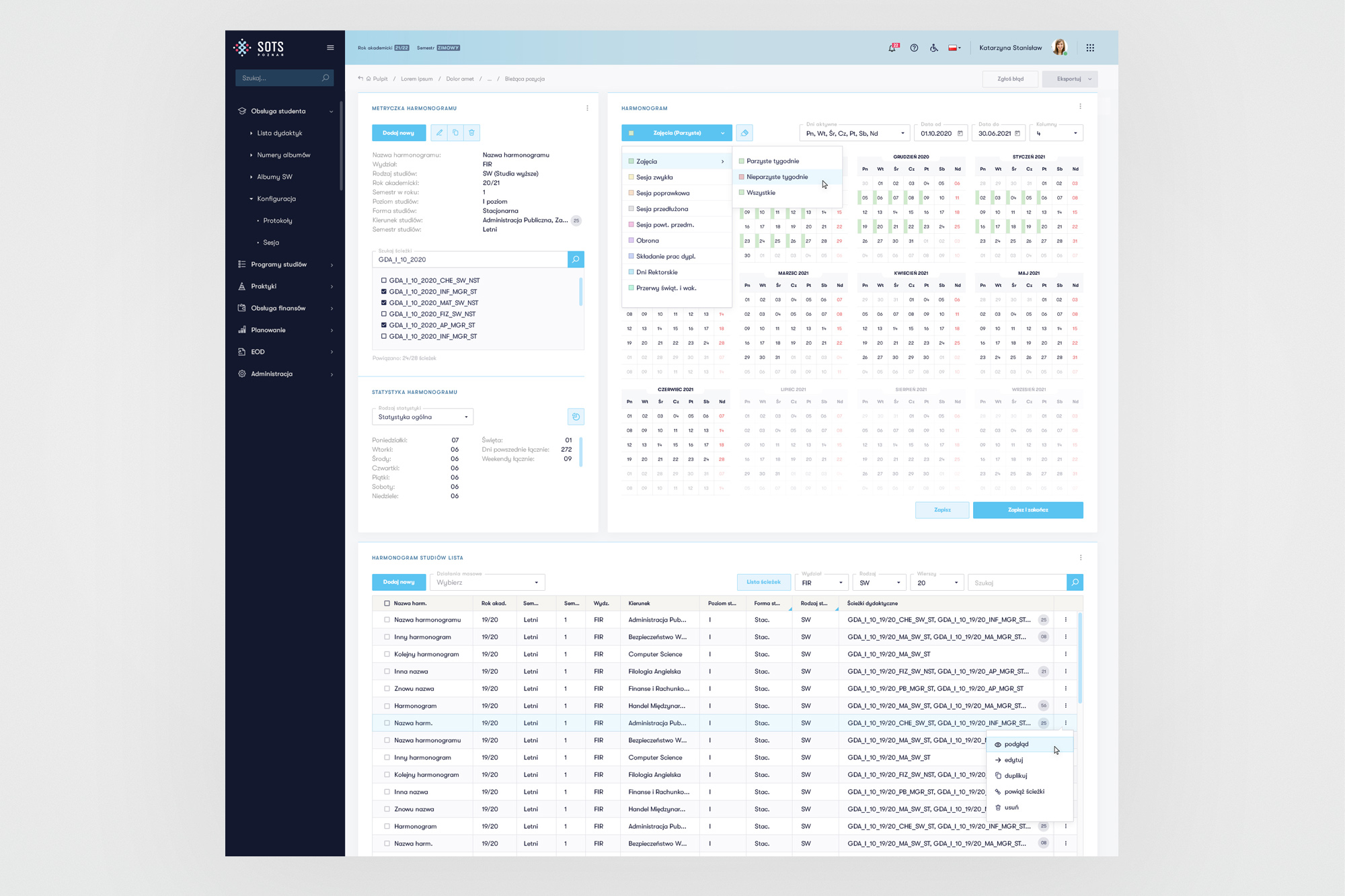
Lecturer settlement and scheduling - two modules with the highest data density, requiring careful table design and filtering patterns.
09. Outcomes
A working product. Shipped to all seven campuses.
After six years and hundreds of sprint cycles, SOTS was deployed across all Merito Group campuses - replacing the patchwork of legacy systems, spreadsheets, and workarounds that had held the organisation back for years.
10. Learnings
What 6 years on one product teaches me
Scale demands systems thinking. Working as the sole designer across six parallel workstreams would have been impossible without the discipline of building a design system first. Every hour invested in component architecture saved dozens of hours of inconsistency-fixing downstream.
Proximity to users is a superpower. Having direct access to business stakeholders who were themselves end users compressed the feedback loop to days rather than weeks. The quality of design decisions improved dramatically when validation was continuous rather than periodic.
Facilitation is a design skill. The most impactful design work often happened not at the screen level, but in a room with developers and business owners - facilitating the conversation that turned a vague process into a clear, buildable specification. Knowing how to run that room became as important as knowing how to use Figma.
Iteration beats perfection. Shipping something testable every two weeks forced a healthy pragmatism. Not every screen was perfect, but the system improved continuously, and users could see their feedback reflected in the product within weeks - which built trust and sustained engagement across the full six-year project.