01. Overview
One visual language for an entire enterprise platform
SNP develops and maintains a growing suite of enterprise applications and tools - all built on the CrystalBridge platform and all serving the same fundamental purpose: supporting large-scale SAP transformations. As the platform evolved and the number of dedicated tools grew, so did the inconsistencies between them. Different spacing conventions, different component shapes, different interaction patterns - the same underlying system presenting itself differently depending on where a user was.
The CrystalBridge 2.0 Design System was built to solve this. A complete, documented library of visual foundations and UI components that every designer and developer working on CrystalBridge tools could reference, use, and extend. Not a style guide - a live system, maintained in Figma, with detailed anatomy, spacing specs, state documentation, and direct correspondence to a developer-side Storybook component library.
02. The challenge
Inconsistency at platform scale
CrystalBridge 1.0 had grown organically. Tools were built when they were needed, by whoever was available, without a shared design baseline. By the time CrystalBridge 2.0 was being planned, the inconsistencies had accumulated to the point where the same action - a button press, a table row selection, an error notification - could look and behave differently depending on which module the user was in.
For enterprise software that SAP consultants use daily across multiple modules in a single session, this fragmentation was not merely aesthetic. It created cognitive friction: users had to re-learn interaction patterns as they moved through the platform, and developers were repeatedly solving the same implementation problems in slightly different ways.
The core problem
"Multiple applications, multiple designers, no shared rules. Every team was solving the same design problems independently - with different results every time. Consistency couldn't be maintained through communication alone; it required a system."
The task was not just to document what existed - it was to define what the platform should be. That meant making decisions about foundations (typography, colour, spacing, iconography) before a single component could be built. It also meant designing for longevity: the system needed to be extensible enough that new components added by other designers would naturally feel like part of the same language.
03. My role
Co-creator - from first token to ongoing maintenance
I built the CrystalBridge 2.0 Design System collaboratively with one other UX/UI designer, working in parallel across different component areas and converging on shared decisions about foundations. The work was divided pragmatically - some components were clearly owned by one of us, others were designed together - but the visual language, naming conventions, anatomy format, and documentation standards were always shared decisions.
Beyond the initial build, the system became infrastructure: as new CrystalBridge modules were designed (including Organization Structure and Glue Cloud), any component gaps were identified, designed to match the existing language, and added to the library. Maintaining a living system while simultaneously using it to build new features required constant discipline about the difference between a one-off solution and a genuinely reusable pattern.
04. Foundations
Shared language before shared components
Everything in the design system rests on a layer of foundational decisions - the rules that all components inherit and that make them feel part of the same whole. Getting these right before building any component was the most important structural decision we made. A component built on inconsistent foundations will be inconsistent itself, no matter how carefully it's documented.
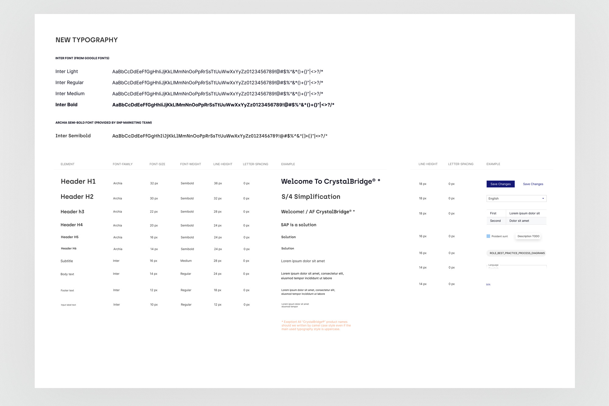
Typography. Two typefaces: Inter (Google Fonts) for body text and UI, and Archia Semibold (provided by SNP marketing) for headings. A full type scale from Input Label (10px) to Header H1 (32px), with documented font-family, weight, line-height, and letter-spacing for each level. All heading examples show CrystalBridge product names in camelCase per SNP's naming convention.
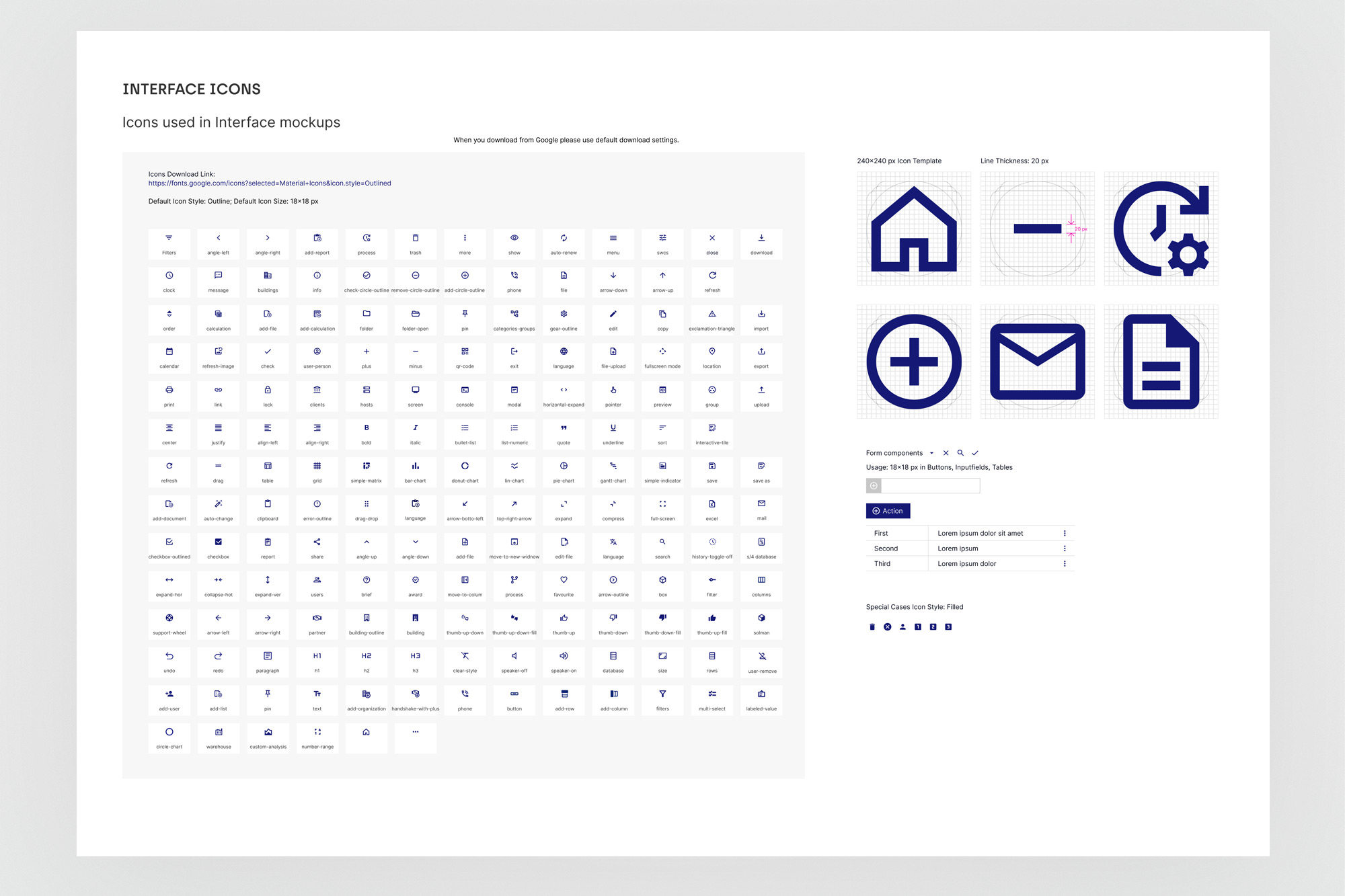
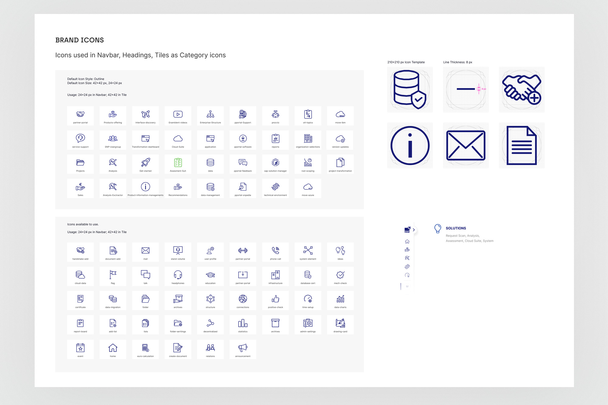
Icon system - two tiers. Interface icons (18×18px, Material Icons Outlined, line thickness 20px) used in buttons, input fields, and tables. Brand icons (42×42px, custom outline style, line thickness 8px) used in the navbar, headings, and tile category patterns. Each icon is named and catalogued with usage context. Special filled-style variants documented for exception cases.
05. Components
Every state. Every variant. Every edge case.
The component library covers the full range of UI patterns used across CrystalBridge tools - from atomic elements like tags and progress indicators, to complex compositional patterns like tree components with on-hover actions and multi-level menus. Each component is documented with its full anatomy (spacing, sizing, typography), all interactive states, and all meaningful variants.
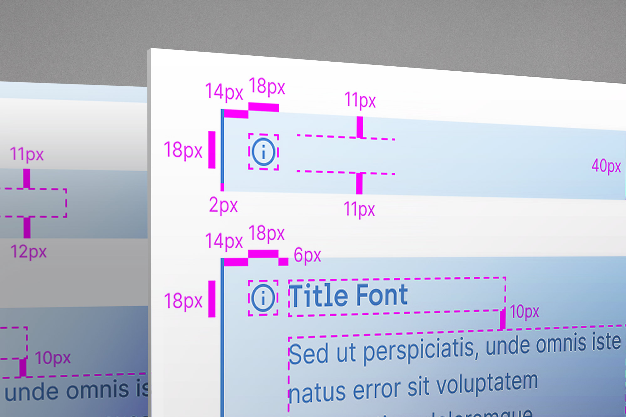
The anatomy documentation - detailed redline specs showing exact pixel values for padding, gap, and icon sizing - served a dual purpose: it gave designers a precise reference for composing new screens, and gave developers the specification needed to implement components in Storybook with accuracy.
Callout
5 semantic variants: neutral, info, success, warning, danger. Text, icon+text, title, and full action configurations. Full anatomy with px redlines.
Menu & Divider
5 menu variants: normal, sections with icons, sections with headers, text content with nesting, and buttons content. Horizontal and vertical dividers with anatomy.
Tags & Tree
Tags in 9 states (active, removable, icons, semantic colours). Tree component in 4 structural templates: folders, arrows, bullets, with additional icon sets and on-hover action patterns.
Progress & Spinner
Progress bars and circular spinners across 5 semantic colour states. Size variants, loading message configurations, and dark/light background usage examples.
Charts
Area charts, area spline charts, and pie/donut charts. All interactive states (hover, selected segment) documented. Colour coding and legend placement standardised.
Tabs & Skeleton
Tabs in controlled and uncontrolled modes, with icon variants and count badges. Horizontal tab layout. Skeleton loading states for cards, tables, and content blocks.
Breadcrumbs
Normal, hover, with icons, start-folded, and end-folded variants. Current page as input state. Anatomy with pixel-level spacing documentation for all configurations.
Non-ideal states
Empty states and error states in vertical and horizontal layouts. 5 configuration variants including icon-only, with text, with CTA. Covers no-results, empty sections, and error views.
Pagination
Multiple pagination styles: simple numbered, numbered with ellipsis, and full "showing X to Y of N rows" with page-size selector. All used across CrystalBridge data tables.
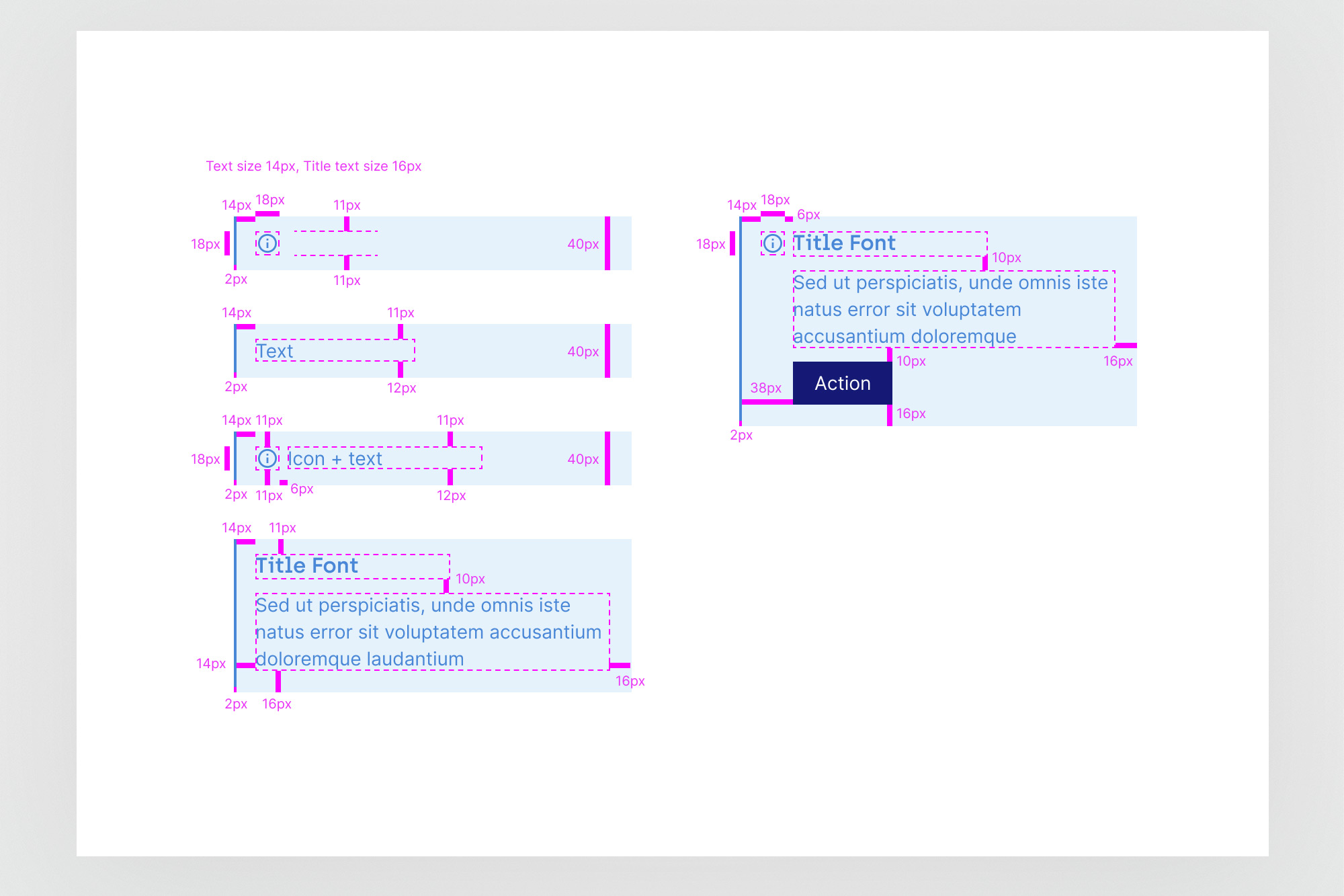
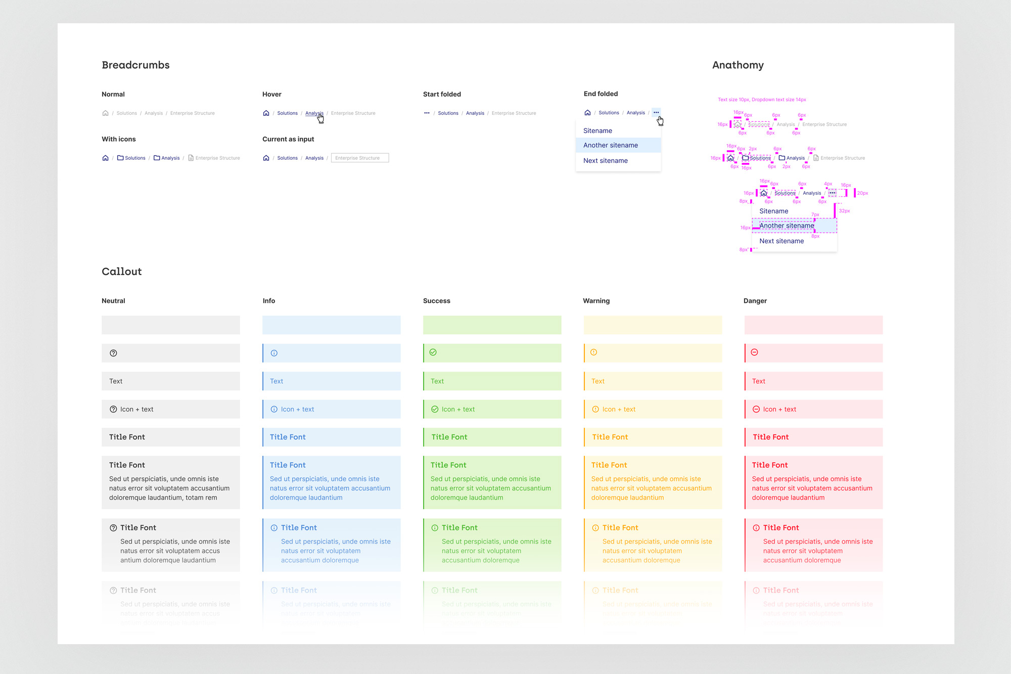
Anatomy documentation style - every component includes pixel-level redlines (magenta annotations) showing all spacing, sizing, and typography values. The same format was used for every component, making both Figma usage and developer implementation consistent across the library.
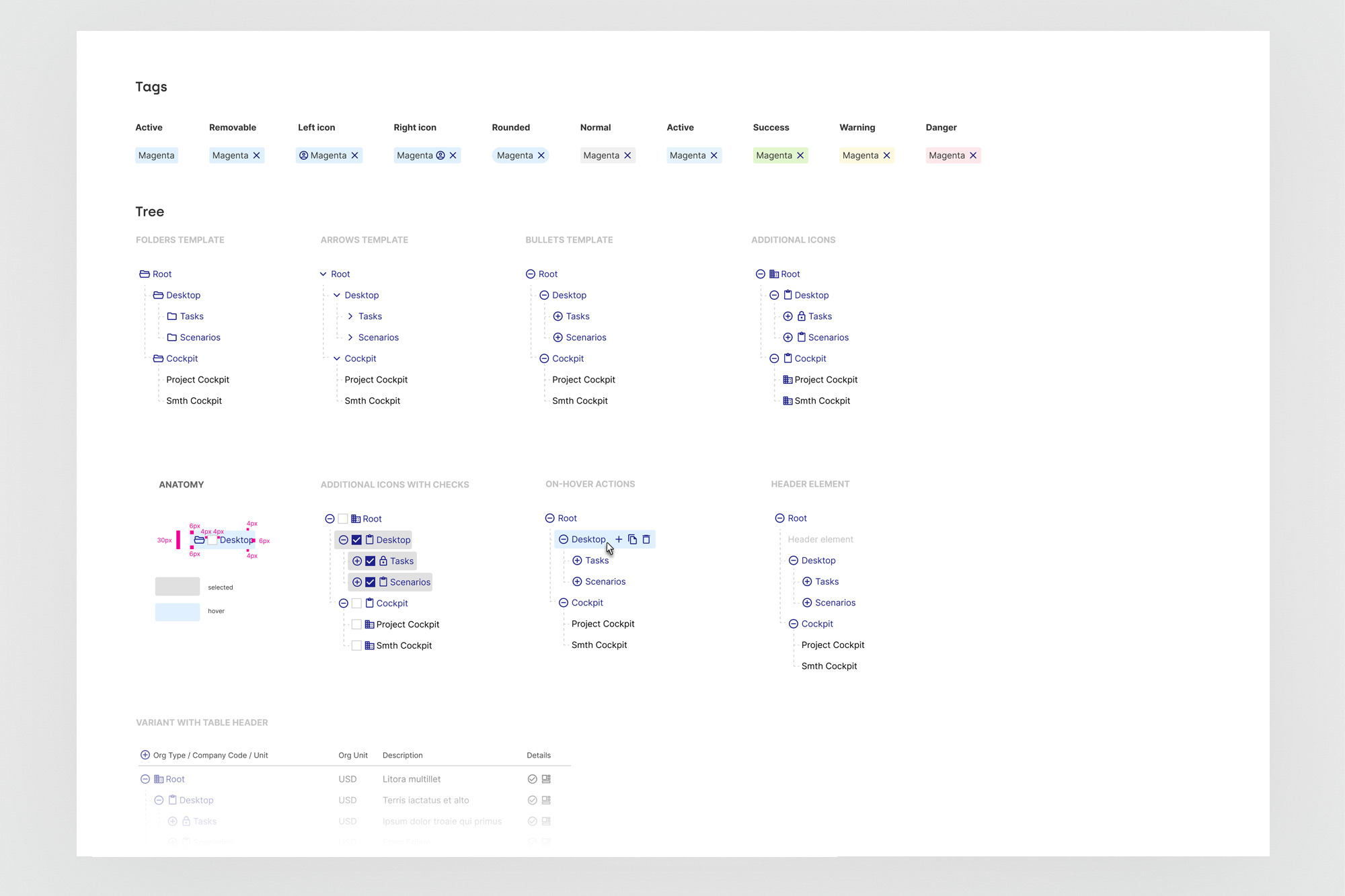
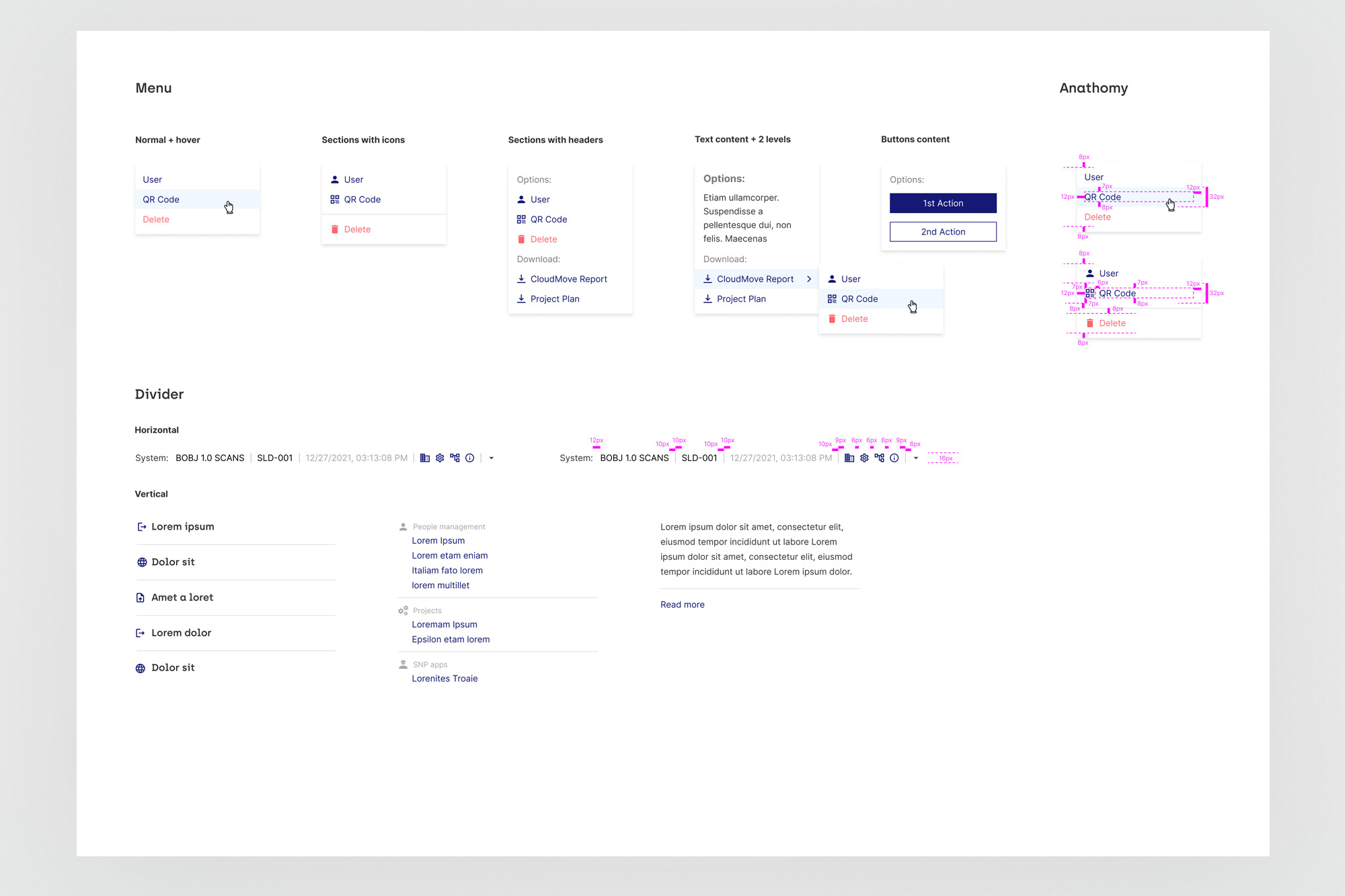
Tags (9 state/colour variants) and the Tree component with four structural templates - the Tree was one of the most complex components in the system, used extensively in the Organization Structure module. Menu variants cover the full range from simple lists to multi-level nested navigation with action buttons.
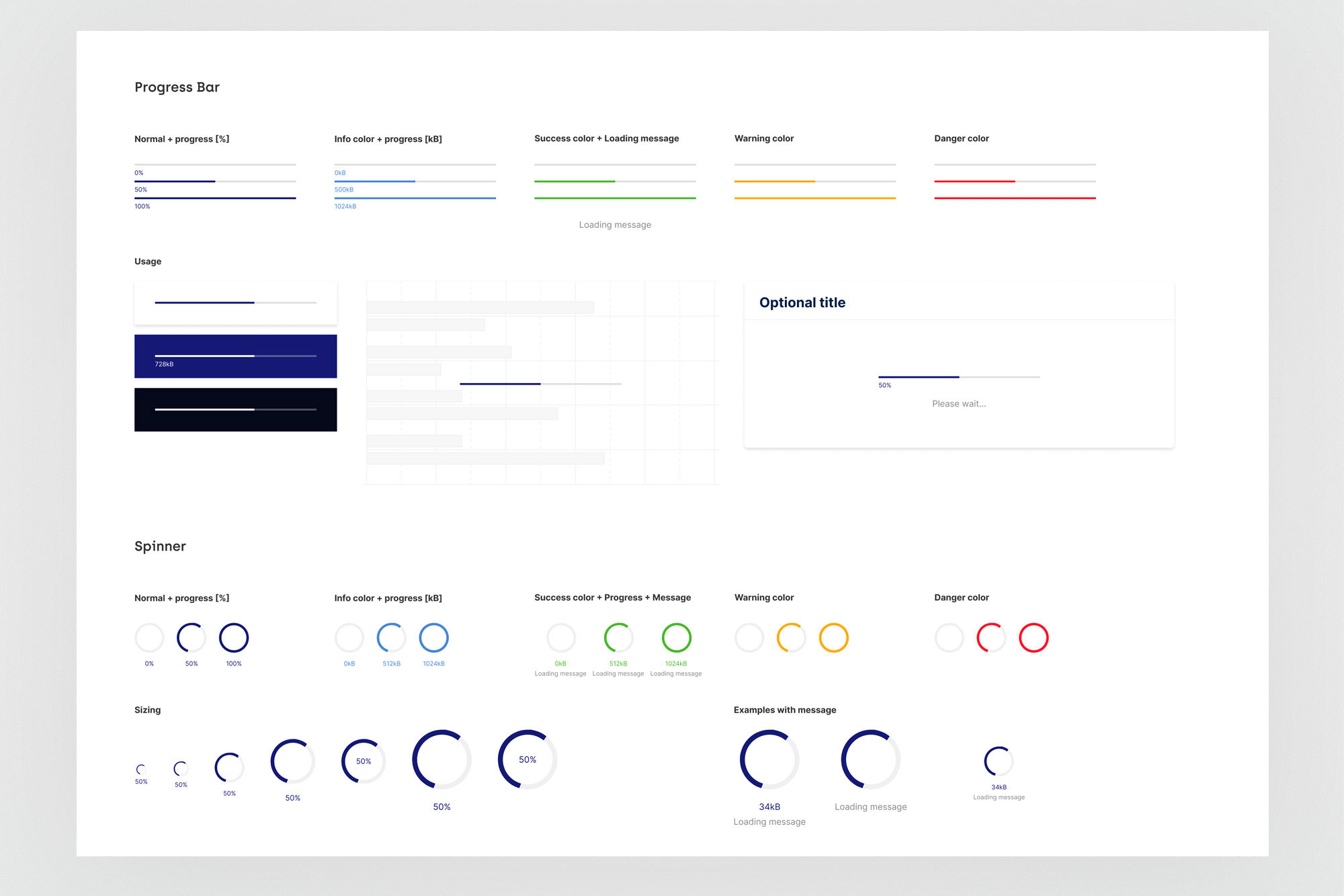
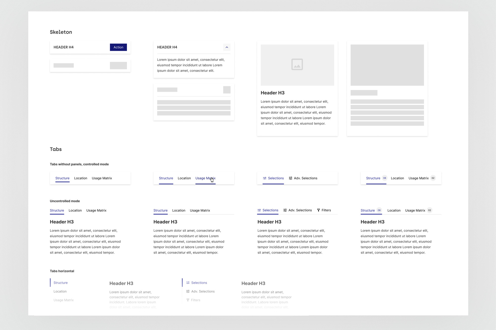
Progress and Spinner components across all 5 semantic states (normal, info, success, warning, danger) with size variants and message configurations - used directly in the Glue Cloud pipeline monitoring views. Skeleton and Tabs were among the most frequently reused components across all CrystalBridge modules.
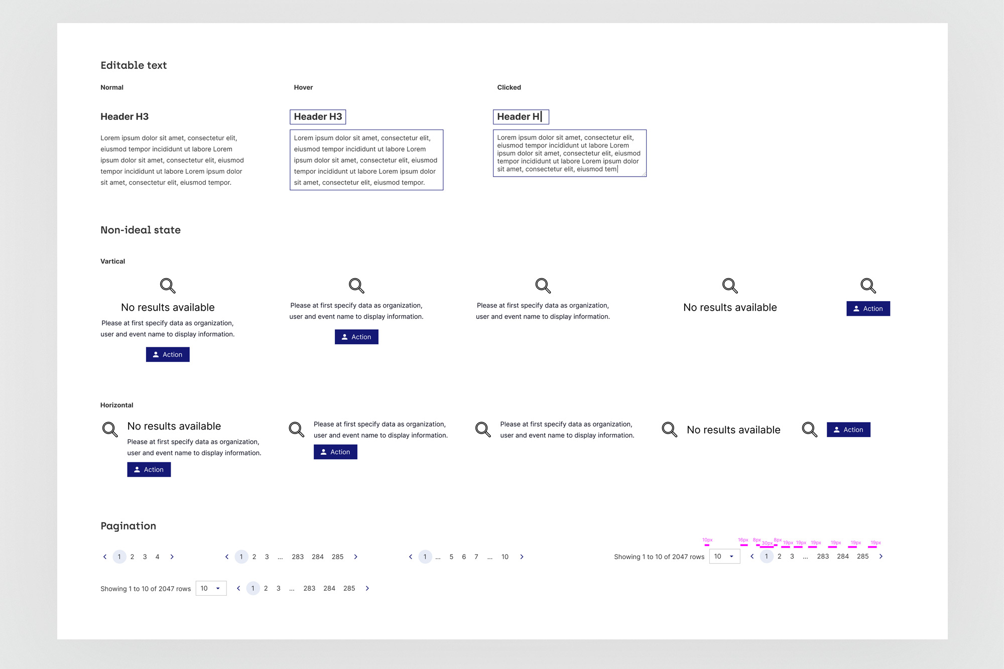
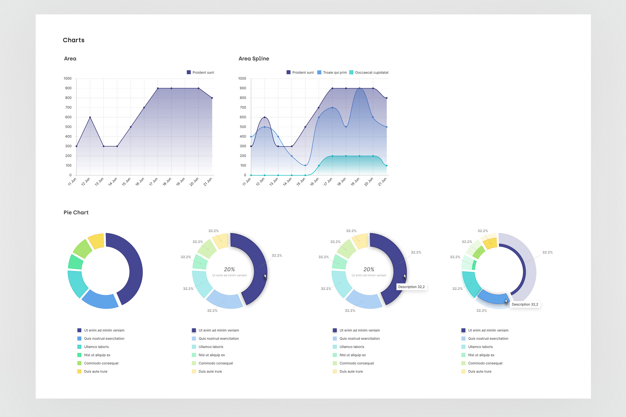
Non-ideal states (empty and error) in both vertical and horizontal layouts - critical for a data-heavy platform where "no results" is a common and meaningful state. Chart components covering area, spline, and donut variants with interaction states and colour standardisation for data series.
06. Outcomes
Consistency shipped. Velocity unlocked.
The design system became the foundation on which all subsequent CrystalBridge work was built - including the Organization Structure module and Glue Cloud, both designed entirely from the existing component library without requiring new one-off patterns. Its value was felt most directly in the speed and consistency of new feature design: with foundations and components already decided, the work was composition, not construction.