01. Overview
Designing inside inherited constraints
CrystalBridge 1.0 was a mature enterprise platform by the time I joined SNP. It had an existing visual identity, an existing component library, and a user base - SAP transformation consultants and enterprise clients - who depended on it daily for managing and analysing complex business processes across organisations.
My work on CrystalBridge 1.0 was not a redesign. It was a refinement: tightening the existing style guide, clarifying component definitions, establishing more precise usage rules, and applying all of this to new and revised interface areas - particularly dashboards, overview screens, and the advanced filtering system. Every design decision had to work within an inherited visual language, even when there were legitimate arguments for changing it.
That tension - between the constraints of the existing system and the growing list of things that weren't working - became the foundation for an eventual conversation with SNP's leadership about whether CrystalBridge needed more than refinement. That conversation led to CrystalBridge 2.0.
02. The challenge
Fragmentation built up over time, across teams
CrystalBridge 1.0 had been built incrementally by multiple teams over several years. The existing style guide was a starting point, not a complete system - its component definitions were underspecified, its usage rules were ambiguous, and there was no shared enforcement mechanism. Individual teams had interpreted it differently, and those differences had accumulated into a platform that felt inconsistent from one module to the next.
The visual inconsistency was the symptom. Underneath it were two more fundamental problems. First, the information architecture in several key areas was disordered - elements were positioned based on implementation history rather than user need, and the relationship between different data panels wasn't always clear. Second, the component library had gaps - some interaction patterns simply weren't specified, which meant developers made their own decisions in the absence of design guidance.
The core constraint
"Working within an existing style guide - even a flawed one - means that every improvement has to negotiate with what already exists. The goal is consistency and clarity, not a blank canvas. The discipline here is knowing when you can improve within the system, and when the system itself is the problem."
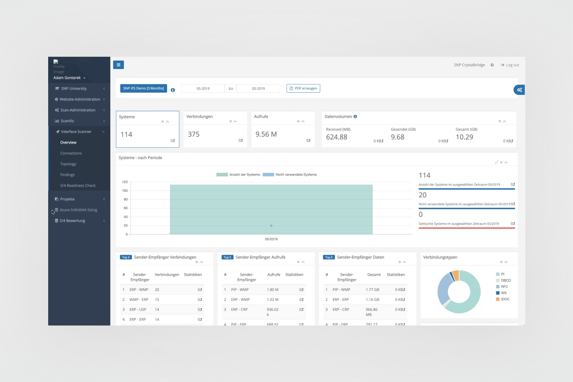
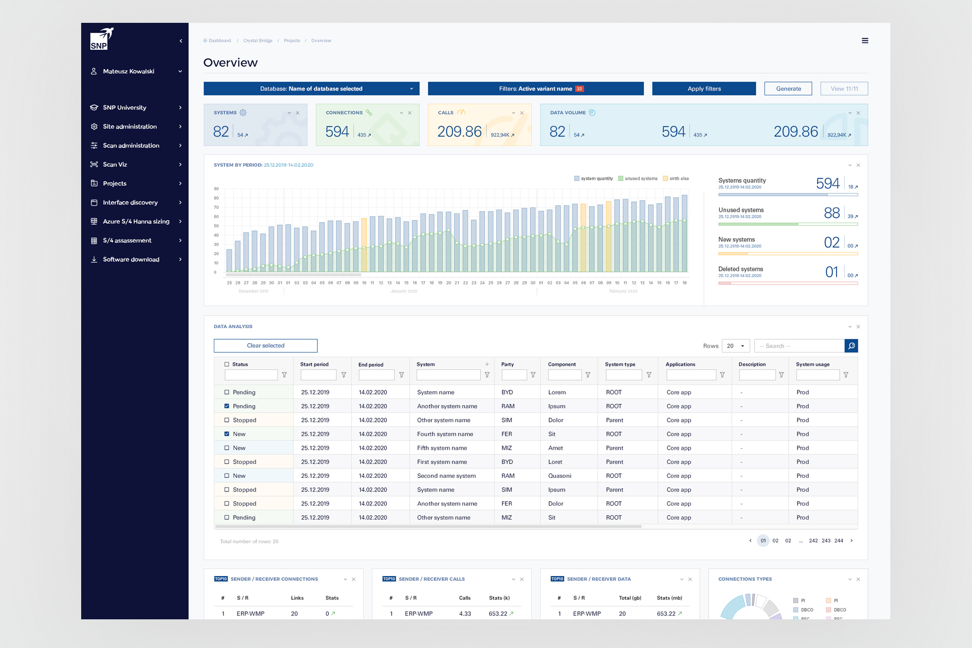
Earlier version (left) vs CrystalBridge 1.0 (right). The navigation structure, metric card layout, and chart panel organisation were all refined - lighter sidebar, cleaner hierarchy, more structured data panels - while staying within the existing visual language.
03. My role
Clarifying, standardising, and applying the rules
My work on CrystalBridge 1.0 was threefold. First, I worked on the component library itself - going through existing components, documenting their anatomy more precisely, defining their states, and filling in the gaps where no specification existed. The goal was that any designer or developer looking at the library would find unambiguous answers, not starting points for interpretation.
Second, I received the results of user research that had been conducted prior to my involvement. This gave me a grounded understanding of which parts of the platform were causing the most friction - not as abstract design problems, but as documented user pain points that needed addressing. The research pointed clearly at dashboards, overview screens, and the filtering interface as the highest-priority areas.
Third, I designed interface solutions for those priority areas. Every layout decision - panel arrangement, information hierarchy, filter structure - had to be justified within the existing style guide. When the style guide didn't cover a case, I extended it in a way that was consistent with its existing decisions, rather than introducing new visual language.
04. Key screens
Priority areas: dashboards, overviews, and filtering
The three areas most clearly identified by user research - overview dashboards, data analysis tables, and the advanced filter interface - were where the information architecture problems were most visible. These were also the most frequently used screens in the platform, which made their inconsistencies the most impactful.
Overview screen. The primary entry point for transformation analysis. Metric summary cards at the top (Systems, Connections, Calls, Data Volume) with period-based bar charts and a detailed data analysis table. The layout establishes a clear top-to-bottom information hierarchy: summary → trend → detail. All within the existing visual language - dark sidebar, blue accents, white content area.
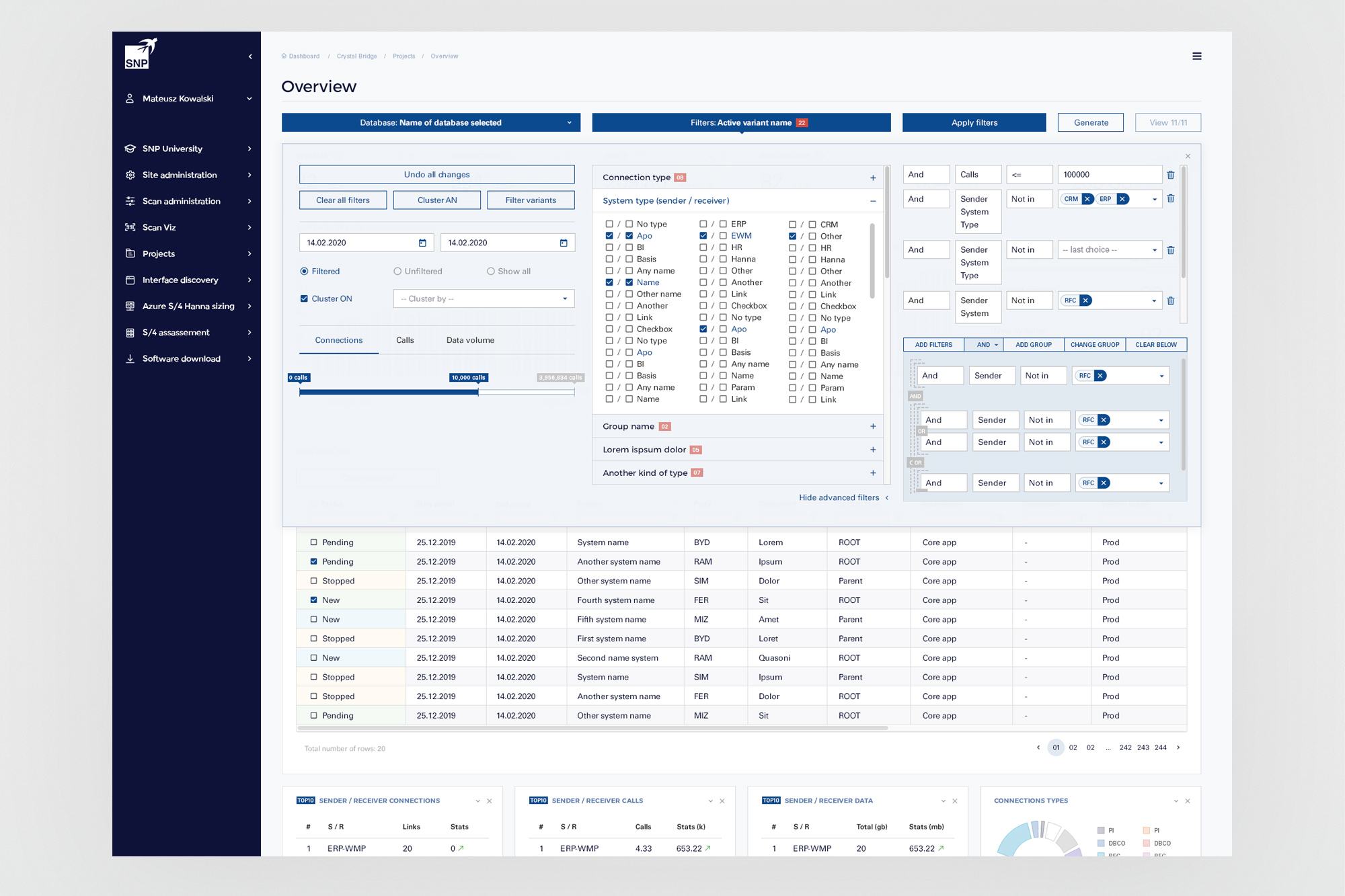
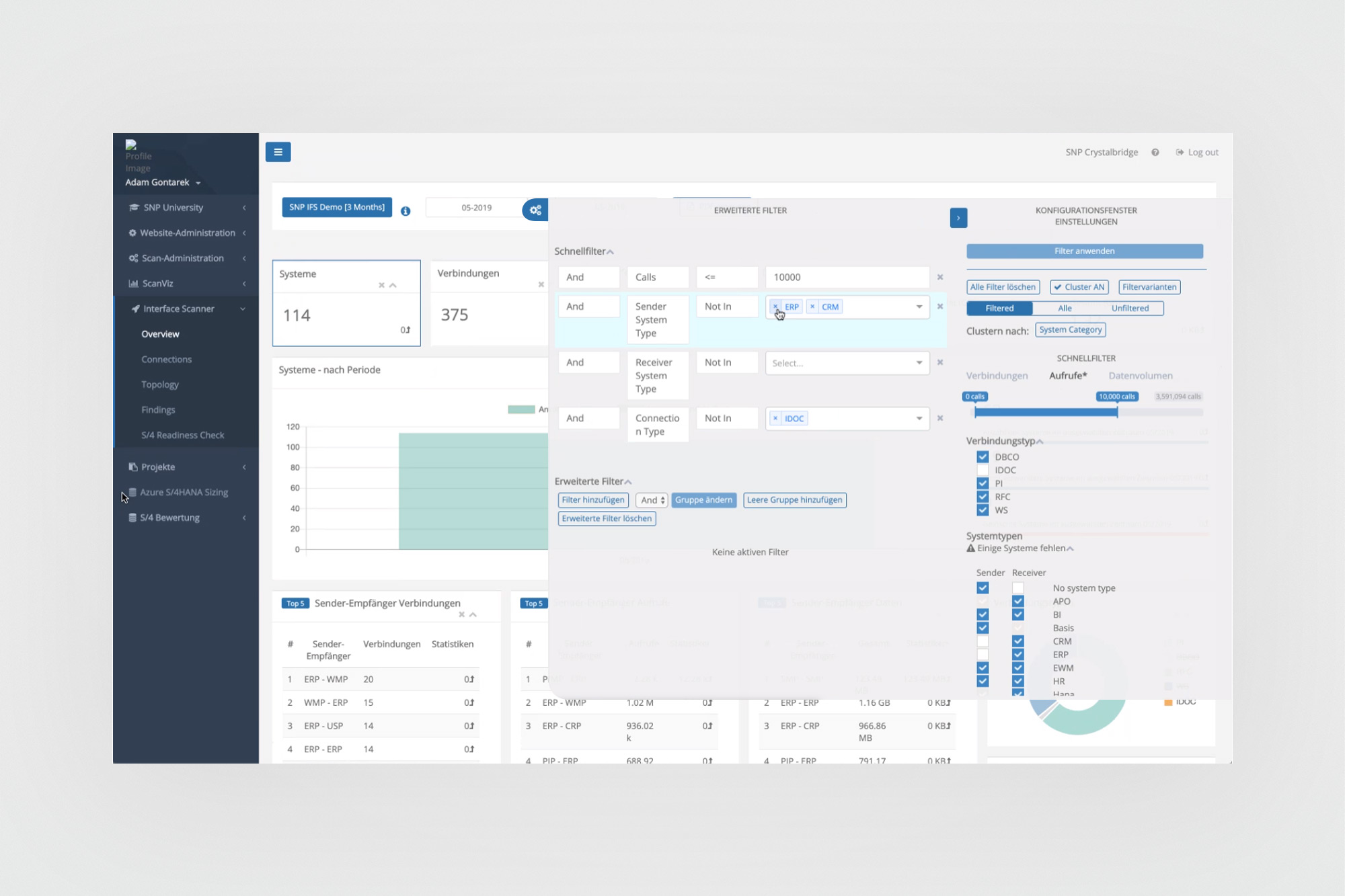
Advanced filter system. One of the most complex interfaces in the platform. The full-screen filter overlay organises controls into three columns: quick filter settings on the left, a system-type selection matrix in the centre, and an advanced filter builder with logical operators on the right. Designing this required making dozens of structural decisions about how to present complex, nested filter logic in a way that was both powerful and readable - while staying within existing component patterns.
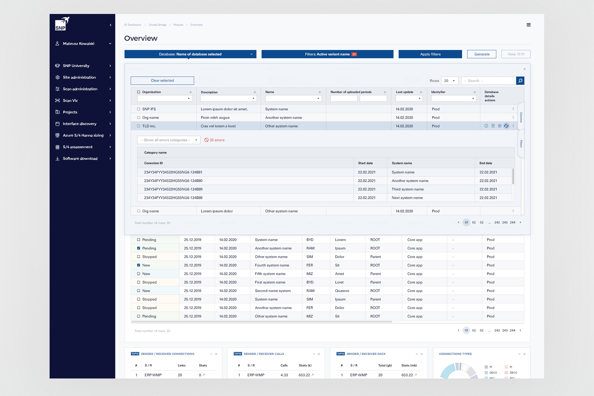
Data table with expandable rows. A core pattern used across the platform. The expandable row reveals detailed connection data including error counts and connection IDs - the design had to handle both the collapsed and expanded states consistently, with an inline error display that used the existing semantic colour system without introducing new components.
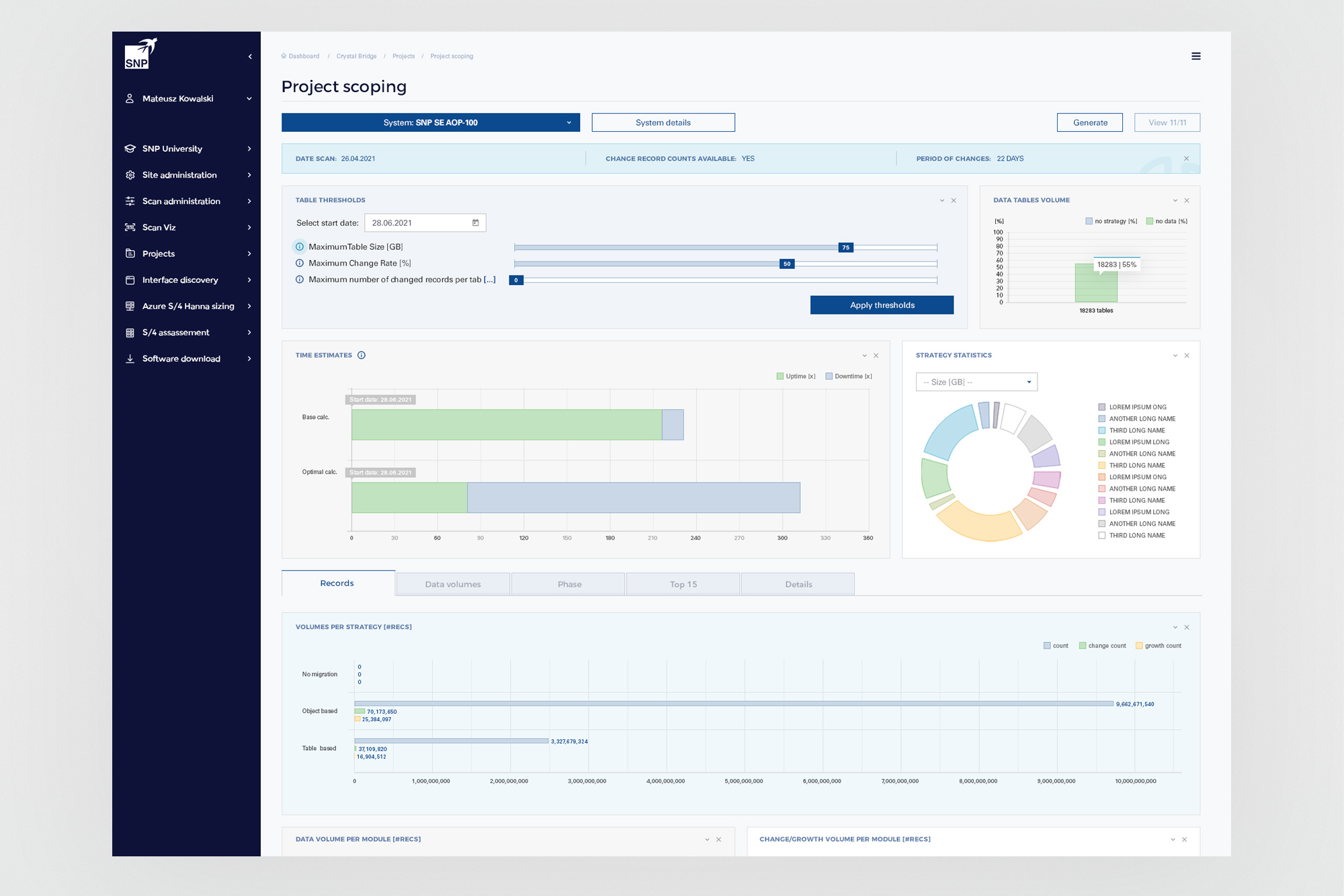
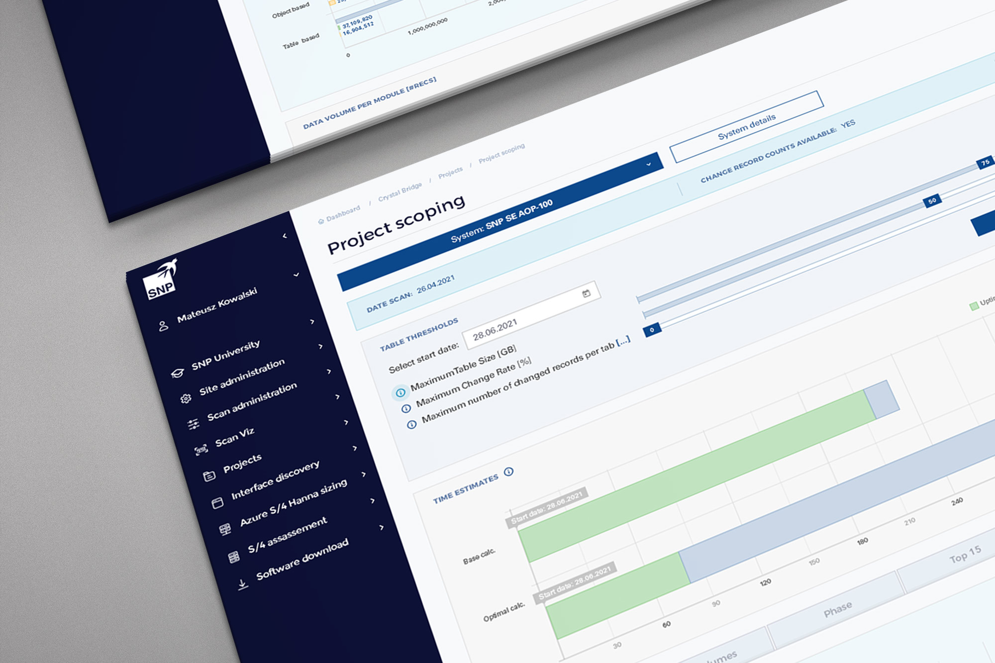
Project Scoping. A specialised analytical view for estimating transformation scope and timing. Table threshold sliders, time estimate Gantt bars (base vs optimal calculation), data tables volume charts, and a strategy statistics donut - all in one view. The challenge was fitting this density into the existing layout grid without the screen collapsing under its own complexity.
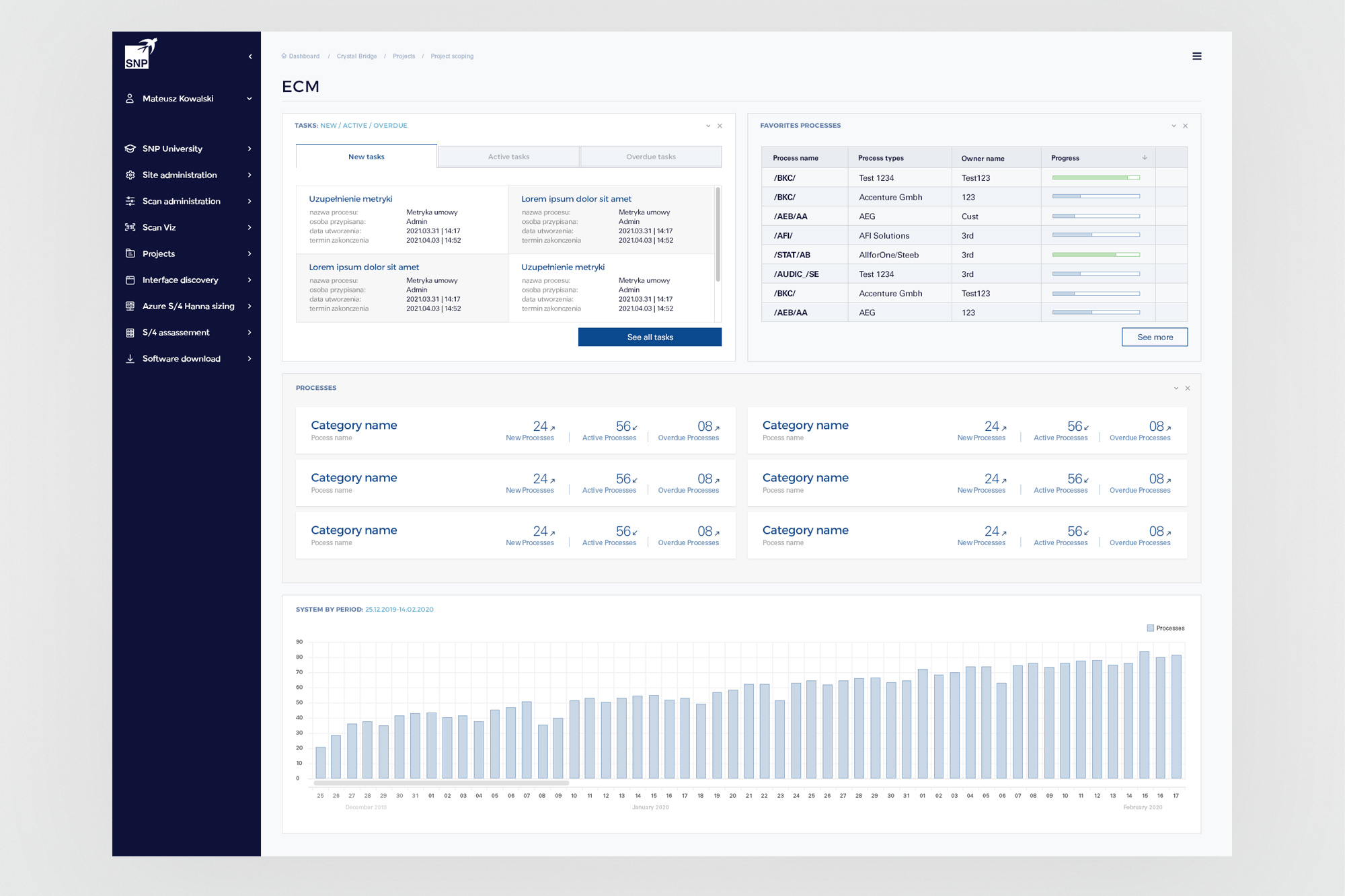
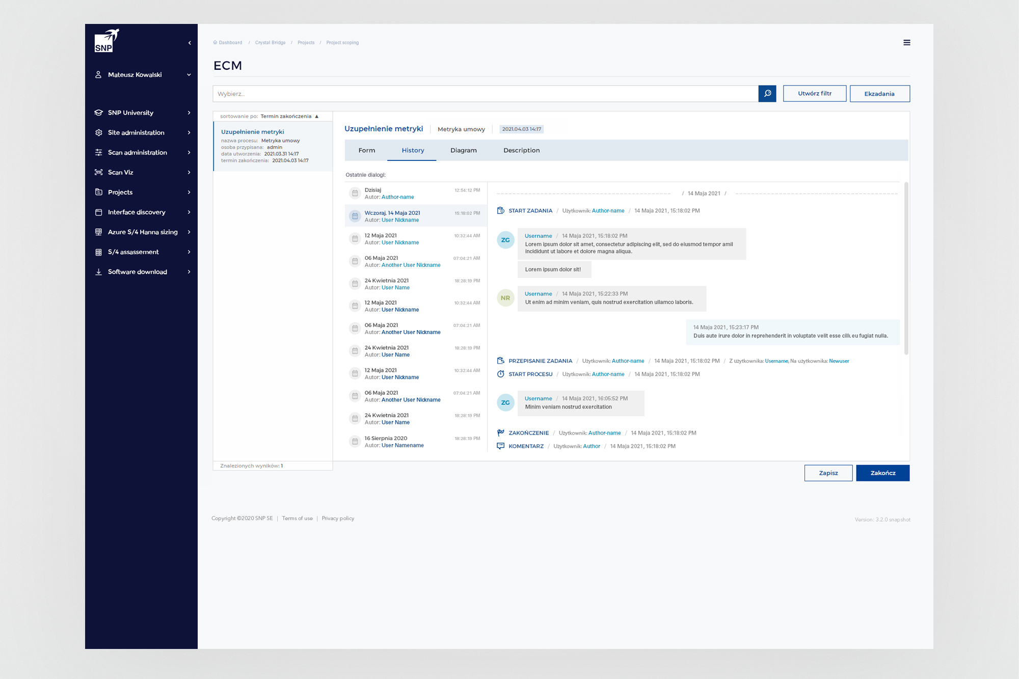
ECM module - dashboard and task detail. The ECM (Enterprise Content Management) area introduced a workflow layer: tasks with new/active/overdue states, a favourites process list, and a process grid. The task detail view combines a form panel with a chronological history thread - a more collaborative, document-centric interaction pattern than the data-analysis views elsewhere in CB.
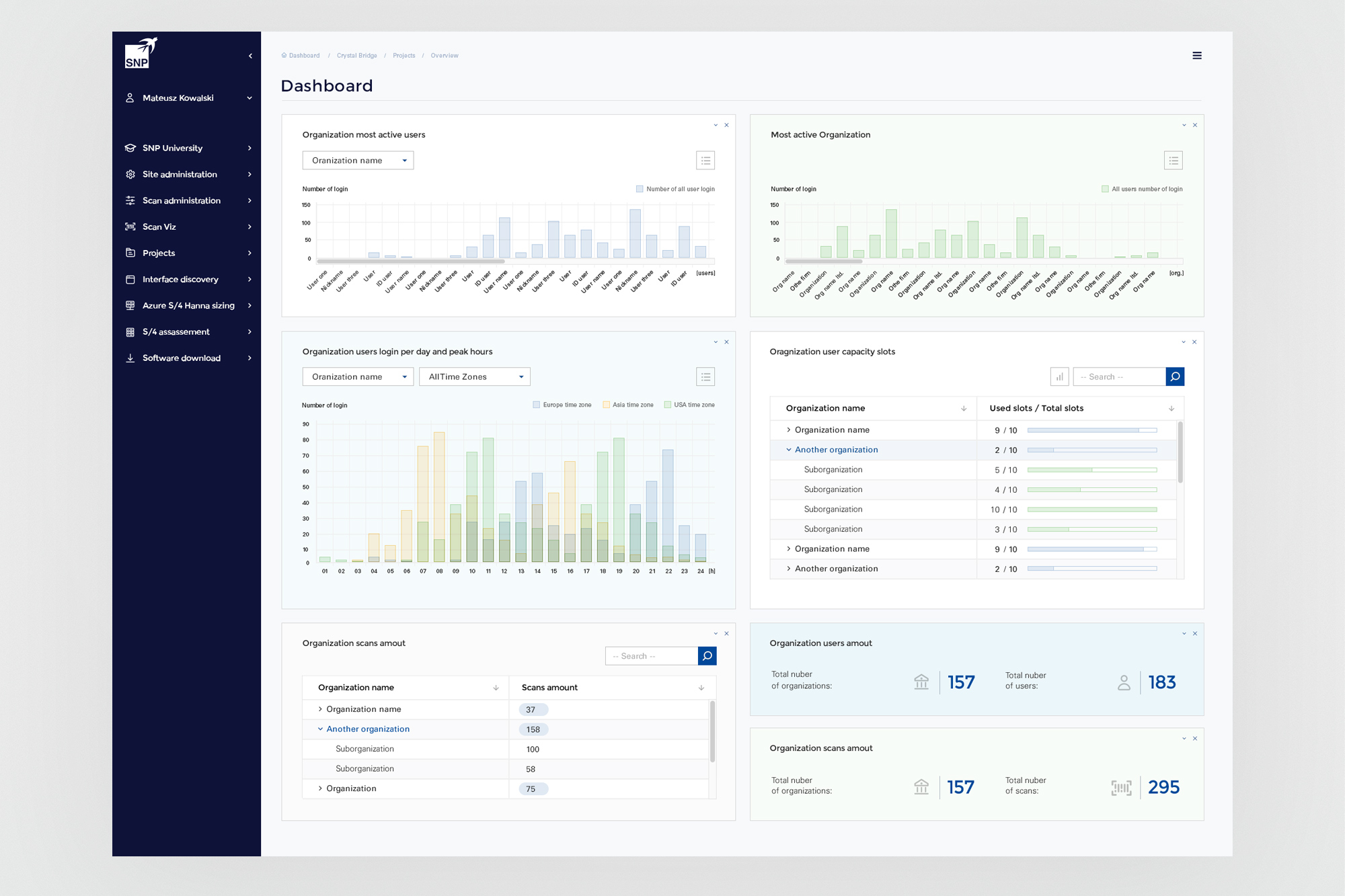
Admin Dashboard. A platform administration view showing organisation-level usage analytics: most active users, most active organisations, login patterns by time zone, and user capacity slot utilisation. The tree table component - showing organisation hierarchies with expandable suborganisations and slot usage bars - was one of the more structurally complex patterns to specify clearly within the existing system.
05. Outcomes
Better 1.0 - and the foundation for 2.0.
The CrystalBridge 1.0 work delivered measurable improvements to the platform's consistency and usability within the inherited design constraints. But its longer-term significance was different: the process of working inside those constraints - and accumulating a clear, documented understanding of where they failed - produced exactly the evidence needed to make the case to SNP's leadership that CrystalBridge needed more than incremental refinement.