01. Overview
One central team. Many markets. Every brief different.
ROCKWOOL Group is one of the world's largest manufacturers of stone wool insulation - a Danish company with production sites, sales offices, and subsidiary operations across more than 40 countries. Its products range from building insulation (thermal, acoustic, fire protection) to industrial applications and automotive components.
The global Marketing & Branding department functions as a centralised creative service for the entire group. Subsidiary companies from Lithuania to the Philippines, from the Netherlands to the UK, submit design requests - and the team produces. Every piece leaves the department with the same visual language: ROCKWOOL red, clean typography, and strict adherence to brand guidelines that have been built over decades to reflect the company's engineering-grade standards.
I joined as a Senior Graphic Designer for a six-month contract engagement. Each morning started with a team daily stand-up where new requests were reviewed and distributed across the team. From that point, each designer owned their assigned tasks through to final production and delivery - fully responsible for quality, brand compliance, and turnaround time.
02. The work
Broad scope, non-negotiable brand standard
The range of deliverables was deliberately broad - this is the nature of an in-house global design service. One day might involve producing a carousel series for LinkedIn across six department verticals; the next, a printed event invitation in Lithuanian, a product comparison poster for the Philippines market, and a display banner campaign for Estonia. The common thread was always the same: the ROCKWOOL brand guidelines were the ceiling, not a starting point for negotiation.
Working in this environment sharpens a particular kind of design discipline - the ability to deliver variety within tight constraints, and to make every brief feel resolved and intentional even when the brief itself is minimal. A subsidiary team submitting a request often had no more than a copy block, a product name, and a market - the visual approach, the photography selection, and the compositional logic were the designer's decision to make.
The core discipline
"Working in a global brand team at this scale means that consistency is the product. Every market, every language, every channel - the brand must be instantly recognisable. The designer's job is to make variety feel inevitable within a fixed visual system."
Social media posts & carousels
LinkedIn and Instagram - employer branding, product campaigns, department introductions, #InsideROCKWOOL series.
Print - posters & flyers
Event invitations, internal campaigns, product comparison sheets - in multiple languages and for multiple national markets.
Display banners
Digital advertising banners for national markets (Estonia, Netherlands) - product campaigns in local languages.
E-commerce feature design
UI feature design for the ROCKWOOL B2B webshop - product listing page layout with new filtering and variant selection functionality.
Interactive PDFs
Campaign documents with interactive elements - including a quality-themed quiz document for an internal engagement initiative.
PPTX presentations & internal comms
Branded presentation templates and internal communication materials for department teams across the group.
04. Print & digital
From a ski resort invitation to a Manila product sheet
Print and digital requests arrived from across the group - each with its own market context, language, and specific purpose. The visual approach had to adapt while the brand remained constant. A flyer for an internal team event in Lithuania required a completely different tone from an anti-counterfeit product poster for the Philippines market - but both had to be unmistakably ROCKWOOL.
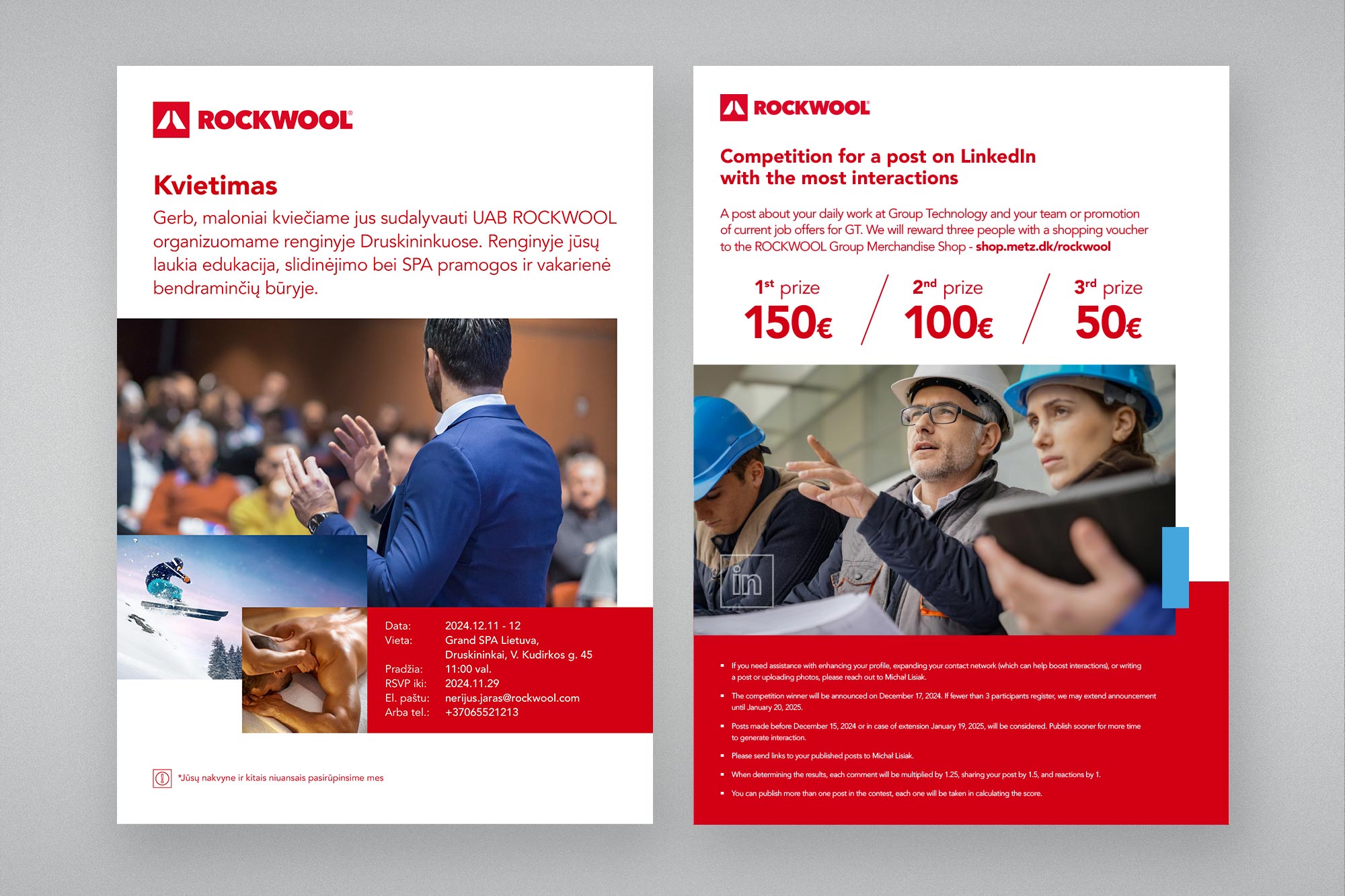
Event invitation and LinkedIn competition flyer. Left: a team event invitation for UAB ROCKWOOL Lithuania - printed A4, combining lifestyle photography (skiing, spa, audience) with a structured event details block and clean ROCKWOOL typography. Produced in Lithuanian. Right: a LinkedIn interaction competition flyer for the Group Technology department - prize structure (€150 / €100 / €50), competition rules, and strong typographic hierarchy in an internal communications format.
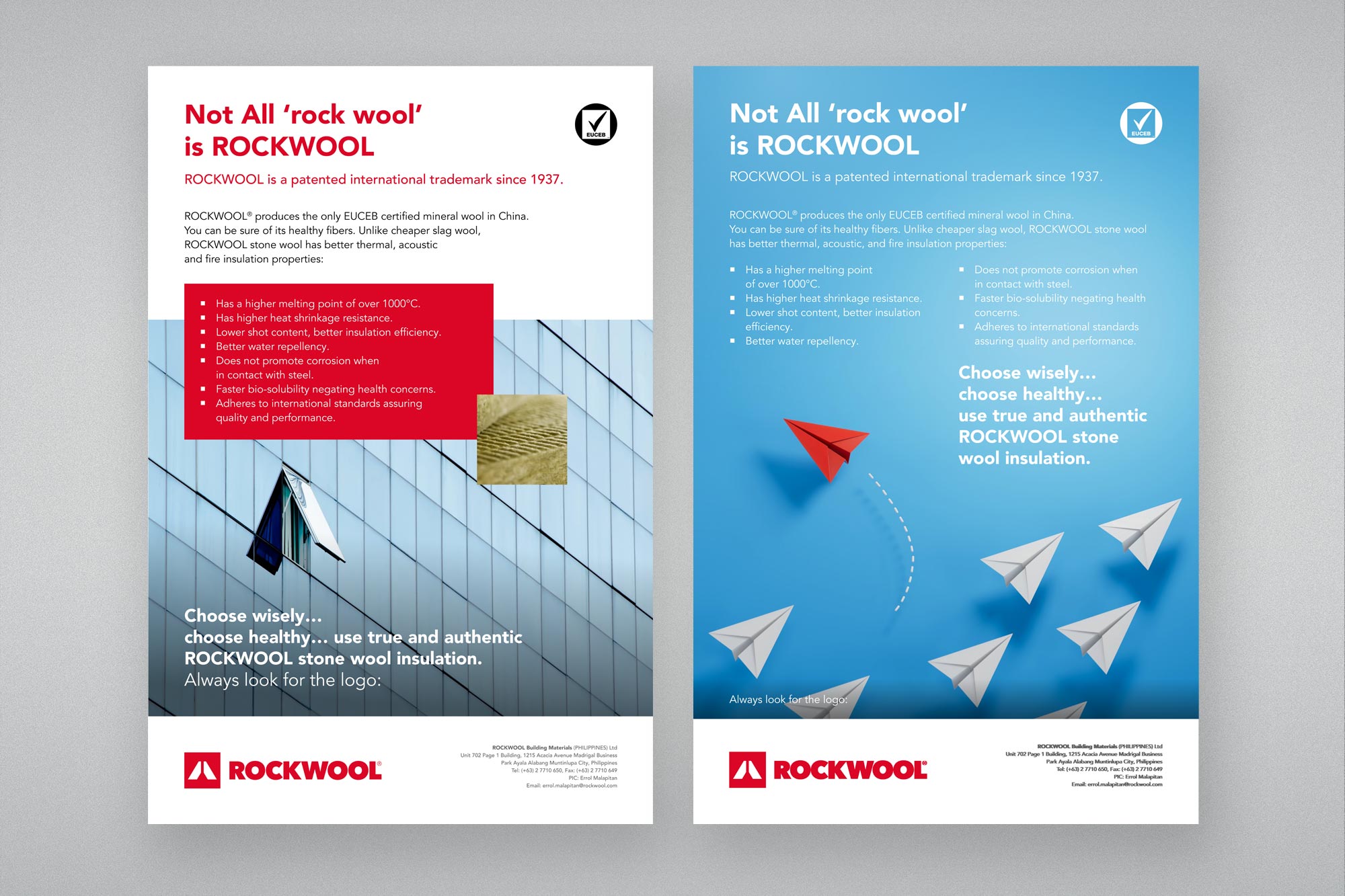
"Not All rock wool is ROCKWOOL" - product authenticity poster. Produced for ROCKWOOL Building Materials Philippines. Two colour variants: a white-background technical version and a high-impact blue-background emotional version. Both communicate ROCKWOOL's EUCEB certification and technical superiority over cheaper slag wool alternatives - a direct anti-counterfeit communication piece for a market with significant substitution risk. The red paper plane leading a formation of grey planes is a strong, market-tested visual metaphor for genuine quality.
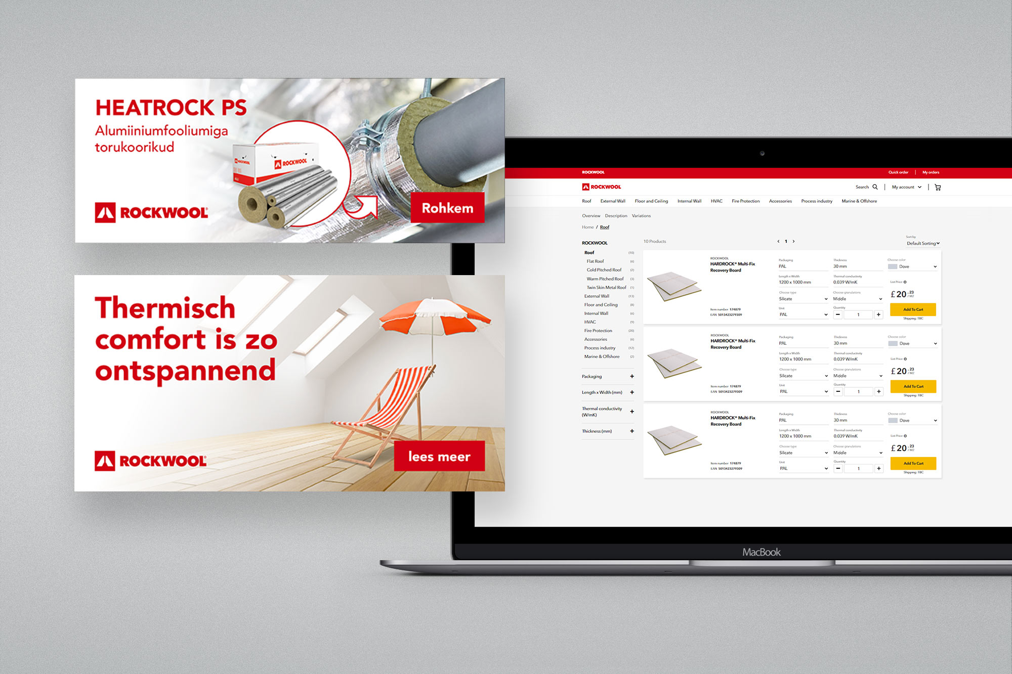
Display banners and e-commerce feature. Upper left: product banner for ROCKWOOL Estonia - Heatrock PS pipe insulation with aluminium foil, in Estonian. Lower left: lifestyle campaign banner for Netherlands - "Thermisch comfort is zo ontspannend" - comfort-led messaging in Dutch. Right: B2B webshop product listing page with a new filtering and variant selection feature - HARDROCK Multi-Fix Recovery Board with packaging, thickness, and colour configurators alongside Add-to-Cart functionality. The webshop feature required working within the existing platform UI constraints while introducing a new interaction pattern.
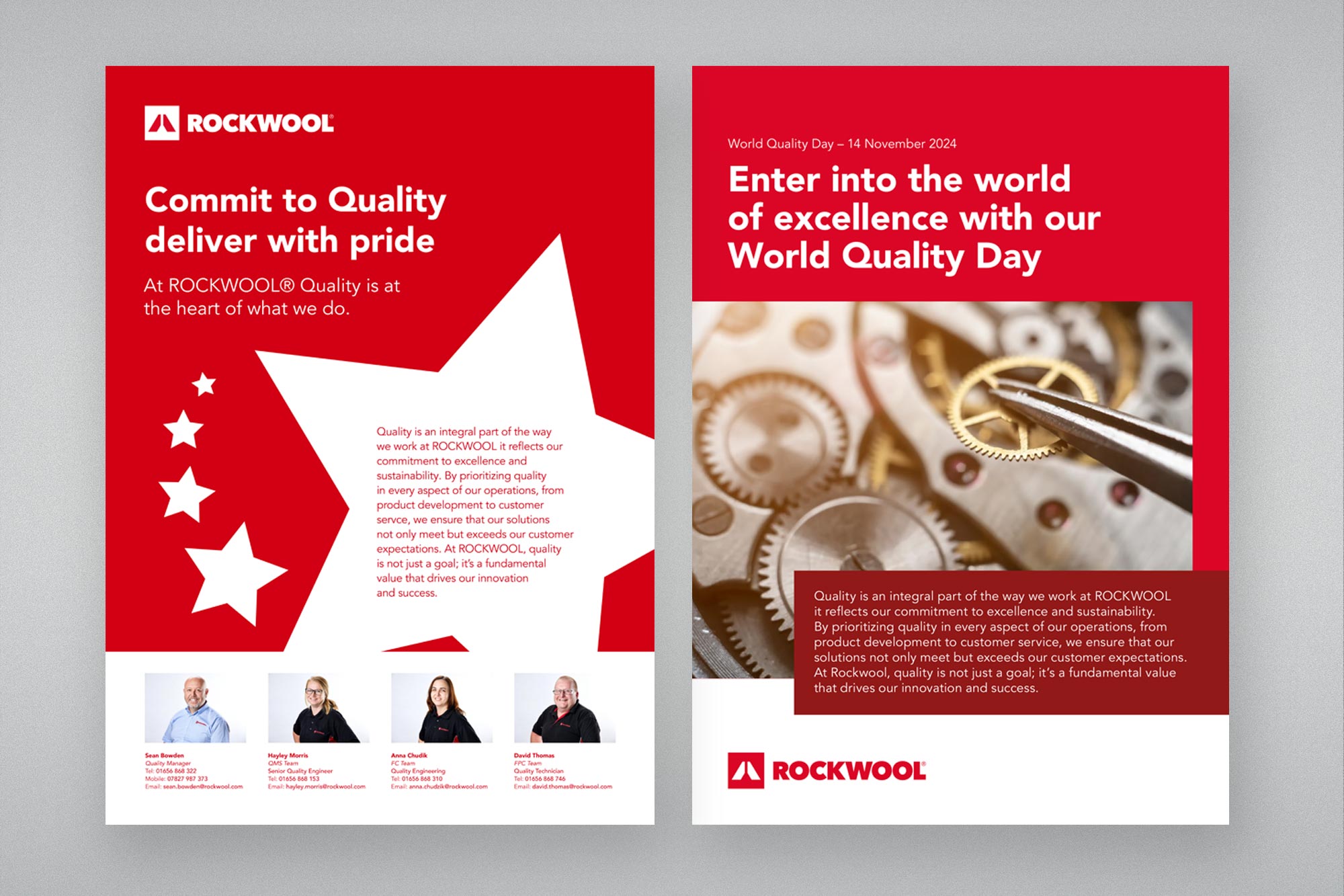
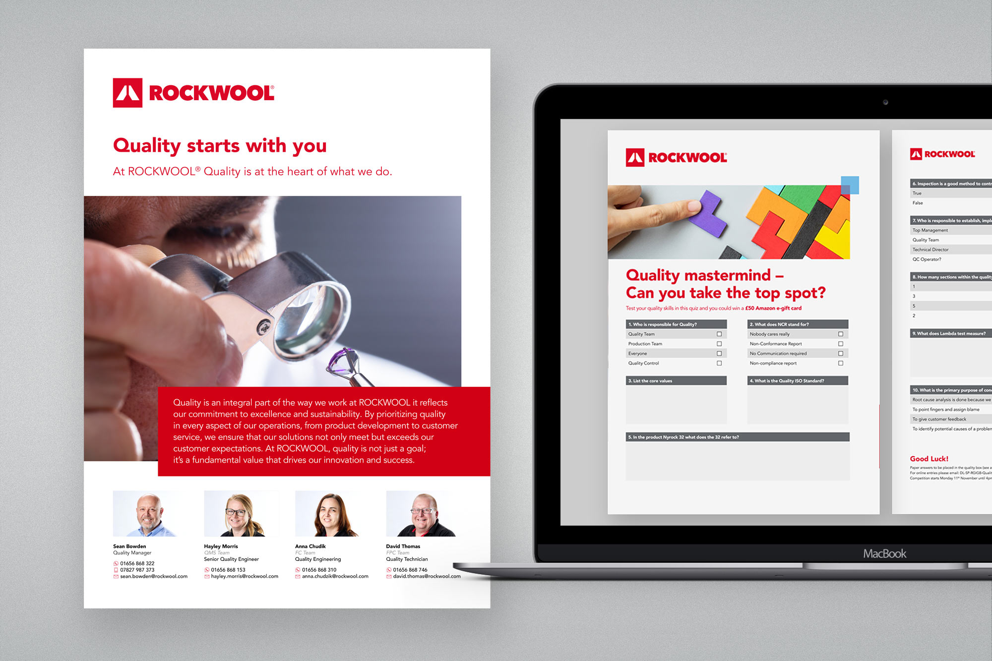
World Quality Day campaign - UK plant. Left: two poster variants for World Quality Day (14 November 2024) - a bold red-and-white star graphic version and a photography-led version with precision engineering imagery. Both feature a four-person quality team with named photo credits, reflecting the internal campaign's goal of humanising the quality function. Right: the quality campaign extended into an interactive PDF format - a branded "Quality mastermind" quiz printed as a take-away sheet alongside the digital poster, with a £50 Amazon e-gift card prize. The combination of poster, people photography, and interactive document shows the multi-format thinking applied to a single campaign brief.
05. Outcomes
On-brand, on-time, across every market.
The contract concluded positively - I left with strong references from the team lead. In six months, I delivered across social media, print, digital advertising, e-commerce, and internal communications for multiple ROCKWOOL subsidiaries, without a single brand exception. The work was what it needed to be: consistent, professional, and immediately legible as ROCKWOOL - regardless of the market, the language, or the channel.
03. Social media
Employer branding and product storytelling - at global scale
A significant portion of the work was social media production for LinkedIn and Instagram. One of the recurring campaign formats was the #InsideROCKWOOL employer branding series - carousel posts profiling individual departments, combining a department headline, a VP-level quote, a recruitment CTA, and the brand's social channel callout. Each carousel was produced as a consistent four-panel sequence, adapted per department with relevant photography and appropriate colour temperature.
The challenge was making each series feel distinct to its subject while remaining immediately recognisable as ROCKWOOL. The Supply Chain series used motorway photography; Marketing & Communications used architectural glass with a green tint; Finance used blue-toned commercial imagery. The template was fixed - the visual judgement was the designer's.
#InsideROCKWOOL - Sourcing & Procurement. Four-panel carousel: department headline ("Empowered to generate the greatest possible value"), VP quote, recruitment CTA (#InsideROCKWOOL), and brand social media callout. Shown here in both the flat card format and mocked up on a phone in Instagram feed context.
#InsideROCKWOOL - Marketing & Finance. Two further department carousels shown in the horizontal strip format used for LinkedIn. Each uses a distinct photographic palette: green-tinted architectural glass for Marketing & Communications; deep blue for Finance & Control. The four-panel structure is identical across all departments - logo, headline, quote, CTA - maintaining series coherence while feeling visually tailored.
#InsideROCKWOOL - Supply Chain & Logistics. Motorway and logistics photography for the Supply Chain series. Quote from the Supply Chain & Logistics Director. The template accommodates long director quotes without layout breaking - a deliberate design decision in the carousel structure to handle the range of copy lengths across different departments.
Product social media - two formats. Left: Group Technology employer branding post in portrait format for Instagram. Right: Two product carousels - a building insulation benefits explainer (Direct benefits / Indirect benefits split) and an LC Spanrock stone wool sustainability post highlighting a 45% reduction in Global Warming Potential. Each uses ROCKWOOL's multi-panel format with coloured background segments and clear typographic hierarchy.