01. Overview
Three websites - one effort to grow beyond a single client
For most of its life, Mergesoft's revenue came almost entirely from NeoBank. As the company matured, it set out to change that - building a public-facing identity and expanding into adjacent services. The websites in this case study were part of that push: a corporate site for Mergesoft itself and two iterations of a product site for Topdata, a hosting and domain service built on Mergesoft's own infrastructure.
All three sites were built on a custom CMS developed in-house by Mergesoft's engineering team. My role covered the full design and front-end theming: visual design, layout, component design and CMS template implementation. The work happened alongside my other Mergesoft engagements - the ERP system, HSB banking app and Feedback tool - as part of the same ongoing collaboration.
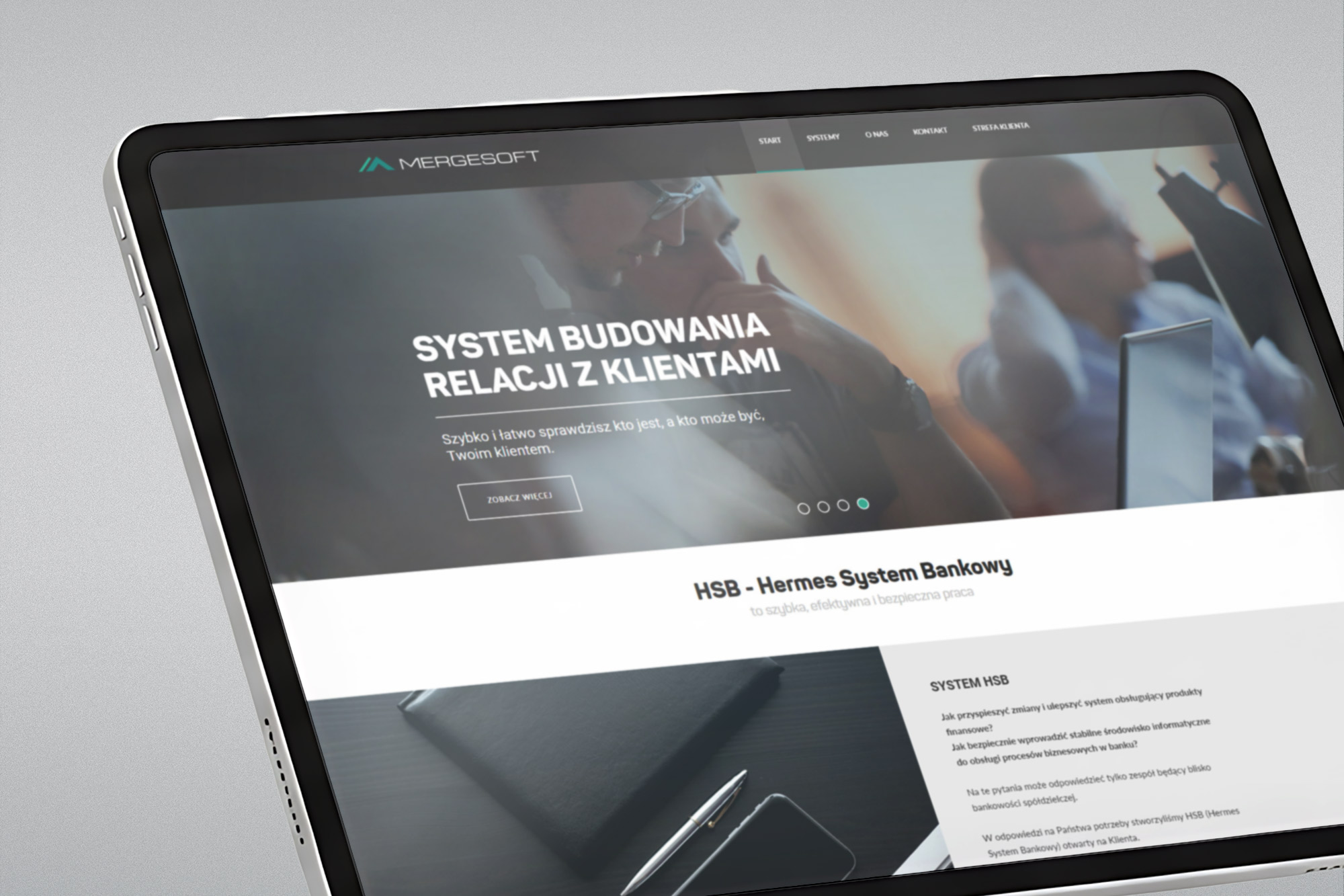
02. mergesoft.pl
A corporate site that put the company on the map
Before this project, Mergesoft had no public website to speak of. The corporate site needed to establish the company as a credible software provider - not just an internal development shop for one bank - and introduce its growing product portfolio (HSB, MergeERP, DotCASH) to potential new clients.
The visual language uses a dark charcoal header with a teal brand accent, transitioning to a clean white content area. The product showcase is structured around a tabbed navigation bar separating the four main products. The "About us" section introduces the team's values - quick response, consultancy, practice, experience, passion, exploration - giving the company a face beyond its products.
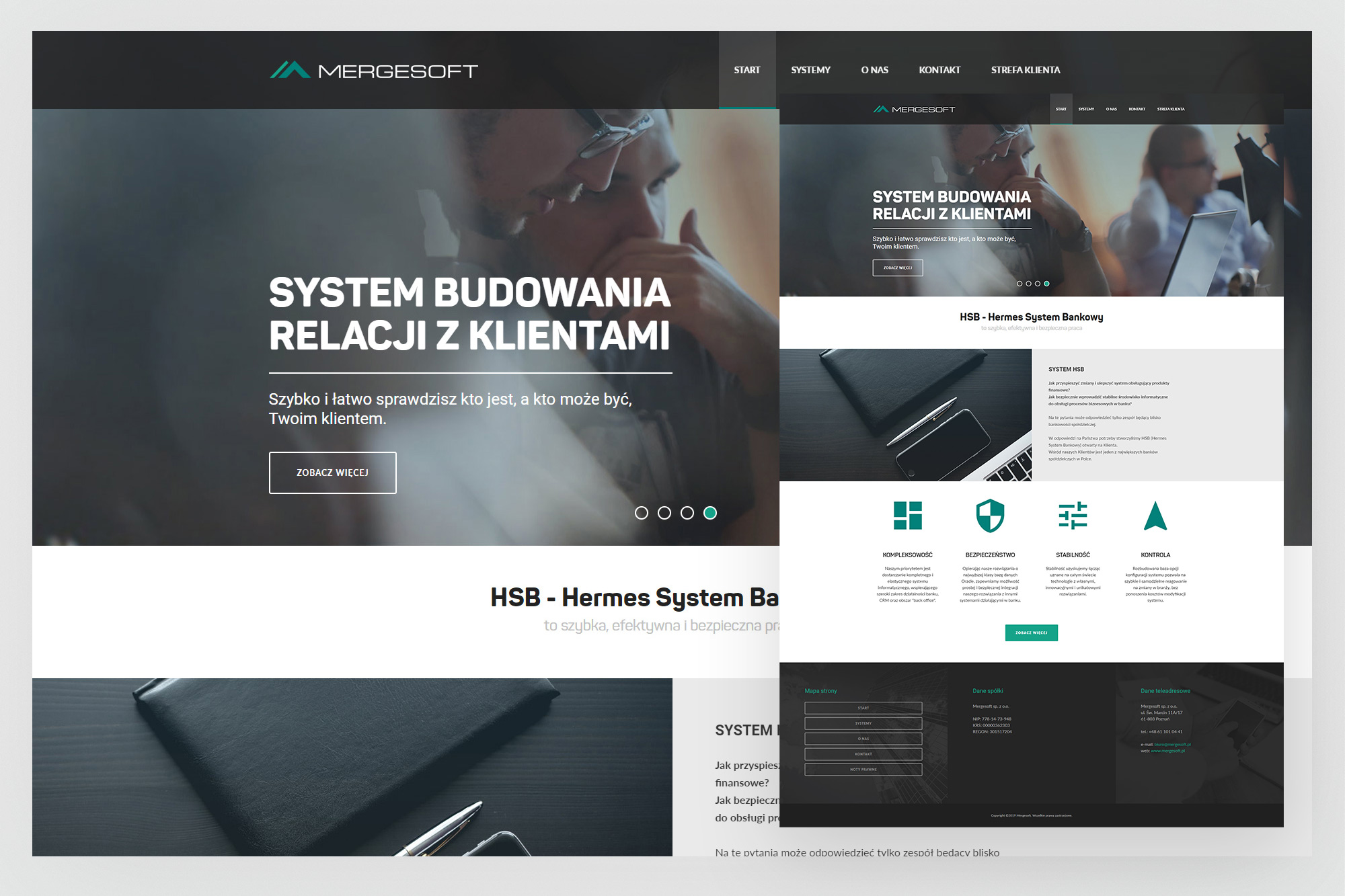
Homepage - full-bleed hero with the CRM positioning statement, followed by the HSB system section presenting the four product pillars (Kompleksowość, Bezpieczeństwo, Stabilność, Kontrola) with teal icon cards.
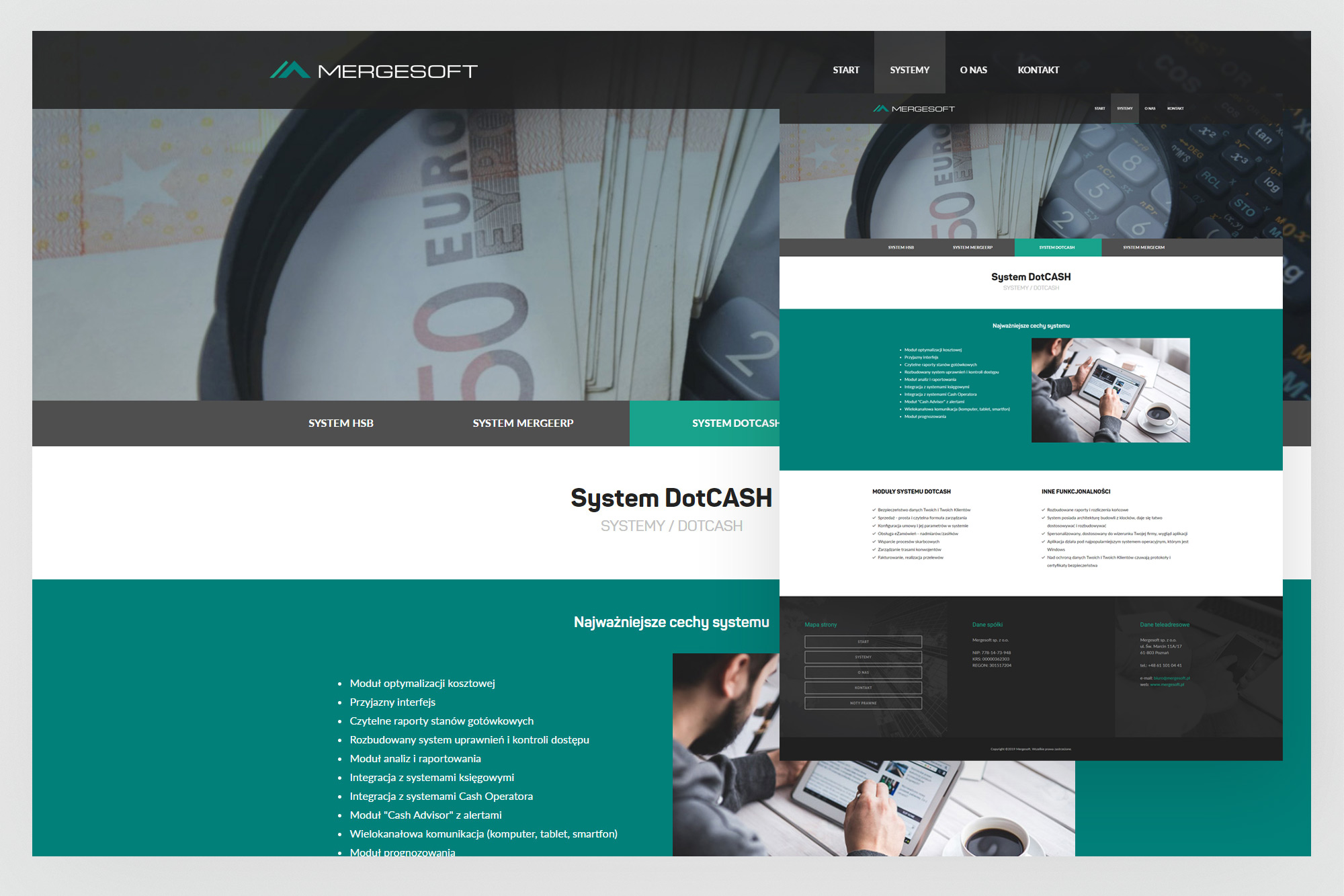
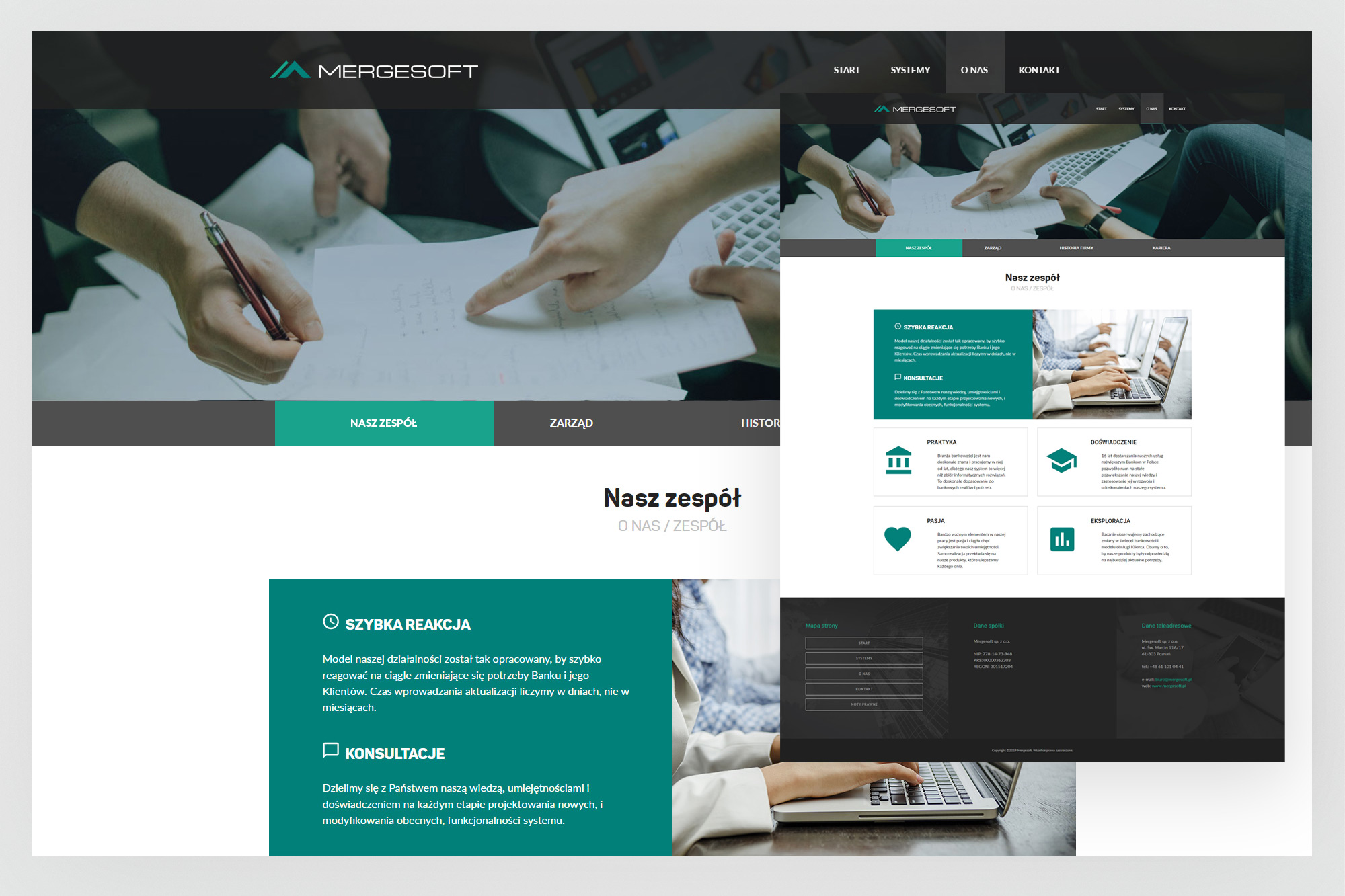
DotCASH product page (left) - tabbed product navigation with a teal feature strip, module list and additional functionality breakdown. About / Our Team page (right) - team values presented as icon cards within the same teal/white palette.
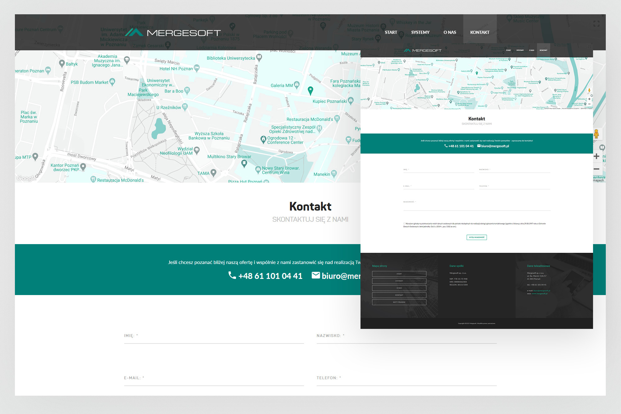
Contact page - full-width Google Maps integration with a prominently placed phone number and email, contact form, and three-column footer with site map, company data and contact details.
03. topdata.io - first version
A hosting product site built for business clients
Topdata was Mergesoft's hosting and domain venture - a B2B service targeting small and medium businesses that needed reliable infrastructure without the complexity of managing it themselves. The first version of the site used a deep navy and teal palette, establishing a distinctly different visual identity from the parent brand while staying consistent with the professional register.
The site covered the full commercial offering: domain registration and transfer, dedicated servers, SSL certificates, antivirus products and contact. Pricing was presented with two-tier comparison tables using a characteristic arrow-shaped price badge to highlight the recommended tier.
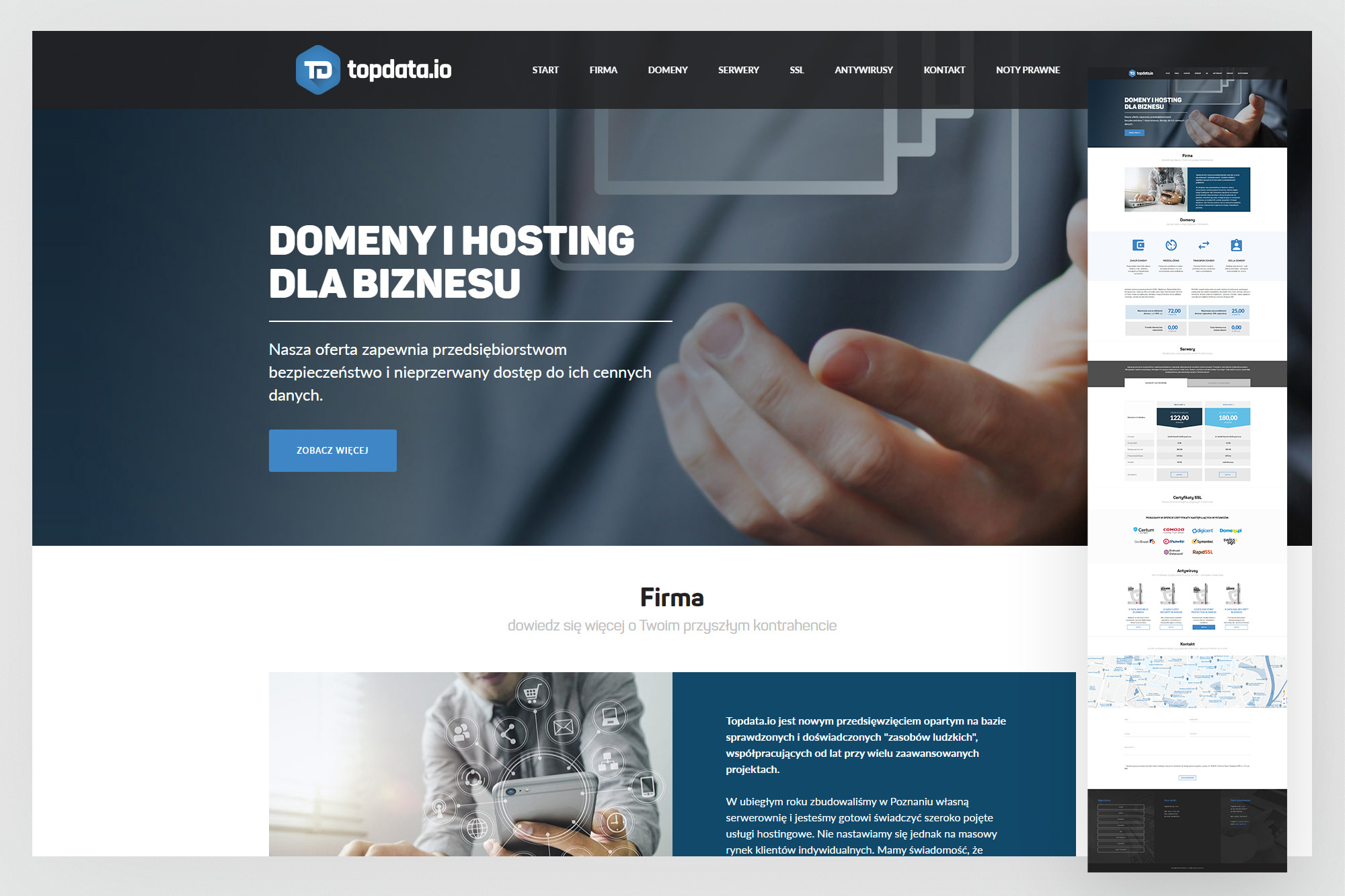
Homepage - full-bleed hero with the "Domains and hosting for business" headline, transitioning into the domain services section with four service types (purchase, renewal, transfer, assignment) and a NASK partnership statement.
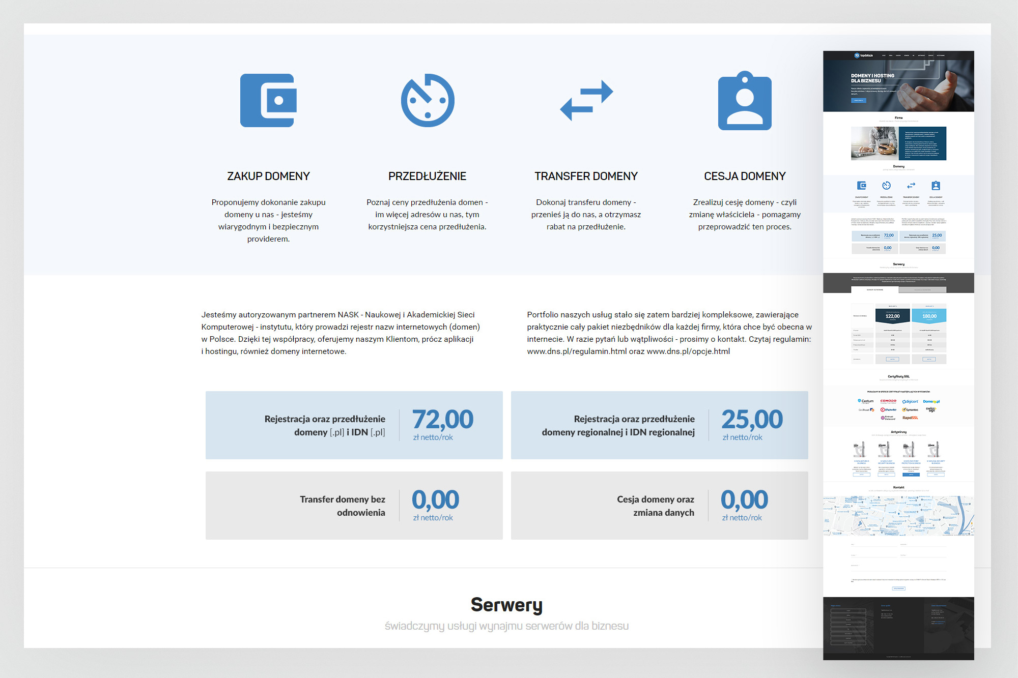

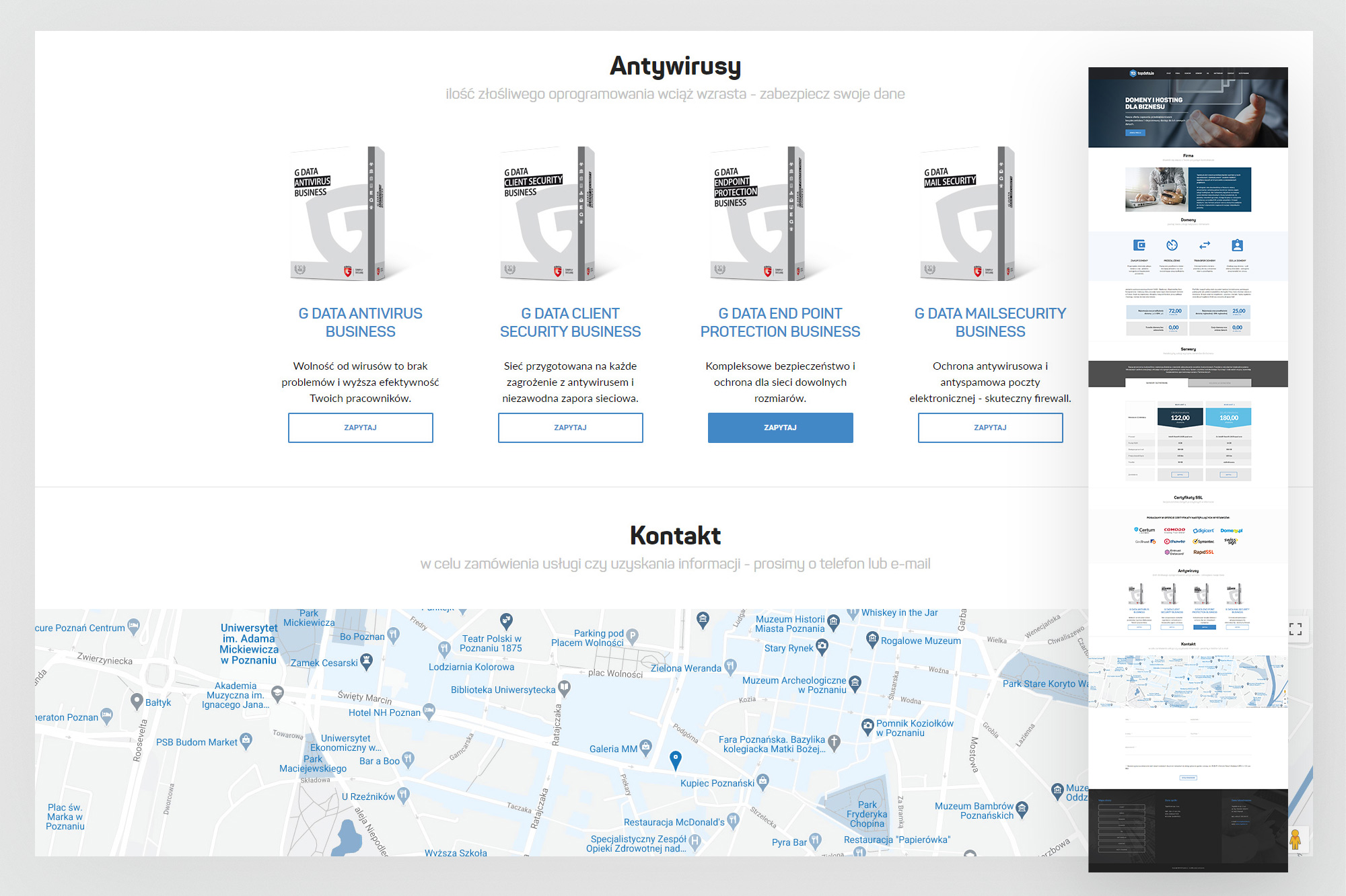
Server pricing (left) - two-column dedicated server comparison with arrow-tipped price badges, specification table and enquiry CTAs. Antivirus products (right) - four G DATA business products in a card grid, followed by the contact section with Google Maps.
04. Skórzewo - developer product site
A product site for a residential housing development near Poznań
Alongside its software activities, one of Mergesoft's affiliated companies operated in the property development sector - acquiring land, constructing residential buildings and selling apartments. For the Skórzewo housing estate project - a terrace house development on the outskirts of Poznań - a dedicated product website was needed to present the investment and generate enquiries from prospective buyers.
The site is compact and focused: a homepage establishing the location and product proposition, a project page with aerial renders, a specification table and pricing, and a developer page presenting the company's credentials. The visual language is warm and residential - cream backgrounds, terracotta accents, clean icon-based feature highlights - appropriate for a product aimed at families considering a first home or an upgrade to a house with a garden close to city infrastructure.
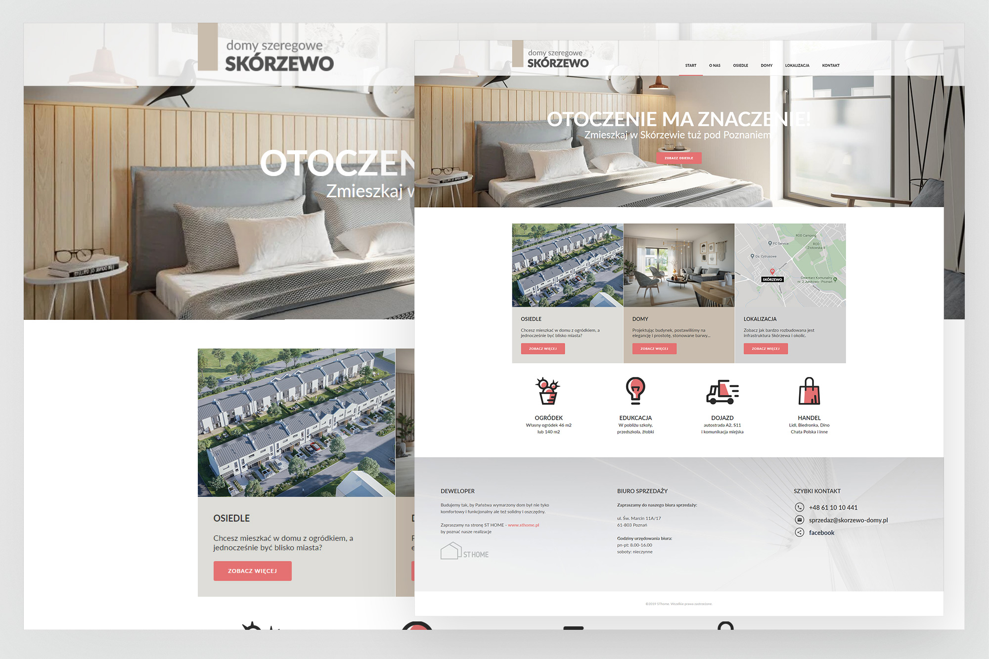
Homepage - full-bleed exterior render hero with "Otoczenie ma znaczenie" headline, estate navigation tiles (Osiedle, Domy, Lokalizacja), neighbourhood highlight icons (garden, education, access, retail) and a three-column developer / sales office / quick contact footer.
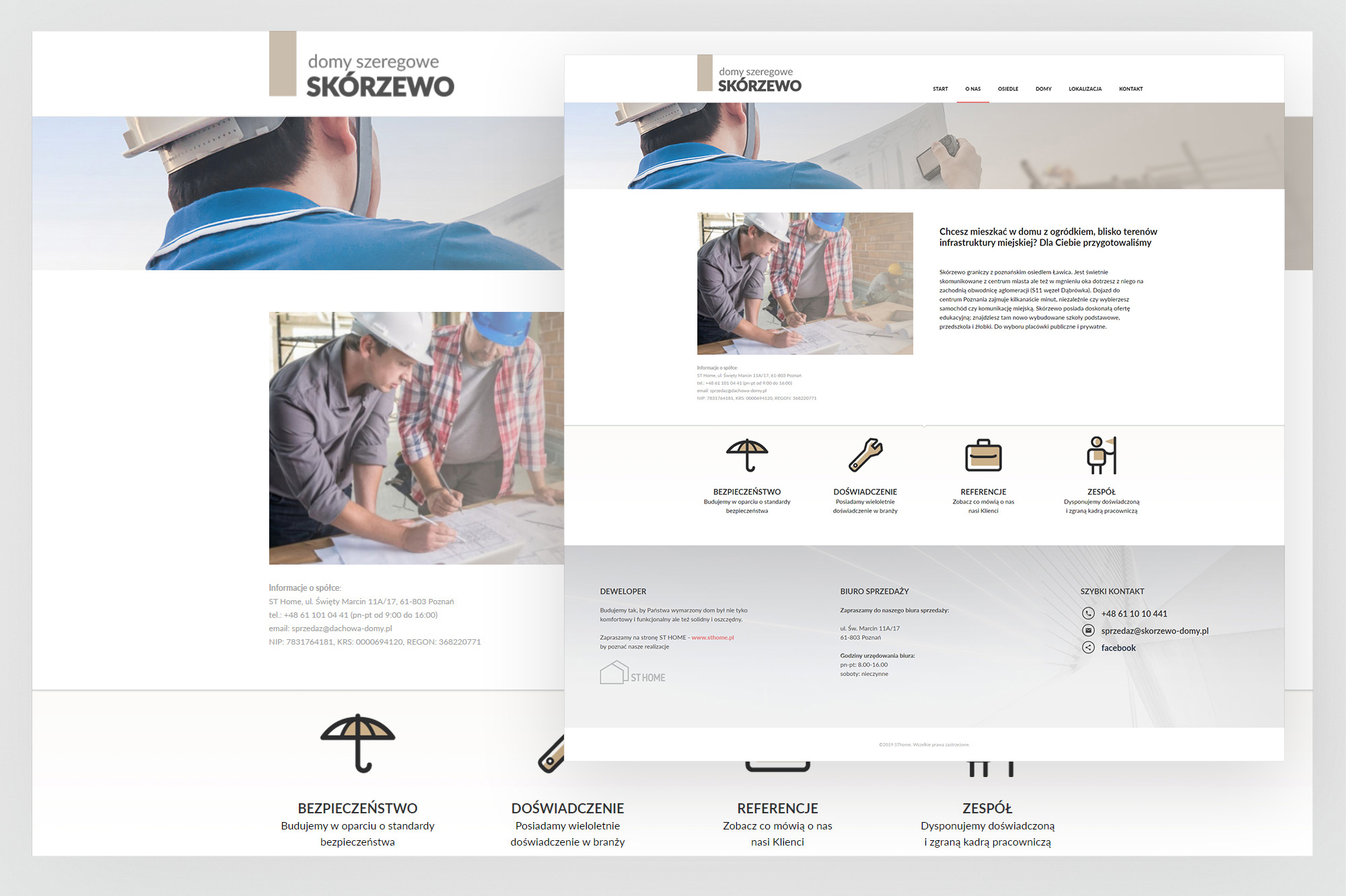
Developer page - split layout with a team photograph and the company's four value pillars (Bezpieczeństwo, Doświadczenie, Referencje, Zespół) presented as icon cards, followed by developer information, sales office details and a quick contact strip.
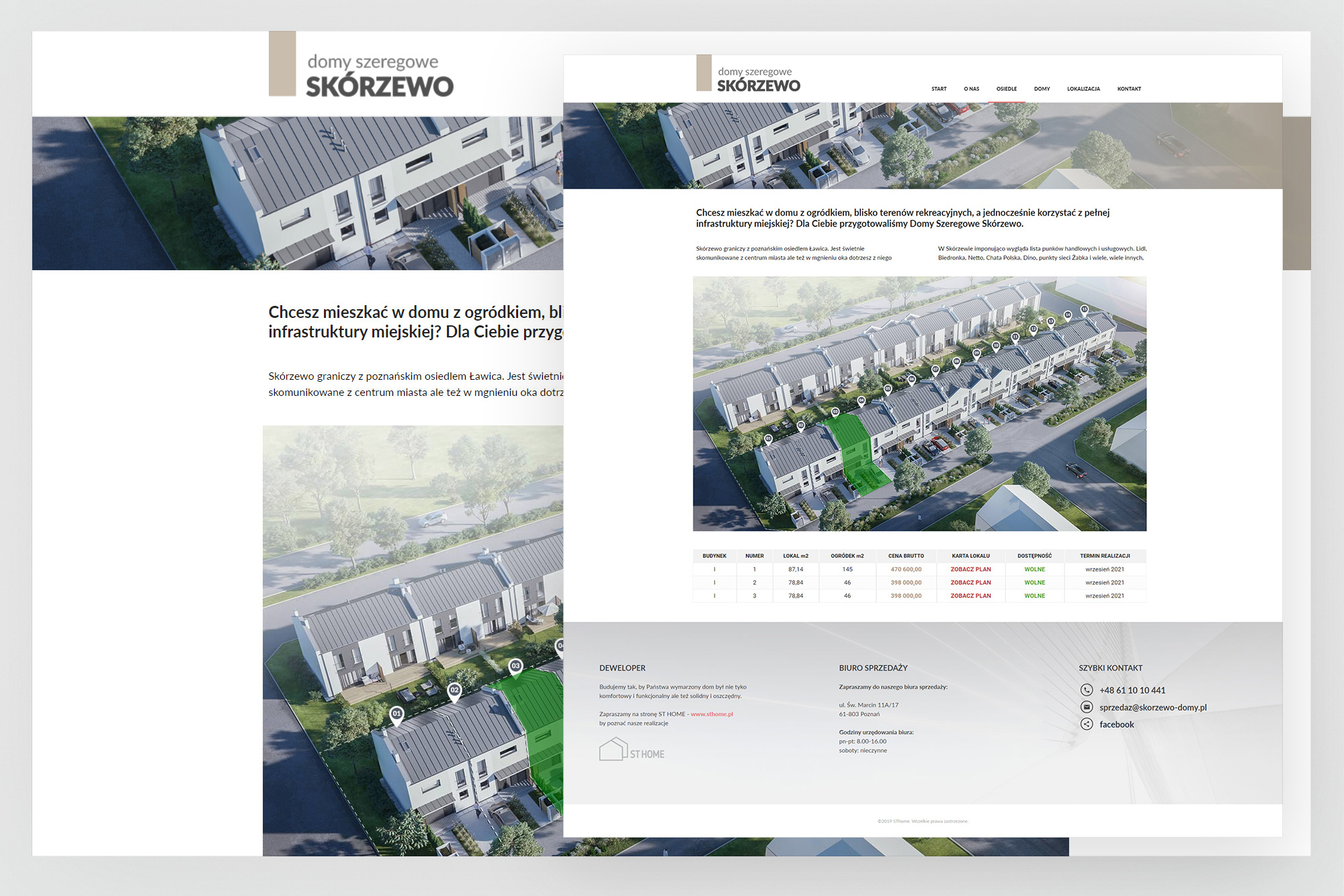
Project / Domy page - introductory text with location pitch, aerial render of the completed estate, and a structured availability table showing unit types, areas, plot sizes, prices and completion dates. Available units highlighted in the brand terracotta colour.
05. Outcomes
A public presence for a company that had been working in the shadows
The three sites collectively gave Mergesoft and its ventures a credible, professional web presence for the first time. More than purely functional deliverables, they represented the company's attempt to build a business that wasn't entirely dependent on a single client.