01. Overview
A nameless, unstyled ERP that needed an identity - and a complete UI overhaul
Mergesoft had been developing and maintaining a Windows desktop ERP application for NeoBank since the company's founding. The system was the operational backbone for the bank's employees - managing clients, accounts, loans, projects, HR records, task tracking, messaging and more. It worked. But it had no brand, no cohesive visual language, and no design system guiding it.
New features had been added over the years in an ad hoc way. Controls were styled inconsistently. There was no colour palette, no typographic hierarchy, no identifiable identity of any kind. As the system grew in scope and the Mergesoft team began positioning it as a standalone commercial product - Connector Clouds - the need for a proper design foundation became urgent.
02. The challenge
Designing inside a framework that was already built
This was not a greenfield product design. The application was a mature, complex system with years of accumulated functionality, and the code defined hard constraints on what could and couldn't change. Element positions, control sizes, tab structures - much of this was locked. The design work had to be done within those constraints, not around them.
The scope was correspondingly broad. Every screen, every module, every control had to be brought into alignment with the new visual system: client management, account and loan views, project management, HR and time tracking, calendar, messaging, configuration panels, and the application launcher itself.
Core brief
Create a brand identity for the product (name, logo, colour palette). Then apply that visual system across the entire application - redesigning every view to be consistent, professional and recognisable - while working within the hard constraints imposed by the existing application code.
03. My role
Brand first, then every screen that followed
I was the sole designer on the project throughout its four-year run. The work began with establishing the brand - name, logo, colour palette, and a set of UI guidelines for the most frequently used controls. Once that foundation was in place, the application itself became a long, module-by-module design process: taking existing, unstyled views and redesigning them to the new standard, one at a time, in close collaboration with the frontend and backend development team.
Because I worked daily in the application myself (Mergesoft used it internally to manage tasks, time, projects and HR), I experienced the interface as a user first - which informed every design decision I made.
04. Brand identity
Connector Clouds - a cloud-native identity for a bank's ERP
The product name and logo were designed to reflect what the system actually does: it connects - people, data, processes - through a cloud-based architecture. The Connector Clouds mark combines two interlocking cloud forms rendered in a two-tone blue palette: a deep navy for credibility and a bright sky blue for approachability. The rounded, geometric construction of the mark mirrors the system's multi-module structure while remaining immediately legible at small sizes in the application header.
The brand palette - navy, sky blue, warm sand, and white - was applied consistently across the application's UI, from the sidebar navigation to status badges, data highlights and the login launcher.
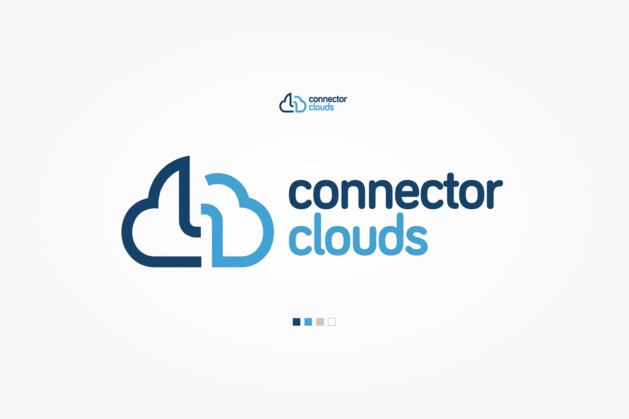
Connector Clouds brand identity - the interlocking dual-cloud mark in navy and sky blue, with the full wordmark and four-colour brand palette.
05. Login & launcher
The entry point - system selector and user authentication
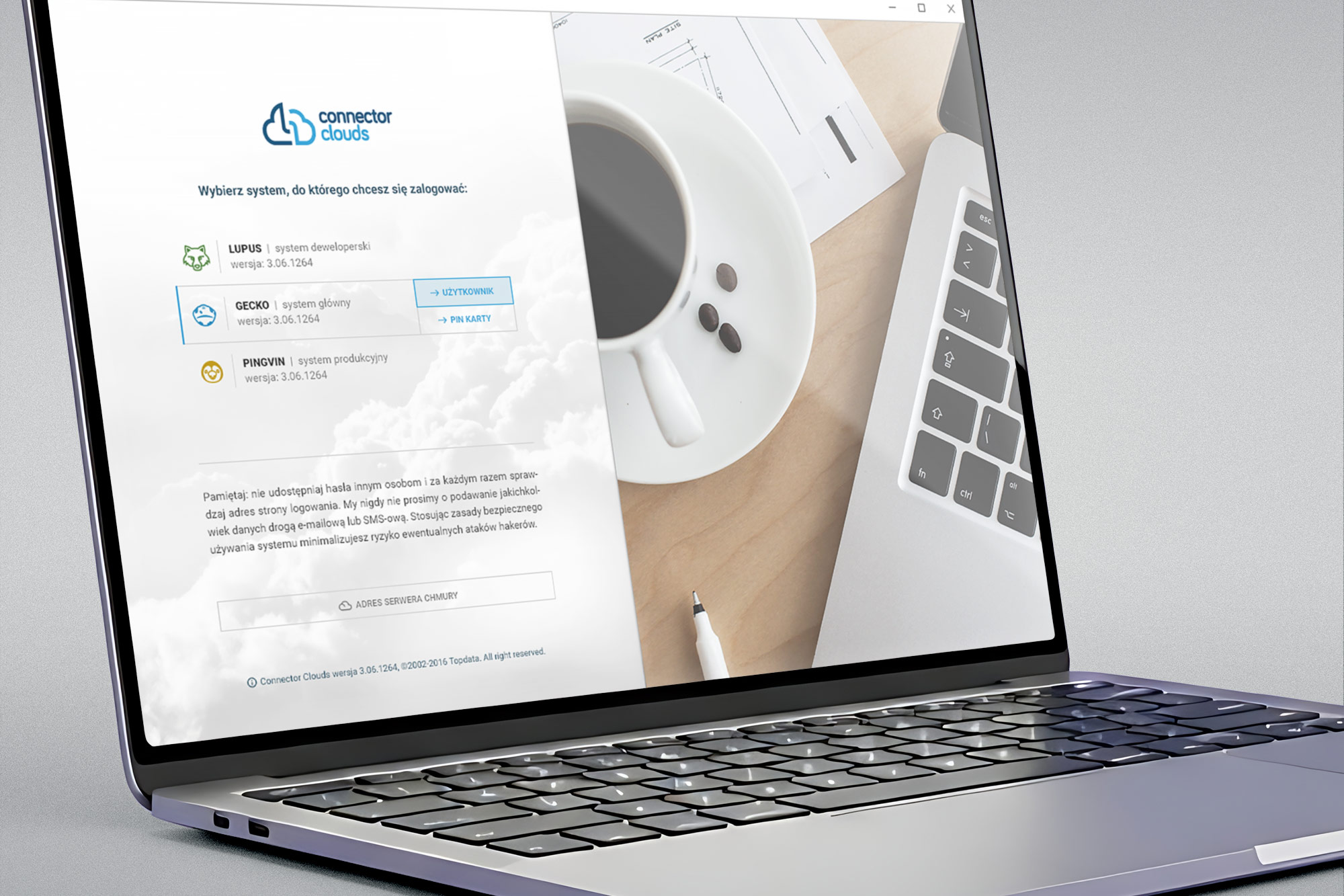
The login screen for Connector Clouds doubles as a system launcher - users choose which environment they want to connect to (development, main, or production) before authenticating. Each environment is represented by its own animal icon (Lupus, Gecko, Pingvin), making the selection clear and memorable even across multiple system instances.
The split-screen layout - login panel on the left against a contextual lifestyle image on the right - carries the brand's balance of professional utility and approachable design. After selecting a system, a modal handles user credential entry.
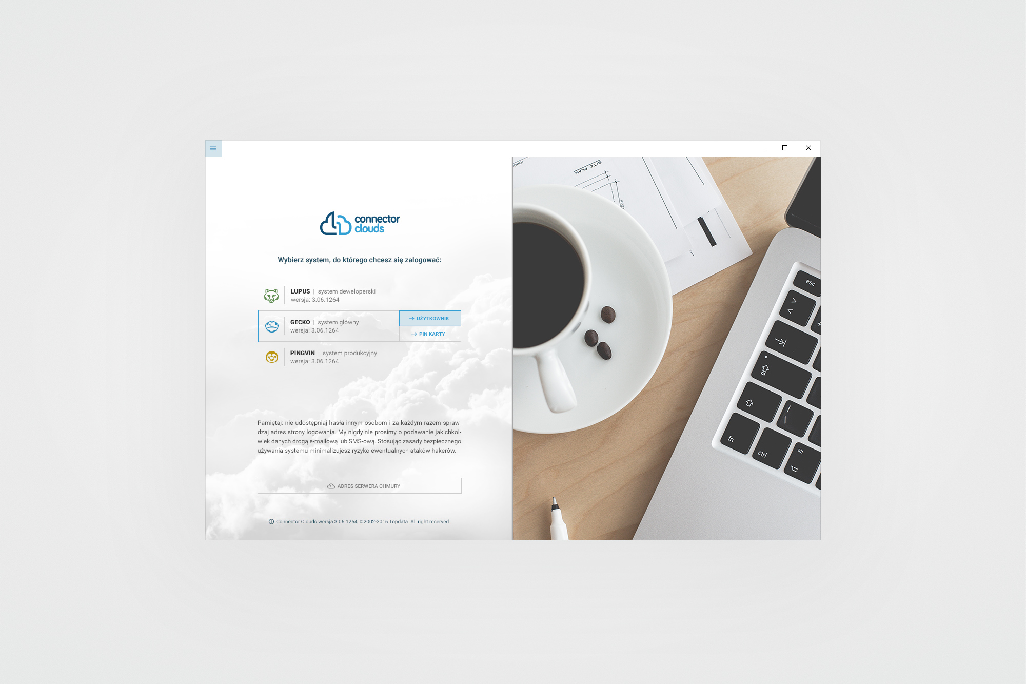
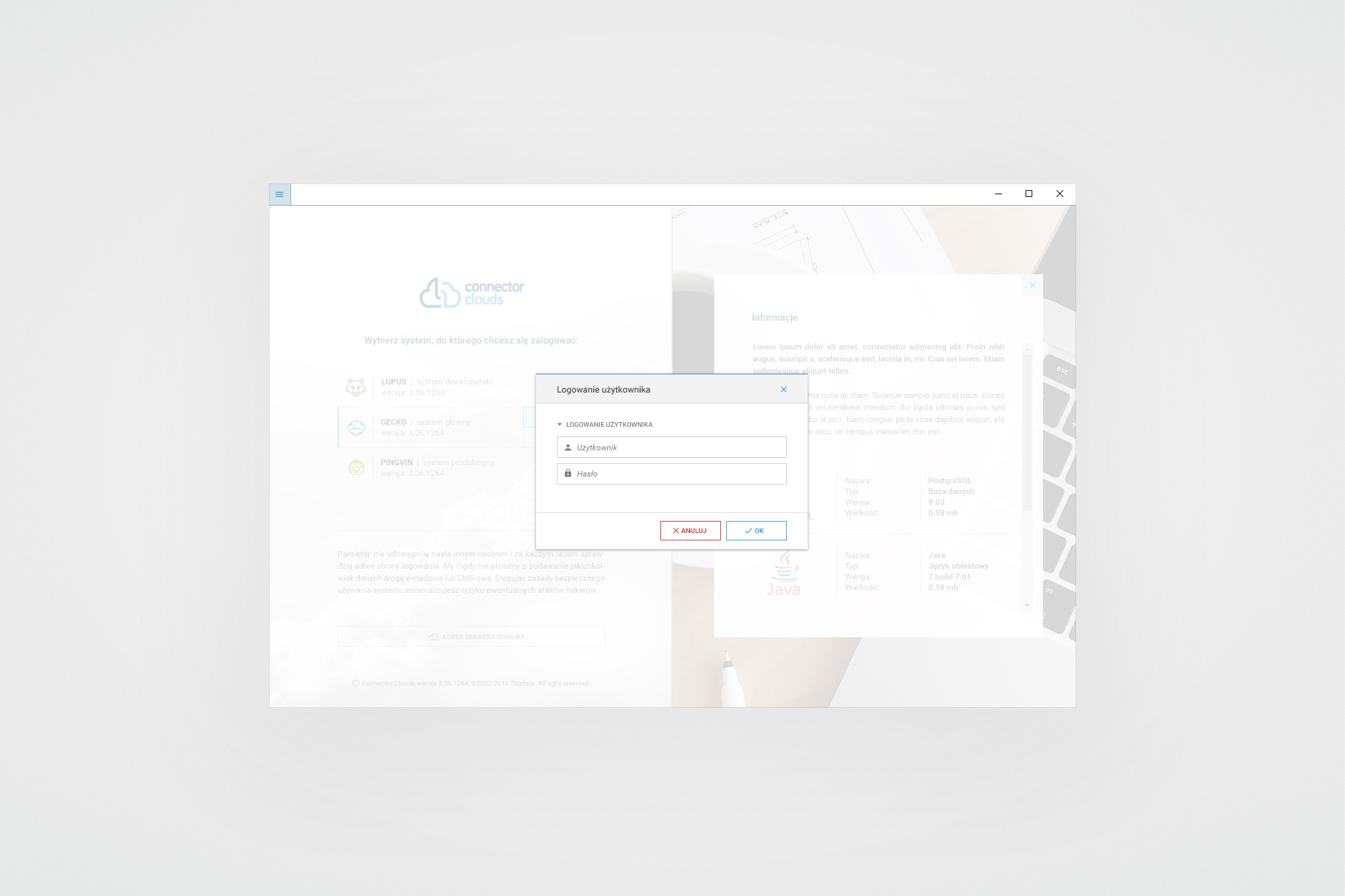
System launcher - environment selector (left) and username/password modal (right). The GEKON application shell is visible in the background after authentication.
06. Key screens
A complete banking ERP - every module brought into the design system
The GEKON shell - the main application window - uses a browser-like tab model, allowing users to keep multiple modules open simultaneously. A persistent dark sidebar provides navigation within each module, while a global search, notification area, mail, and toolbar controls run across the top. The visual system uses the brand palette with careful colour-coding for statuses, progress states and data categories throughout.
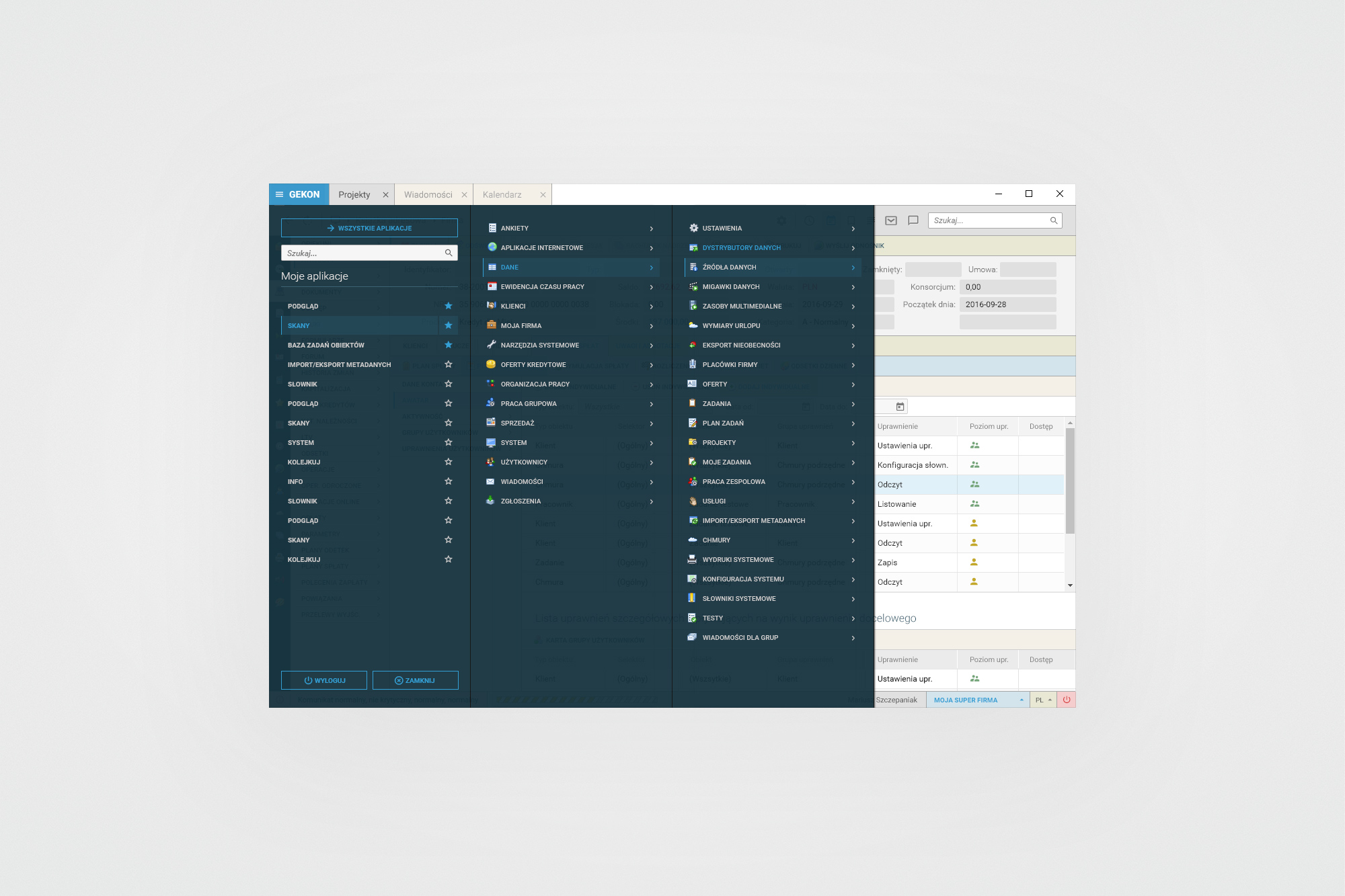
Global navigation panel - a three-column mega-menu exposing the full module tree: from client management, HR and projects to system configuration, data sources and multimedia. The left panel shows bookmarked (starred) items for quick access.
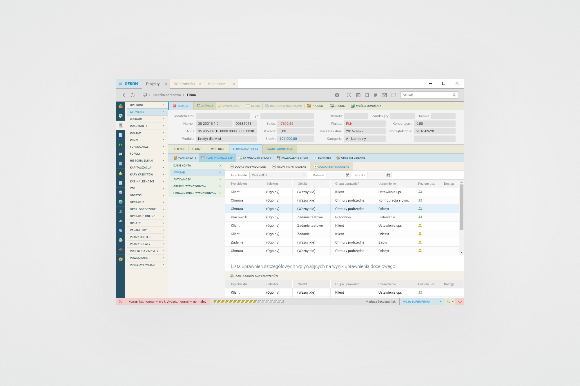
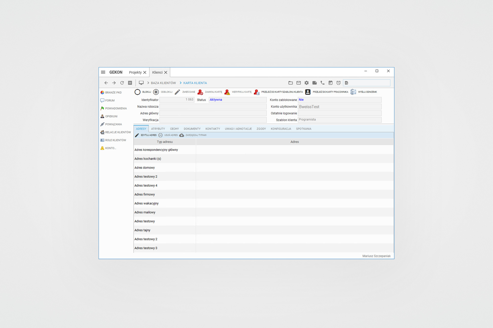
Loan record detail (left) - tabbed view of repayment plan, schedules, permissions and annotations. Client card (right) - address management with multiple address type categories. Both views share the same sidebar navigation + tab + content area structure.
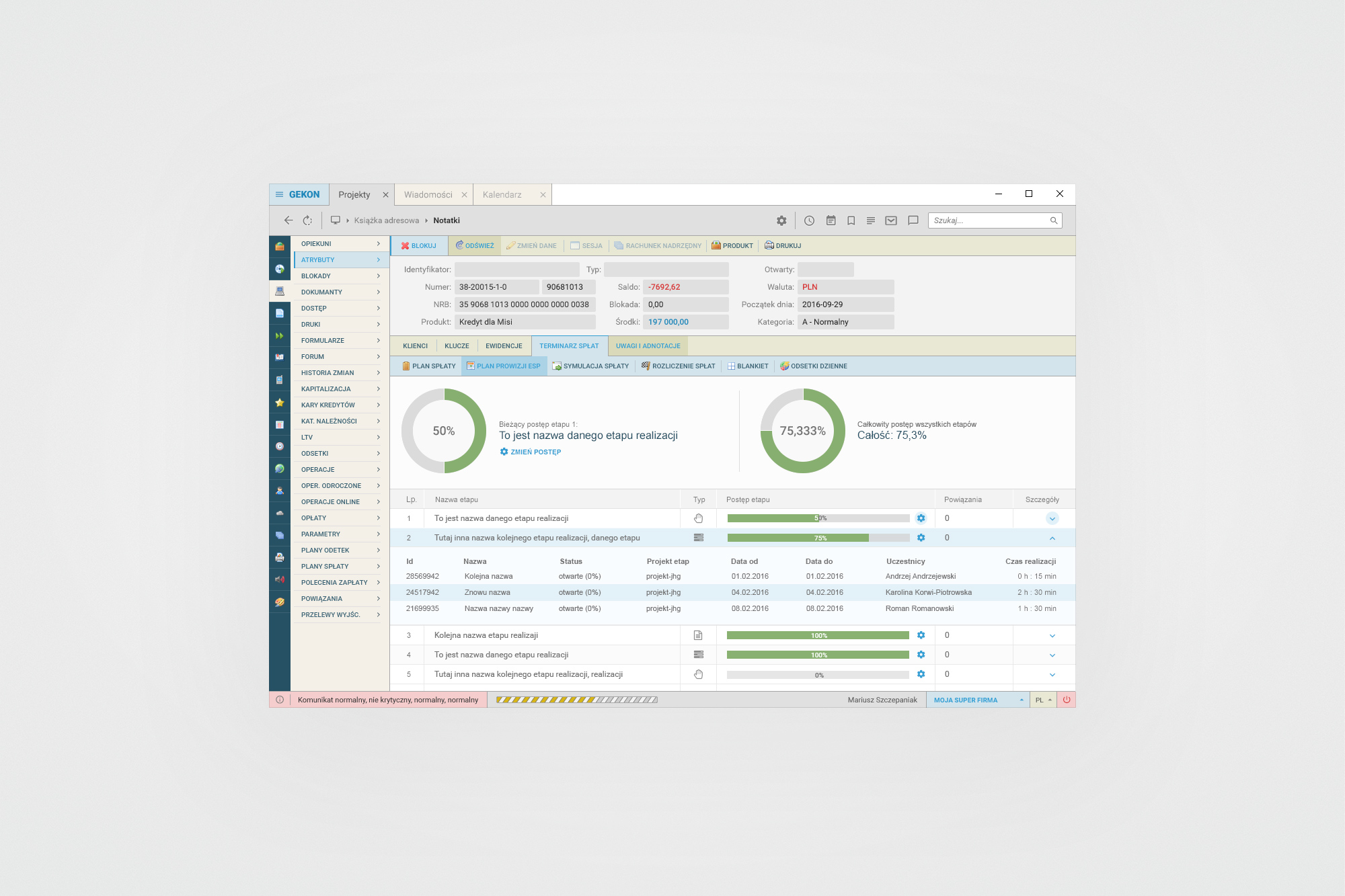
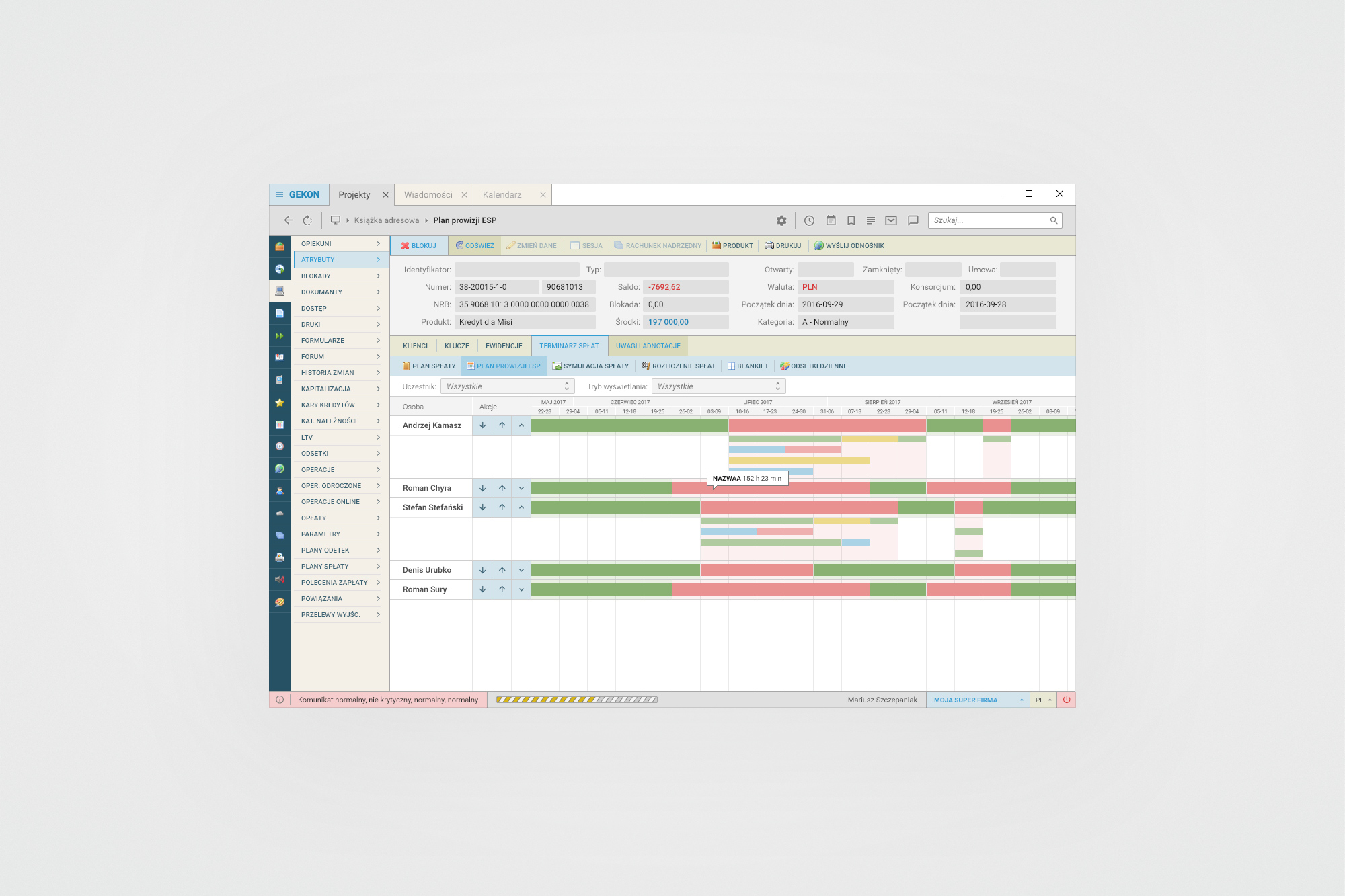
Project progress view (left) - donut charts showing current and total completion percentages, with a collapsible task/sprint breakdown and per-task time tracking. ESP Gantt chart (right) - resource-level timeline view across months, colour-coded by task status and participant.
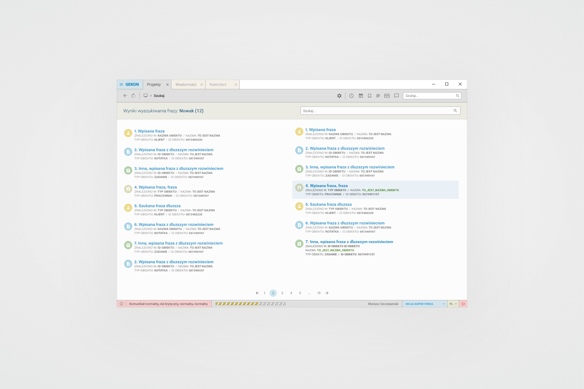
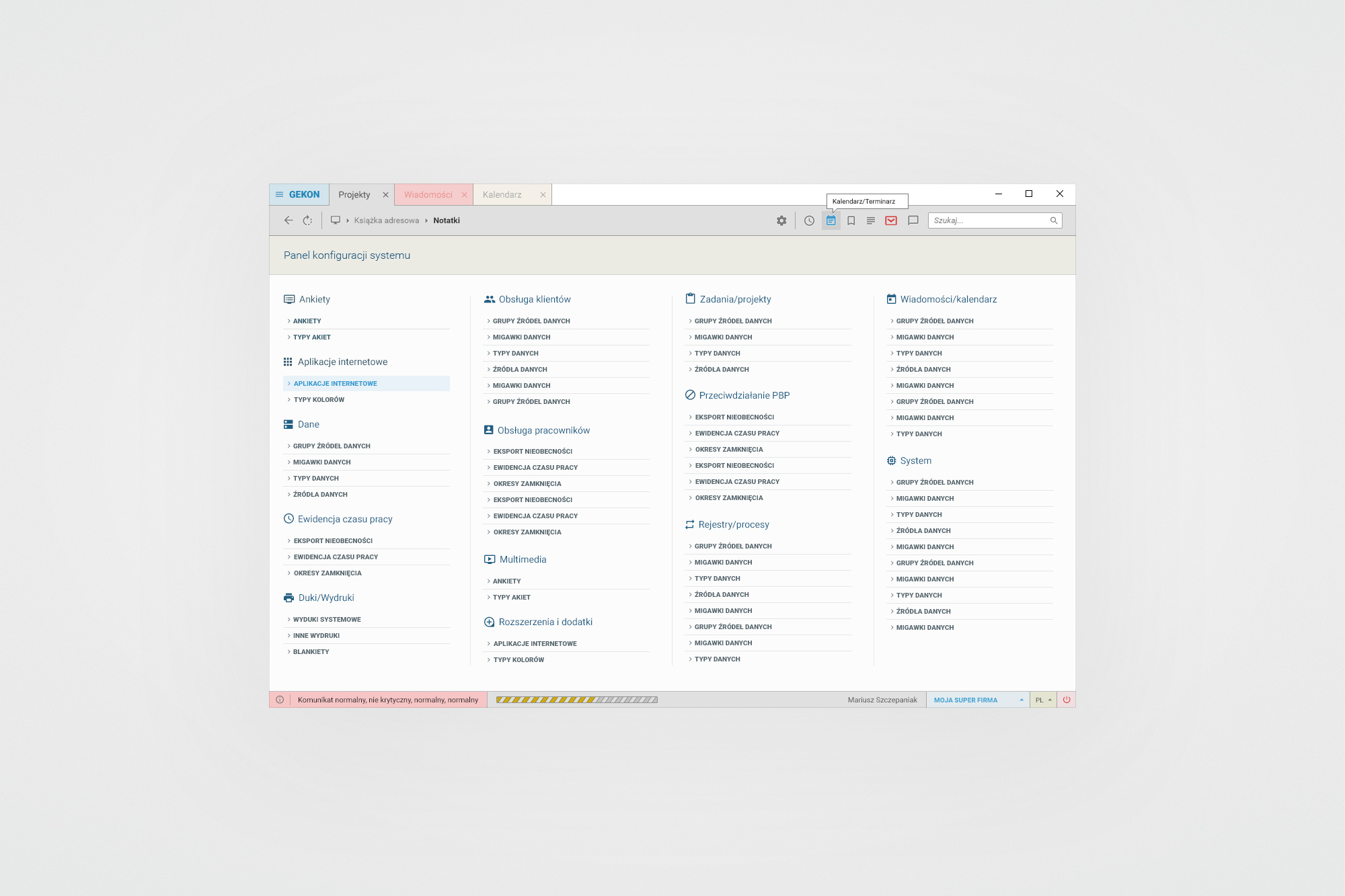
Global search results (left) - two-column layout with colour-coded object-type badges (client, note, task, employee) and contextual metadata. System configuration panel (right) - a structured overview of all configurable areas, grouped by domain with expandable sub-items.
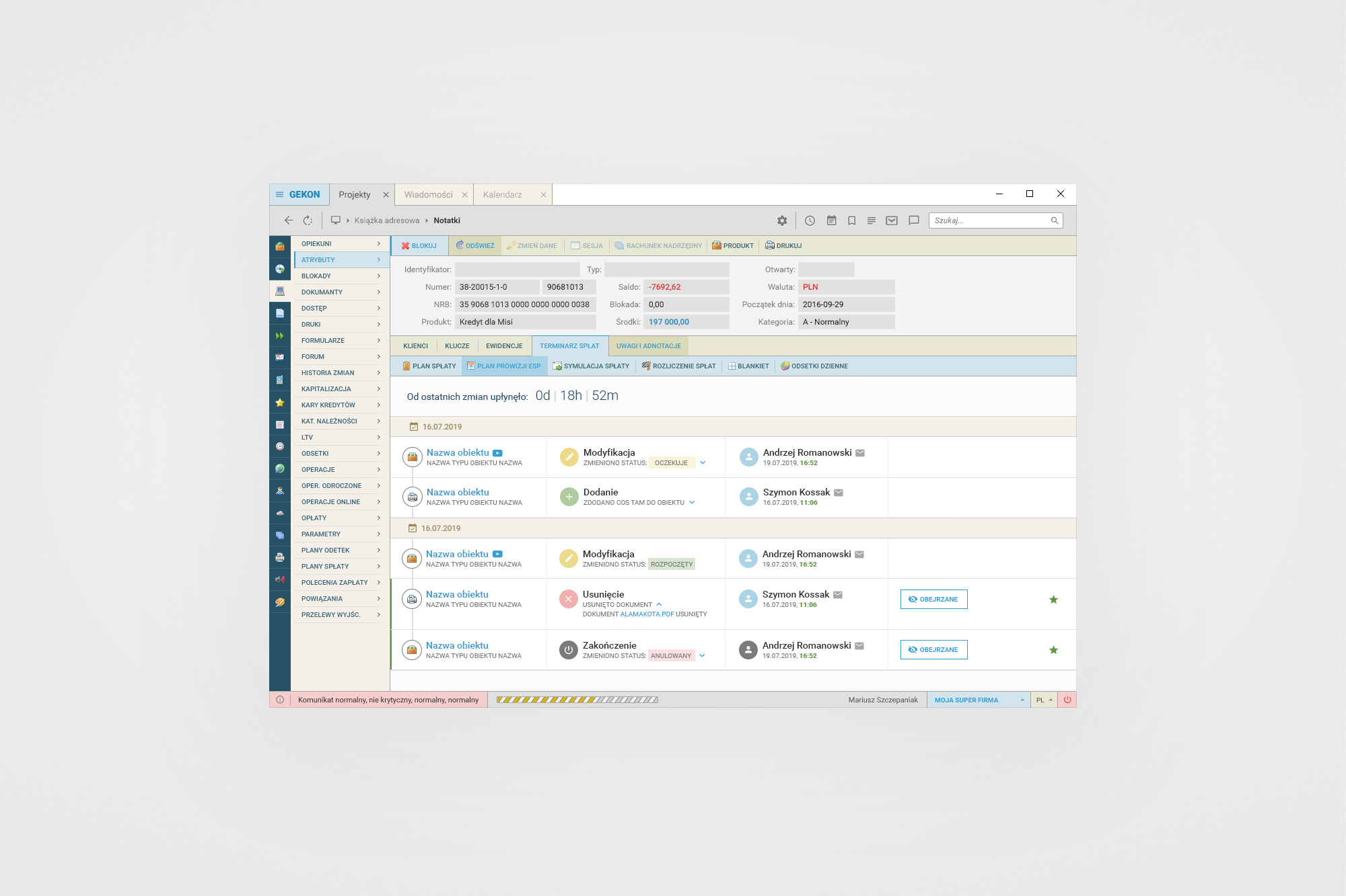
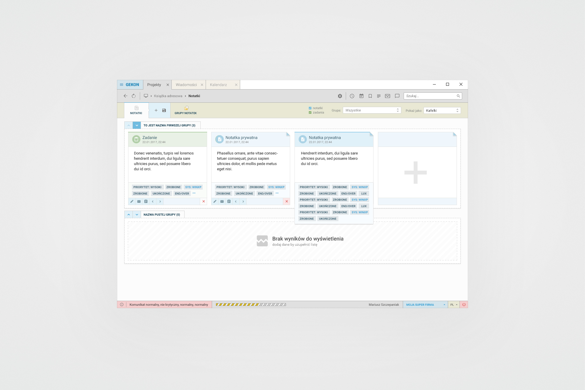
Activity feed (left) - timestamped change history for any record, showing object name, action type (modification, addition, deletion, closure) and responsible user. Notes module (right) - tile view with grouped note cards, task badges, priority and system tags, and an add-new placeholder tile.
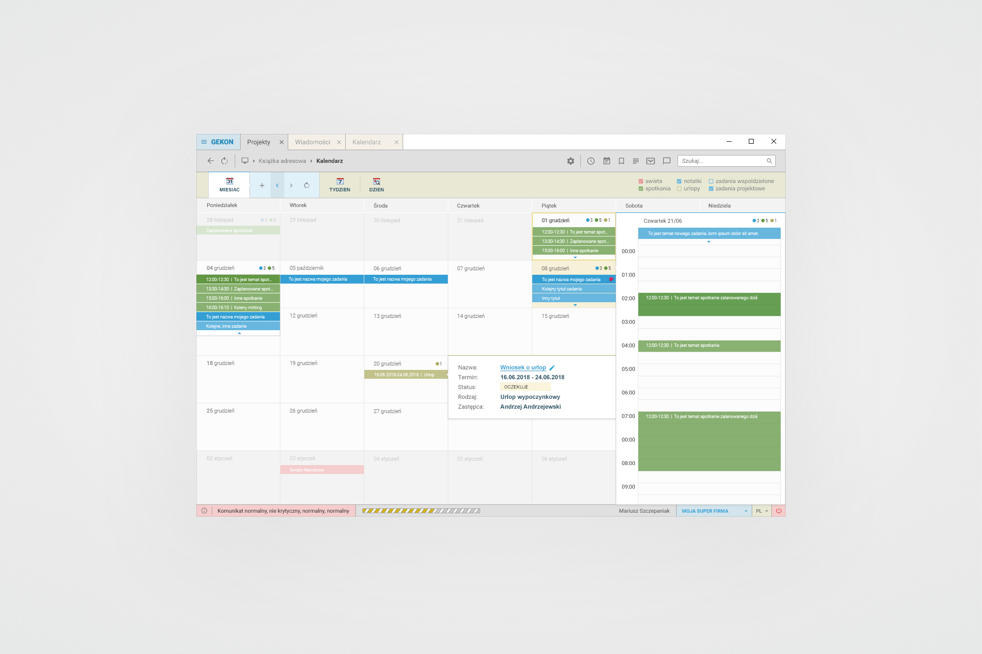
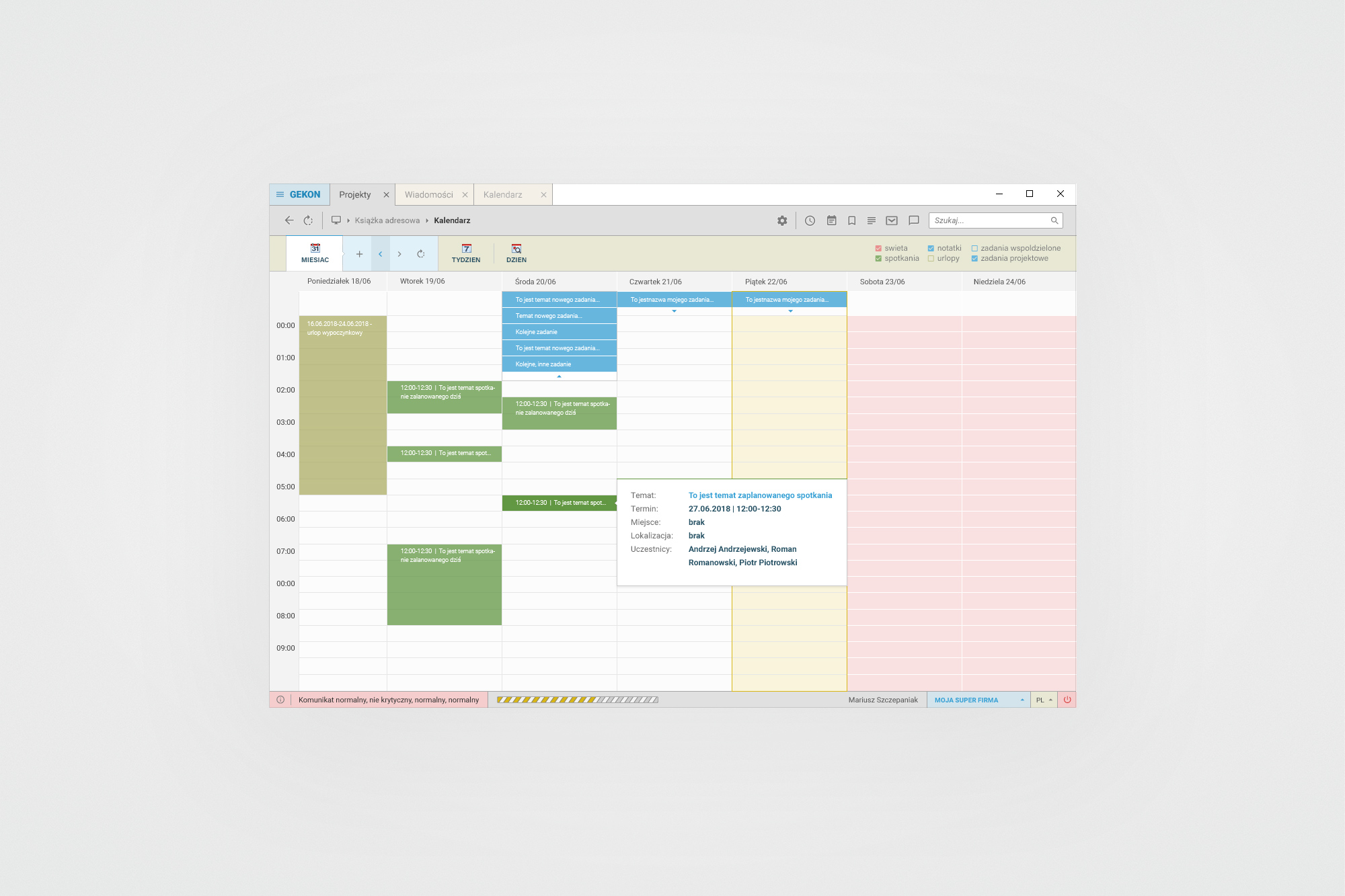
Calendar - month view (left) with event density indicators and a leave request popover. Week view (right) with a meeting details popover showing attendees and time. Events are colour-coded by type: meetings, holidays, notes, leaves, shared tasks and project tasks.
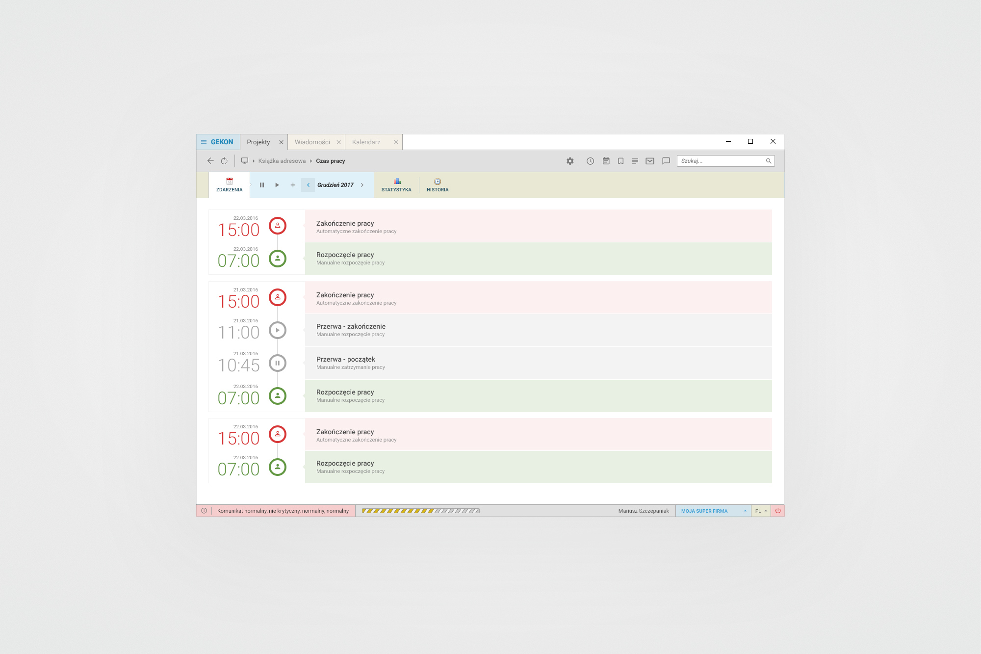
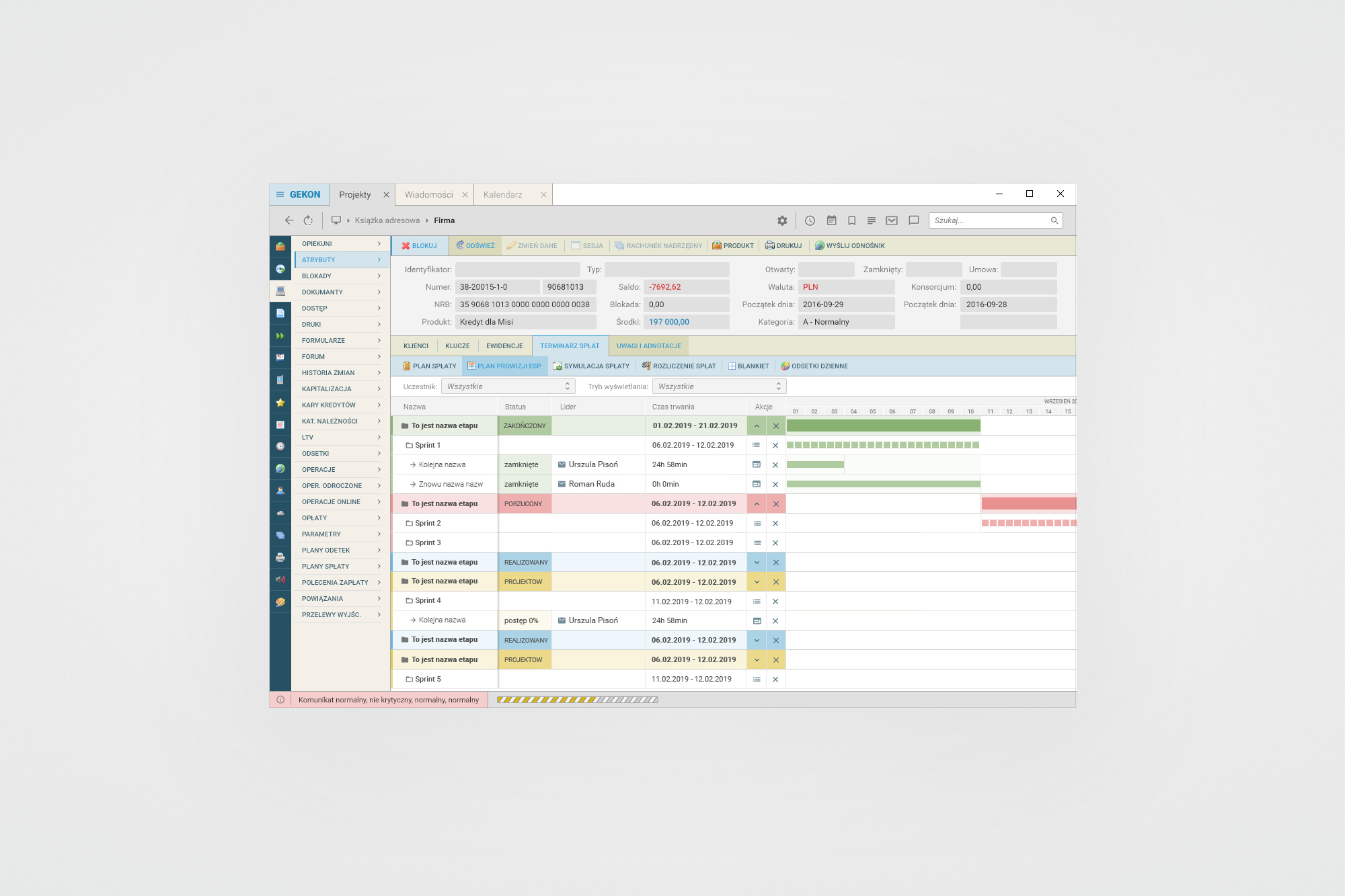
Time tracking module (left) - chronological event log of work start, break and end events, colour-coded green/red, with statistics and history tabs. Project plan Gantt (right) - hierarchical view of project phases, sprints and tasks with status badges (ZAKOŃCZONY, PORZUCONY, REALIZOWANY), assignees and a timeline bar.
07. Outcomes
From anonymous internal tool to a named, branded commercial product
The four-year design process transformed Connector Clouds from an unbranded, visually inconsistent system into a coherent, commercially presentable ERP product with its own identity and a unified visual language across all its modules.