01. Overview
A dedicated tool to replace the chaos of email and phone calls
Mergesoft developed and maintained several software products - most notably the Connector Cloud desktop ERP system for NeoBank. As the product portfolio grew, so did the volume of incoming requests: bug reports, change requests, improvement ideas and questions, all arriving through a mix of emails, phone calls and informal conversations.
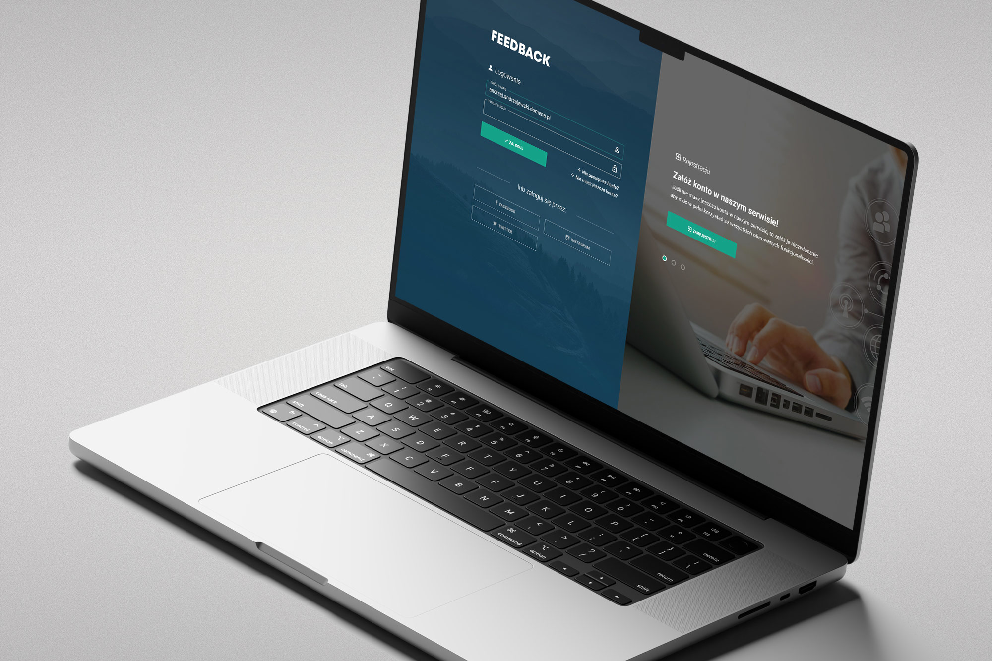
There was no single place to log, prioritise or track these requests. Reports got lost or duplicated, priorities were unclear, and both the Mergesoft team and their clients had no reliable way to see what was being worked on or what had been resolved. Feedback was created to fix exactly this - a simple, focused web application for structured reporting, tracking and management of all incoming requests across every maintained product.
02. The challenge
Fast delivery, two very different user types
The application had to serve two distinct groups with conflicting needs. Clients (primarily NeoBank users) needed a quick, low-friction way to report issues - something that could be done in a few steps without learning a complex system. Administrators (the Mergesoft team) needed robust filtering, sorting, prioritisation, and progress tracking across a potentially large volume of incoming requests.
The project was delivered under time pressure - this was an internal tool being built to solve an immediate operational problem, not a long product discovery cycle. The design had to be right enough fast: clear, functional, and maintainable by a small development team.
Core brief
Design a web application that lets clients report errors, corrections and improvement requests in a simple, multi-step process - and gives administrators the ability to catalogue, prioritise, filter and track the progress of each request.
03. My role
Sole designer on a fast-track internal product
I was the only designer on the project, responsible for the full UX/UI scope: information architecture, user flows, all screen designs and developer handoff. The fast-track nature of the delivery meant working in close, continuous collaboration with the development team rather than following a sequential design-then-build process.
04. The application
Login, dashboard, detail - the full request lifecycle
The visual language of Feedback draws on a dark teal and white palette, with a clean, document-like aesthetic suited to a professional B2B tool. The interface is structured around two primary contexts: the client view (reporting, tracking own submissions) and the administrator view (managing the full request pipeline across all projects and users).
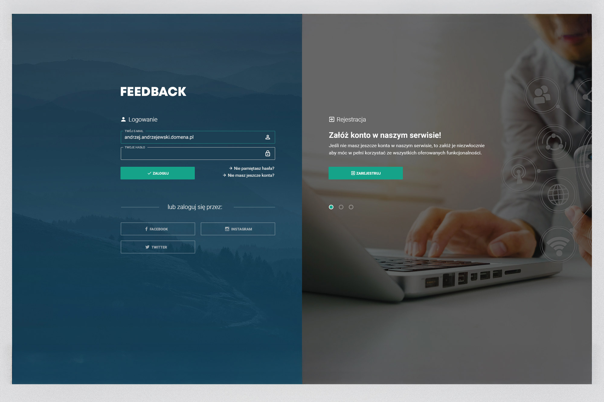
Login screen - a split layout separating the login form (left, dark teal panel with mountain landscape) from the registration prompt (right, photographic background). Social login options via Facebook, Instagram and Twitter were included for flexibility.
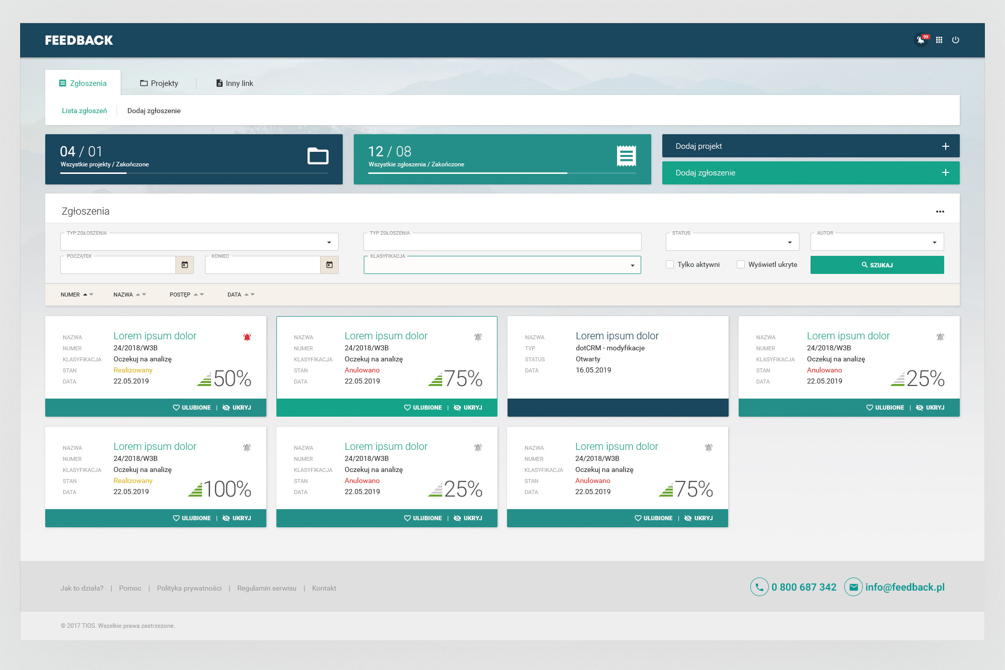
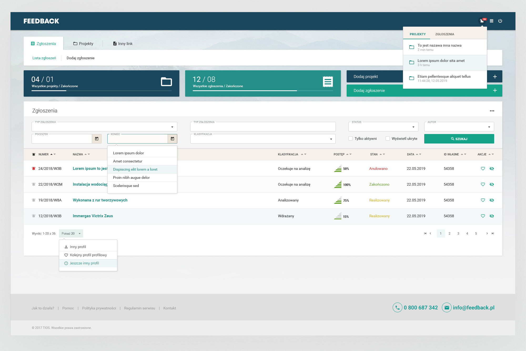
Submissions dashboard - toggling between card view (left) and table/list view (right). The top strip shows live counts for projects and submissions. Advanced filtering by type, classification, status and author is always accessible. Right: notification panel and inline autocomplete for quick classification.
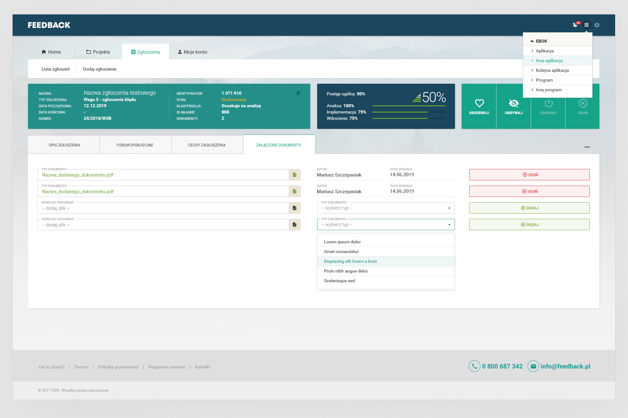
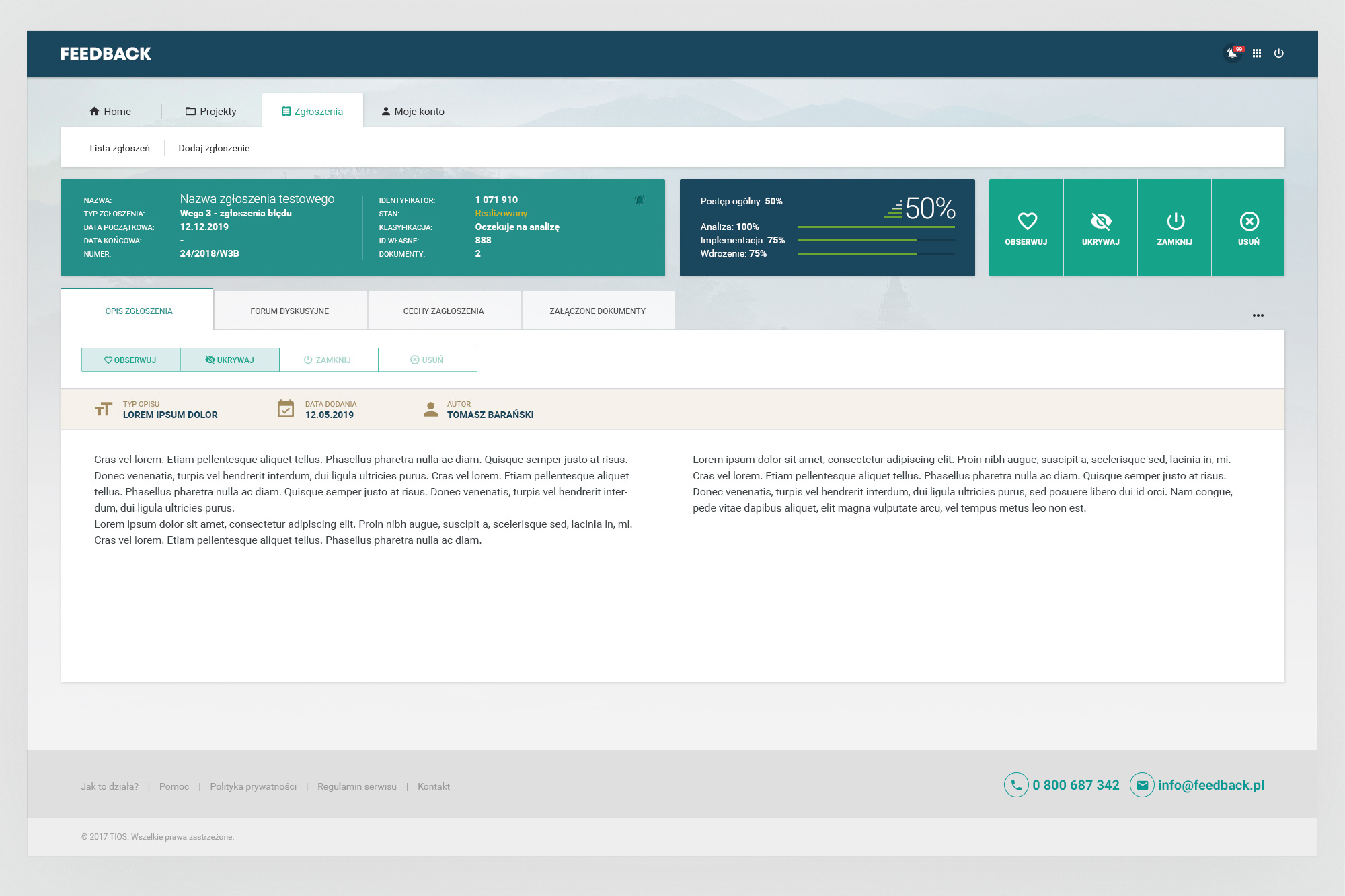
Submission detail view - a persistent header strip shows all key metadata (name, type, status, progress percentages per phase) alongside quick action buttons (Watch, Hide, Close, Delete). Tabs separate the report description, discussion forum, attributes and attached documents. Right: app-switcher dropdown in the top bar for navigating between Mergesoft products.
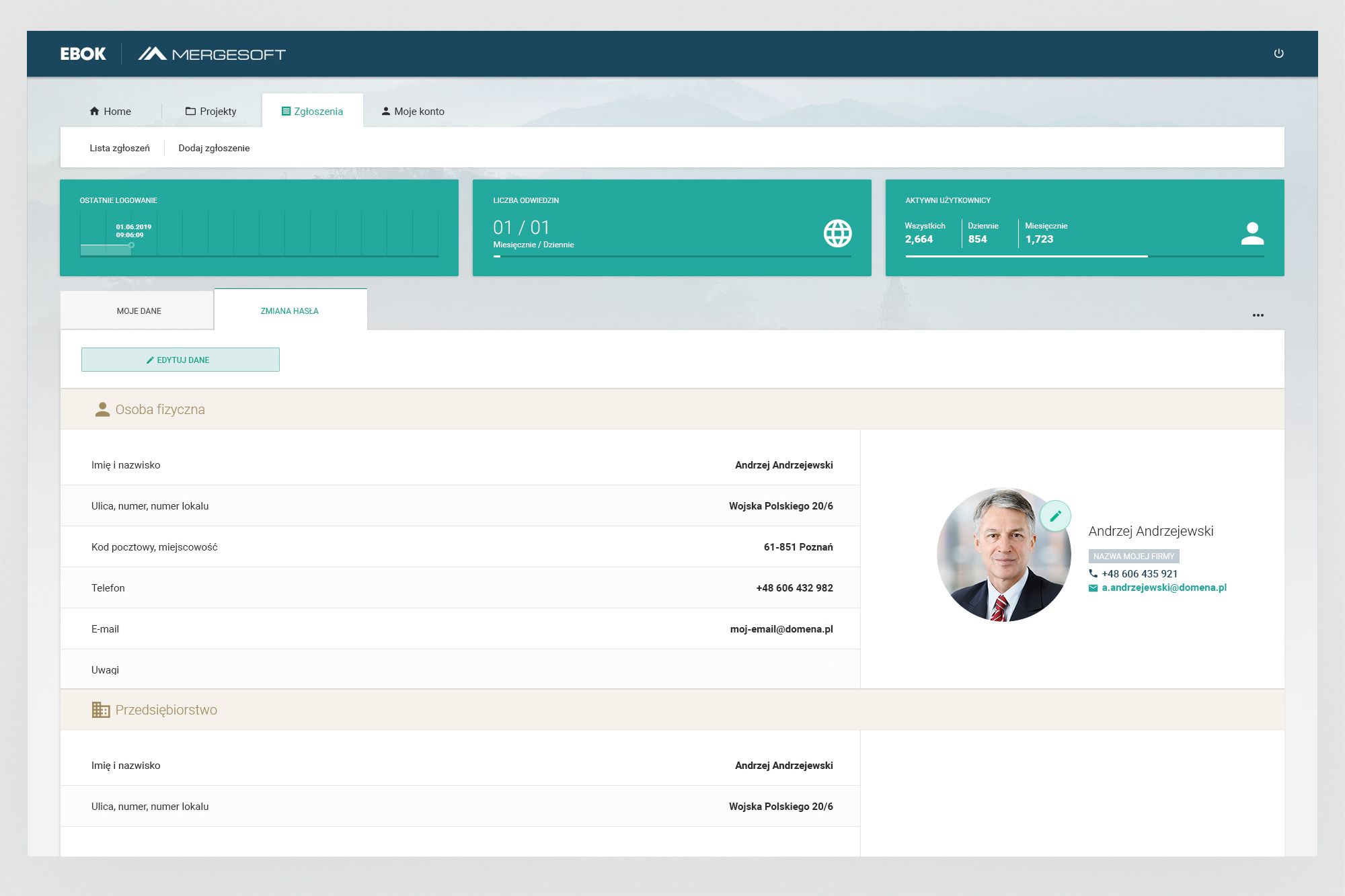
Account / My account view (EBOK context) - user profile with personal and company data, editable avatar, and an admin statistics strip showing last login, visit counts and active user totals. The same interface adapts to serve both the client-facing EBOK portal and the Mergesoft admin context.
05. Outcomes
A working tool that solved a real operational problem
Feedback was delivered quickly and put into active use. It wasn't a perfect product - the timeline didn't allow for that - but it was a functional one that directly addressed the communication breakdown it was built to fix.