01. Overview
A banking application rebuilt from the ground up - and rebranded to sell
NeoBank already had an internet banking application. But it was visually dated, limited in functionality, and struggling to convey the qualities a bank most needs to communicate - modernity, reliability and trust. As the development team undertook a technical overhaul of the application engine, the moment was right to rethink the product from the interface level up.
The brief went further than a typical redesign. Mergesoft wanted to create a standalone commercial product - a white-label internet banking platform that could be licensed to smaller banking institutions - under a new brand entirely separate from NeoBank's identity. That product became HSB (HERMES System Bankowy), with its own name, visual identity and marketing website.
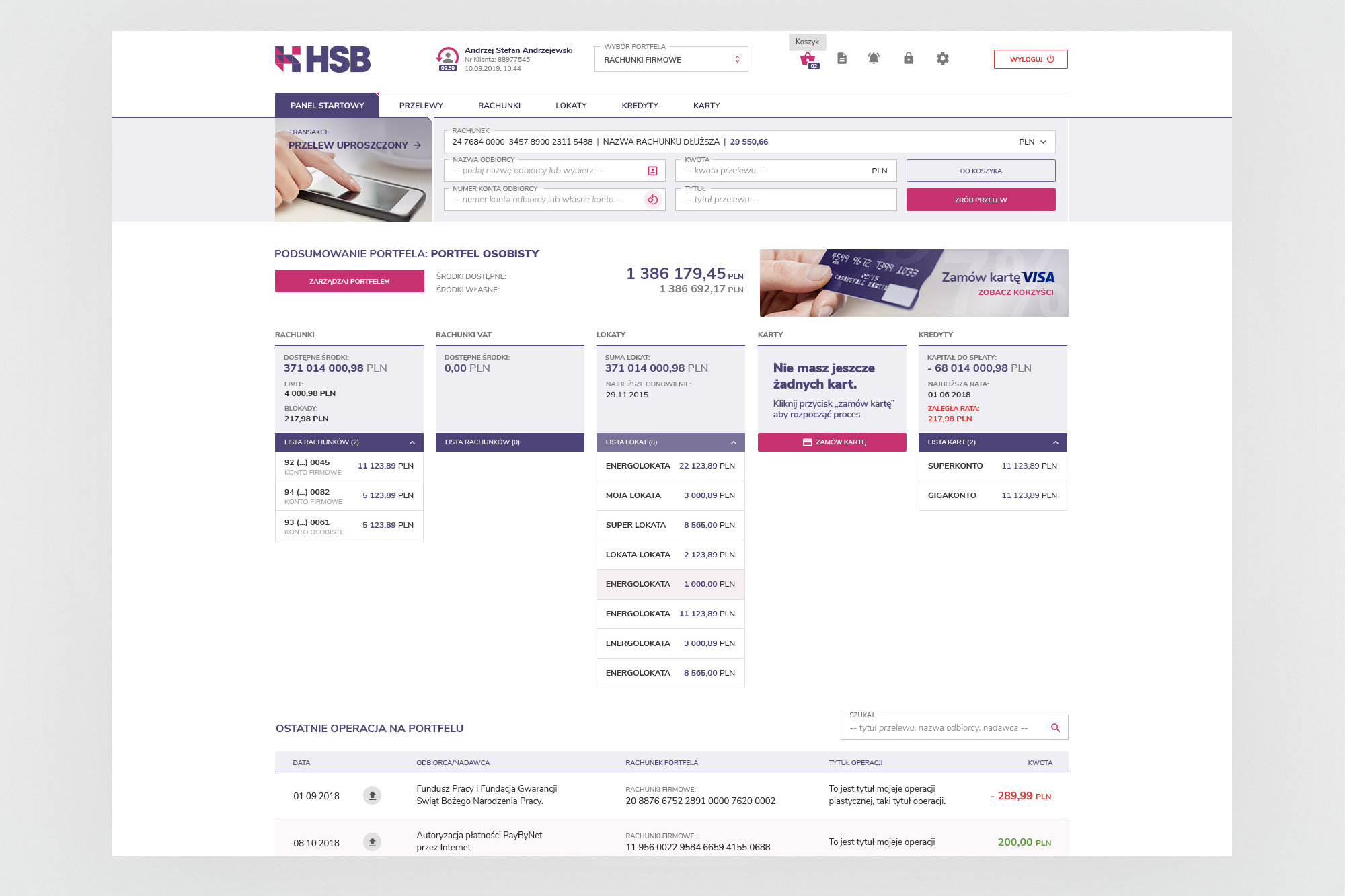
Main dashboard - entry point to the application, surfacing the most frequent actions (quick transfer, account overview, recent transactions) without deep navigation.
02. The challenge
Redesign the product. Create the brand. Ship the website.
The scope of the project was broad by design. It wasn't enough to make the existing application look better - the product had to be rethought as a commercial offering, with a clear identity, a consistent visual language across all modules, and a public-facing website to support sales and demo downloads.
Core brief
Redesign all views of the banking application in response to usability research findings. In parallel, create a new commercial brand - independent of NeoBank - with a name, colour palette and visual identity suitable for licensing the platform to other banks.
The application had to cover a broad feature set: account management, transfers (standard, ZUS, US, VAT, bulk), deposits, credits, cards, and internal messaging. Each module had its own information architecture, its own edge cases, and a demanding audience of both private and business banking customers.
A parallel challenge was designing for data density. Banking interfaces are inherently information-heavy - account numbers, transaction histories, filtering, multi-step forms. The design had to make this density manageable without sacrificing the clean, modern feel the new brand required.
03. My role
Sole designer across the entire product
I joined Mergesoft in 2015 as the company's in-house designer. On the HSB project I was the only designer, working directly with a five-person development team (frontend and backend), with no separate UX researcher or art director above me.
My ownership covered the full scope: brand identity creation for HSB, UI design for all application modules in Adobe XD, handoff to developers, and oversight of implementation. I also designed and built the promotional website - hsb.mergesoft.pl - which served as both a product landing page and a download portal for the desktop client.
04. Brand identity
A new brand built to stand on its own
One of the most distinctive aspects of this project was the requirement to create a completely independent commercial identity — separate from NeoBank — that could be licensed to other banking entities. The result was HSB (HERMES System Bankowy): a geometric logo mark built from interlocking H-shapes in a deep navy-violet and vivid pink-red, paired with a strong wordmark and a four-colour palette designed to read as simultaneously modern and trustworthy.
The palette — navy, pink-red, warm grey, and white — informed every aspect of the product, from button colours and active states in the application interface to the hero section of the marketing website. The brand had to work across contexts: a small header logo in the banking app, a large-format presentation asset, and a standalone identity in sales materials.
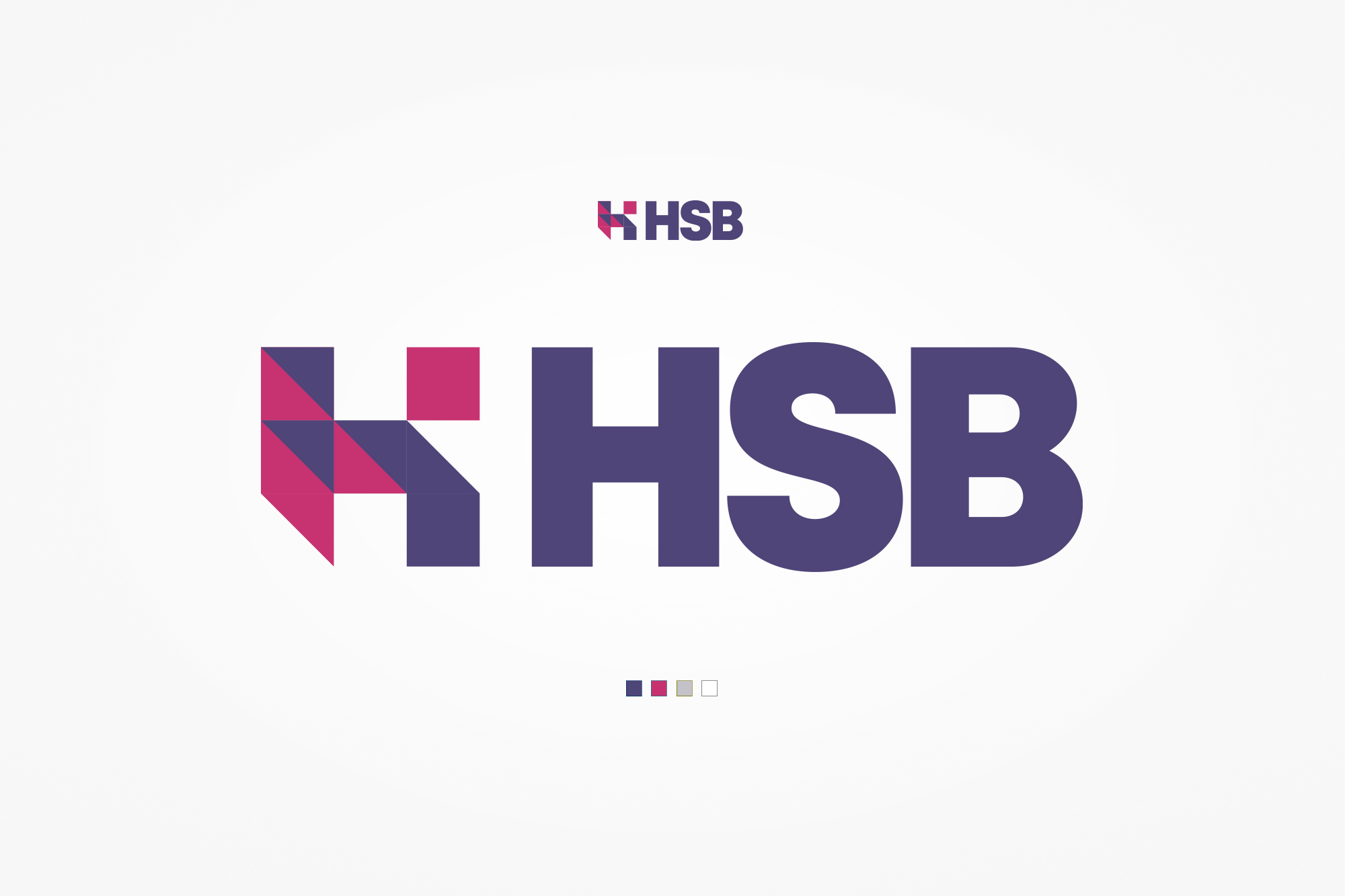
HSB brand identity — the geometric H-mark constructed from intersecting triangular forms in navy and pink-red, alongside the full wordmark and the four-colour brand palette.
05. The application
A complete banking platform - every module redesigned
The HSB application covers the full scope of retail and business internet banking. The visual system is built around a clean white canvas with the HSB brand colours - a deep navy-violet and a vivid pink-red used for primary actions - maintaining the professional credibility a financial product demands while modernising the look significantly from what existed before.
Each module follows the same structural pattern: a contextual navigation strip at the top, a sidebar for sub-section navigation, and a main content area. This consistency allowed users to transfer their mental model from one module to the next without re-learning the interface.
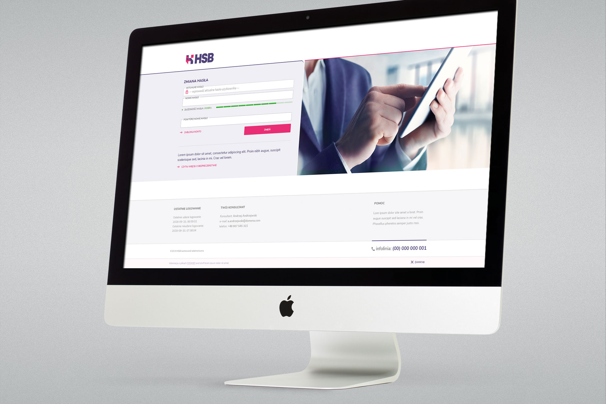
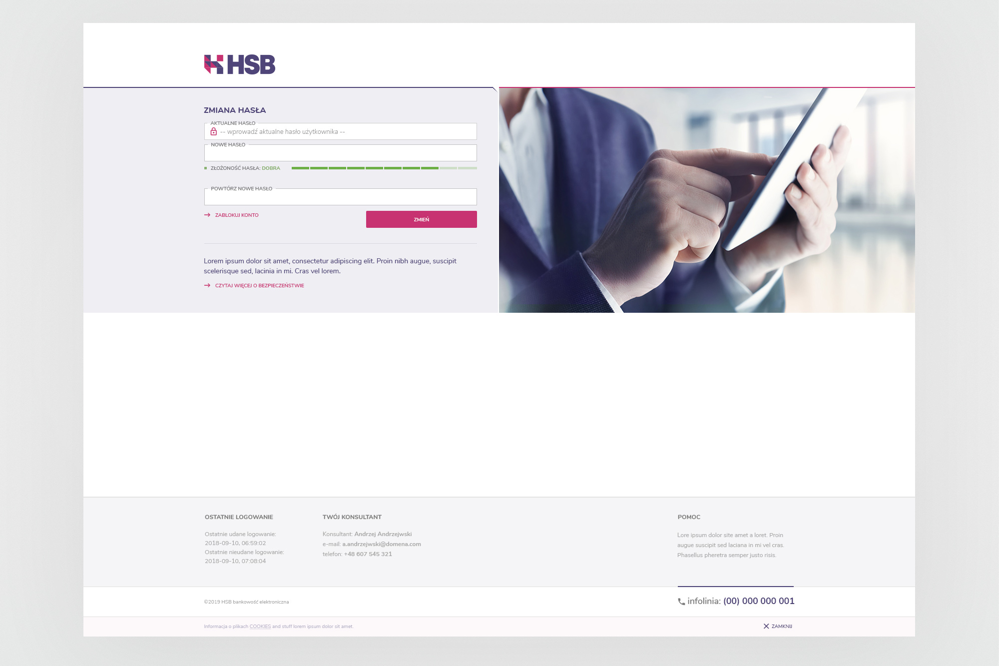
Security module - password change view. The split layout pairs a functional form on the left with a contextual image on the right, a pattern used consistently across security and settings screens.
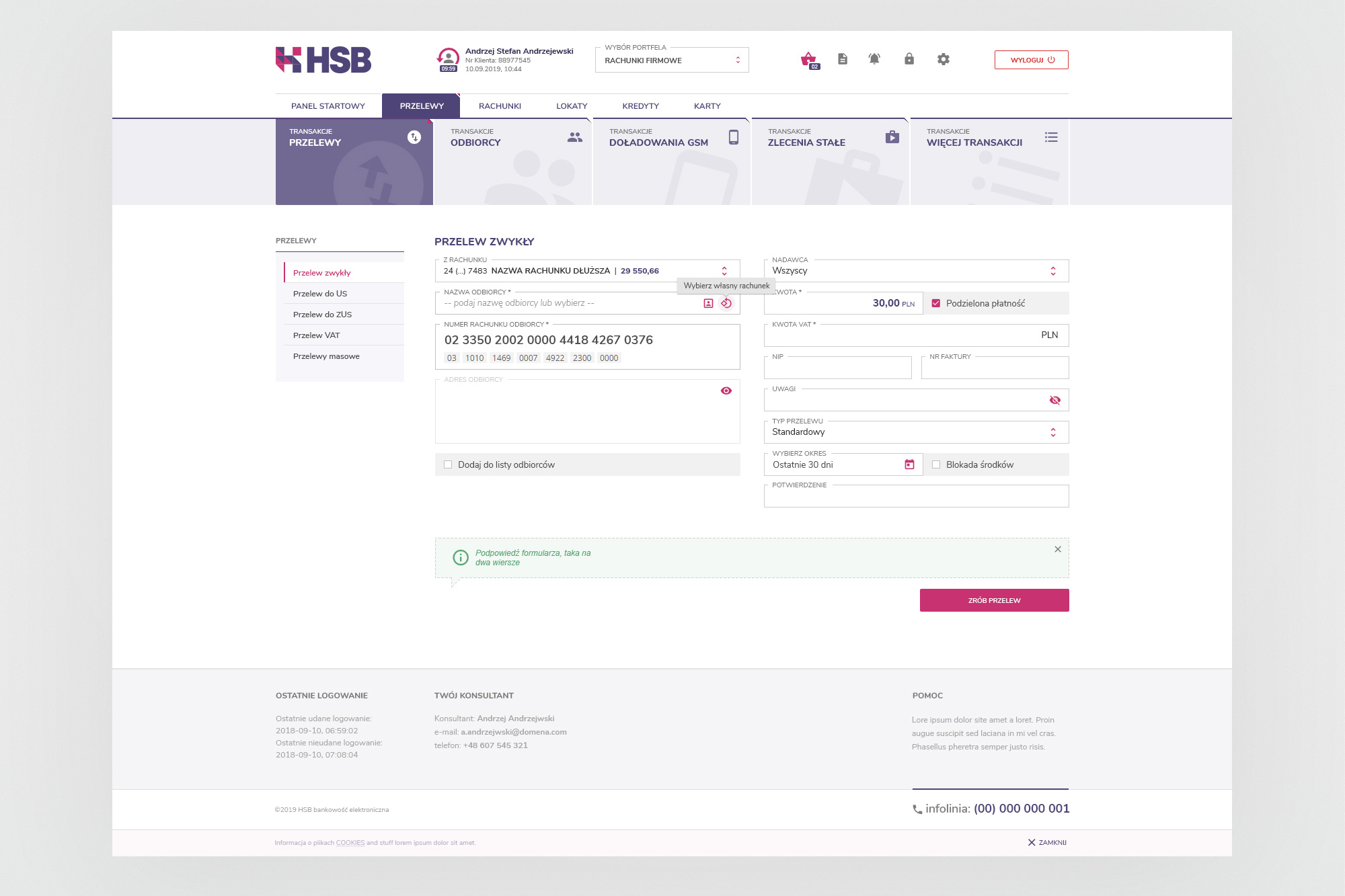
Transfer module - standard transfer form with account selector, recipient search, split-payment support and inline form hints. The contextual navigation strip at the top provides access to all transfer types without leaving the module.
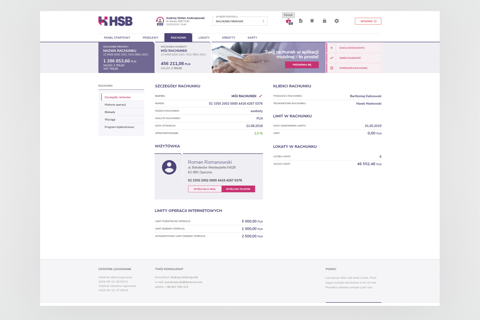
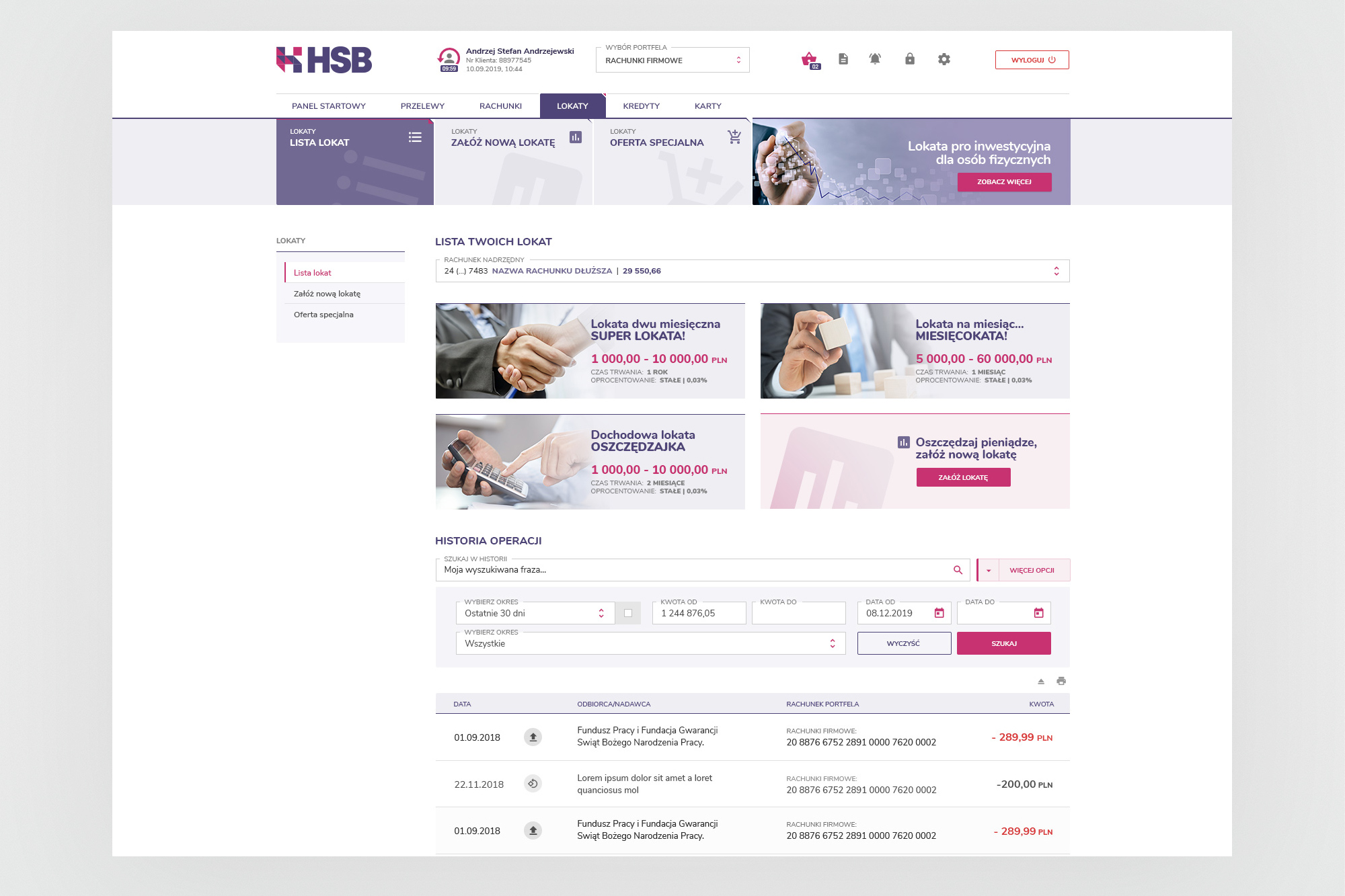
Accounts module (left) - account detail view showing full account data, client information, account card and internet limits. Deposits module (right) - deposit list with product tiles and integrated transaction history with advanced filtering.
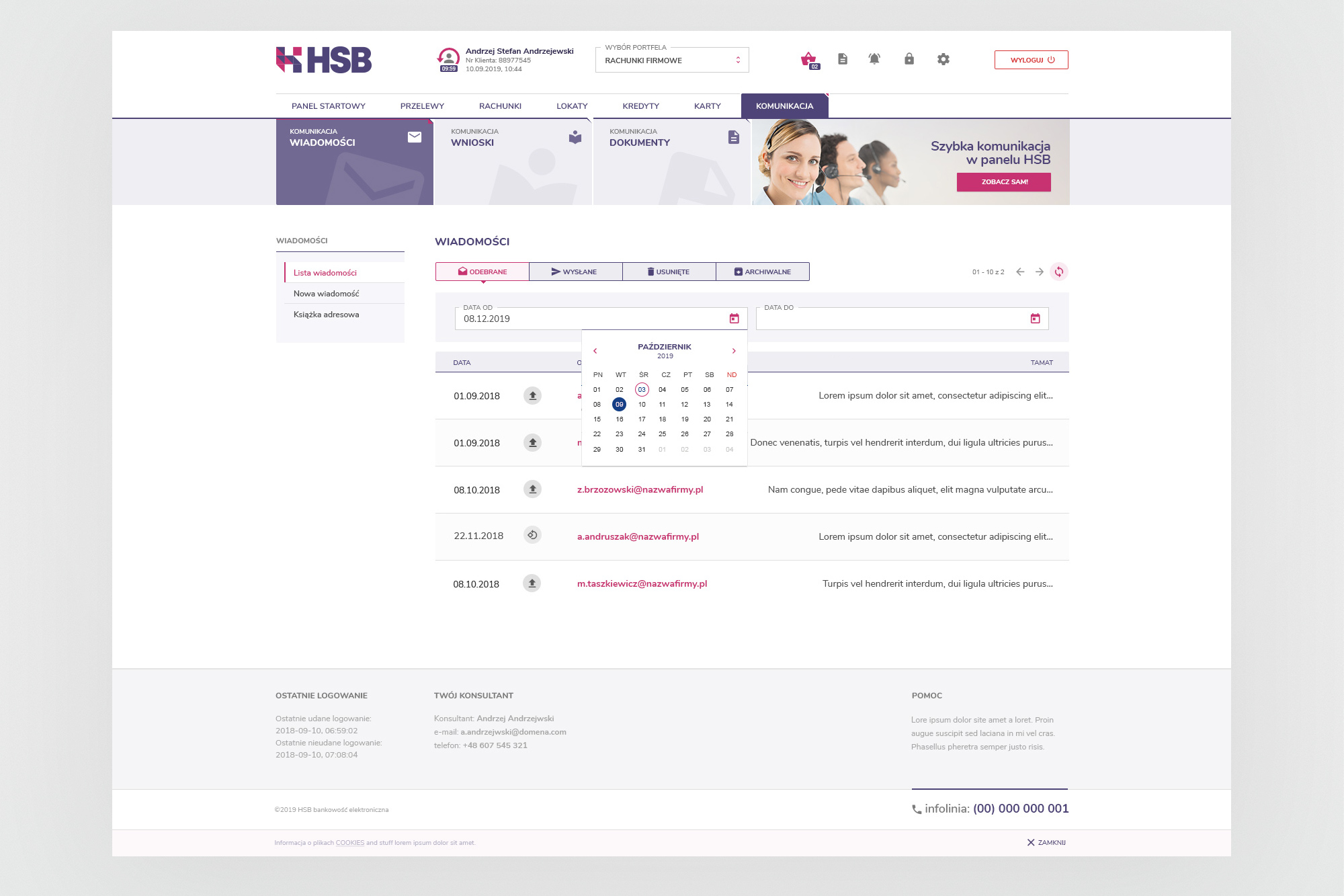
Communication module - internal messaging between the customer and the bank, with inbox, sent items, archived messages, document management and an address book. The inline date-picker follows the same design language as the rest of the form components.
06. Product website
A commercial website to support sales and demo access
Alongside the application, I designed and built the HERMES System Bankowy promotional website - the public face of HSB as a commercial product. The site was aimed at banking institutions considering the platform, providing an overview of the system, the team behind it, product documentation, and download links for both the browser-based and desktop client versions.
The website carried the full HSB brand identity into a marketing context - adapting the colour palette and visual language for a landing page format, with a bold hero, feature highlights and a contact section.
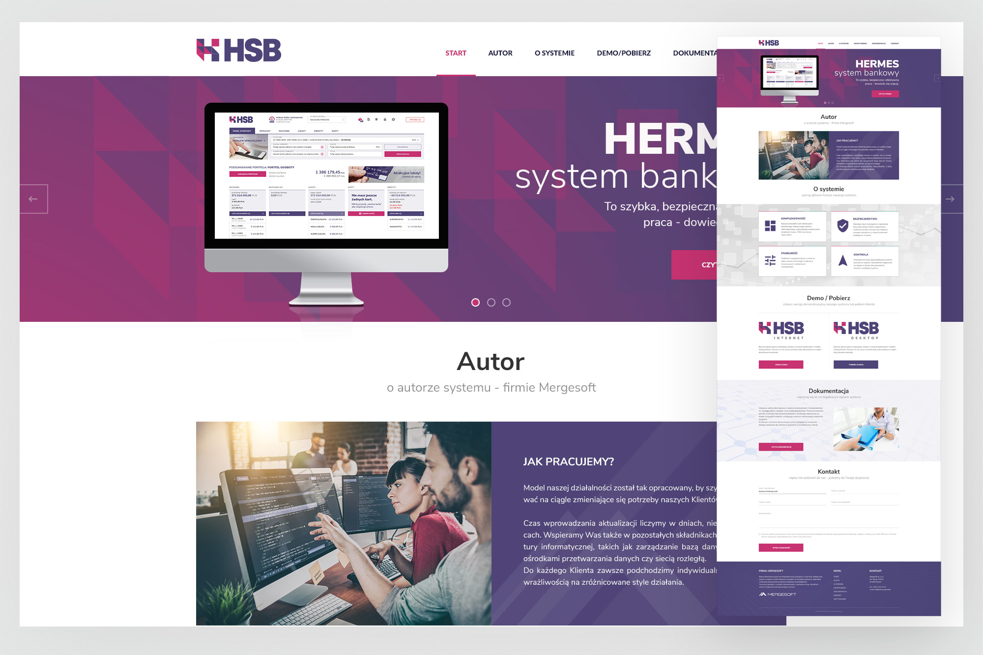
Product website - hero section with application mockup, followed by the About section describing Mergesoft's approach and work methodology.
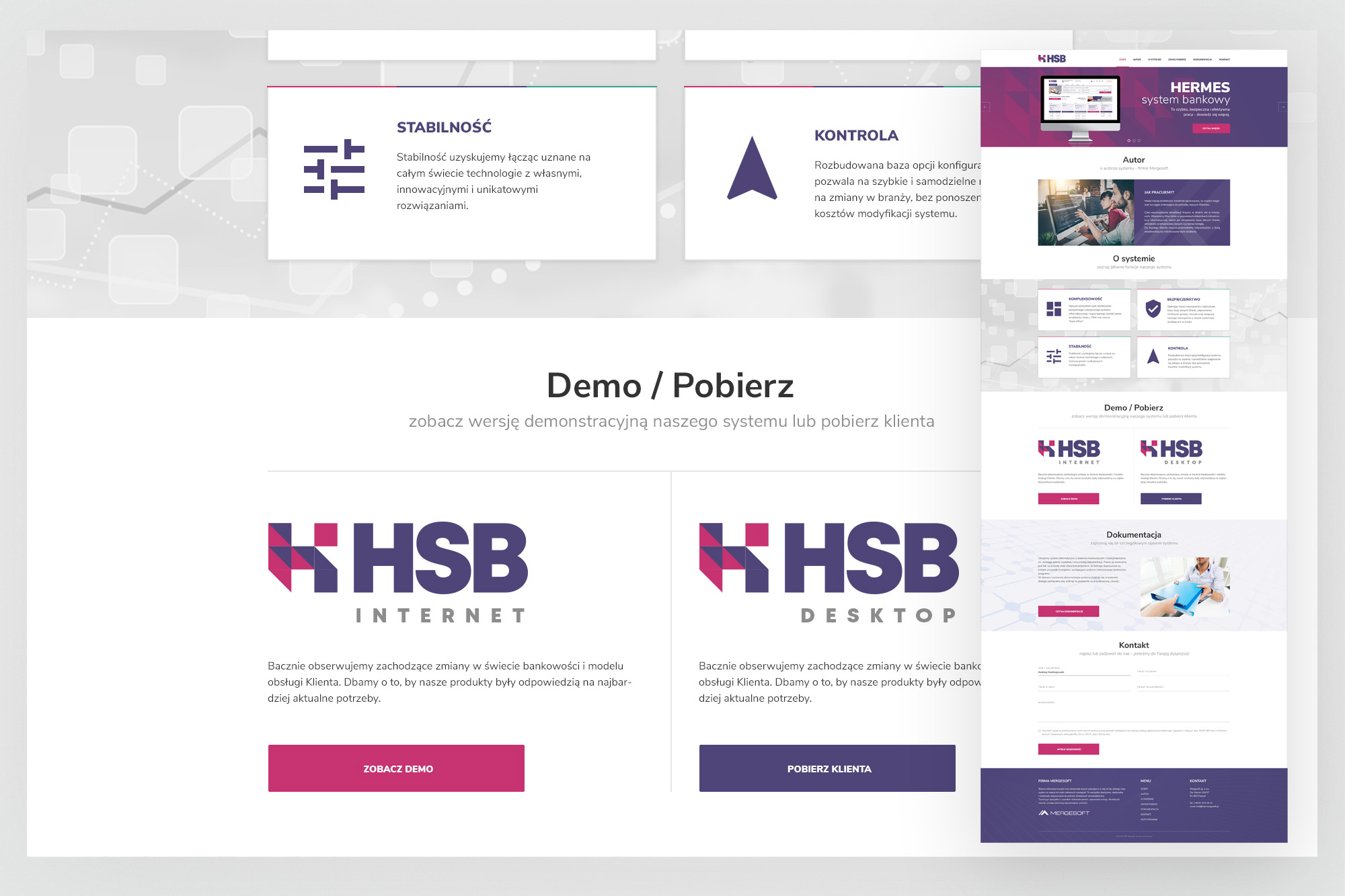
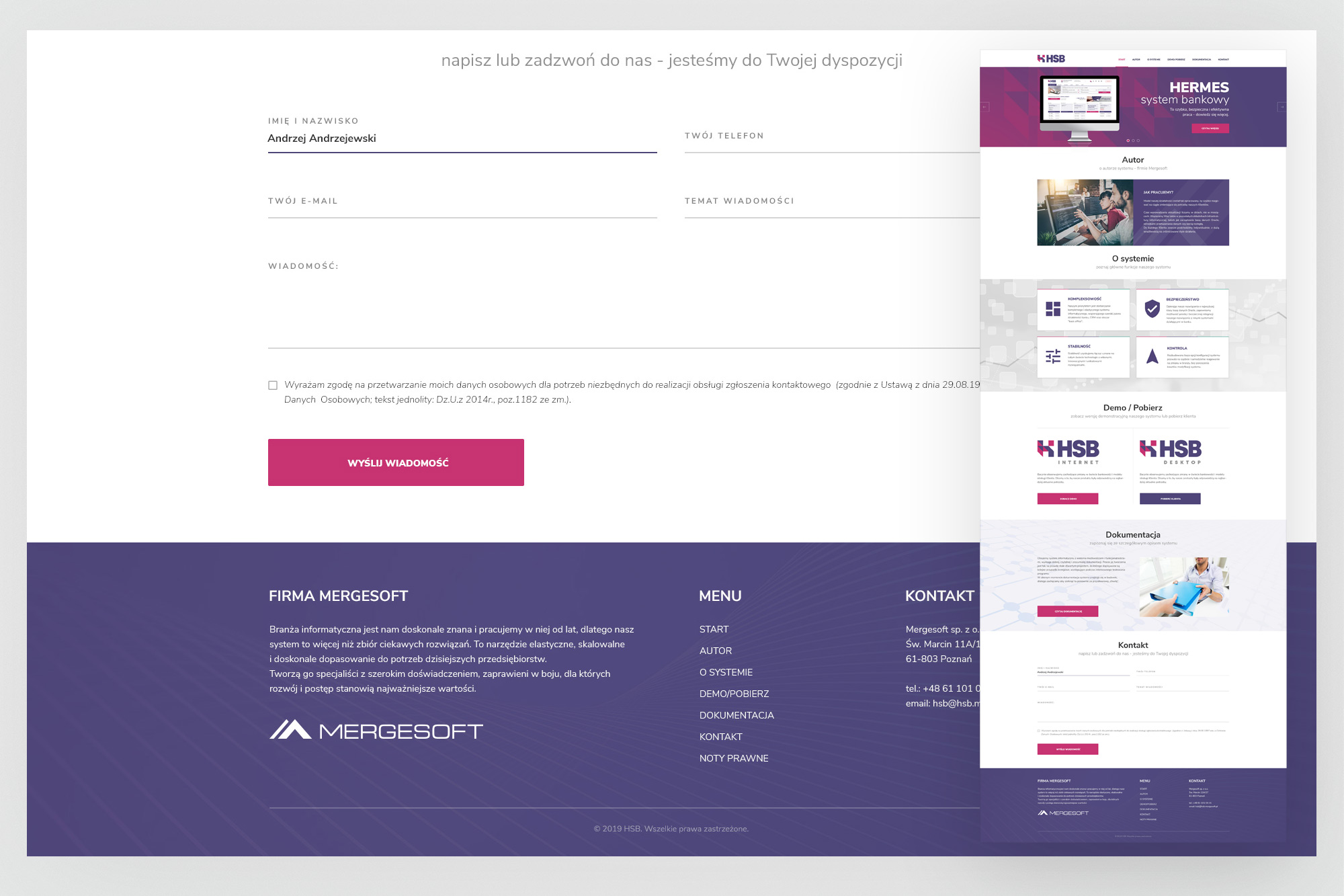
Feature highlights (Stabilność, Kontrola), Demo / Pobierz section with separate download paths for HSB Internet and HSB Desktop, and the contact form with Mergesoft's footer.
07. Outcomes
A fully shipped product - and a transferable commercial asset
The HSB platform was delivered in full and deployed for NeoBank customers. Beyond the primary client, the new brand identity and white-label architecture positioned the product for licensing to other banking entities - the original strategic goal of the Mergesoft team.