01. Overview
From a domain name and an idea to a full visual identity
Eventudu was a community-driven crowdfunding platform for events - a place where people could collectively back ideas they cared about: bringing a touring artist to their city, funding a collaborative art installation, or organising a shared celebration. The concept was about giving communities a practical tool to make things happen together.
The founder reached out to my studio, skillo, having discovered my work online. He arrived with a name, a registered domain, and a clear vision for the platform - but nothing visual. The task was to build the brand from scratch, then extend it into the user interface of the platform itself.
02. The brief
A startup that needed a face - and a platform to go with it
The founder had thought carefully about the product but hadn't yet defined its visual direction. The name "Eventudu" was playful and energetic - hinting at action, festivity, and togetherness. The visual identity needed to match that energy without tipping into frivolity.
The brief
Build a brand that feels vibrant, modern, and community-minded - then carry that identity into the UI of a crowdfunding platform for community events. Deliver all assets print-ready and handoff-ready for developers.
The project was structured as two sequential phases: first establish the brand identity in full, then apply it to the web platform design. My responsibility ended at the asset delivery stage - the client had a small in-house development team ready to build from my mockups.
03. My role
Sole designer, across both brand and product
I worked as the only designer on this project, handling the full visual scope - from the first logo sketch to the final UI screen. The collaboration with the client was direct and iterative: the founder was closely involved throughout, with regular review rounds and quick feedback cycles that kept the project moving efficiently.
04. Brand identity
A bold, geometric mark built around movement and community
The Eventudu logotype pairs a custom geometric icon with a strong, modern wordmark. The icon - a faceted, isometric shape assembled from colourful interlocking pieces - was designed to evoke a sense of collective construction: different people, different contributions, one shared outcome. The warm colour palette (magenta, orange, yellow, teal) deliberately breaks from the blue-dominated fintech and platform-startup aesthetic of the era, giving Eventudu an immediately recognisable and energetic presence.
The wordmark uses bold, even letterforms with a capitalised treatment for the EVENT prefix and a lighter weight for the suffix - a typographic device that nods to the duality of the platform: the event and the "to-do" that makes it happen.
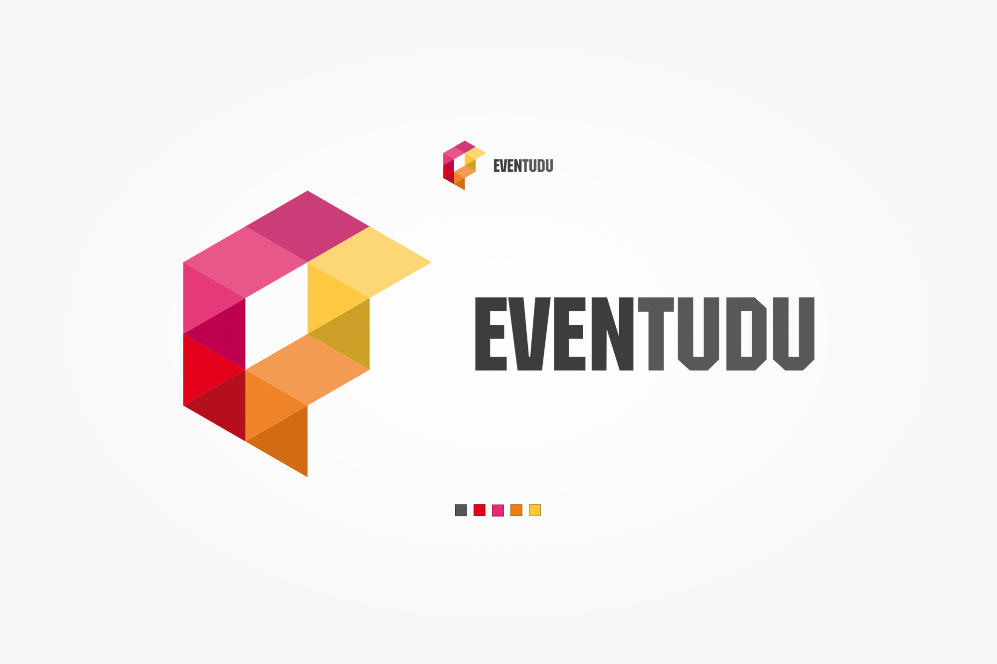
Primary logo with the full brand colour palette - four colours used both individually and in gradient combinations across brand materials.
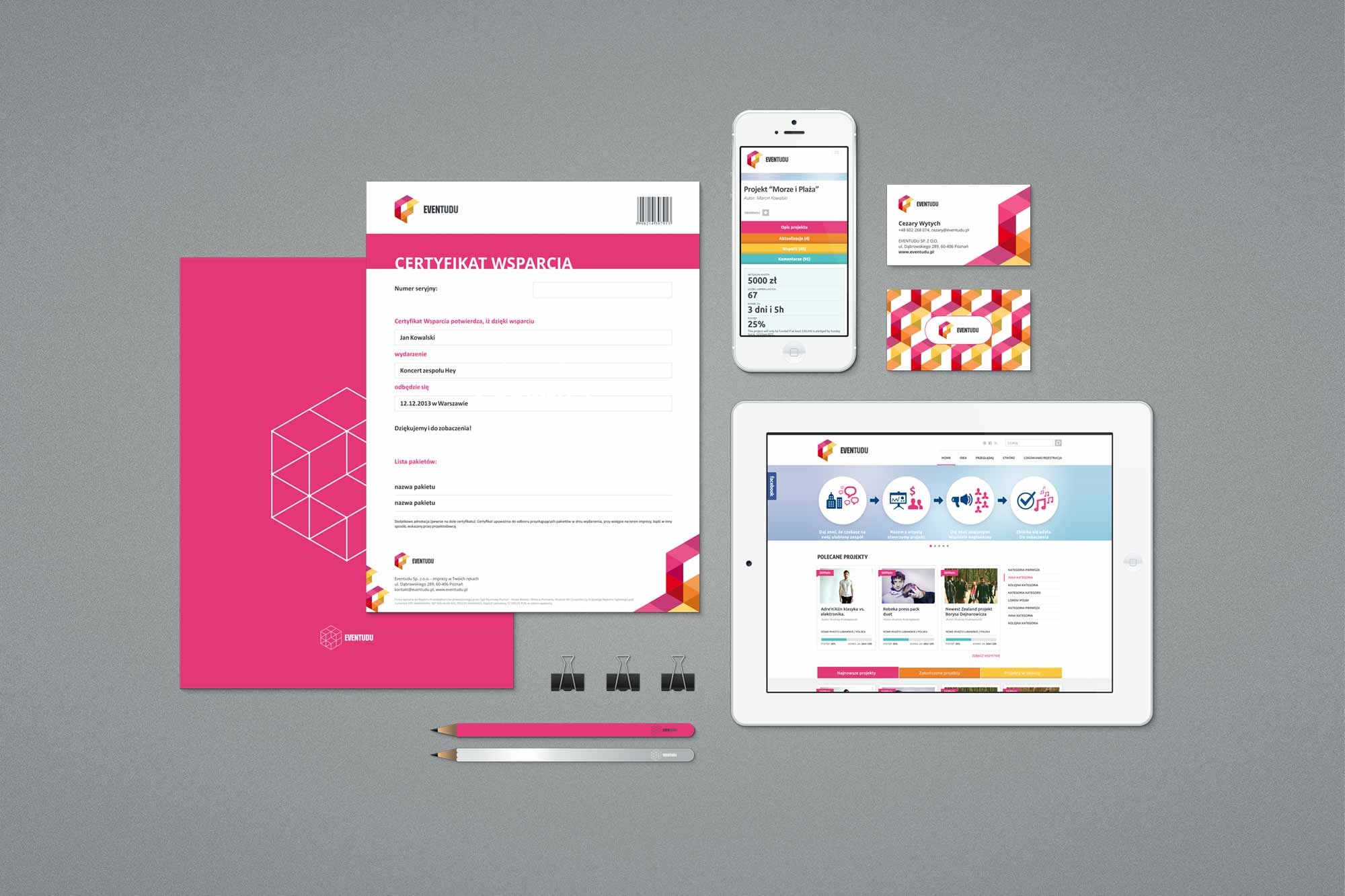
Brand system overview - logo across different contexts and at varying scales, establishing consistency across print and digital applications.
05. Stationery
A complete set of physical brand touchpoints
Corporate stationery extended the brand identity into the physical world. Each piece was designed to carry the brand's energy without overwhelming the functional content - the colourful icon mark and brand pattern doing the heavy lifting, while the wordmark and body type stayed restrained.
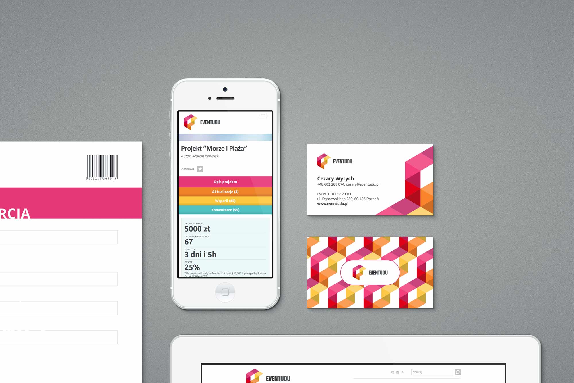
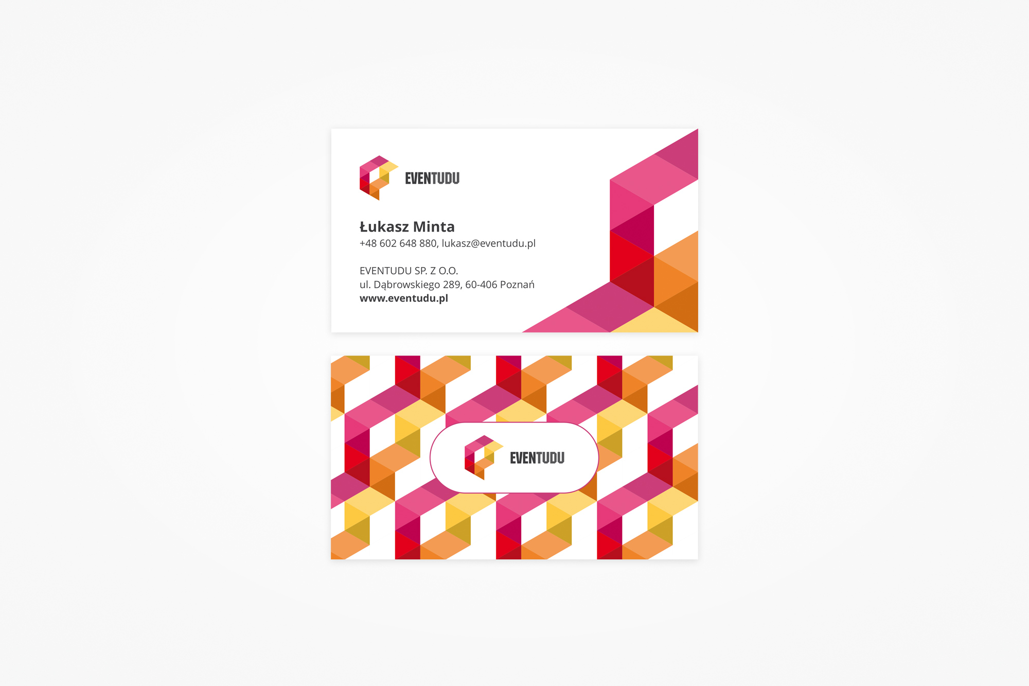
Business cards alongside early mobile concept, and the official letterhead - both using the brand's geometric pattern as a structural visual element.
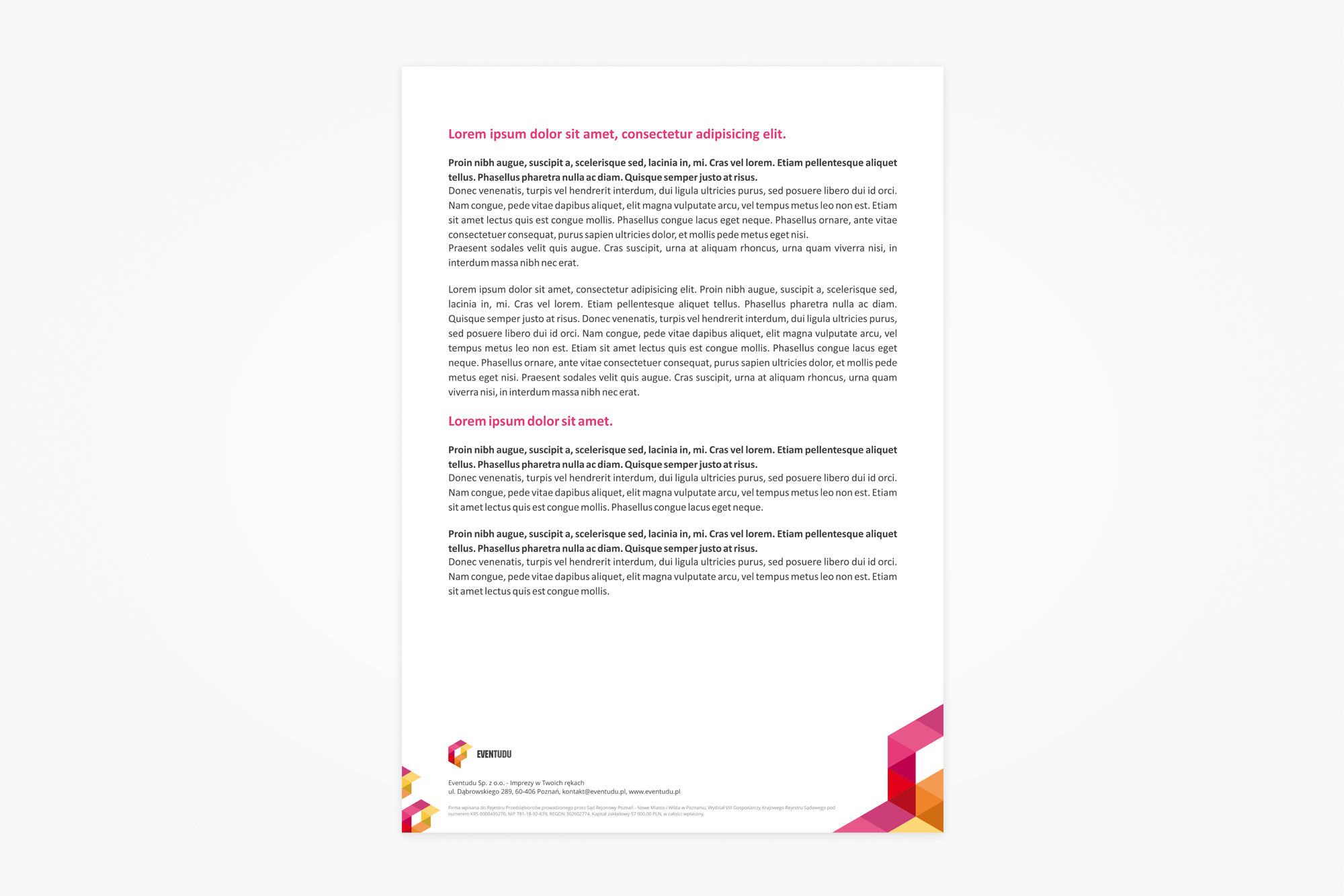
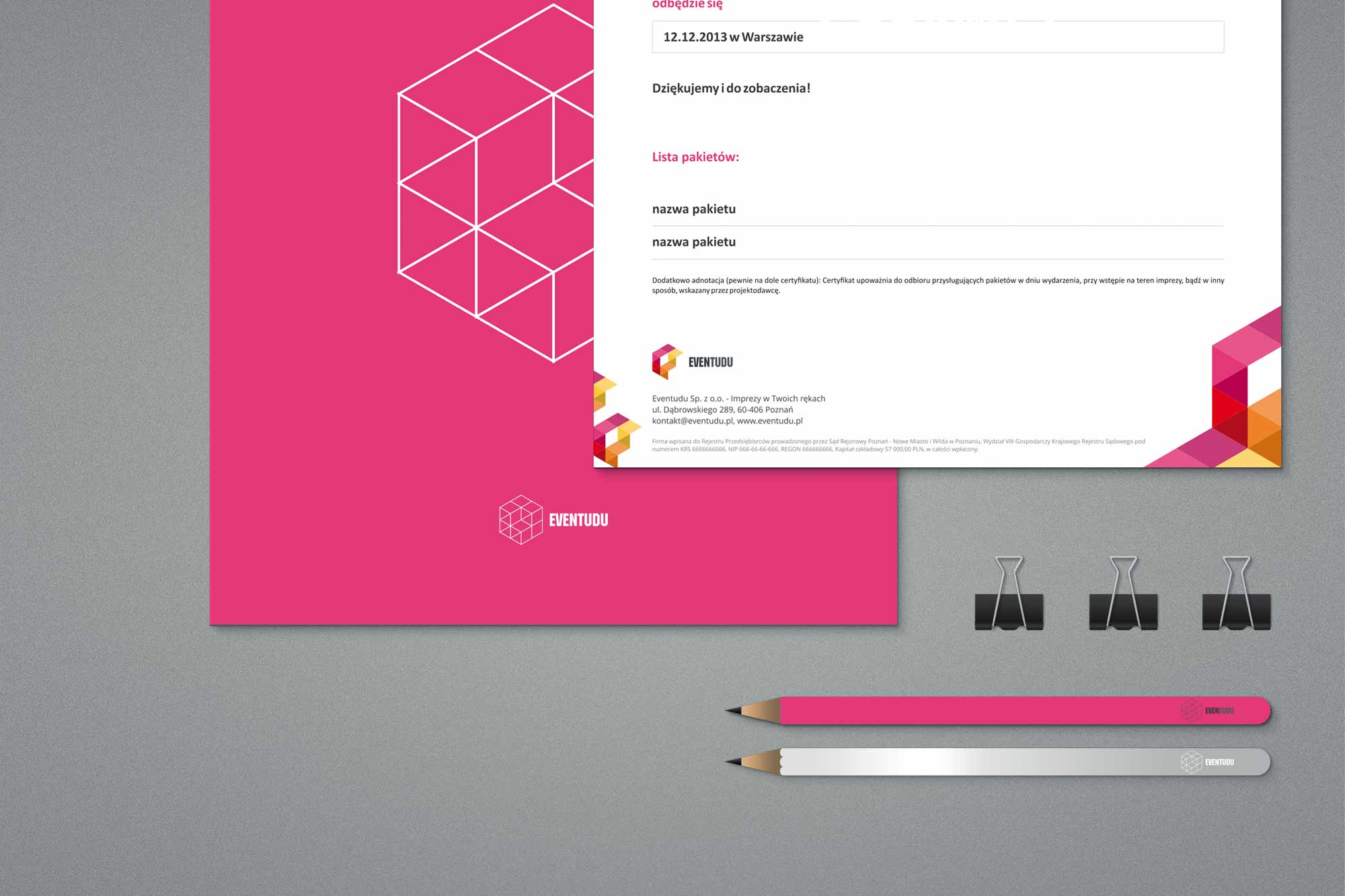
Document template system and the full stationery set - letterhead, envelopes, folders, and branded accessories - delivered print-ready.
06. Web platform
Translating the brand into a working product interface
With the brand identity established, the second phase brought it into the digital product. Eventudu's platform needed to feel alive and inviting - a place where browsing projects was enjoyable and the call to participate was clear. The design had to balance the vibrancy of the brand with the practical clarity required of a transactional platform: browsing events, understanding funding status, and contributing needed to be effortless.
The UI carried the brand's colour system directly into functional elements - category tags, progress bars, and call-to-action buttons all drew from the established palette. The layout prioritised the event projects themselves: large imagery, clear funding progress indicators, and social proof signals were the primary building blocks of each page.
Design approach
The platform UI was designed with a clear handoff model in mind - every screen was documented and exported for the development team, with no designer involvement expected during the build phase. This meant decisions had to be thorough and self-explanatory from the start.
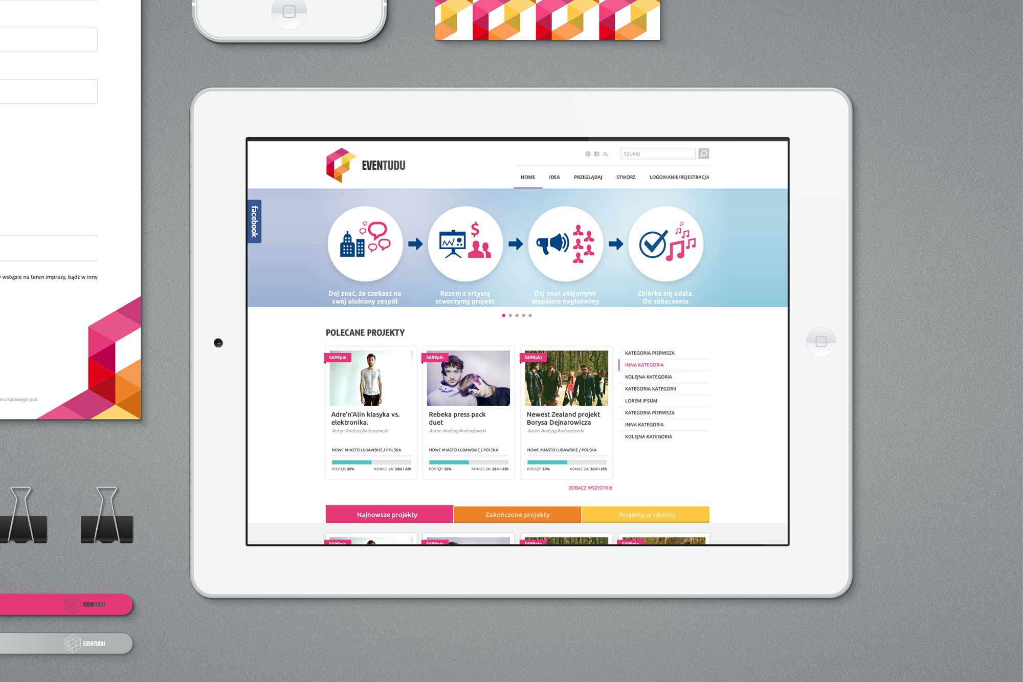
Platform homepage on tablet - event discovery feed with category filtering, funding progress, and the brand identity integrated into the UI system.
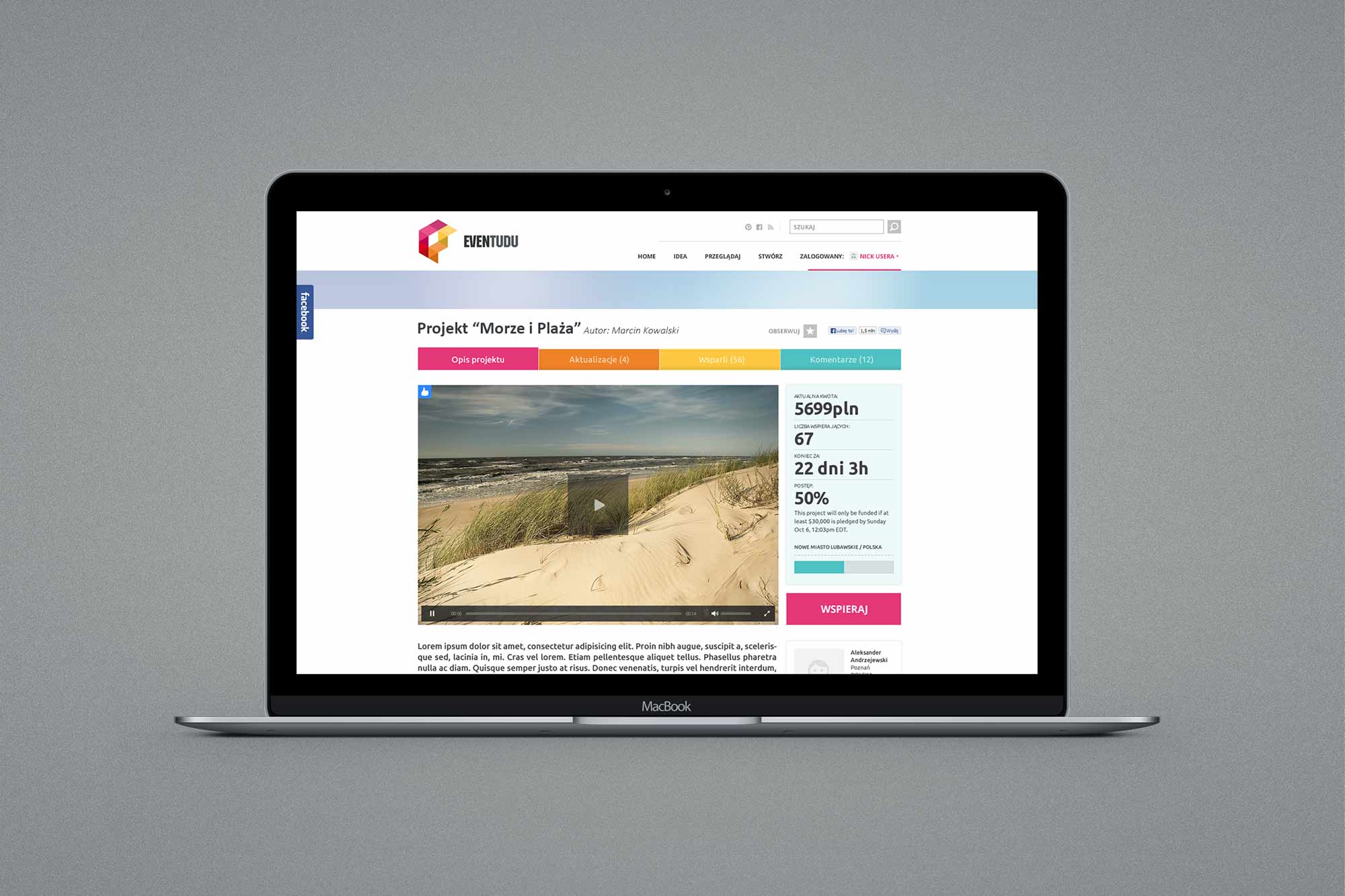
Desktop view of an individual event project page - showing funding progress, contributor count, and the key calls to action.
07. Outcomes