01. Overview
Building a brand and a shop from a blank page
In 2013, a client approached Skillo - my design agency at the time - with a precise business idea but no brand, no name, no website and no visual identity. They wanted to launch an online shop selling premium home textiles: bedding, duvets, decorative pillows, throws and home accessories. The target market was Poland, and the target buyer was primarily female.
The brief was as open as it gets. The engagement started not with a logo brief but with a naming exercise - what would this brand even be called? From there it expanded to cover everything needed to go to market: name, identity, e-commerce store design, print materials, and an ongoing stream of promotional assets.
Scope
Naming · Brand identity (logo, palette, typography) · Business card · E-commerce store on Shoper (template design + implementation) · Thank-you card (in-parcel insert) · Promotional banners · Newsletter design · Redesign concept
02. Brand identity
From a name to a mark - a brand built for its buyer
Research confirmed what intuition suggested: the primary buyer of home textiles and bedroom décor in Poland is female, typically aged 25–45, with a strong interest in interior aesthetics. The brand had to feel considered, warm and slightly aspirational - not clinical, not masculine, not generic.
Several naming directions were explored. The chosen name - Dekano - references "decor" naturally for a Polish ear, holds a warm, feminine ending, and was available as a .pl domain. The tagline Beauty Interior fixed the positioning immediately in the brand mark itself.
The logo is built around a geometric D-form constructed from interlocking triangular facets - echoing both the D initial and the abstract shape of a folded textile. The palette is deliberately warm and non-aggressive: crimson/magenta as the primary brand colour, supported by blush salmon tones and sandy gold. The combination reads as contemporary and feminine without being clichéd.

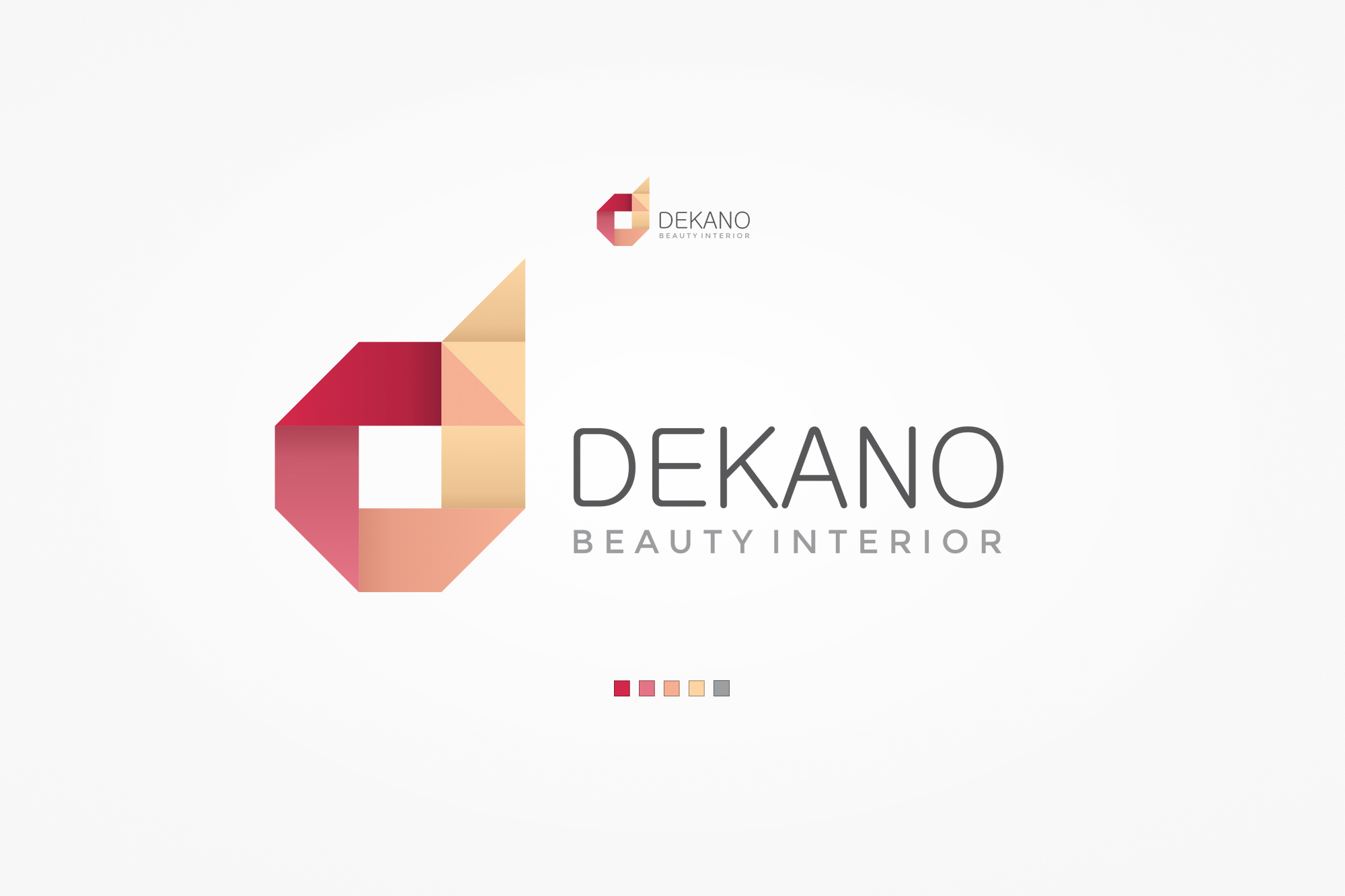
Dekano logo on textured paper (left) - the geometric D-mark with the Beauty Interior tagline. Brand identity sheet (right) - mark, wordmark, and the five-colour palette: crimson, blush, salmon, sand and warm grey.
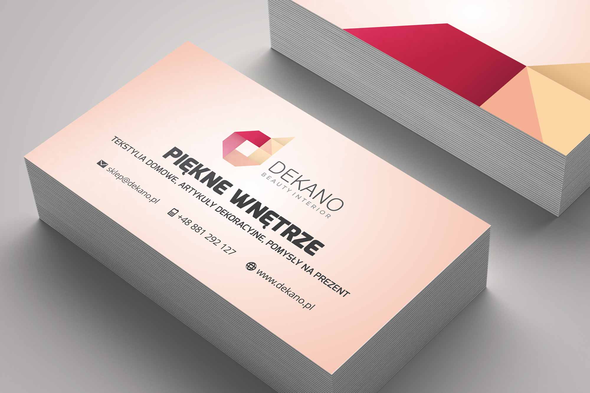
Business card - front with gradient blush background, logo and store tagline. The back features the geometric triangle pattern derived from the logo mark, rendered in crimson and gold tones, establishing a consistent brand texture across touchpoints.
03. Process
Six phases, one continuous engagement
The project ran as a single end-to-end engagement rather than a series of separate briefs. Each phase built directly on the last, with the brand identity setting the visual parameters for everything that followed.
01
Naming & positioning
Multiple name candidates explored and evaluated against availability, domain names, brand feel and target audience resonance. Dekano selected and domain secured.
02
Identity design
Logo, palette, typography and brand pattern designed. Mark tested at multiple sizes - from favicon to large-format - and across light and dark backgrounds.
03
Platform selection
E-commerce platform evaluated. Shoper selected for its strong Polish community, documentation quality, feature set and cost-effectiveness for the client's scale and market.
04
Store design
Key templates designed: homepage, category listing, product detail page, cart and checkout. Consistent with brand identity throughout.
05
Shoper implementation
Designs implemented as Shoper templates using the platform's documentation and templating system, with custom CSS and layout adjustments.
06
Ongoing assets
Continued production of promotional banners, social media graphics, newsletter designs and in-parcel print inserts over the course of the client relationship.
04. The store
A shopping experience that matched the brand
The store design carries the brand identity into the e-commerce context without compromise. The header uses the geometric triangle pattern from the logo as a soft decorative element - present but not overwhelming. The palette, typography and button style are all consistent with the brand identity established earlier.
The category structure reflects the product range: bedding, duvets and pillows, throws, and decorative cushions - plus curated sections like Styles of Interiors and Gift Ideas that add editorial value beyond a simple product catalogue.
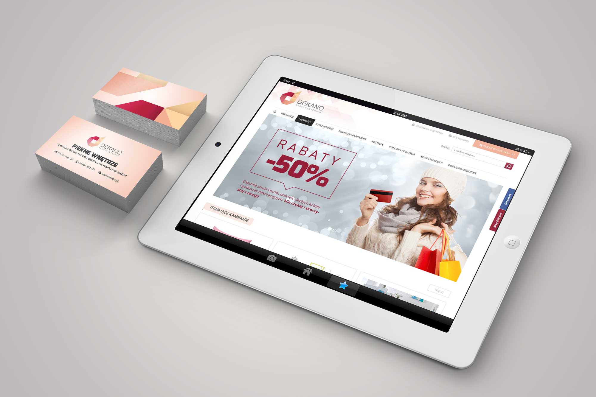
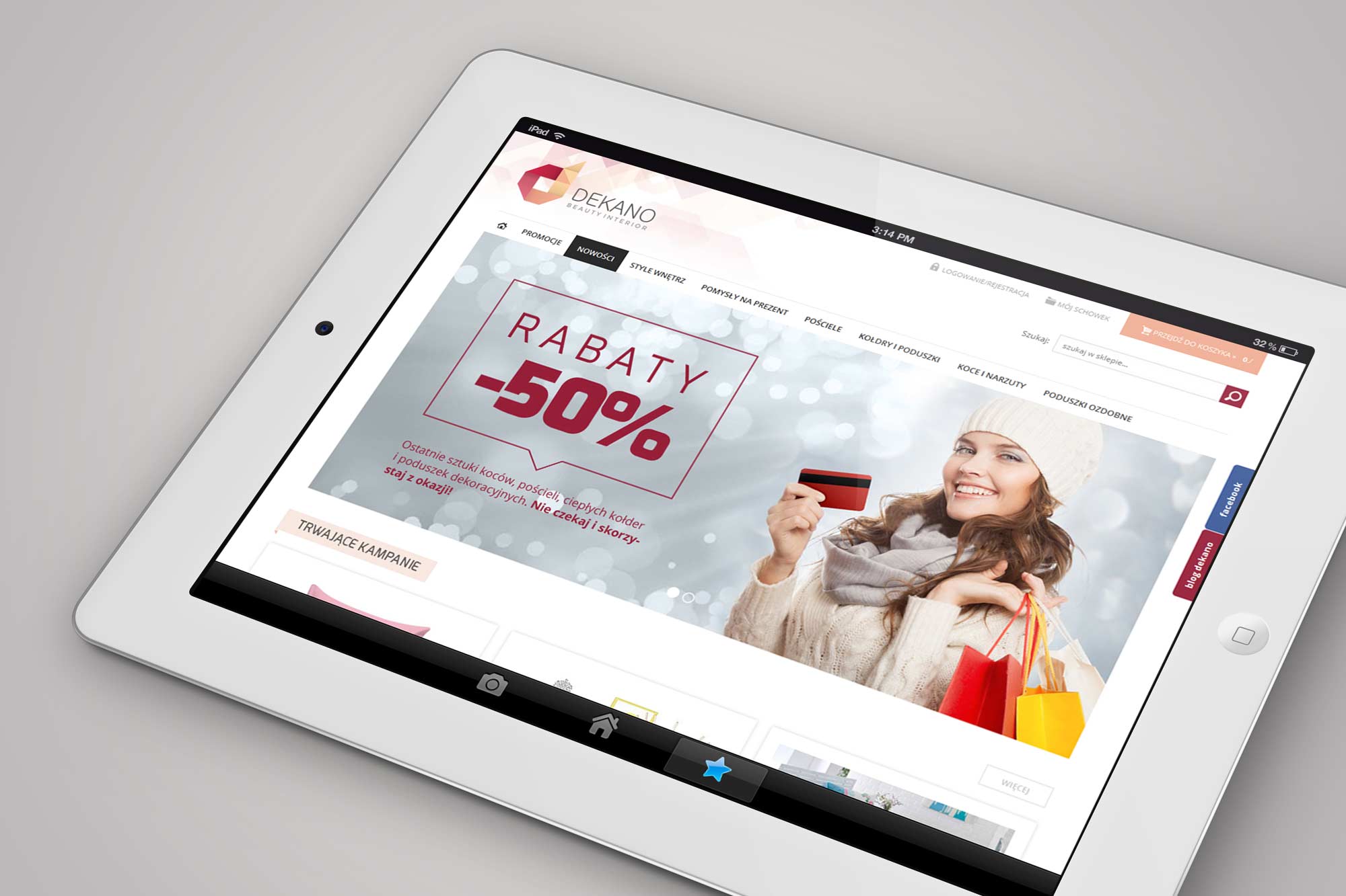
Homepage - full-width promotional slider with seasonal campaign, active campaigns section below. Shown on iPad in both portrait and landscape orientations - the layout adapts to tablet screens throughout.
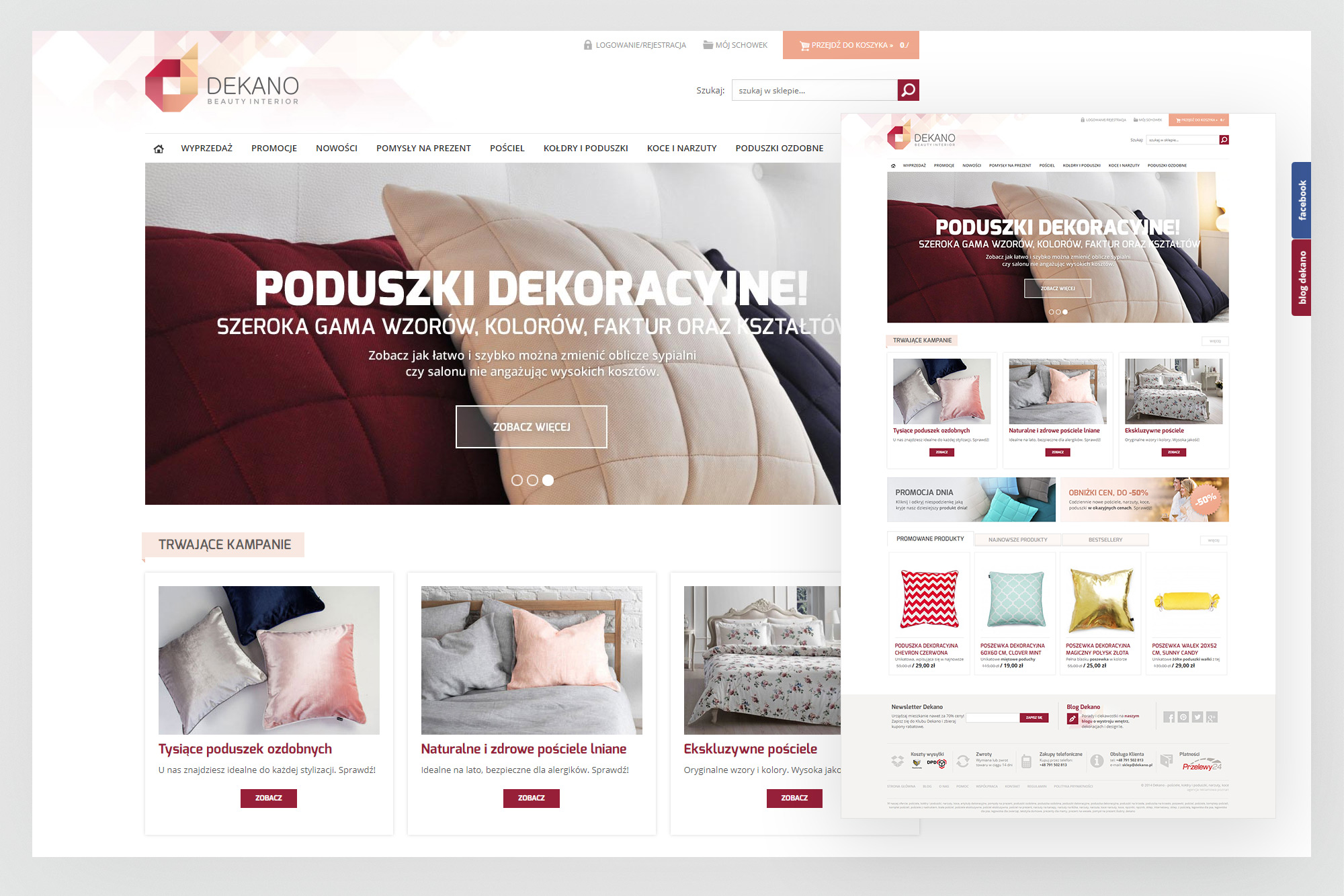
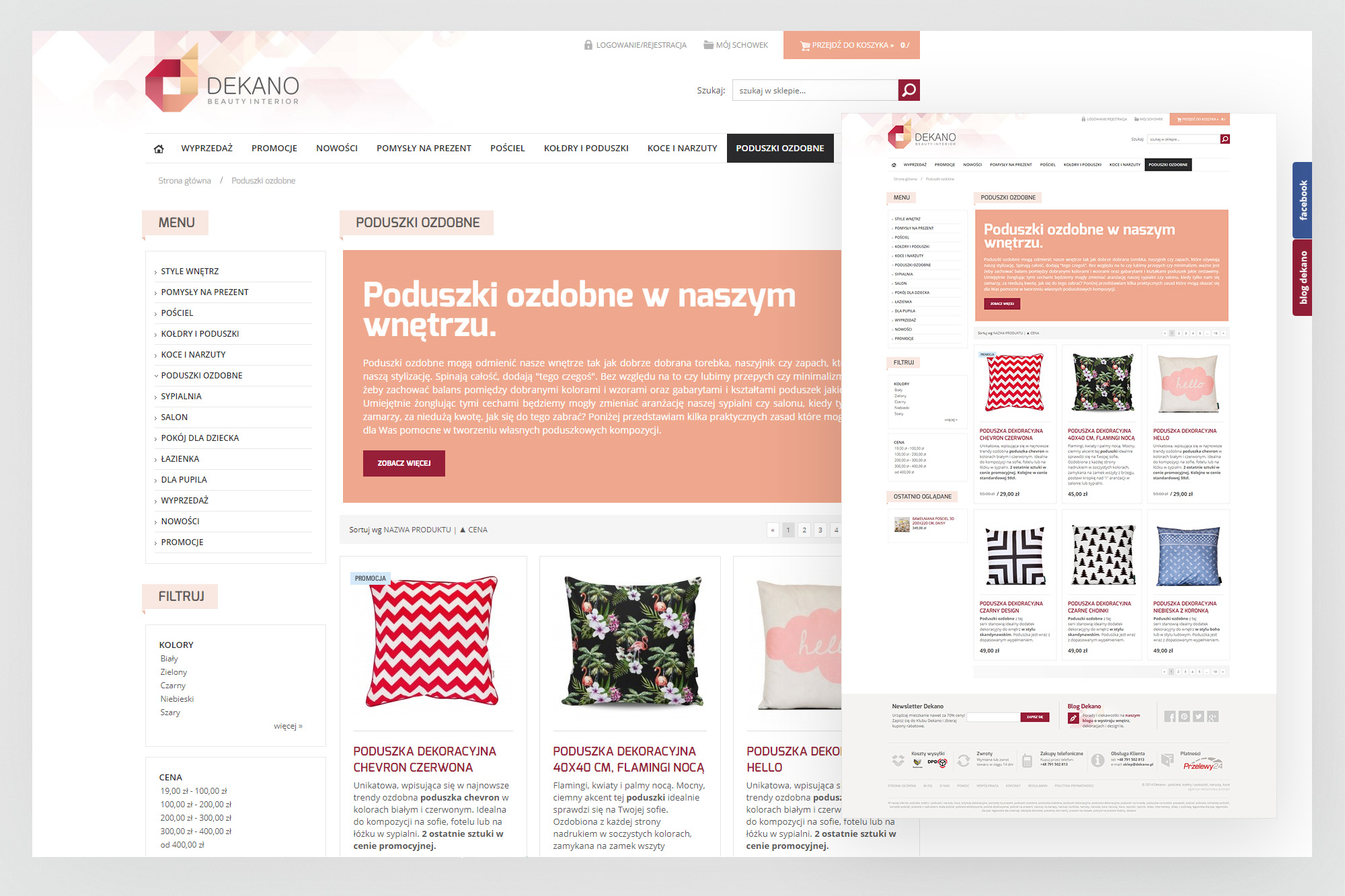
Homepage full view (left) - hero slider, active campaigns, product promotions, product-of-the-day banner, product tabs (promoted, newest, bestsellers) and the newsletter/blog footer. Category page (right) - decorative cushions listing with left sidebar navigation, colour and price filters, and product cards with promotional badges.
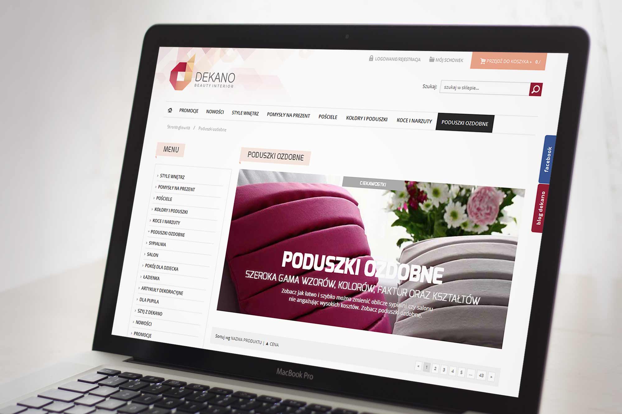
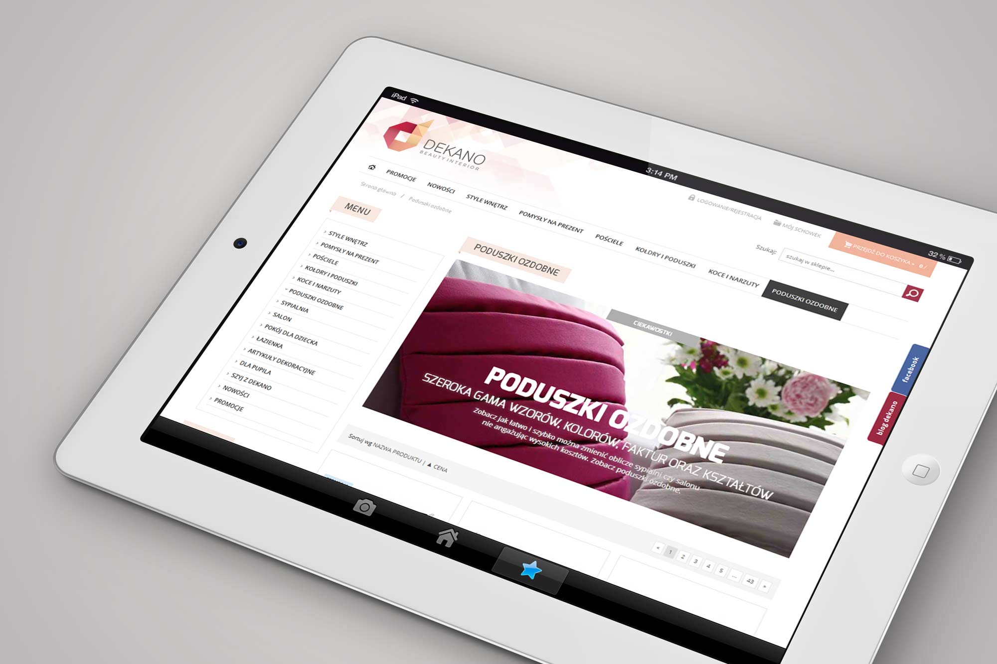
Category page on MacBook (left) - the full category header banner with product grid below, breadcrumb navigation and sidebar. Category page on iPad (right) - the same layout adapting to tablet, with the characteristic brand header pattern visible above the navigation.
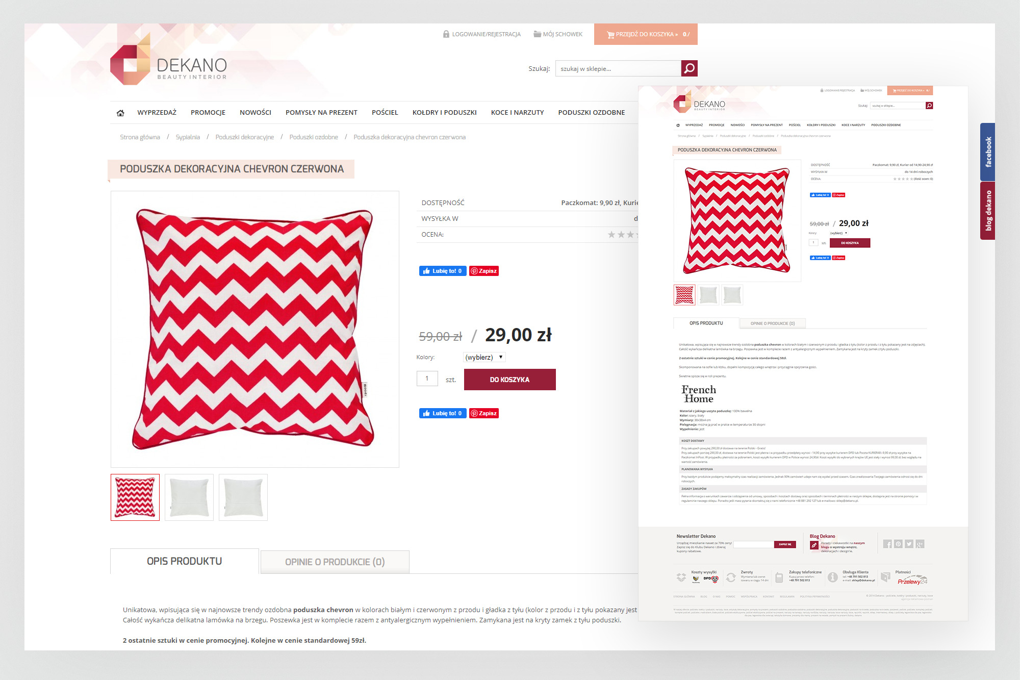
Product detail page - large product image with thumbnail gallery, pricing with crossed-out original price, colour selector, quantity input and add-to-cart button. Product description and reviews tabs below. The thumbnail grid on the right side provides quick navigation to related products.
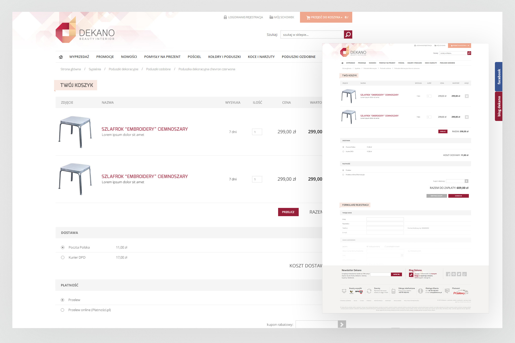
Cart and checkout - product list with quantity adjustments, delivery options (Poczta Polska / Kurier DPD) with pricing, payment method selection and customer registration form. The compact side preview on the right maintains context during the checkout process.
05. Print & collaterals
Small touches that extended the brand into the physical world
For an e-commerce brand selling premium home goods, the unboxing experience matters. A branded thank-you card inserted in every parcel turned a logistics touchpoint into a brand moment - reinforcing quality, building loyalty and providing the store URL, phone number and Facebook presence at exactly the right moment.
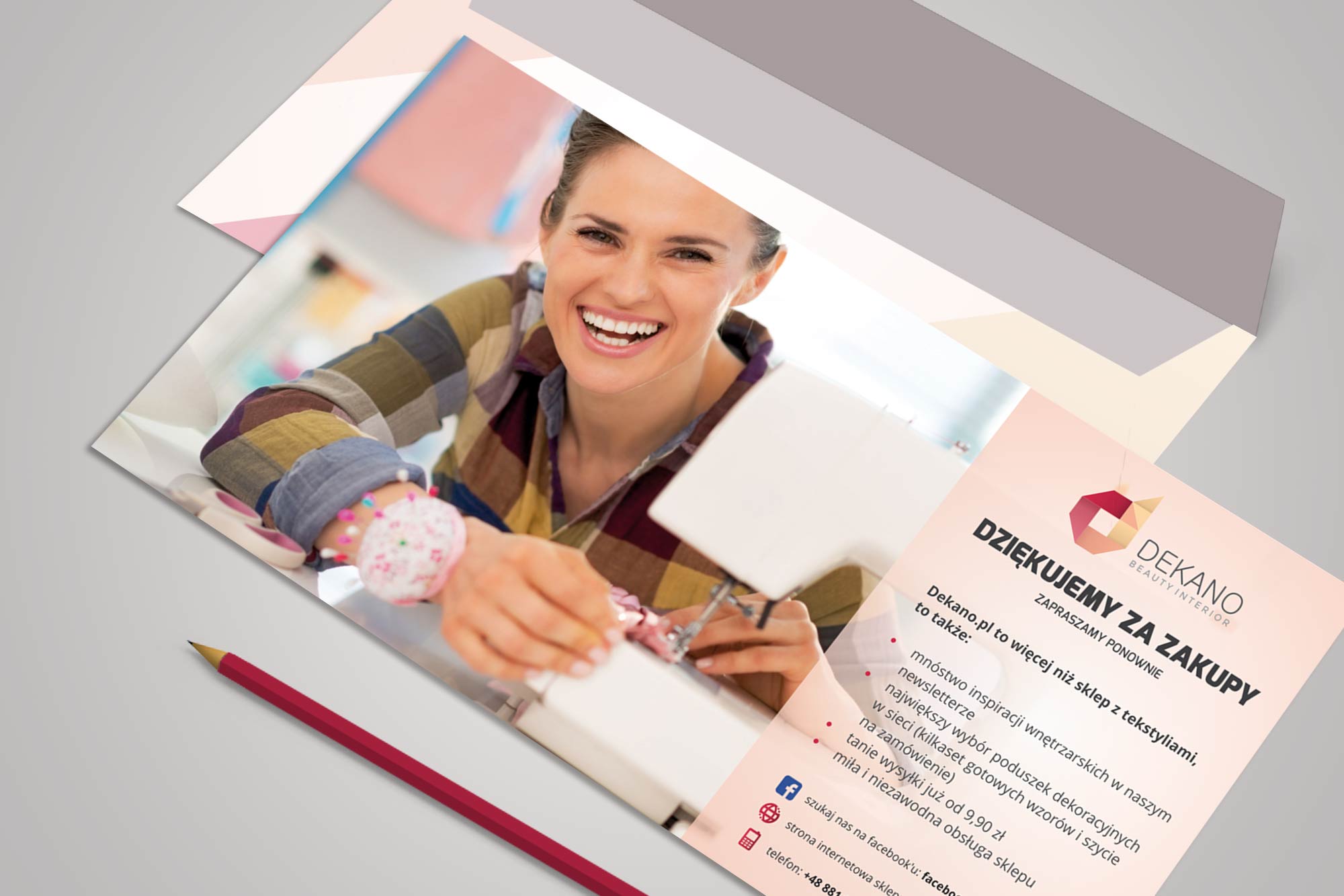
In-parcel thank-you card - "Dziękujemy za zakupy" (Thank you for your purchase), with a lifestyle photograph on the left panel and the brand message, value proposition and contact details on the right. The card reinforces the brand at the moment of delivery and encourages repeat purchases and social follows.
06. Redesign concept
A second-generation store - refined for a maturing brand
As the store grew and the product catalogue expanded significantly, a redesign was undertaken to bring the visual language up to date and improve the shopping experience. The second version of the store moved towards a cleaner, more editorial aesthetic - larger product imagery, reduced chrome, and a more content-driven homepage format with thematic category sections.
The brand identity remained intact, but the implementation became more sophisticated: more generous whitespace, improved product card design with overlapping promotional elements, and a layout that could accommodate the expanded catalogue depth. No screenshots from the live implementation have been preserved - this concept view shows the design direction.
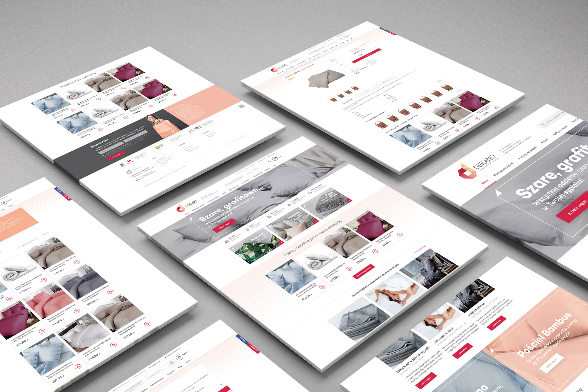
Redesign concept overview - multiple page types shown in an isometric layout: homepage with editorial hero and product grid, category pages for bedding collections, product detail views with expanded imagery. The palette retains the brand's warmth while the layout becomes more generous and content-led.
07. Outcomes
A complete brand - built to sell
The Dekano engagement demonstrates what end-to-end ownership of a brand looks like in practice: from the first strategic decision (what to name the company) through to the customer's unboxing experience. Every element was designed to work as part of a coherent whole.