01. Overview
A furniture retailer that needed a brand as premium as its products
chair4home is a Polish furniture retailer specialising in upholstered seating - sofas, armchairs, dining chairs - and living room collections from domestic and international manufacturers. The company came to the tender with a name, a registered domain, and a clear commercial goal: launch an online shop that could compete credibly in a premium market segment.
The brief covered everything needed to go to market properly: a visual identity to establish the brand, a complete stationery set for business use, and an e-commerce store that would serve as both the sales channel and the company's public face. The store needed to communicate quality and design sensibility without feeling cold - furniture buying is an emotional, considered decision.
Scope
Logo & brand identity · Business cards · Letterhead · Stationery set · E-commerce store on Shoper (custom template design + full implementation) · About us page
02. Brand identity
Geometry and warmth - a mark built for furniture
The chair4home logo needed to feel premium without being cold, and design-conscious without being abstract. The mark draws on a hexagonal form - geometric and precise - with a stylised h-chair silhouette embedded within it. The combination references both the product category (seating) and the company's initial, while the hexagon adds structural authority and a sense of craft.
The palette is built on a rich warm gold as the primary brand colour, paired with deep charcoal for text and a clean white base. This combination - associated with interior design, materials quality and premium retail - positions the brand clearly at the considered end of the furniture market without relying on safe neutral palettes.
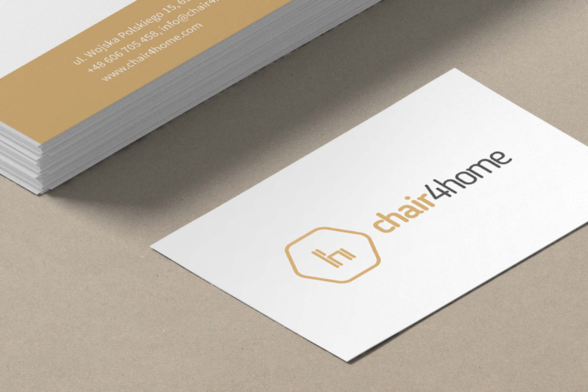

Business card front (left) - the hexagonal logo mark centred on a warm gold background, with the wordmark in clean geometric sans-serif. Brand identity sheet (right) - mark, wordmark and the three-colour palette: warm gold, deep charcoal, and white.
03. Stationery
A complete identity system for business use
The identity system extended across a full stationery set - business cards, letterhead, and document folder - all applying the brand's gold and charcoal palette consistently. The gold accent appears as a structural element: footer strips on the letterhead, edge bands on the folder, and as the dominant background on the card back featuring the decorative honeycomb pattern derived from the logo mark.
This use of a geometric pattern derived from the logo is a detail that turns the mark into a brand texture - giving the stationery depth and distinctiveness without requiring additional illustration or photography.
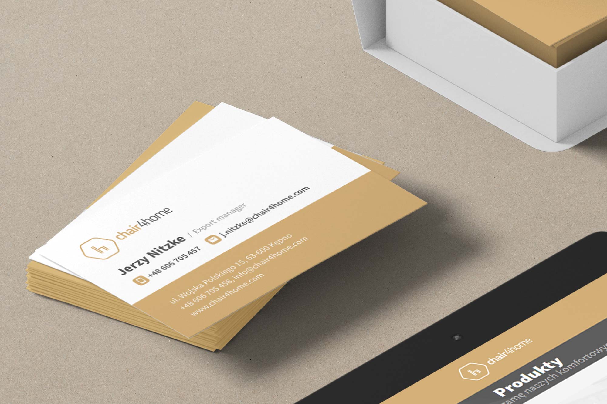
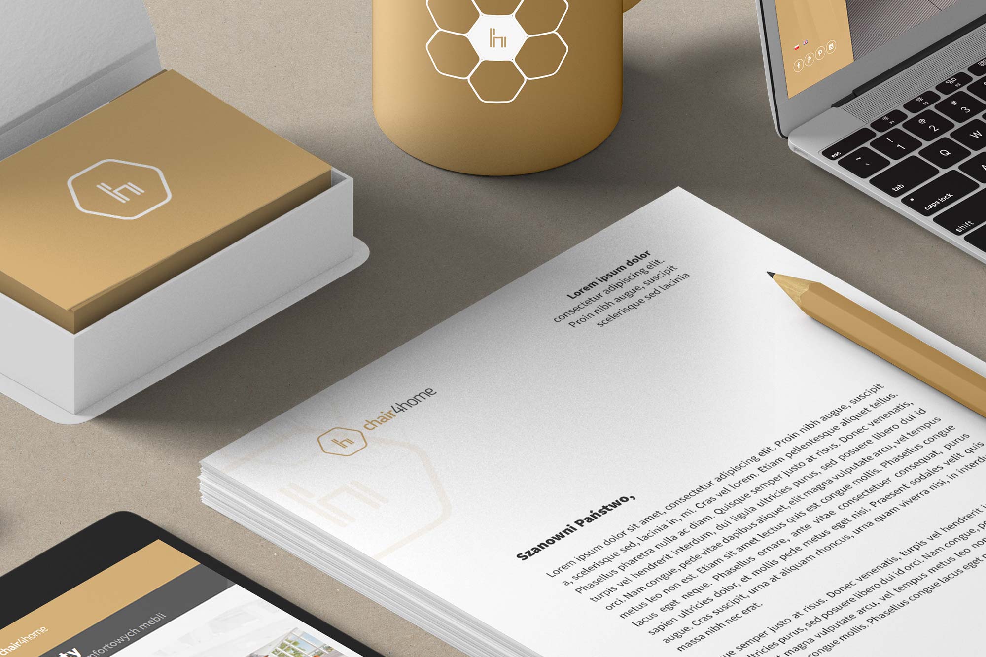
Business card (left) - front with logo and contact details on a warm white ground; back with full-gold background and the honeycomb geometric pattern. Stationery set (right) - A4 letterhead with gold footer band and document folder with gold spine, both carrying the logo mark consistently.
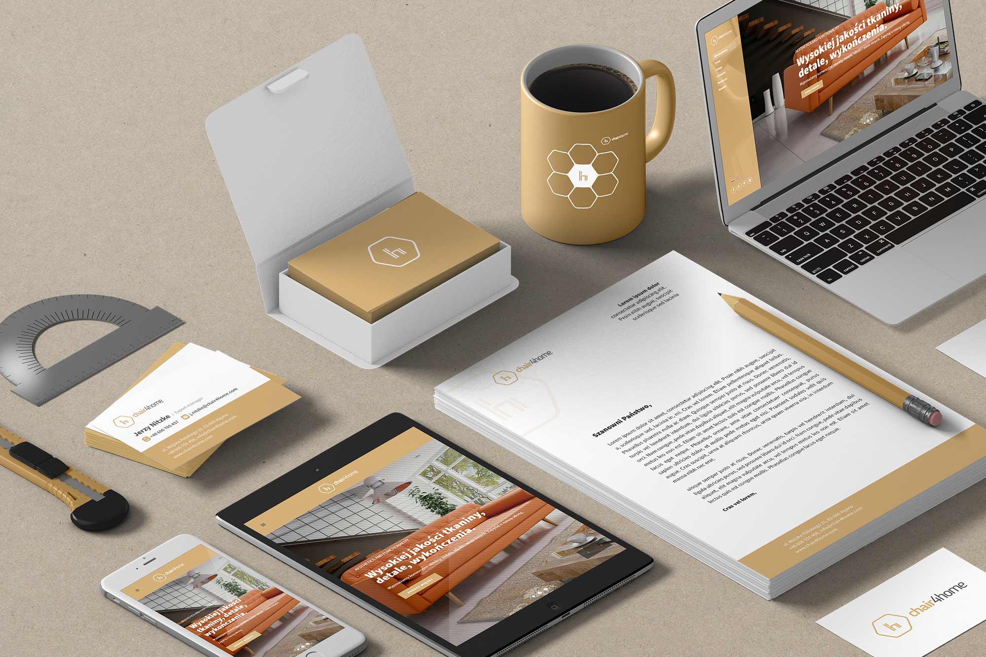
Brand identity in use - stationery mockup showing business cards, letterhead, mug and digital devices. The gold/charcoal palette reads consistently across print and screen contexts.
04. The store
An e-commerce store that is also the company's website
The chair4home store on Shoper was designed and implemented as a custom template - not a platform default - built to carry the brand identity into the digital shopping experience. The visual system uses the gold accent consistently as a structural element: the left sidebar navigation strip, promotional banners, category labels and call-to-action buttons all use the brand gold, creating a strong visual thread from the logo through to the product pages.
Because the store served as the company's primary digital presence as well as its sales channel, it included a full About page alongside the commercial sections - giving customers a sense of the brand's story, values and product approach alongside the product catalogue.
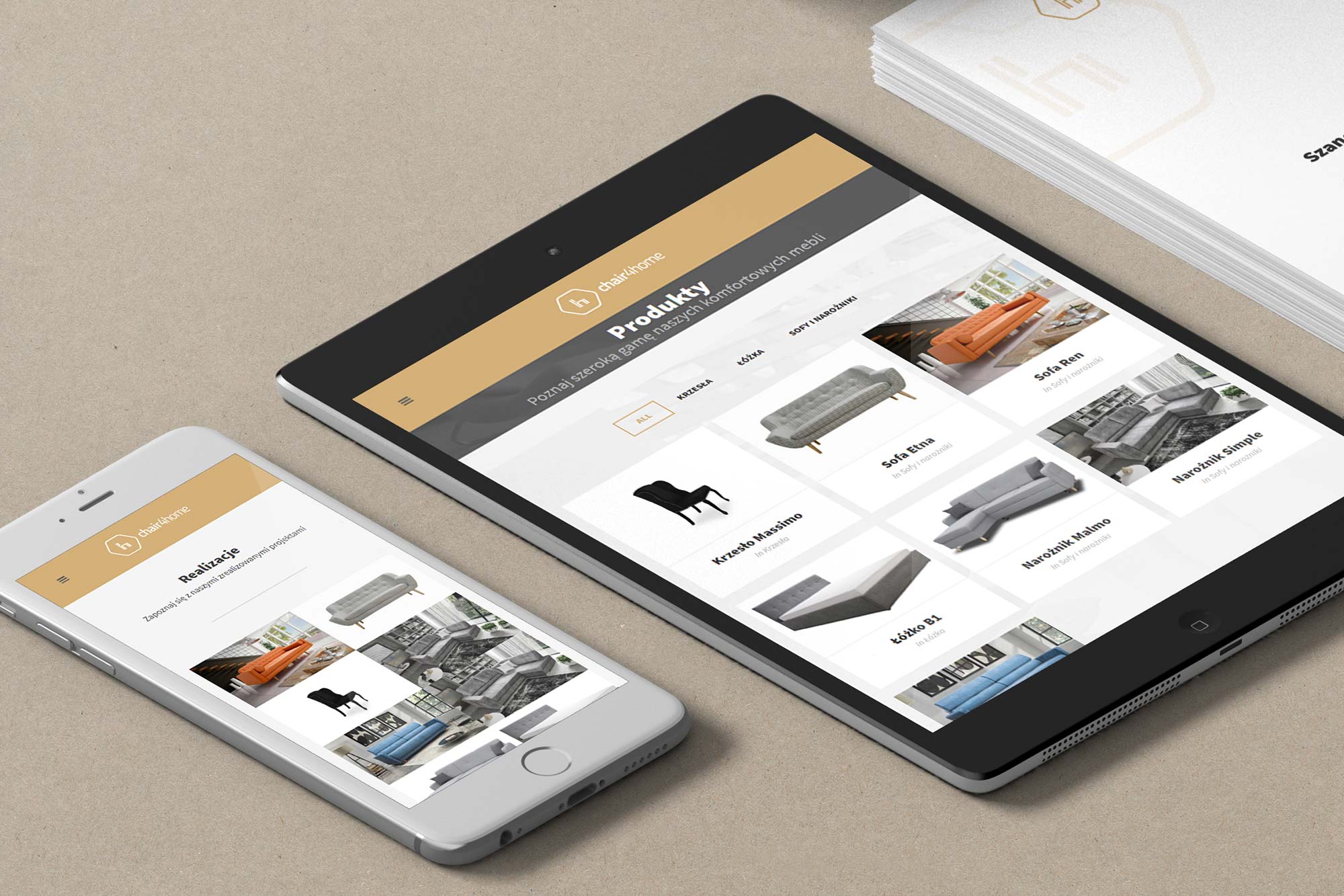
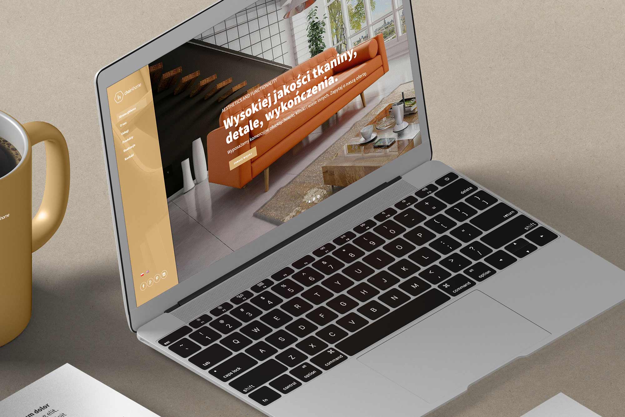
Store shown across devices - iPad and iPhone (left) demonstrating the responsive layout adapting to tablet and mobile viewports. MacBook (right) showing the full desktop homepage with the "Wypożycz jadalnię i kanapę dzisiaj" promotional hero banner.
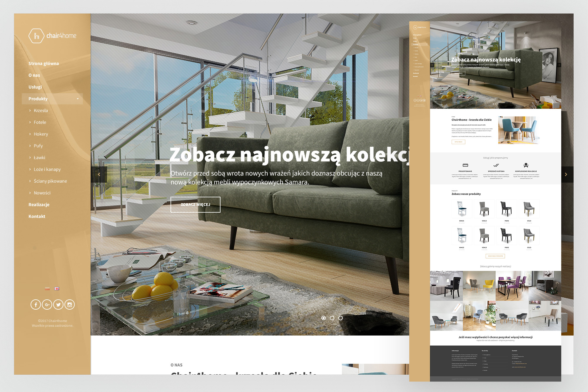
Homepage - full desktop view showing the gold-accented left navigation, promotional hero, "Zobacz najnowszą kolekcję" new collections section with lifestyle photography, and the product category grid below.
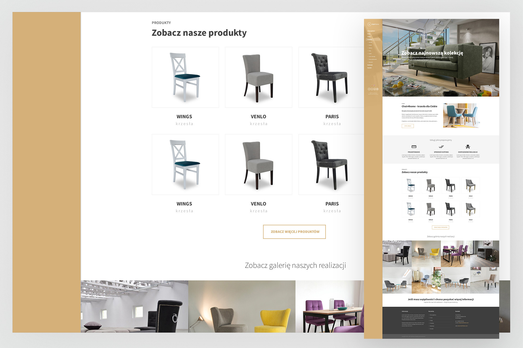
Product listing page - the full catalogue view with left sidebar navigation (product categories, filters), product card grid with images, names and prices, and a "Browse our latest collection" CTA banner at the foot of the page.
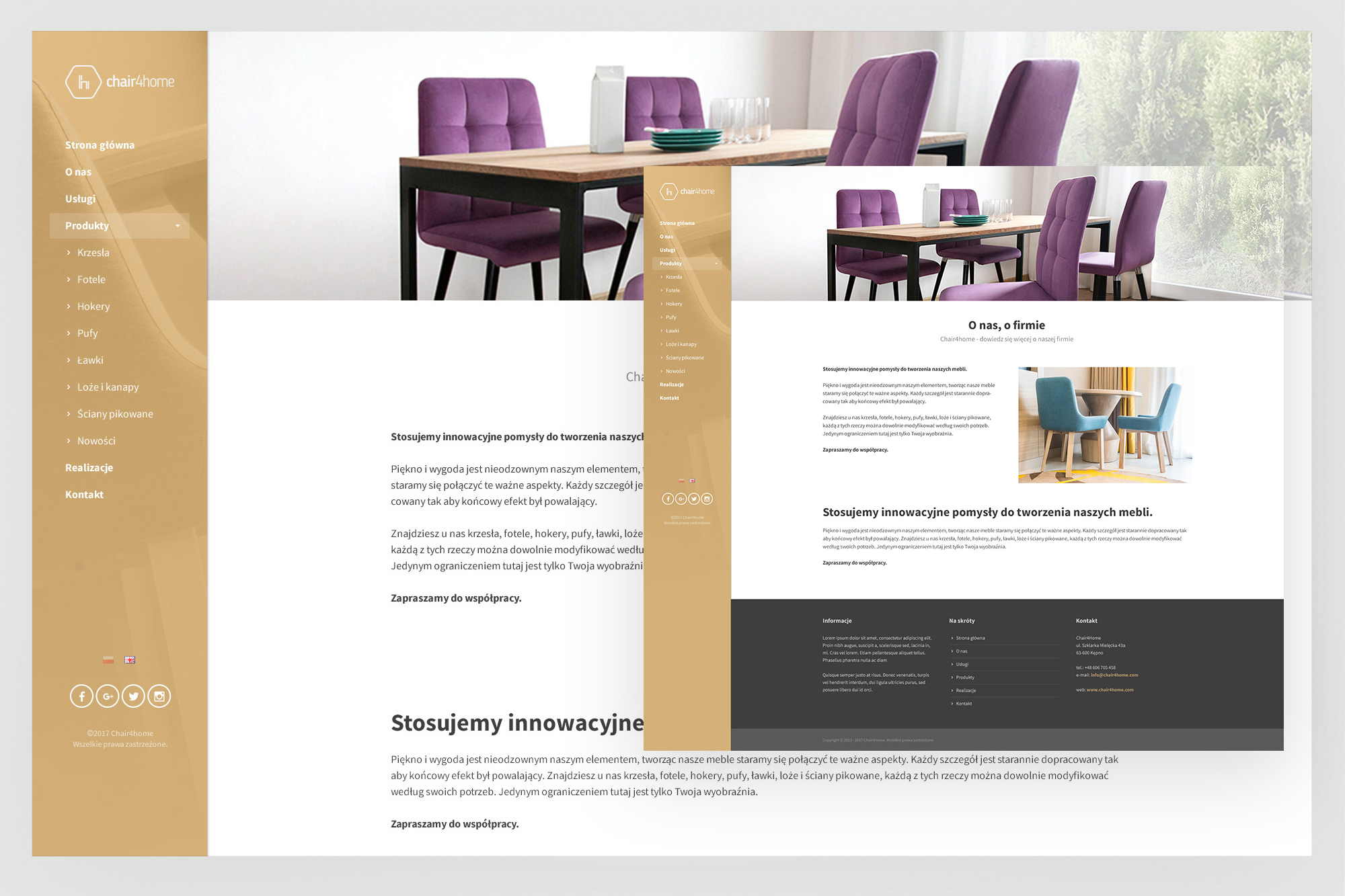
About us page - the brand story section combining lifestyle room photography on the left with the company description and values text on the right. "Stosujemy innowacyjne" (We apply innovative) begins the copy, positioning the brand around quality and forward-thinking product curation. The gold footer CTA strip carries through to the bottom of every page.
05. Outcomes
A brand and a store that positioned chair4home in a premium segment
The engagement delivered a complete market-ready brand and e-commerce presence - from the first business card a potential partner would receive to the product page a customer would land on from a search result.