employee self-service platform

employee self-service platform
BeOnTime App is an application for managing the working time of employees of various scale companies, based on popular beeoffice software. In this case, it has been used by the All For One Organization employees who were obliged to record there all activities related to their work. AFO, as a company from the IT industry, has a large development team responsible for - among others - maintaining the beeoffice for the organization. Apart from changing the color of the interface, they made many modifications to the program to better adapt it to the company's needs. With the appearance of research by ux researchers on the need to rebuild certain views, a decision was made to start a project involving deeper modifications to the beeoffice software. The team delegated for this task consisted of Product Owner, Project Manager, UX researcher, UI/UX designers, front-end and back-end developers.
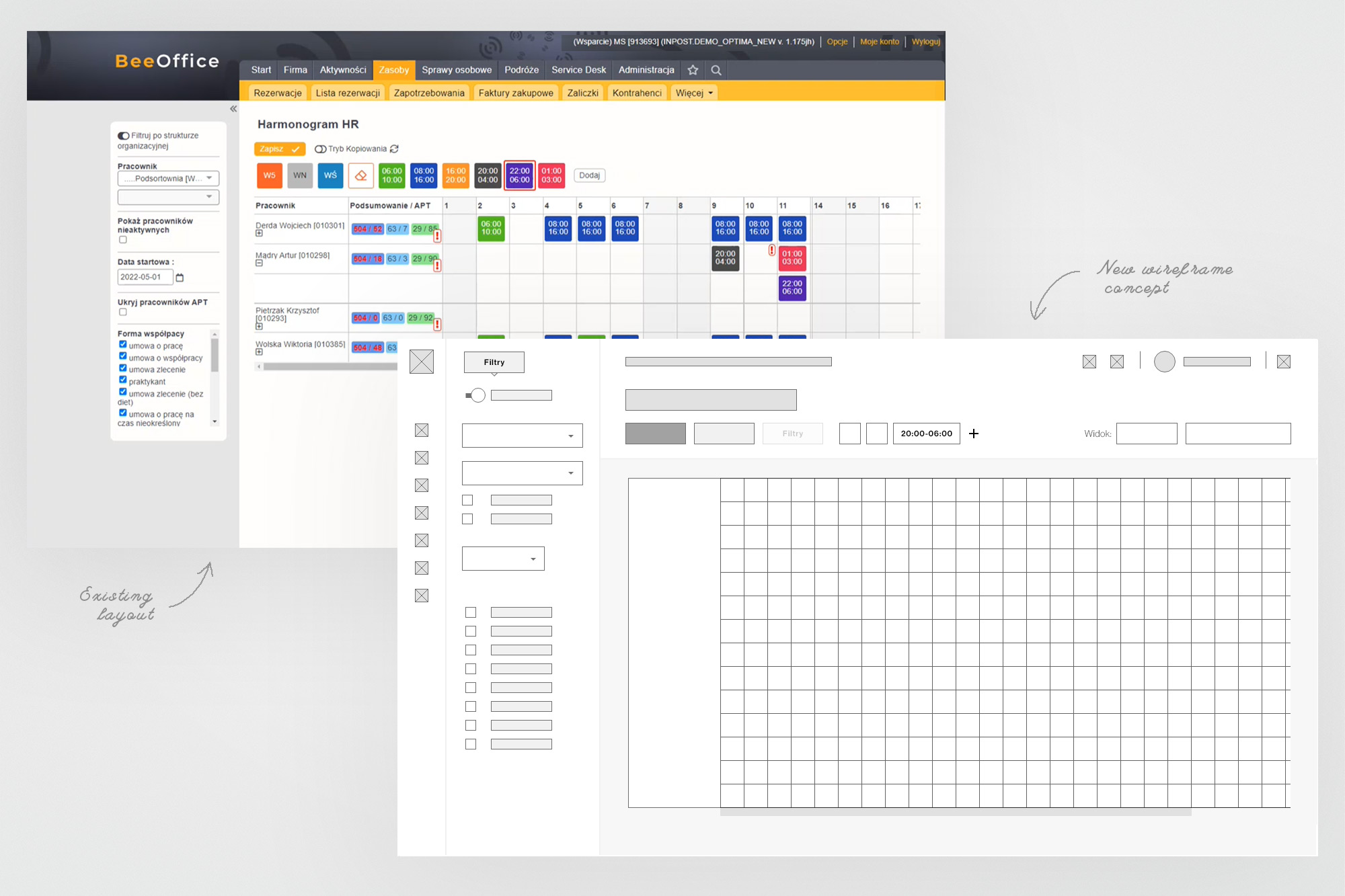
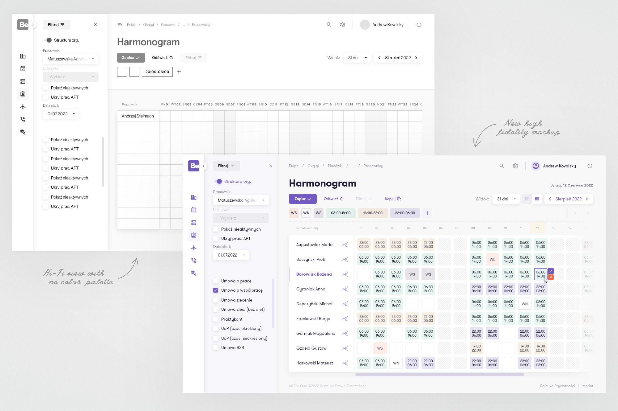
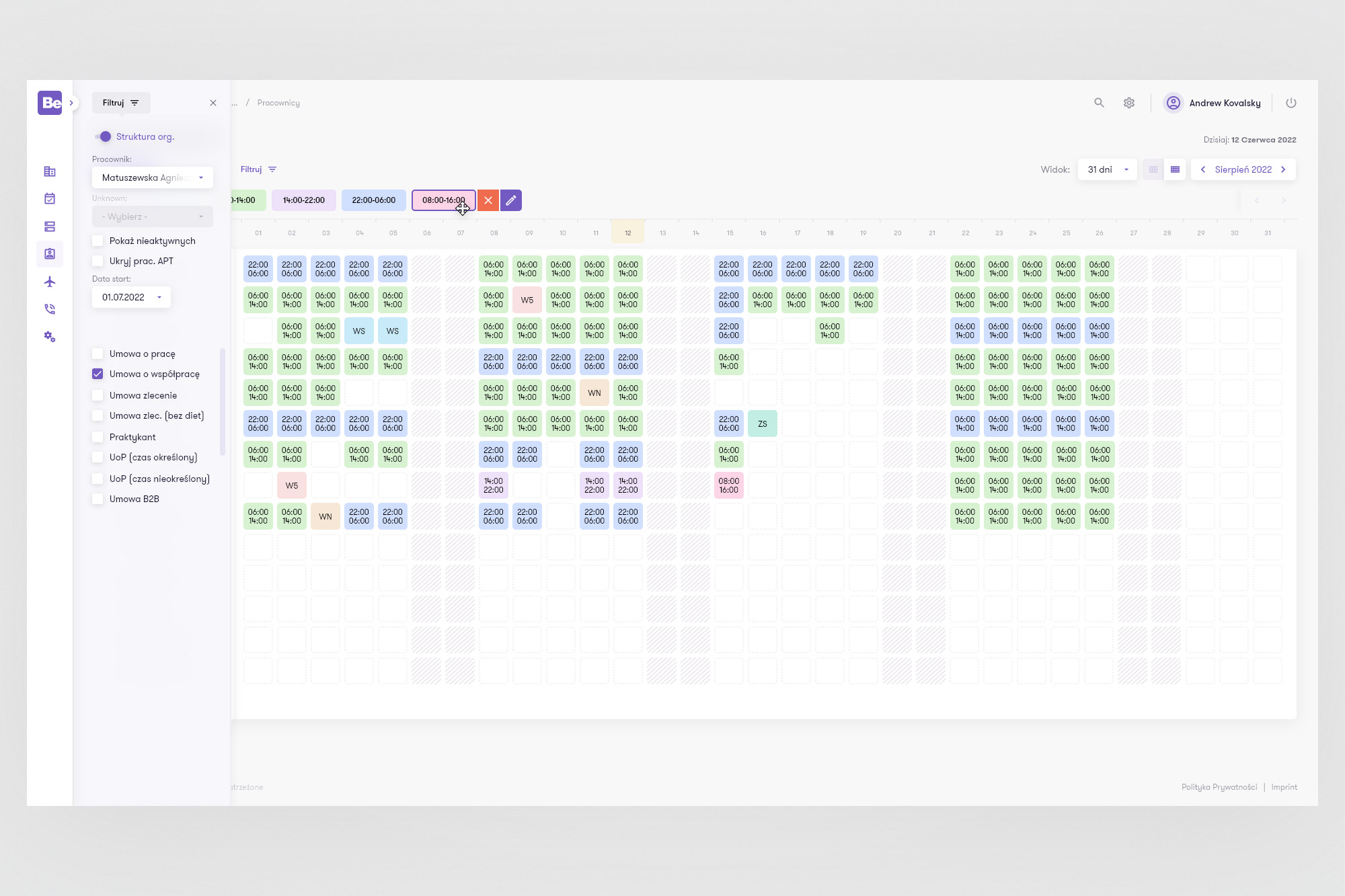
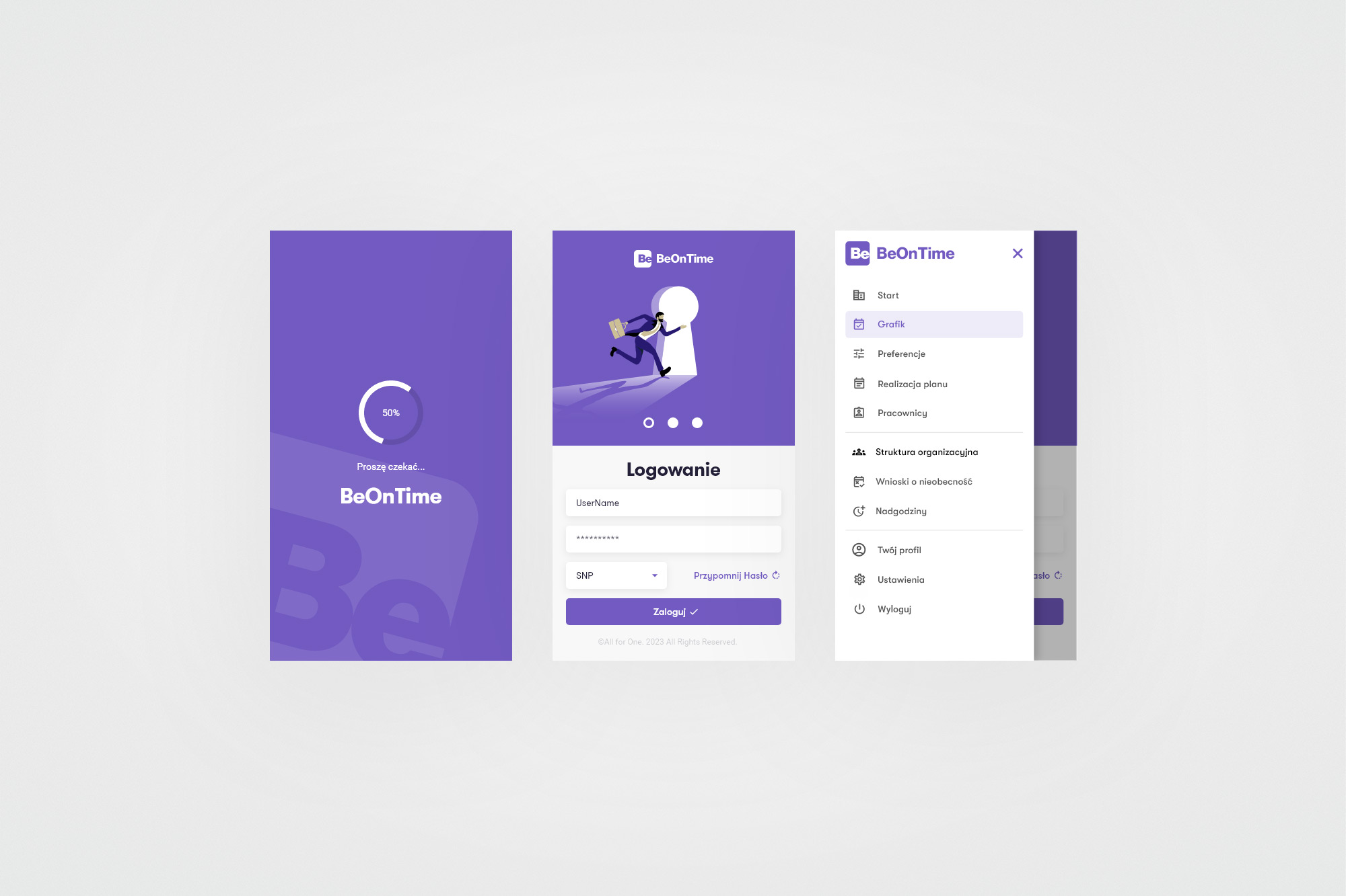
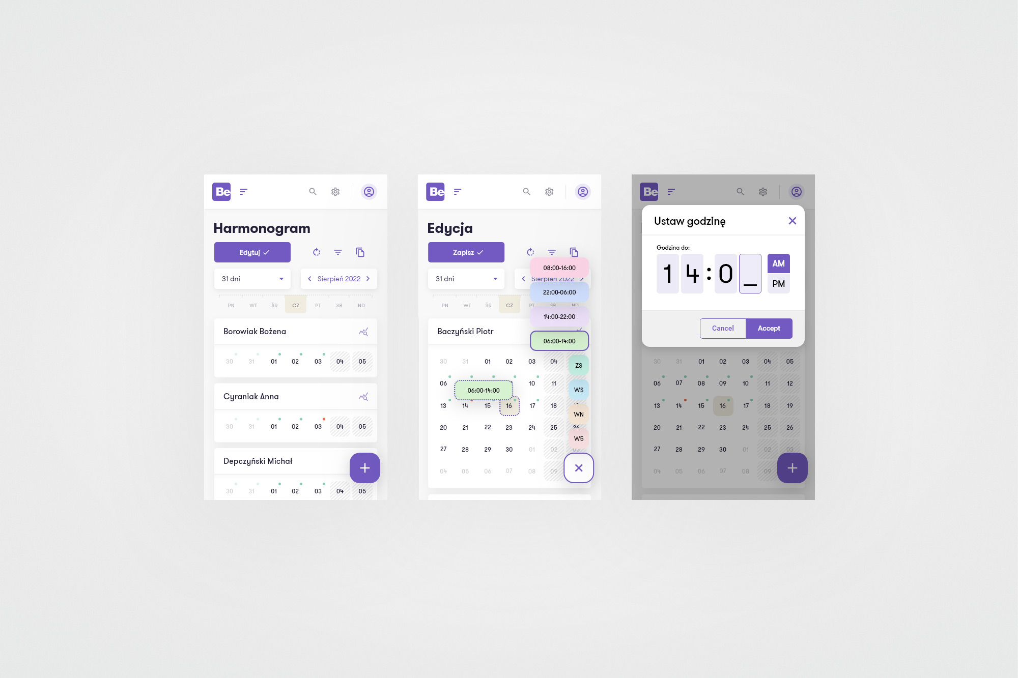
The main problem reported by users was insufficient space (vertically) on the Schedule tab to display as many employees as possible on one screen in addition to other relevant information. The lack of enthusiasm among employees in using a rather gray and not very modern-looking application, pushed the management to decide to create something visually pleasant and encouraging, while maintaining all the necessary functionalities. The appearance of a new CI for AFO only solidified that decision. Additionally, users also wanted to be able to make and edit entries in the mobile application, which BeeOffice did not provide at that time. Therefore, I was obliged to also provide concepts for the new look of the mobile application, which is the visual equivalent of the desktop one.
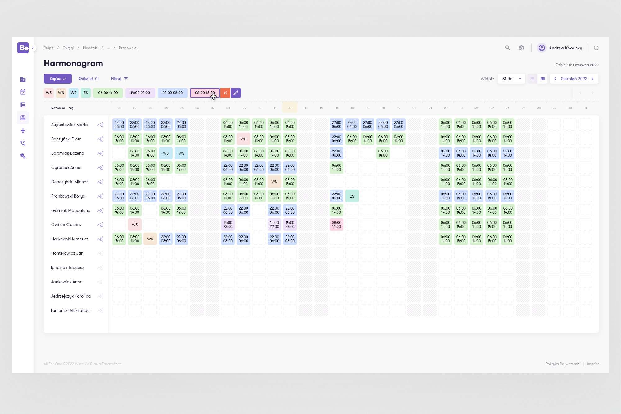
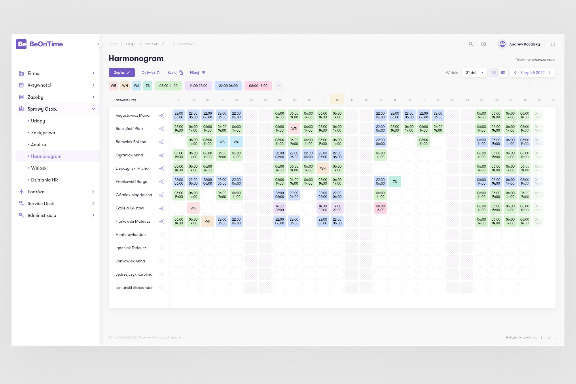
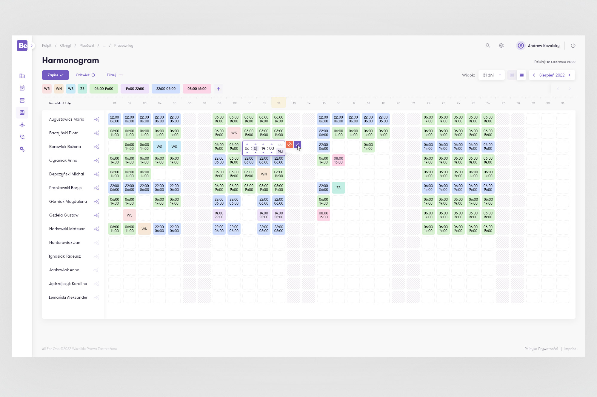
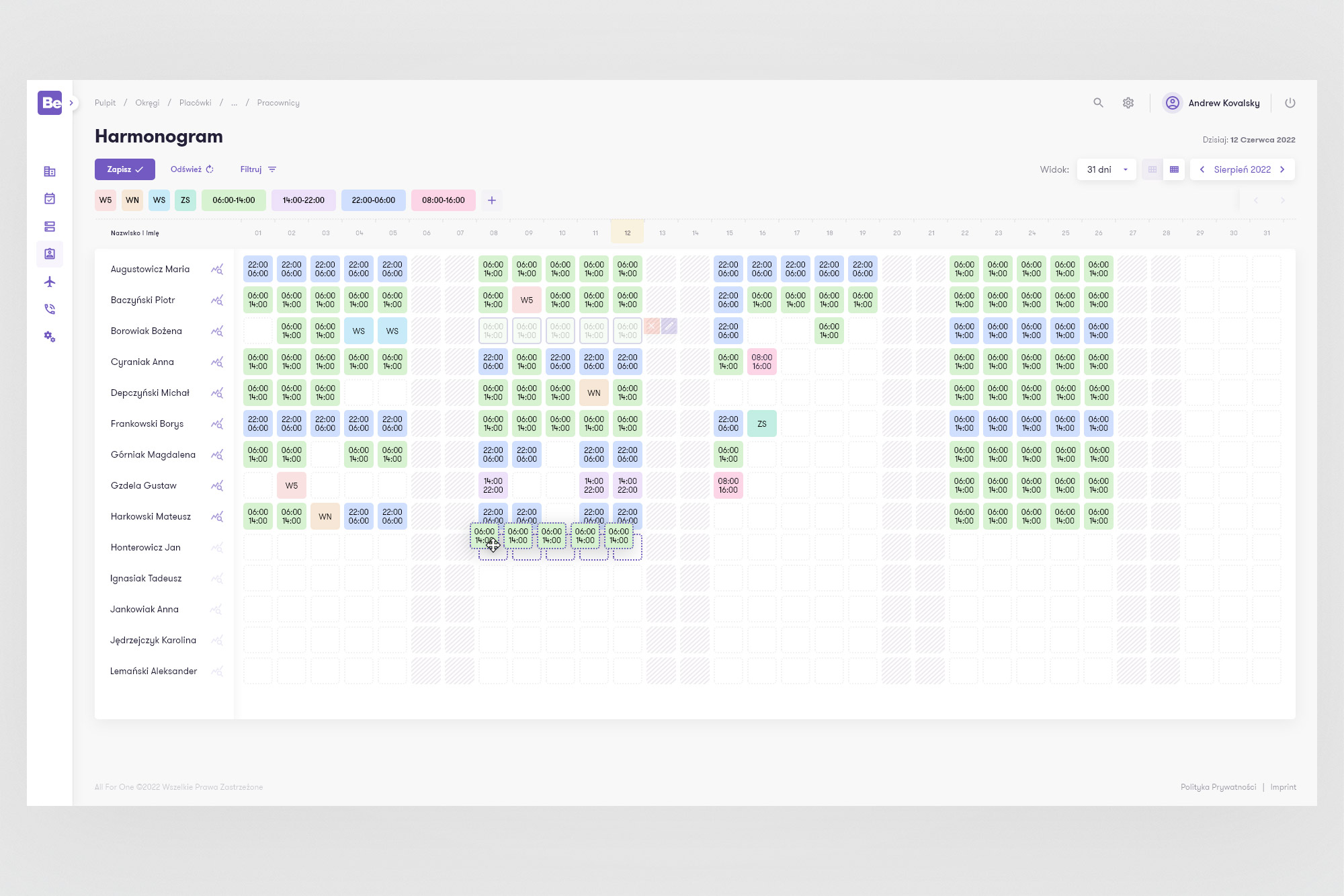
My task here was purely interface-related - it mainly consisted in creating as much space as possible for managing elements on the calendar board and proposing a concept of a new, fresh and positive-emotional interface. Additionally, I also had to show an idea for displaying calendar table elements in a mobile application, the appearance and layout of which I also provided. We worked in the scrum methodology, in two-week sprints. Starting from creating wireframe mock-ups based on research provided by UX researchers, performing remote tests of the proposed solutions, I improved the solutions iteratively until achieving moderate satisfaction among those tested comapny employees. Visually, the implemented solution aroused positive emotions, curiosity and willingness to test the app among the company's employees. The goal of obtaining more space for the employee list was only partially achieved, due to technical conditions some things had to be abandoned, but the main point of this case, which was moving the main menu from the top of the screen to the left, was achieved and received a positive response.