01. Overview
A business idea, nothing else - building the whole brand from zero
mebrando was the most complete brand-from-zero engagement of my time at skillo. The client arrived with a business concept - a workshop offering embroidery, printing, and custom sewing for branded apparel - but with absolutely nothing built around it. No name, no identity, no platform.
The project covered the entire chain: naming the business, designing the visual identity, building the e-commerce platform on Shoper, producing the supporting digital materials (transactional emails, newsletter), creating social media graphics, and - uniquely for this project - designing a series of actual embroidery and print artworks that the client would go on to sell as products.
02. Naming & insight
Finding the name inside the service itself
The discovery process followed the same flow as other brand-from-zero projects: a brief with the client, desktop research into the apparel branding and promotional textile market, and an ideation phase to find a direction. But here, naming came first - there was no existing word to design around.
The core of the business was, quite literally, branding garments - adding logos, names, and graphics onto t-shirts, polos, and workwear via embroidery, print, and sewing. That description contained the name: mebrando, a contraction that reads naturally as "branding" with a distinctive, ownable twist - short, memorable, and instantly suggestive of what the business does without being a literal descriptor.
Key insight
The service itself - branding clothing - was the most distinctive thing about the business. Rather than inventing an abstract name and explaining what it does, the name could describe the offer directly while still sounding like a brand, not a category label.
03. Brand identity
A mark rooted in thread and craft
The logo pairs a stitched-arch monogram - two looping forms suggesting thread or embroidery hoops - with a clean, lowercase wordmark split across two weights: "me" in a lighter tone, "brando" in bold. This split mirrors the name's construction and gives the wordmark a rhythm that feels handmade rather than corporate.
The colour palette draws on a fresh green and deep navy, with the green carrying most of the brand's energy - appropriate for a business positioned around craft, customisation, and small-batch production rather than mass manufacturing. The tagline "Haft × Nadruk × Szycie" (Embroidery × Print × Sewing) was set directly beneath the wordmark, making the service offer legible at a glance.
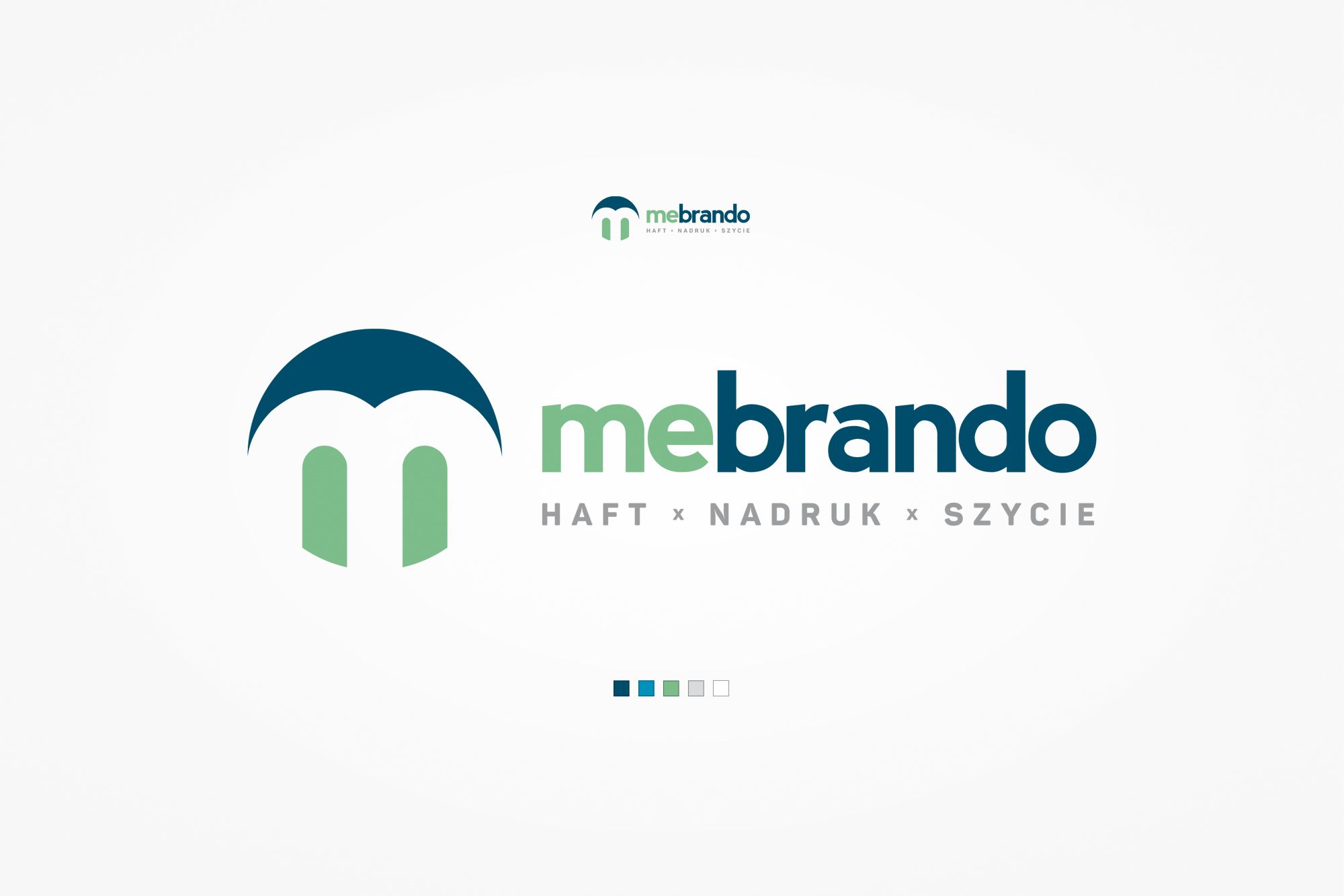
Primary logo with the brand colour palette and service tagline - the stitched monogram and two-weight wordmark establish the brand's craft-driven character.
04. Stationery & print materials
From business cards to delivery inserts
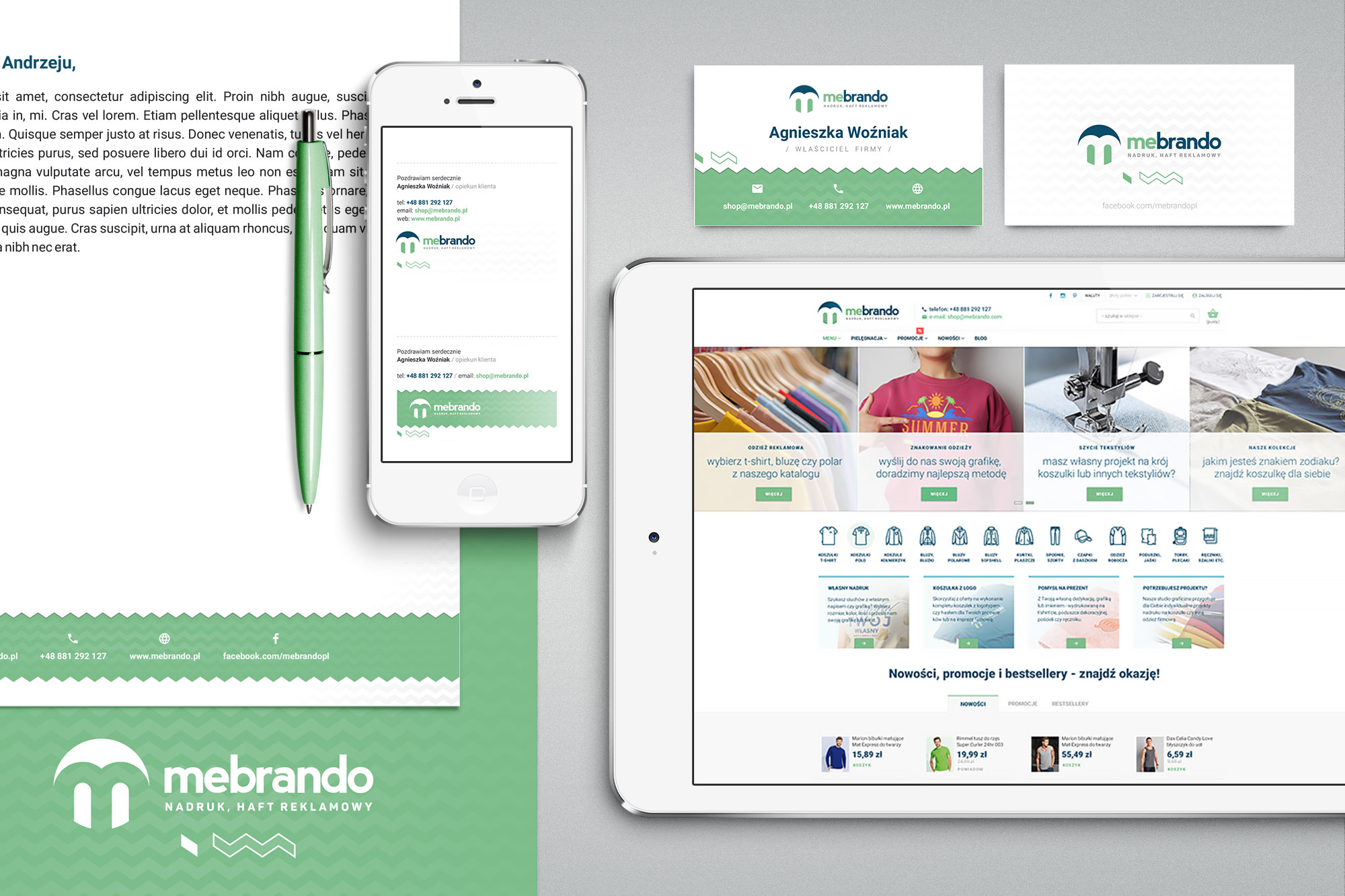
The identity was extended across a full set of physical touchpoints - business cards, letterhead, and promotional leaflets designed to be included with shipped orders. The brand's signature wave motif, echoing a stitched seam, became a recurring graphic device across these materials, tying everything back to the craft at the centre of the business.
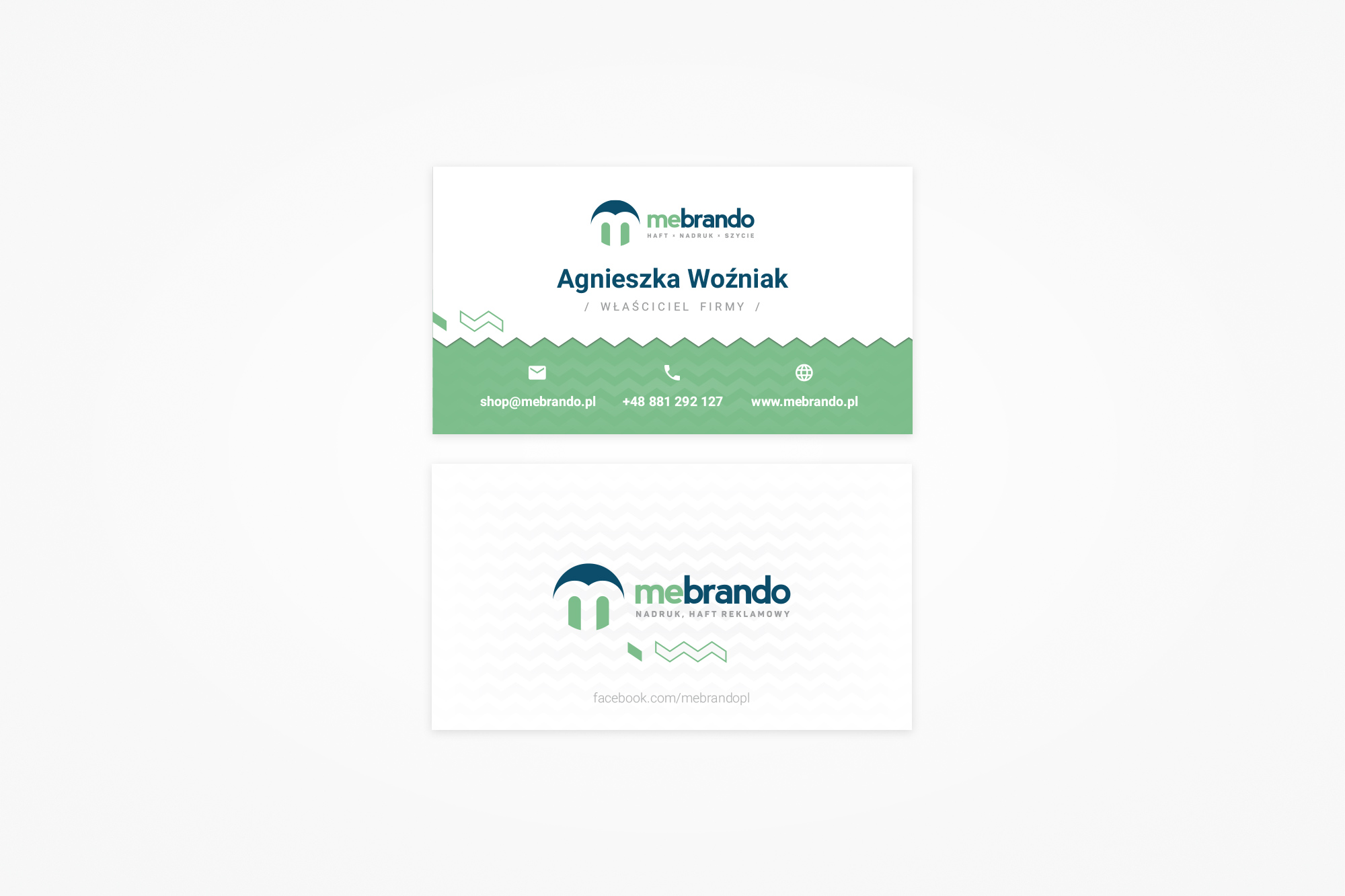
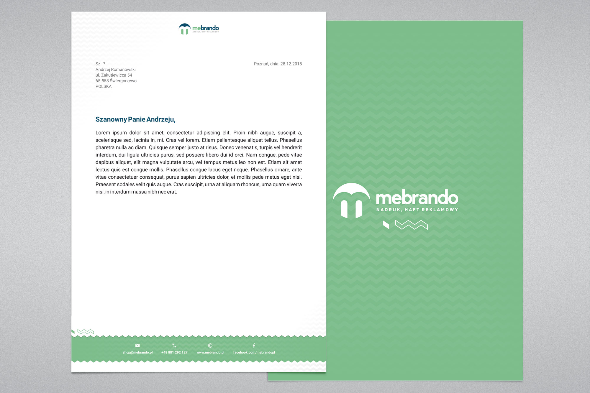
Business card with the stitched-wave motif, and the letterhead/folder system applying the same device as a structural graphic element.
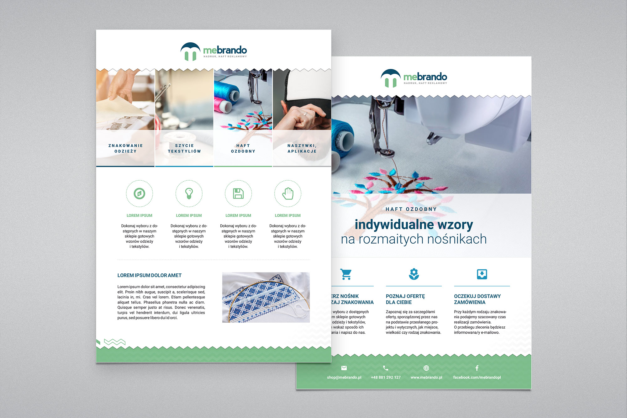
Promotional leaflets designed to be included with shipped orders - introducing customers to the full range of embroidery, print, and sewing services.
05. Online store
A Shoper storefront, built around customisation
The store needed to communicate something most furniture or fashion e-commerce sites don't: that every product could be customised - your logo, your design, your garment. The homepage layout led with this message directly, combining lifestyle photography (produced from stock and art-directed for the brand) with clear calls to action around custom orders and bestsellers.
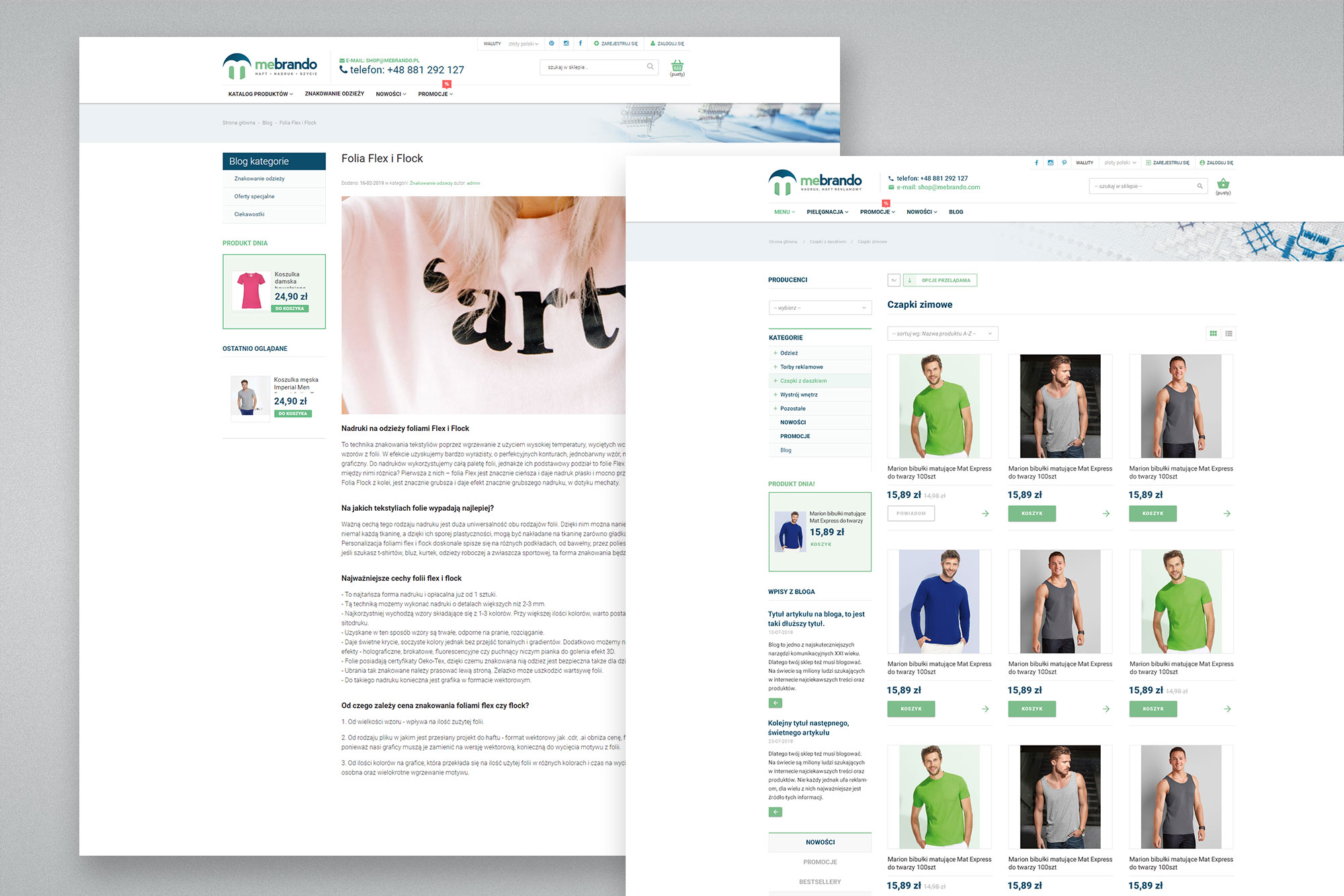
Category and product pages followed familiar e-commerce conventions - clean grids, clear pricing, and prominent imagery - while a dedicated "send us your design" flow addressed the core of the business model: customers requesting bespoke branding work rather than buying off-the-shelf items.
As with InsideHouse, the platform of choice was Shoper, implemented from approved mockups as a fully custom template - selected for the same reasons of template flexibility and long-term editability by the client.
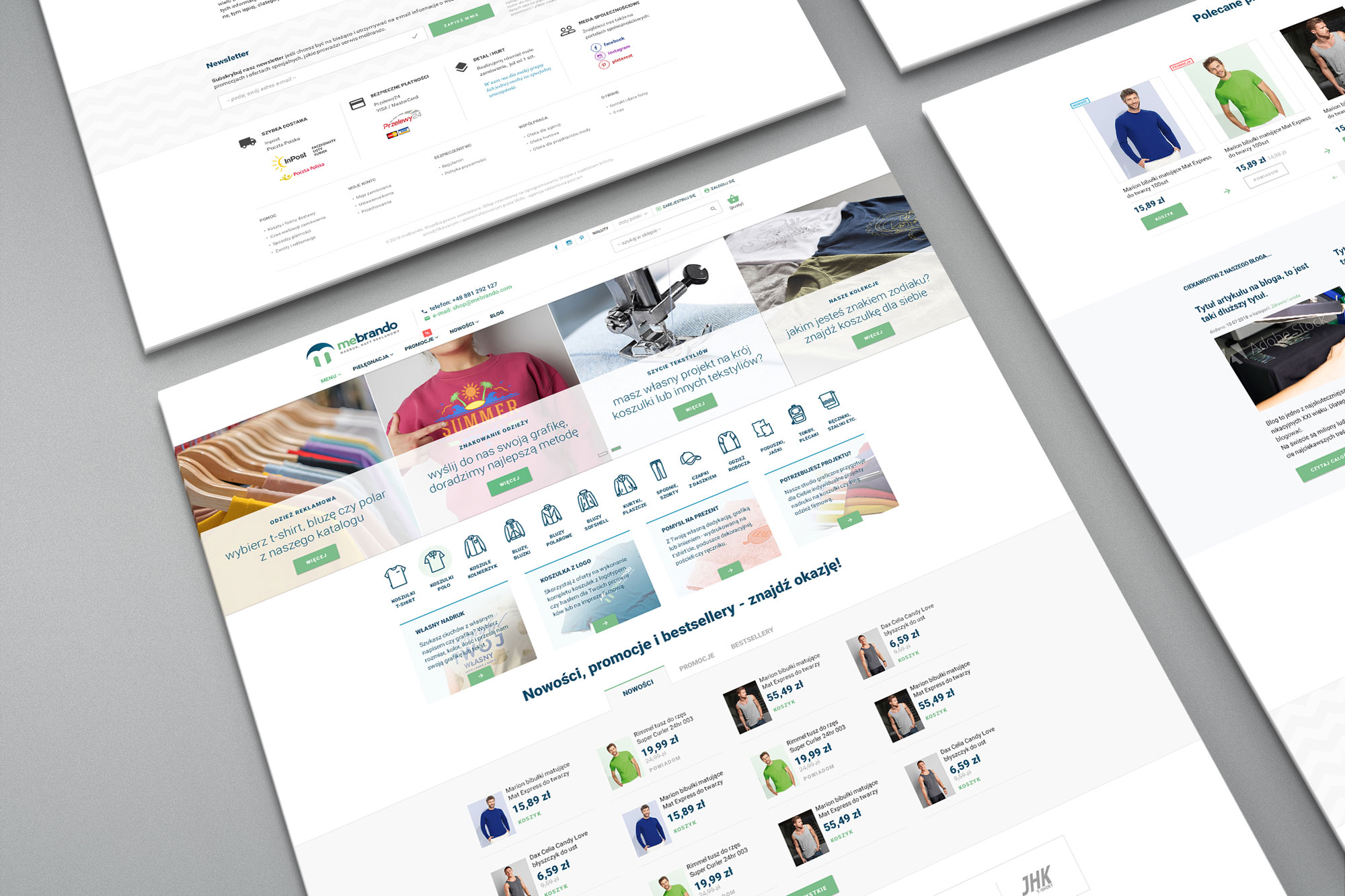
Store homepage - hero messaging around custom design services, paired with featured products and seasonal promotions.
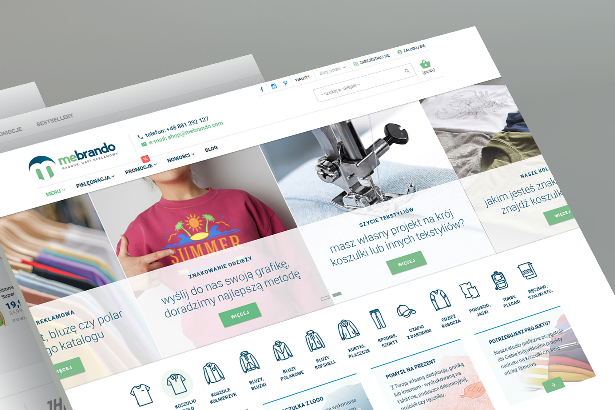
Homepage variations highlighting the "send your design" service alongside category navigation and bestseller listings.
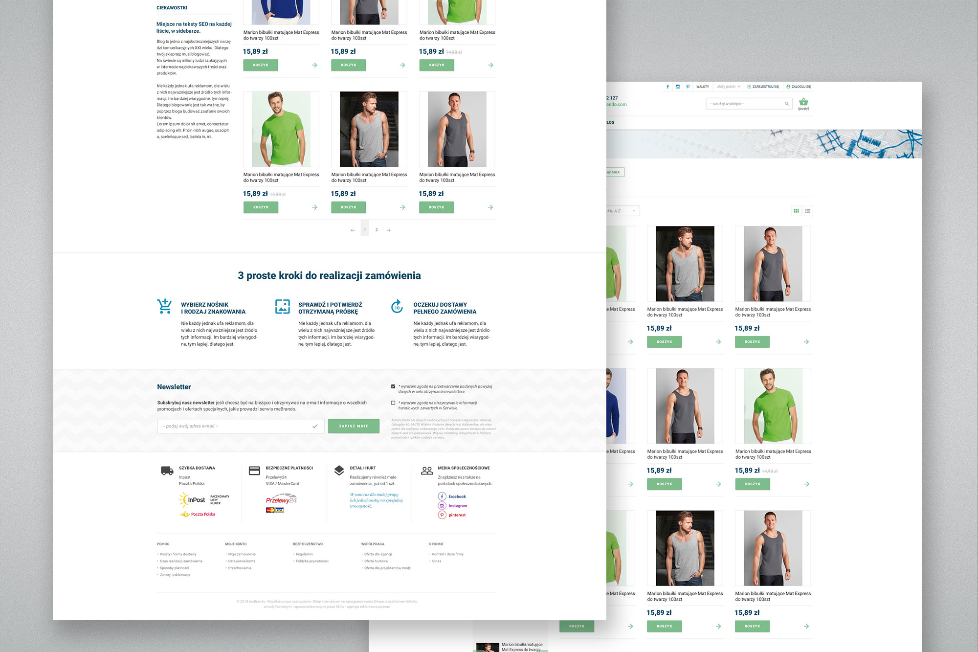
Category listing alongside the product detail page - consistent grid layout, pricing, and quick navigation across the catalogue.
06. Apparel & embroidery design
Designing the products themselves
Beyond the brand and the platform, I also designed a series of artwork ready for production using mebrando's own techniques - embroidery, Flex, and Flock heat-transfer printing - which the client could then sell directly as finished apparel designs.
The centrepiece was a set of twelve zodiac sign illustrations, each adapted for embroidery - a technique with its own specific preparation requirements, designed using specialised digitising software rather than standard illustration tools, since embroidery files define stitch paths and densities rather than vector shapes. Alongside these, I produced graphic designs for Flex and Flock print applications - bolder, flat-colour artwork suited to heat-transfer vinyl rather than the textured finish of embroidery.
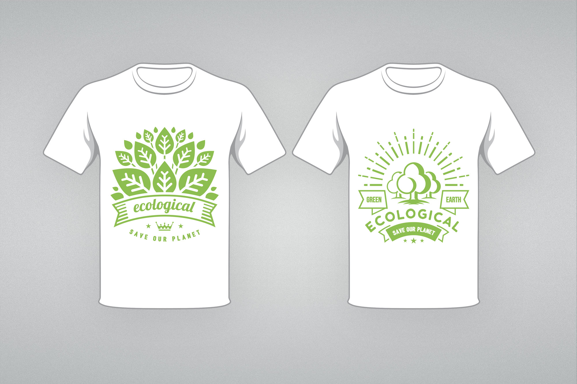
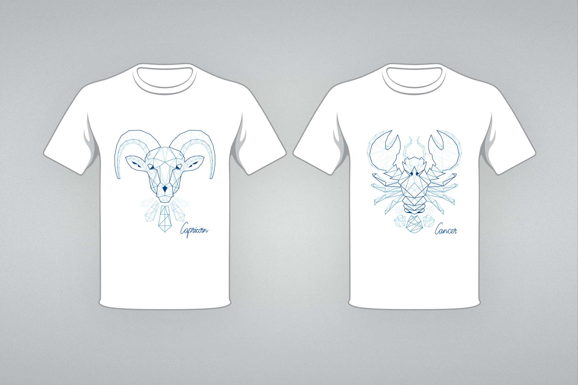
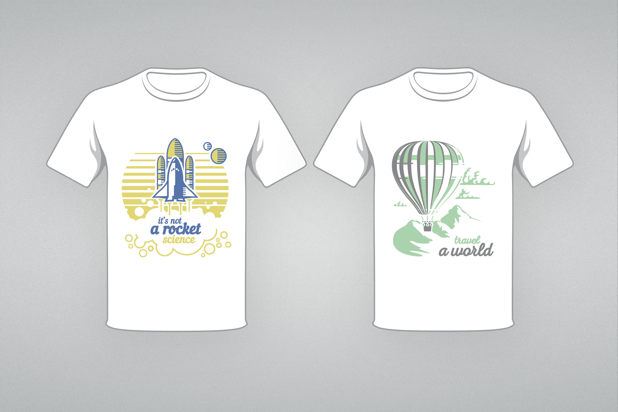
Three production techniques, three design approaches: Flock print designs (left), zodiac embroidery series prepared for digitised stitching (centre), and Flex heat-transfer designs (right).
07. Outcomes