01. Overview
A seasonal catalogue for an exotic travel specialist
Holiday Experts is a Polish tour operator specialising in long-haul and exotic travel - destinations including India, Sri Lanka, Tunisia, China and beyond. The agency came to Skillo with a clear brief: design a seasonal print catalogue presenting their current exotic offers, handle print production, and deliver the finished copies to the client.
The client had a working logo and a yellow brand colour, but no developed visual identity system. The brief was to create a catalogue that could carry the brand confidently across its entire run - from the front cover through introductory pages to individual destination spreads - while working with the content materials provided, many of which required supplementing with stock photography.
Brief
Design an A4 portrait catalogue presenting Holiday Experts' exotic travel offer for the current season. Supplement sparse client-supplied content with appropriate stock photography. Prepare print-ready files and coordinate print production and delivery.
02. Cover & concept
Sunshine yellow - a cover that stands out in any travel agency rack
The format decision was straightforward: A4 portrait fits standard document folders and travel agency display racks, is easy to mail and handle, and is the established convention for this type of publication in the Polish travel market. There was no good reason to deviate from it.
The cover concept took the client's yellow brand colour and made it the primary design element - a bold, full-bleed yellow background that would be immediately recognisable on a rack alongside competing catalogues from other operators. The holiday photography is cropped into a generous bleed image in the upper portion, anchored by the logo and the "Twoje Podróże" (Your Travels) title treatment in the lower yellow zone. The result is sun-drenched, optimistic and visually strong without relying on complex graphic treatments.
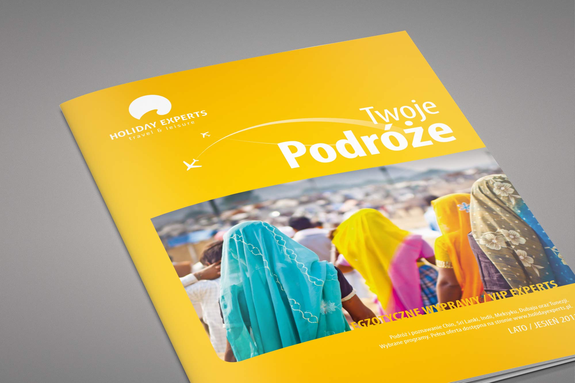
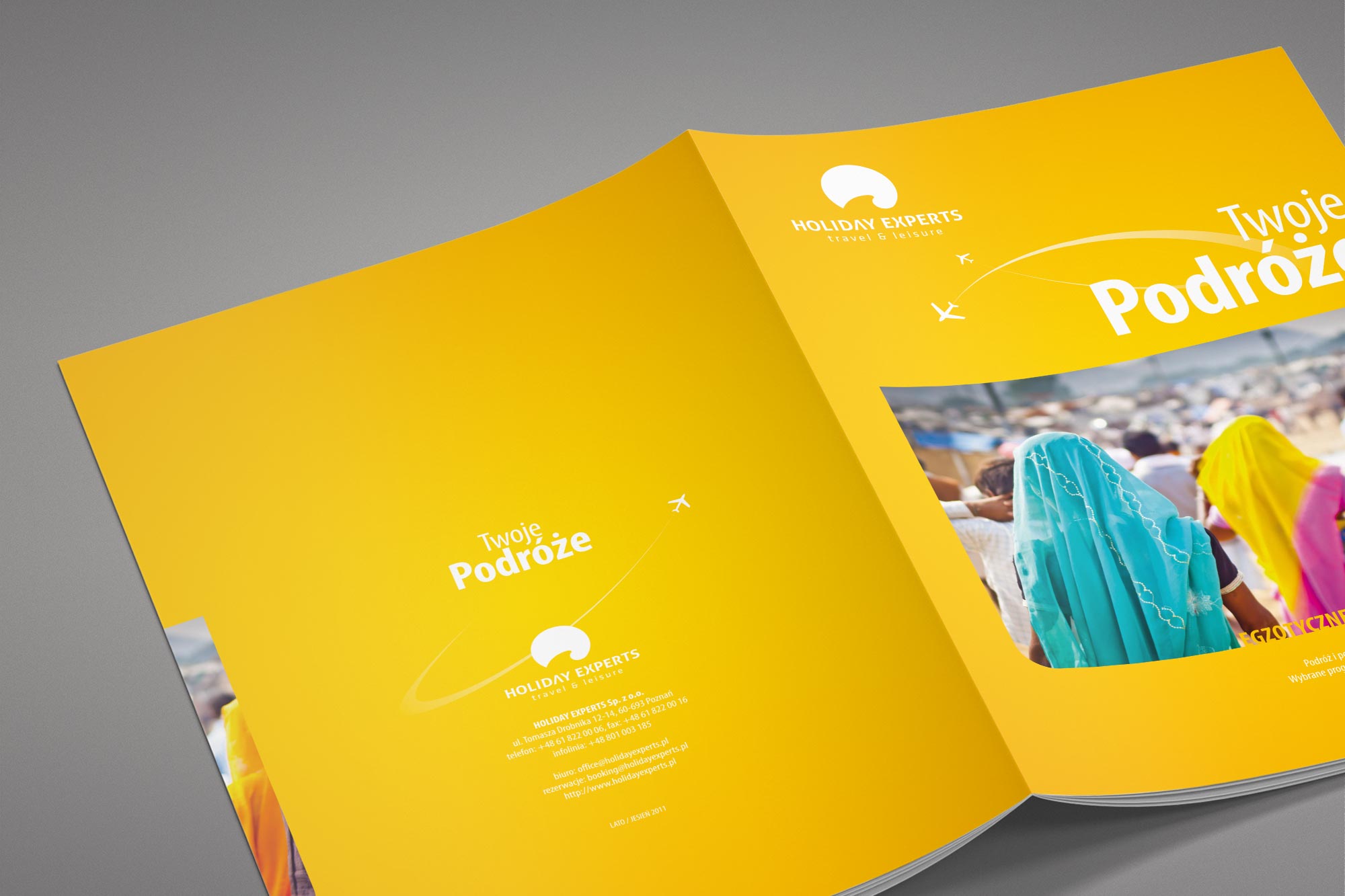
Catalogue cover - full-bleed photography in the upper portion against the signature sunshine yellow, with the Holiday Experts logo, "Twoje Podróże" title and edition details in the lower zone. Right: cover and back spread view showing the full format.
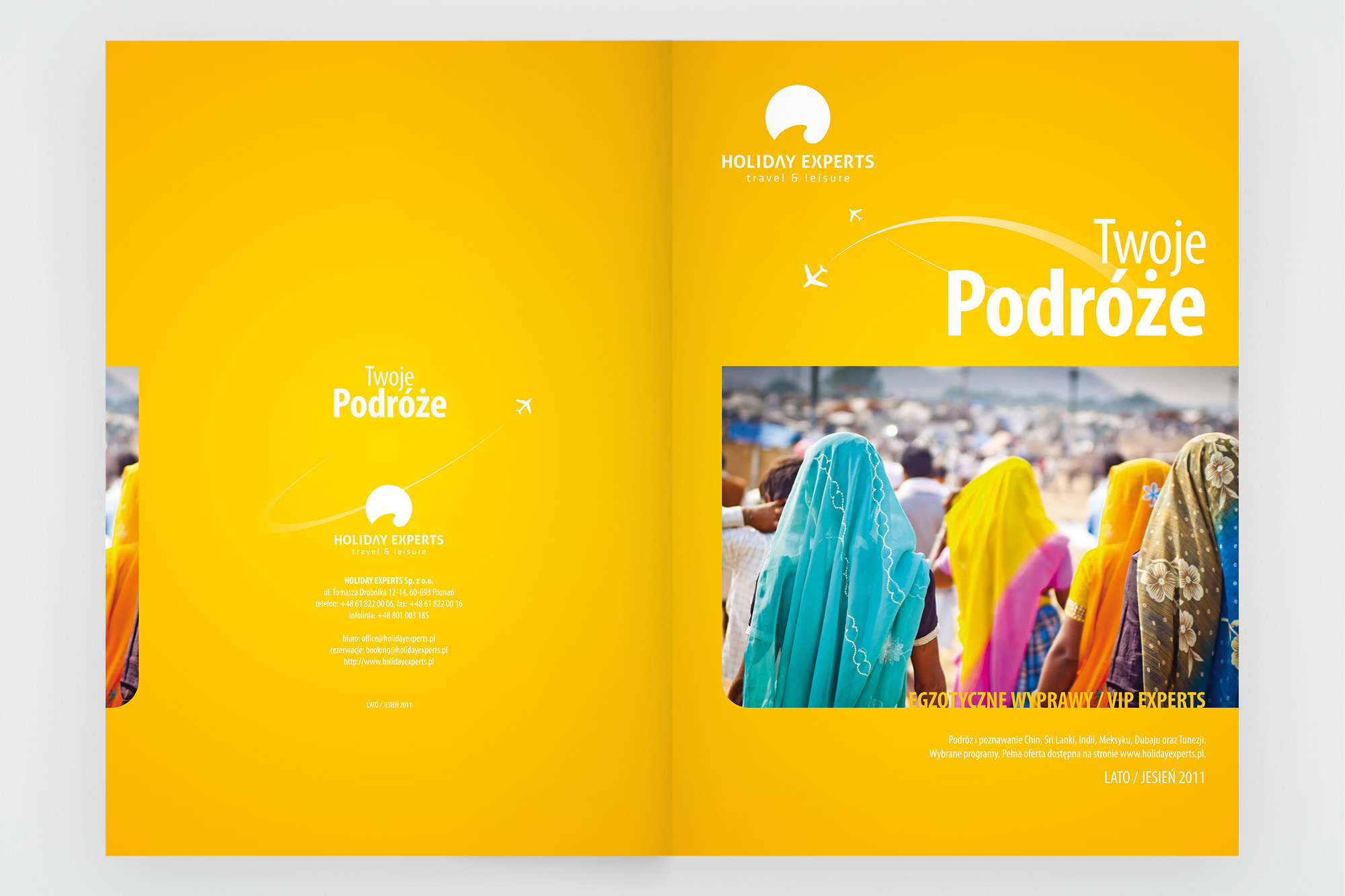
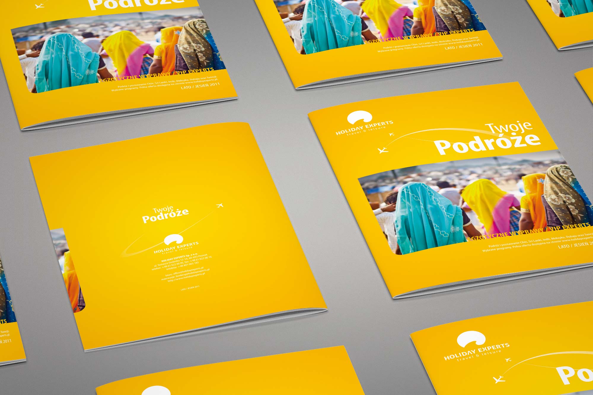
Cover flat view (left) - the A4 portrait format with photography, logo and title. Printed copies (right) - the finished catalogue in quantity, ready for distribution through travel agency locations.
03. Inside pages
Yellow as structure - a grid that holds diverse content together
The interior layout system uses yellow as a structural element rather than a background - vertical accent strips, section headers and decorative icon elements bring the brand colour in without overwhelming the content. The base is clean white with generous margins, making the dense travel information (itineraries, prices, inclusions, practical details) as readable as possible.
Where the client's materials were thin, stock photography was researched and integrated to give each section appropriate visual weight. Destination photography, suitcase travel icons and map elements were combined to create spreads that feel editorial rather than templated, giving each destination its own character within a consistent system.
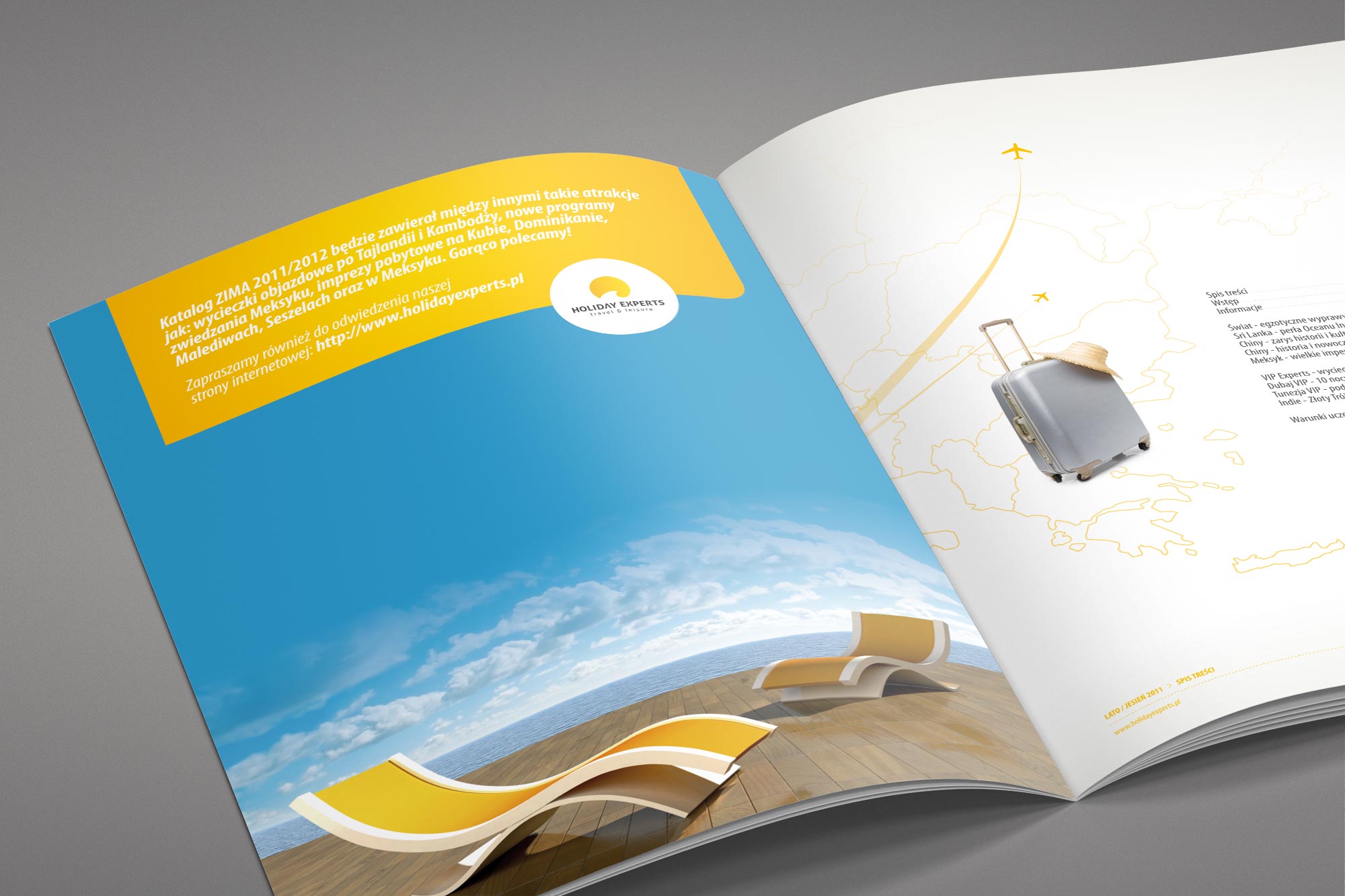
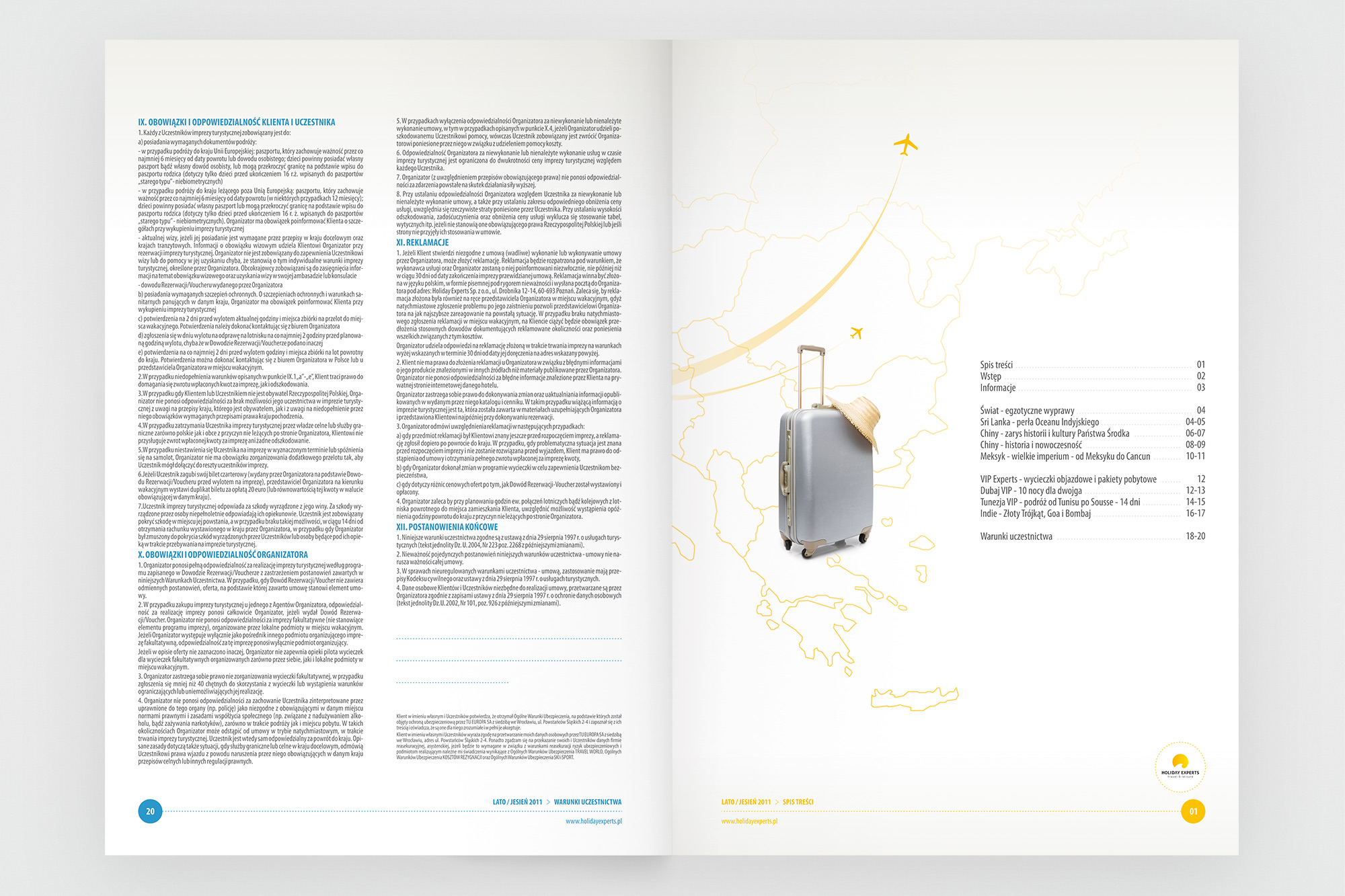
Opening interior spreads - terms and practical information page (left) with a suitcase illustration against a sky-blue photography background. Introduction spread (right) with the yellow accent strip and travel photography integrated into the text layout.
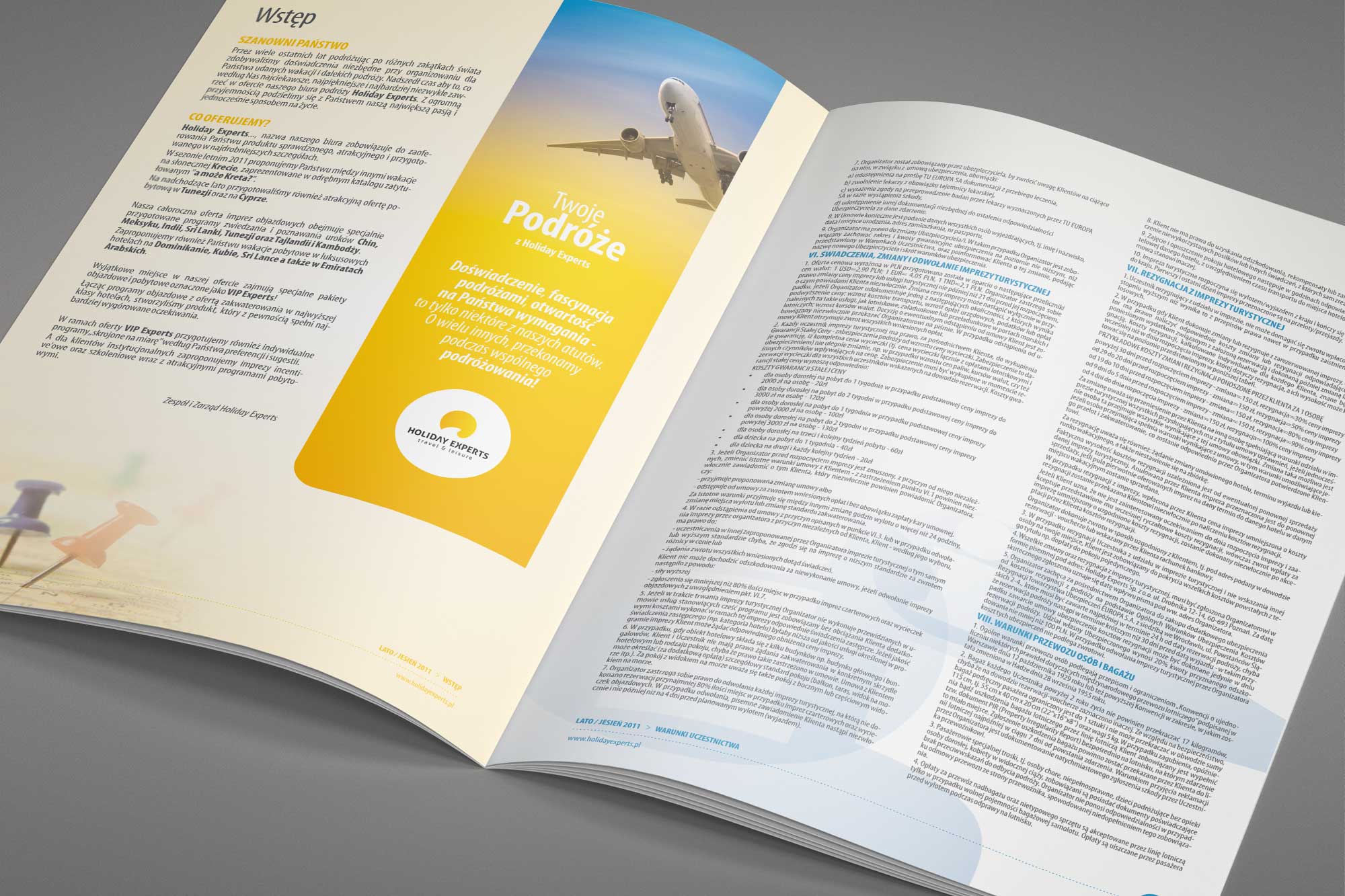
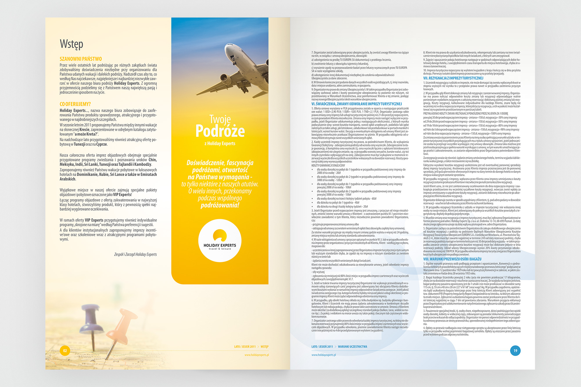
Further interior spreads - the "Wstęp" (Introduction) spread (left) using a split layout with the yellow sidebar, logo mark and flight photography. World destinations section opener (right) with a full-bleed Sri Lanka landscape photograph and the yellow title treatment.
04. Destinations
China, Sri Lanka, Tunisia, India - each destination, its own spread
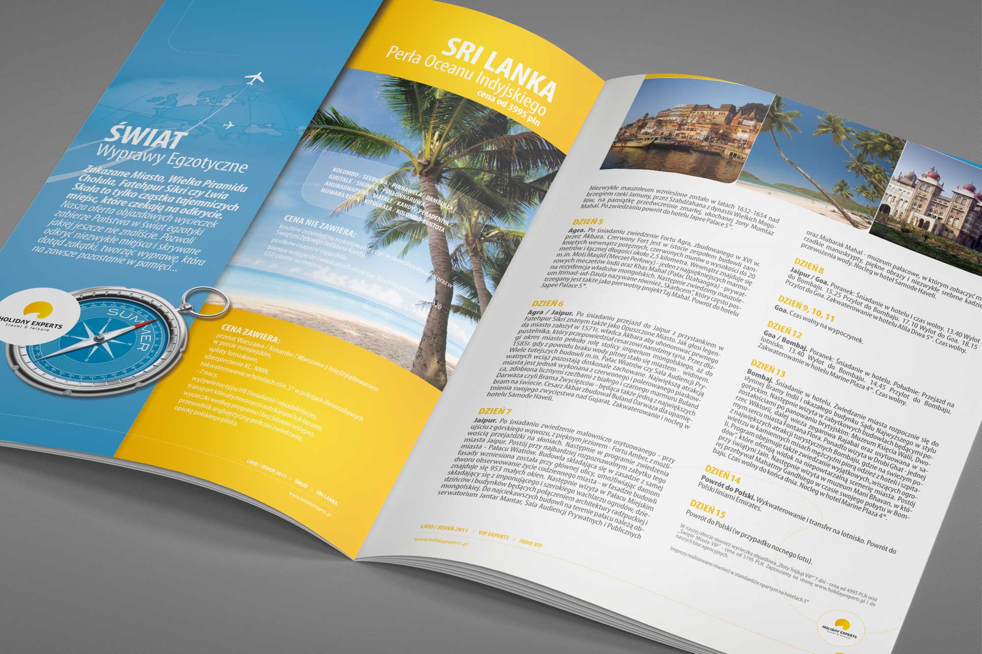
Each featured destination receives a consistent two-page spread treatment: a bold yellow header band with the destination name, a dominant landscape photograph, and the offer details structured in a clear column grid. The yellow header colour - the same across every destination - creates a running thread through the catalogue that makes it easy to navigate while keeping each spread individually expressive through its photography.
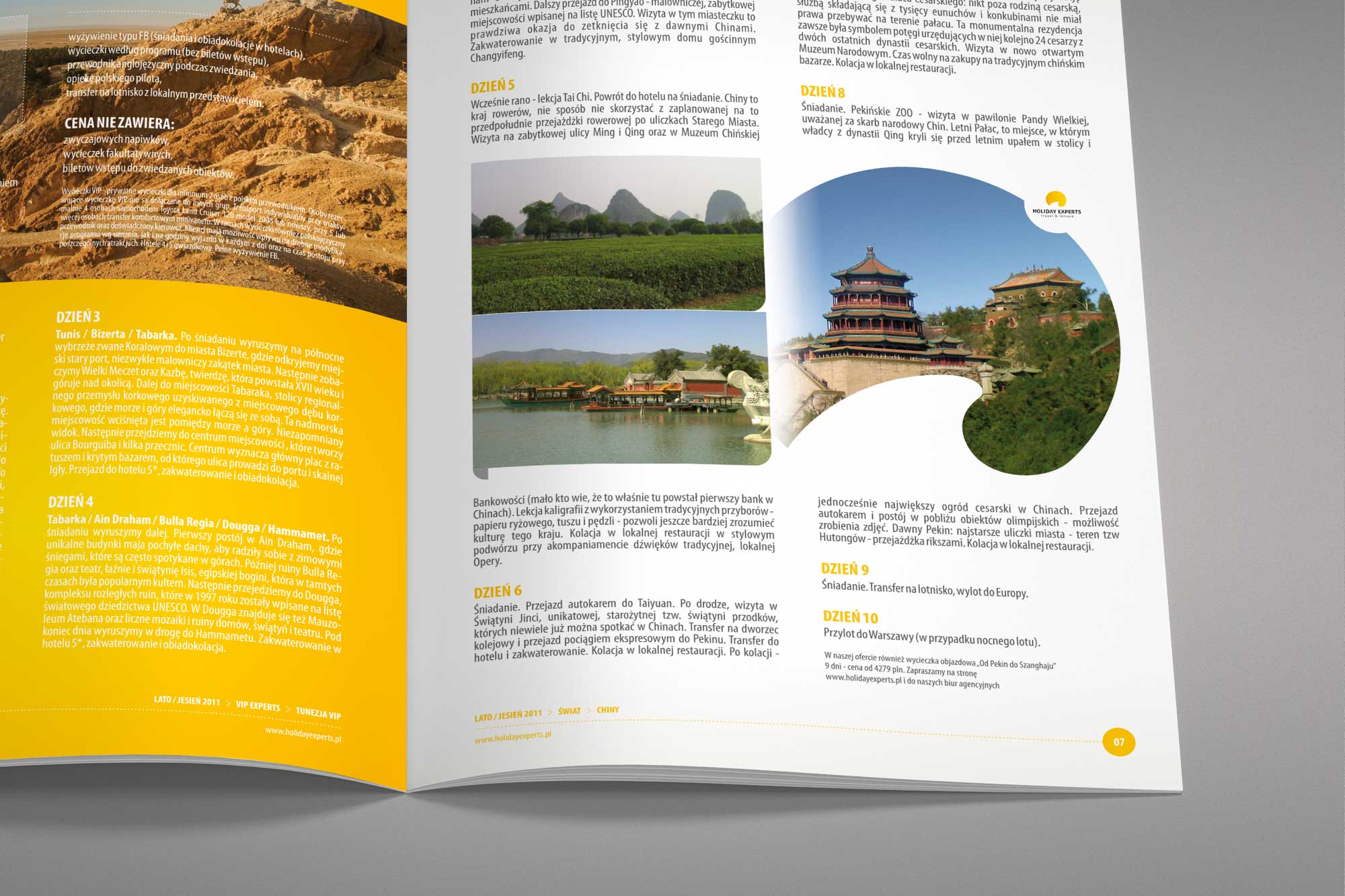
VIP offers (Tunisia VIP, India VIP) receive the same treatment, with the VIP designation clearly marked in the header - a simple but effective hierarchy signal that distinguishes premium packages from standard offers within the same visual framework.
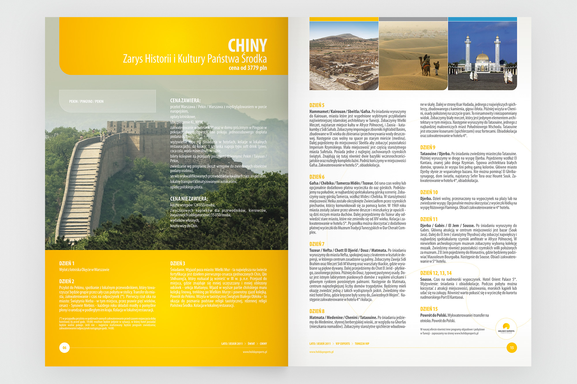
China spreads - the destination header in yellow with the country name and tour subtitle, followed by the offer details in a structured text grid alongside circular-cropped landscape photography.
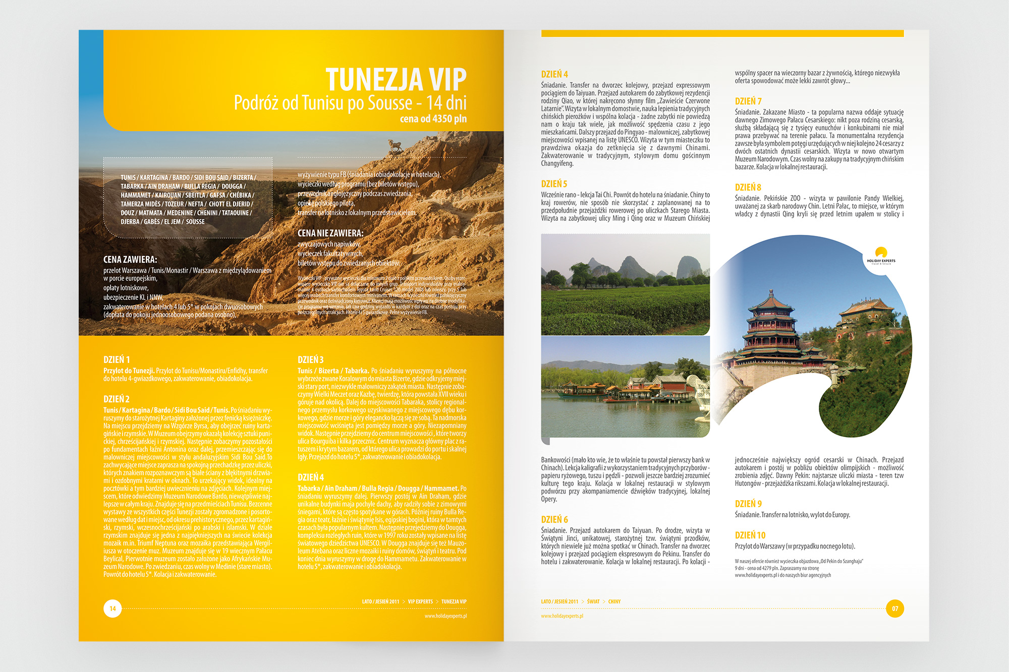
VIP destination spreads - Tunisia VIP (left) with beach photography and structured itinerary grid. India VIP (right) with the Taj Mahal photography and the consistent yellow header treatment, clearly marking the premium offer tier.
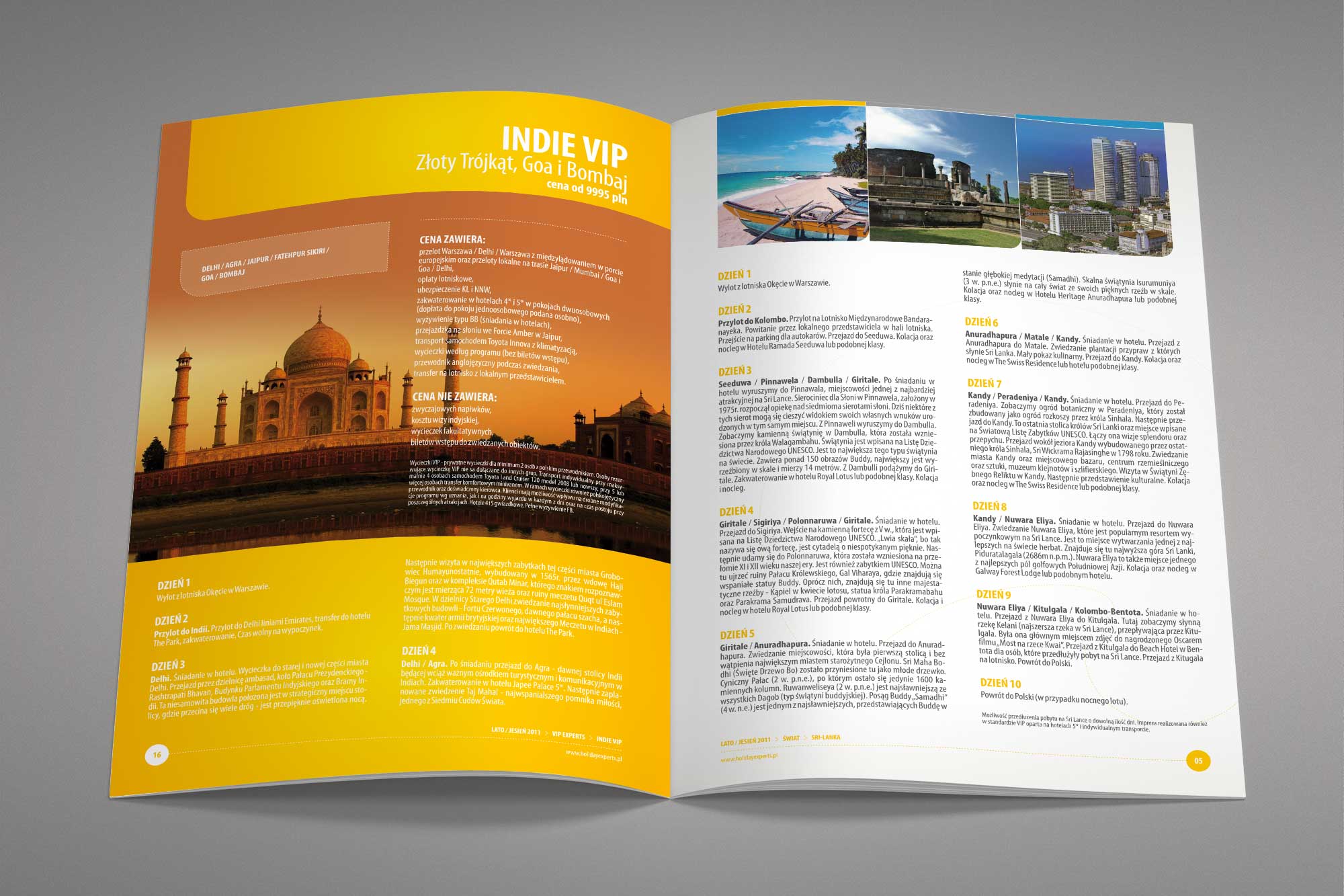
Sri Lanka spread - palm beach photography in the left column with the yellow "Świat / Sri Lanka" header, tour description and offer details structured in the right-hand column.
05. Outcomes
On brief, on time - a print-ready catalogue delivered end-to-end
The Holiday Experts catalogue was delivered as a complete end-to-end engagement: design, content completion, print production and physical delivery. A straightforward brief, executed cleanly.